
In the world of branding and corporate identity, few elements carry as much weight and historical gravity as the “newspaper font.” When people ask what font newspapers use, they are rarely looking for a single name like Arial or Helvetica. Instead, they are inquiring about a specific aesthetic—a blend of high legibility, authoritative presence, and a sense of timeless reliability.
For a brand, typography is more than a stylistic choice; it is the visual voice of the organization. Newspapers, as some of the oldest continuous brands in the modern world, have mastered the art of using type to establish trust and facilitate the rapid consumption of complex information. Understanding the “newspaper font” requires an exploration of design history, brand psychology, and the technical requirements of editorial identity.
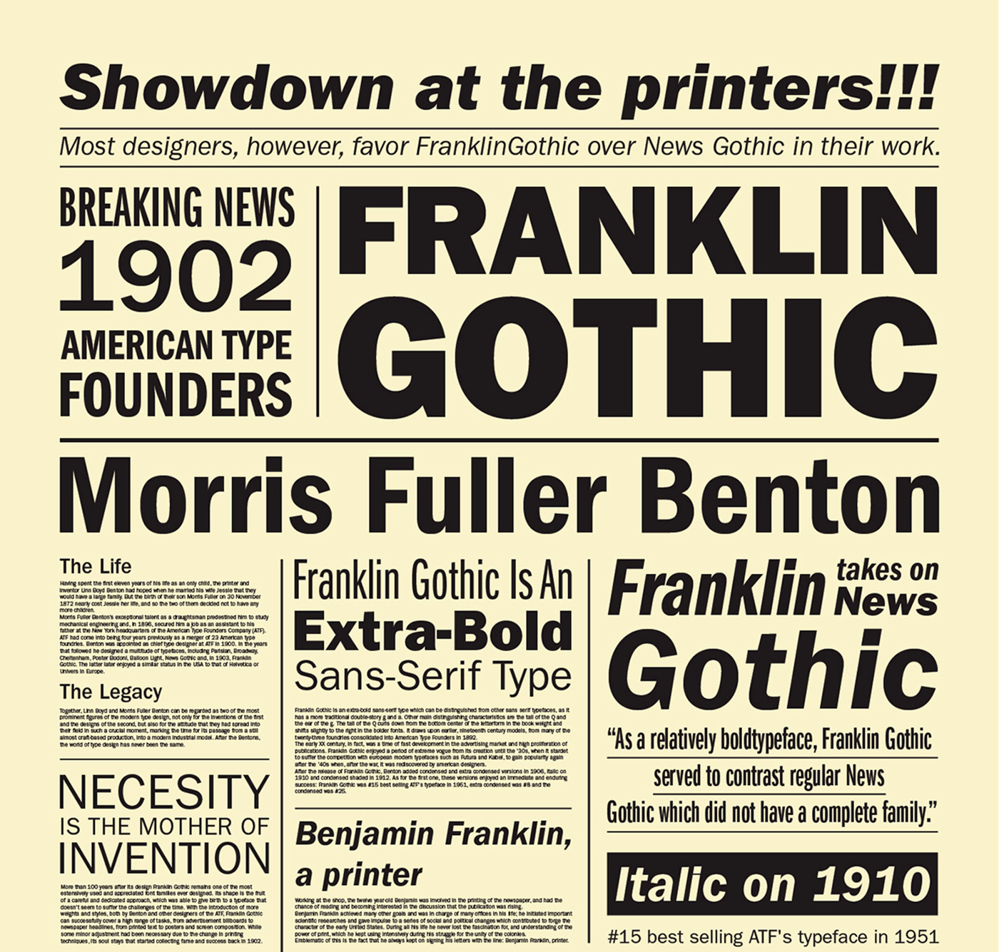
The Psychology of Trust: Why Newspaper Typography Matters for Branding
Every brand seeks to establish a unique identity that resonates with its target audience. In the news industry, the “product” is information, and the “brand promise” is truth. Typography serves as the primary vehicle for this promise. The specific serif fonts associated with newspapers were designed to be invisible yet authoritative, guiding the reader through thousands of words without causing eye fatigue while subtly signaling that the content is serious and vetted.
The Authority of the Serif
Traditional newspaper fonts are almost exclusively serifs—typefaces with small decorative strokes at the ends of the letters. From a brand strategy perspective, serifs are associated with heritage, tradition, and formality. This is why financial institutions, law firms, and prestige publications rarely deviate from serif-heavy identities. In the context of a newspaper, the serif font acts as a visual shorthand for “the record of history.”
Legibility as a Brand Utility
A brand’s identity is often tied to its utility. For a newspaper, the font must perform under extreme technical constraints: narrow columns, low-quality newsprint, and high-speed ink absorption. If the font is too delicate, the ink bleeds and obscures the text; if it is too bold, the page becomes a dark, unreadable mess. The “newspaper font” is therefore a masterpiece of functional branding, balancing thin and thick strokes to remain crisp even under poor printing conditions.
The Gold Standard: Times New Roman and the Birth of a Global Identity
When discussing newspaper fonts, the conversation inevitably begins with Times New Roman. This is perhaps the most successful exercise in corporate identity in history. In 1929, the typographer and scholar Stanley Morison criticized The Times of London for its poor printing quality and outdated typography. This critique led to a complete brand overhaul, resulting in the creation of a new typeface designed specifically for the publication.
The Strategic Redesign of The Times
Morison, working with Victor Lardent, sought to create a face that was more “masculine,” direct, and space-efficient. The Times needed to fit more words on a page without sacrificing readability. When Times New Roman debuted in 1932, it redefined the newspaper’s brand. It was sharp, professional, and modern for its time.
From Publication to Global Ubiquity
What makes Times New Roman a fascinating case study in branding is how it escaped the confines of its original brand. Because it was so well-engineered for clarity and efficiency, it was licensed to Monotype and Linotype and eventually became the default font for word processors globally. For decades, the “brand” of The Times was literally the default setting for human communication. This ubiquity reinforced the idea that serif fonts were the standard for professional and academic discourse.
The “Big Three” of Editorial Brand Design: Cheltenham, Ionic, and Poynter
While Times New Roman is the most famous, other legendary publications have cultivated their own unique typographic identities to differentiate themselves in a crowded marketplace.

The New York Times and Cheltenham
The New York Times is a prime example of using a specific font family to build a recognizable corporate identity. The paper uses a customized version of Cheltenham for its headlines. Developed in the early 20th century, Cheltenham’s long ascenders and compact width give the Times its distinctive, stately verticality. Even without the logo, a reader can recognize a page from The New York Times simply by the “flavor” of its headlines. This is the pinnacle of brand consistency.
The Ionic No. 5 Revolution
In the mid-1920s, the Linotype company introduced the “Legibility Group,” spearheaded by a font called Ionic No. 5. This was a response to the changing technology of printing. Ionic No. 5 was designed with a larger x-height (the height of lowercase letters) and more open counters (the holes in letters like ‘e’ and ‘o’). This font family became the standard for thousands of local newspapers across America, creating a “brand” of American journalism that was robust, accessible, and community-focused.
The Poynter Series: Modern Editorial Strategy
As newspapers faced declining shelf space and the need for more visual “pop,” many turned to the Poynter Oldstyle and Poynter Gothic families. Designed specifically for the Poynter Institute, these fonts represent a modern evolution of the newspaper aesthetic. They are designed to look traditional but are optimized for modern digital-to-print workflows. They allow brands to maintain a sense of history while performing with the crispness required by 21st-century aesthetics.
Digital Adaptation: Transitioning Newspaper Brands to the Screen
The digital revolution forced newspaper brands to reconsider their typographic identities. The transition from ink-on-paper to pixels-on-screen presented a significant branding challenge: how do you maintain the “newspaper” feel when the medium itself has changed?
The Rise of the Web Serif
Early digital displays had low resolution, making traditional newspaper serifs look jagged and unprofessional. As a result, many news brands initially pivoted to sans-serif fonts like Arial or Verdana for the web. However, as “Retina” and high-density displays became standard, news brands returned to their roots. Modern news sites now use high-performance web fonts like Georgia, Miller, and custom-designed typefaces that replicate the authoritative feel of print while ensuring digital legibility.
The Guardian and the Power of Custom Type
In 2005, and again in 2018, The Guardian underwent massive brand refreshes. Central to these was the creation of “Guardian Egyptian,” a slab-serif font that was both contemporary and rooted in the heritage of broadsheet design. By commissioning a custom font, The Guardian ensured that its brand identity was proprietary. No other organization could look exactly like them. This move showed that in the digital age, a “newspaper font” isn’t just about reading; it’s about owning a visual language that signifies a specific editorial perspective.
Applying Newspaper Typography Lessons to Modern Brand Strategy
Corporate brands outside of the media industry can learn a great deal from the way newspapers use typography. Whether you are building a personal brand, a tech startup, or a financial firm, the “newspaper” approach to type offers several strategic advantages.
1. Communicating Heritage and Stability
If a brand wants to signal that it is an established, trustworthy entity, it should look to the “Old Style” serifs common in newspapers. Using fonts like Caslon, Baskerville, or Garamond evokes a sense of longevity. In a world of “disruptive” startups using minimalist sans-serifs, a serif-heavy identity can actually be a powerful differentiator, signaling that your brand is the “adult in the room.”
2. Prioritizing the User Experience
Newspaper fonts are the ultimate user-centric designs. They are built for the reader, not the designer. Brands that prioritize clarity over “flashiness” in their typography often build higher levels of trust with their audience. When a customer can easily digest your information, they are more likely to engage with your brand.

3. The Power of “Visual Voice”
Just as The New York Times owns Cheltenham, a brand should strive to find or create a typeface that becomes synonymous with its message. A consistent typographic system across print, web, and social media creates a cohesive brand experience. When you choose a “newspaper-style” font, you aren’t just picking a way to show text; you are adopting a voice that says your brand is informative, reliable, and essential.
In conclusion, the “newspaper font” is not a singular entity but a sophisticated category of design focused on authority and efficiency. From the 1930s revolution of Times New Roman to the custom digital faces of today, typography remains the cornerstone of how information-heavy brands communicate their values. By understanding the history and technicality behind these fonts, modern brand strategists can better leverage the power of type to build lasting, credible identities.
aViewFromTheCave is a participant in the Amazon Services LLC Associates Program, an affiliate advertising program designed to provide a means for sites to earn advertising fees by advertising and linking to Amazon.com. Amazon, the Amazon logo, AmazonSupply, and the AmazonSupply logo are trademarks of Amazon.com, Inc. or its affiliates. As an Amazon Associate we earn affiliate commissions from qualifying purchases.