
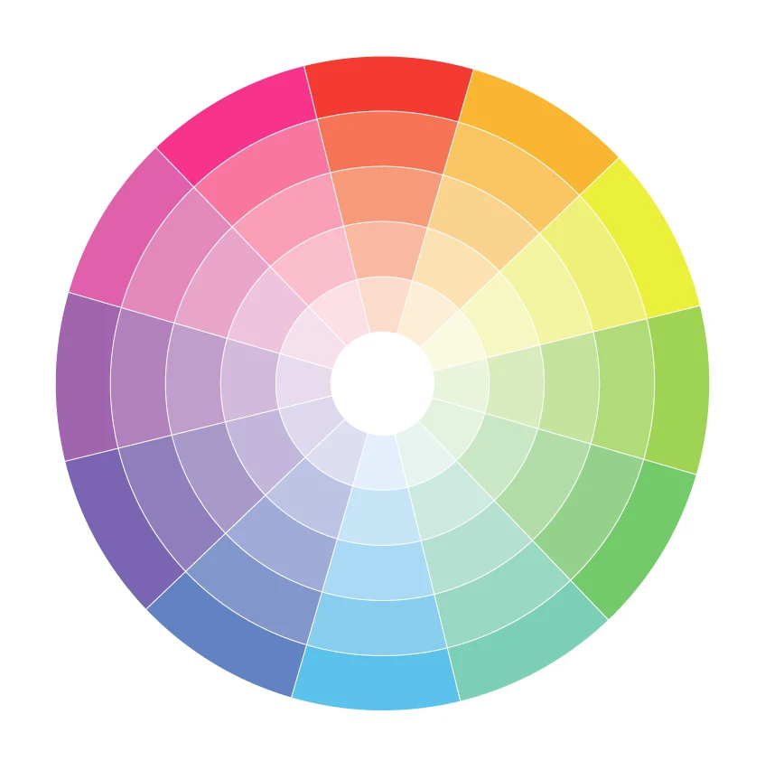
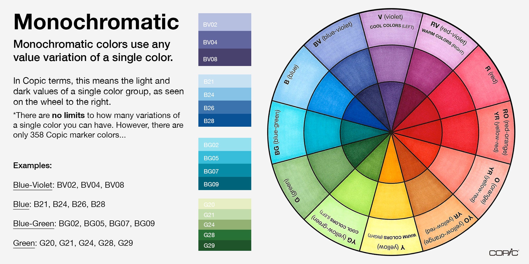
In the sophisticated world of brand strategy and corporate identity, the visual language a company chooses speaks volumes before a single word of copy is read. Among the various color theories available to designers and brand strategists, the monochromatic color scheme stands out as one of the most powerful, disciplined, and effective tools for creating a cohesive brand image. By definition, a monochromatic color scheme is derived from a single base hue and extended using its various shades, tones, and tints.
While it may sound simple—even restrictive—to the uninitiated, the monochromatic approach is a strategic masterclass in minimalism and focus. In an era of sensory overload and fragmented digital attention, a monochromatic identity offers a brand the opportunity to own a specific slice of the color spectrum, fostering instant recognition and emotional resonance.
The Strategic Foundations of Monochromatic Design
To understand the monochromatic color scheme within a branding context, one must first look beyond the primary color. A successful brand palette is not just a single flat color; it is a meticulously crafted range of variations that provide depth, hierarchy, and versatility.
Tints, Shades, and Tones: The Brand’s Visual Vocabulary
A monochromatic palette is built through three specific modifications of a base hue:
- Tints: These are created by adding white to the base color. In branding, tints are often used for backgrounds, secondary UI elements, or to create a sense of openness and airiness.
- Shades: These are created by adding black to the base color. Shades provide the necessary contrast for typography, deep accents, and professional grounding, allowing the brand to appear authoritative.
- Tones: These are created by adding gray to the base color. Tones are essential for a sophisticated brand identity, as they desaturate the hue, making it more subtle and versatile for various corporate applications.
By utilizing these variations, a brand can maintain a singular “color story” while ensuring that its marketing materials—from mobile apps to billboards—remain legible and dynamic.
The Psychology of Concentration
In brand strategy, color is the most immediate form of communication. When a brand adopts a monochromatic scheme, it amplifies the psychological associations of that specific hue. If a brand chooses blue, a monochromatic approach allows it to explore the entire spectrum of trust, security, and intelligence associated with blue without the “noise” of competing colors. This concentration of color psychology helps in cementing a specific brand personality in the mind of the consumer, making the brand synonymous with the emotional state that color evokes.
Advantages of a Monochromatic Approach in Brand Identity
Choosing a monochromatic color scheme is a deliberate strategic move that offers several high-level advantages for both emerging startups and established corporate giants.
Instant Brand Recognition and Recall
The primary goal of any corporate identity is to be memorable. By limiting the palette to a single hue, a brand reduces the cognitive load on the consumer. When a person sees a specific shade of orange or a particular tint of teal consistently across every touchpoint, the brain forms a stronger neural link between that color and the brand. Think of the most recognizable brands globally; many have built their legacy on “owning” a color. A monochromatic scheme takes this a step further by ensuring that even secondary elements reinforce that primary color association.
Simplifying Complex Information Architecture
For brands that deal with complex data, high-tech interfaces, or vast product catalogs, a monochromatic scheme provides much-needed visual clarity. Using variations of a single color allows a designer to establish a clear visual hierarchy without introducing the chaos of a multi-color palette.
For instance, in software design (SaaS), a monochromatic blue palette might use a deep shade for primary navigation, a medium tint for active buttons, and a very light tint for background containers. This creates an intuitive user experience where the user understands the “importance” of an element based on its saturation or brightness, rather than having to decode what a new color signifies.
Cost-Efficiency and Production Consistency
From a pragmatic business perspective, monochromatic branding is highly efficient. When it comes to physical production—such as packaging, business cards, or corporate signage—managing a single color is significantly easier than managing a complex four-color process. It ensures better consistency across different printing vendors and materials. For a brand, maintaining color consistency is vital for perceived quality; a monochromatic scheme minimizes the risk of “brand drift” where colors look different on different platforms.
Implementing Monochromatic Palettes Across Marketing Channels
A monochromatic scheme is not a “set it and forget it” solution. Its success depends on the strategic application of contrast and the intelligent use of negative space.
Creating Contrast Without Complementary Colors
The biggest challenge in monochromatic design is ensuring that elements don’t “bleed” into one another. To solve this, brand strategists rely heavily on value contrast—the difference between light and dark.
- High-Value Contrast: Using a very light tint against a very dark shade of the same hue creates a striking, high-impact look that is excellent for headlines and call-to-action buttons.
- Low-Value Contrast: Using similar tones creates a subtle, sophisticated, and premium feel, often used in luxury branding to evoke a sense of calm and exclusivity.
The Role of Neutrals as Anchors
While the scheme is monochromatic, professional brand identities rarely exist in a vacuum. They are almost always supported by “functional neutrals”—blacks, whites, and grays. In a monochromatic strategy, these neutrals serve as the canvas. White space (or negative space) is particularly crucial; it allows the chosen hue to “breathe” and prevents the visual identity from feeling overwhelming or “heavy.”
Digital Accessibility and the Monochromatic Scheme
In the modern digital landscape, accessibility (A11y) is a non-negotiable component of brand strategy. A monochromatic scheme must be tested for color contrast ratios to ensure that users with visual impairments can still navigate the brand’s digital assets. This is where the use of “shades” becomes a strategic necessity rather than an aesthetic choice. Deep shades must be used for text against light backgrounds to meet WCAG (Web Content Accessibility Guidelines) standards, ensuring the brand is inclusive and professional.
Case Studies: The Power of Single-Hue Authority
Several world-class brands have utilized the monochromatic color scheme to dominate their respective markets, proving that a lack of variety in hue does not mean a lack of impact.
Professionalism and Tech: The Case of LinkedIn
LinkedIn utilizes a monochromatic blue palette that perfectly aligns with its brand promise of professional networking and corporate growth. By using various shades and tints of blue, they create a platform that feels stable, trustworthy, and focused. The absence of distracting colors allows the content—the user’s professional achievements—to take center stage, while the blue framework reinforces the site’s identity as a serious business tool.
Luxury and Exclusivity: The Tiffany Blue
Perhaps the most famous example of monochromatic branding is Tiffany & Co. While they use white as a secondary accent, their entire brand identity is built around a single, specific tint of robin-egg blue. By applying this color to everything from jewelry boxes to marketing collateral, they have created a situation where the color itself acts as a luxury logo. A monochromatic approach here conveys a sense of timelessness and curated elegance that a multi-color palette could never achieve.
Impact and Energy: Financial Disruptors
Many modern FinTech companies are moving toward monochromatic schemes to stand out in a sea of traditional bank “navy blues.” By picking a high-energy color like a vibrant purple or a neon green and using a monochromatic scale, these brands signal that they are modern, tech-forward, and different from the legacy institutions. The single-color focus makes their apps look cleaner and more “app-like” compared to the cluttered interfaces of traditional banking.
The Future of Monochromatic Branding in a Minimalist World
As we move further into a “mobile-first” and “minimalist” design era, the monochromatic color scheme is becoming more relevant than ever. The constraints of small screens and the need for rapid brand recognition favor designs that are bold, simple, and cohesive.
Adaptability in Dark Mode
With the rise of “Dark Mode” across operating systems, monochromatic palettes offer seamless adaptability. A brand that understands its monochromatic tints and shades can easily invert its palette for dark environments without losing its core identity. This flexibility is a key requirement for modern brand guidelines.

Conclusion: The Strategic Choice for Clarity
The monochromatic color scheme is far more than a stylistic preference; it is a strategic tool for brands that value clarity, authority, and emotional resonance. By mastering the nuances of a single hue, a brand can cut through the noise of a crowded marketplace, ensuring that its identity is not just seen, but remembered. In the realm of brand strategy, sometimes the most powerful way to stand out is to focus on doing one thing—or one color—exceptionally well.
aViewFromTheCave is a participant in the Amazon Services LLC Associates Program, an affiliate advertising program designed to provide a means for sites to earn advertising fees by advertising and linking to Amazon.com. Amazon, the Amazon logo, AmazonSupply, and the AmazonSupply logo are trademarks of Amazon.com, Inc. or its affiliates. As an Amazon Associate we earn affiliate commissions from qualifying purchases.