In the competitive landscape of modern commerce, a brand’s visual identity is often the first point of contact with a potential consumer. Among the various elements of design, color is arguably the most influential silent communicator. It bypasses logic and speaks directly to the subconscious, triggering emotional responses before a single word of copy is read. When we ask, “What is the meaning of the colour green?” within the context of brand strategy, we are not merely discussing aesthetics; we are exploring a multi-faceted tool used to signal growth, ethics, stability, and innovation.

Green is a unique protagonist in the world of branding. Positioned at the center of the visible spectrum, it is the color of balance. Unlike the urgency of red or the cool detachment of blue, green invites the viewer to breathe, trust, and participate. For brand strategists, understanding the nuances of green is essential for crafting a narrative that resonates with today’s values-driven market.
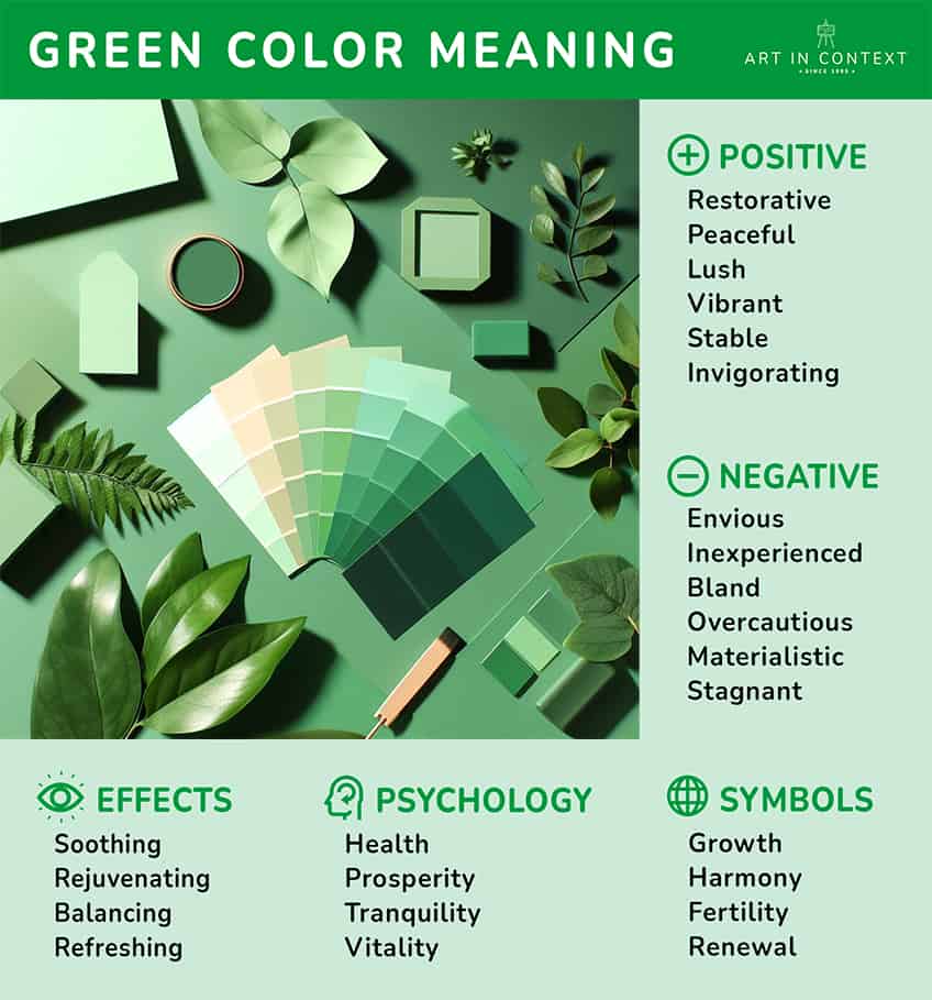
The Psychology of Green: Beyond Nature and Environment
At its most fundamental level, green is the color of life. In nature, it signifies the presence of water and the promise of sustenance. This evolutionary link makes green a “safe” color for the human psyche. In branding, this translates into several core psychological pillars.
Growth, Vitality, and Renewal
In the business world, green is synonymous with “Go.” It represents progress and the upward trajectory of a startup or a maturing enterprise. Brands that want to position themselves as catalysts for personal or professional growth often lean into green. It suggests that by engaging with the brand, the consumer is entering a phase of flourishing. This is why many educational platforms and productivity tools utilize green accents; they want to evoke the feeling of a “fresh start” or a “new season” of achievement.
Balance, Harmony, and Trust
Green is the Great Moderator. It sits between the warmth of yellow and the coolness of blue, making it the most restful color for the human eye. In brand strategy, this balance is used to project stability. While blue is often used by banks to denote security, green is used to denote “health”—both physical and fiscal. It suggests a brand that is grounded and reliable. When a company uses a balanced green, they are telling their audience, “We are in harmony with your needs.”
Green in Brand Strategy: Different Shades, Different Messages
One of the most common mistakes in corporate identity design is treating “green” as a monolithic concept. In reality, the specific hue, saturation, and brightness of the green selected can radically alter the brand’s perceived personality.
Deep Forest Greens: Luxury and Tradition
Darker shades of green, such as emerald or forest green, carry connotations of wealth, prestige, and tradition. This is the “old money” side of the color. In the luxury sector, deep green communicates a sense of permanence and high status. It is the color of the leather chairs in an Ivy League library or the felt on a high-stakes gaming table. Brands that utilize these tones—such as Rolex or Land Rover—are not looking to appear “trendy”; they are looking to appear timeless.
Bright and Lime Greens: Innovation and Energy
On the opposite end of the spectrum, neon, lime, and bright “cyber” greens are synonymous with the tech sector and high-energy disruptors. These shades represent “the new.” They are vibrant, slightly jarring, and impossible to ignore. A brand like Spotify or NVIDIA uses these high-visibility greens to signal that they are at the cutting edge of digital culture. These shades represent energy, modernism, and a break from the traditional “boring” corporate colors.
Soft Mint and Sage Greens: Wellness and Modernity
In the “Direct-to-Consumer” (DTC) era, soft greens like mint, sage, and pistachio have become staples of the wellness and skincare industries. These colors communicate a sense of calm, cleanliness, and gentle efficacy. They are far less aggressive than primary greens and appeal to a demographic that values self-care, mindfulness, and “clean” living. For a modern brand, these shades help lower the consumer’s guard, creating a “boutique” feel that feels personal rather than corporate.
The “Eco-Friendly” Association: Greenwashing vs. Authentic Identity
In the 21st century, the most dominant association with green is environmentalism. This has created both an opportunity and a significant challenge for brand managers.

The Rise of Sustainability Branding
As consumers become increasingly conscious of climate change and corporate responsibility, green has become the shorthand for “sustainable.” From recycled packaging to carbon-neutral shipping logos, green is the visual proof of an ethical stance. When used authentically, green helps a brand align with the values of the “conscious consumer.” It signals that the company is mindful of its footprint and is invested in the future of the planet.
Navigating the Pitfalls of Visual Cues and “Greenwashing”
However, the ubiquity of green in environmental marketing has led to the phenomenon of “greenwashing.” This occurs when a brand uses green imagery or logos to imply eco-friendliness without making substantive changes to its business practices. From a brand strategy perspective, this is a high-risk move. Today’s consumers are more informed than ever; if a brand uses “earth-friendly” green aesthetics but is found to be unethical, the backlash can be catastrophic to the brand’s equity. Authenticity must precede the color choice.
Sector-Specific Applications of Green
Different industries leverage the meaning of green to achieve specific marketing objectives. By analyzing these sectors, we can see how the color is adapted to fit diverse business models.
Finance and Stability
In the United States, green is inextricably linked to the “almighty dollar.” Consequently, many financial institutions, tax services, and investment apps use green to represent wealth creation. However, the goal here isn’t just to show “money”; it’s to show “growth.” A financial brand using green is telling the customer, “We will help your savings grow like a garden.” It shifts the focus from the cold reality of numbers to the organic potential of prosperity.
Food, Beverage, and Health
In the grocery aisle, green is a powerful “health halo.” It signals that a product is organic, fresh, or vegetarian. Even brands that aren’t inherently healthy—such as soda companies—have been known to launch green-packaged variants (like Coca-Cola Life) to appeal to health-conscious demographics. In the food sector, green functions as a “permission” color, making the consumer feel better about their purchase.
Technology and Software
In tech, green often represents the “human” side of the machine. While blue is the standard for hardware and enterprise software (representing logic and reliability), green is often used for apps that involve communication, creativity, or “open” systems. For example, the Android robot is a specific shade of “limon” green, designed to feel approachable, customizable, and full of life compared to the more sterile aesthetics of competitors.
Case Studies: Brands That Own the Green Identity
To truly understand the meaning of green, we must look at the market leaders who have successfully claimed a “slice” of the color for their corporate identity.
Starbucks: Global Community and Comfort
Originally, the Starbucks logo was brown. The shift to green was a strategic masterstroke. The specific “Starbucks Green” was chosen to represent a “third place”—a sanctuary between work and home. It promotes a sense of calm and community. By saturating their stores and cups in this shade, Starbucks moved from being a simple coffee seller to a lifestyle brand centered on relaxation and social harmony.
Rolex: Prestige and Success
Rolex uses a very specific, deep hunter green. In their branding, this color represents more than just nature; it represents the “winner’s circle.” It is associated with the green jackets of the Masters Tournament and the lush grass of Wimbledon. For Rolex, green is the color of ultimate achievement. It is a heavy, substantial green that feels expensive.
WhatsApp: Instant Connection and Vitality
WhatsApp’s vibrant green icon is one of the most recognized symbols on any smartphone. In this context, green represents “active” communication. It feels faster and more urgent than the blue of Facebook or the teal of other messaging apps. It conveys that the platform is “live,” secure, and ready for an instant, organic conversation.
Conclusion: Integrating Green into Your Brand Strategy
Choosing green for a brand identity is a decision that carries significant weight. It is a color that can make a brand feel either traditional and wealthy or modern and disruptive. It can signal a commitment to the earth or a commitment to the wallet.
For brand strategists, the meaning of the color green is found in the intersection of its biological roots and its cultural applications. When selecting a green palette, one must ask: Is our goal to soothe or to energize? Are we leaning into the tradition of the past or the innovation of the future? Done correctly, the use of green creates a psychological bridge between a company’s mission and a consumer’s aspirations, fostering a relationship built on growth, trust, and vitality. In the end, green isn’t just a color; it’s a strategic asset that, when deployed with precision, can define the very soul of a brand.
aViewFromTheCave is a participant in the Amazon Services LLC Associates Program, an affiliate advertising program designed to provide a means for sites to earn advertising fees by advertising and linking to Amazon.com. Amazon, the Amazon logo, AmazonSupply, and the AmazonSupply logo are trademarks of Amazon.com, Inc. or its affiliates. As an Amazon Associate we earn affiliate commissions from qualifying purchases.