
In the competitive landscape of global commerce, a brand’s visual identity often speaks louder than its mission statement. Among the vast spectrum of colors available to designers and strategists, one hue stands as the undisputed titan of corporate identity: blue. From the deep navy of prestigious financial institutions to the vibrant cyan of Silicon Valley’s most disruptive startups, blue is more than just a primary color; it is a psychological tool used to communicate trust, stability, and intelligence.
Understanding the meaning of blue within the context of branding requires a deep dive into color psychology, cultural history, and market positioning. For a brand, choosing blue is rarely an aesthetic accident. It is a calculated move designed to evoke specific emotional responses and establish a particular relationship with the consumer.
The Psychology of Blue: Why Brands Bet on Reliability
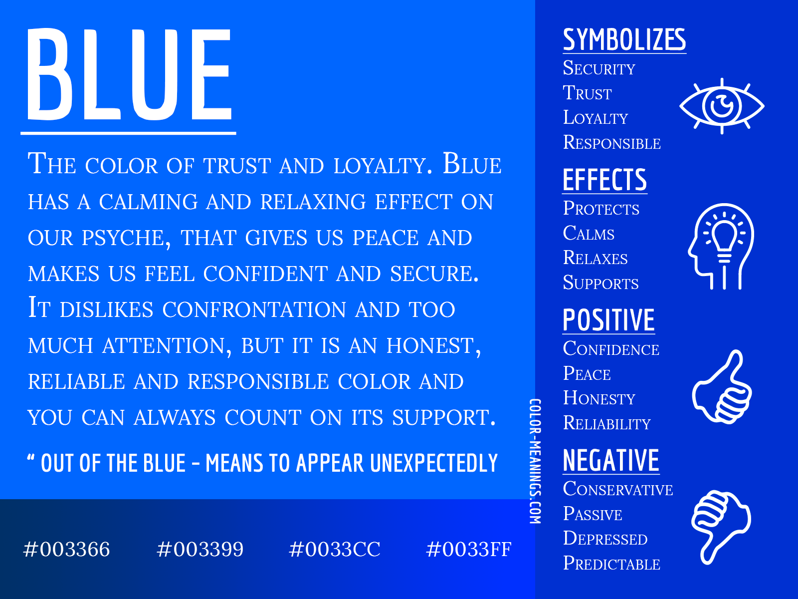
Color psychology suggests that humans have innate and learned emotional responses to different wavelengths of light. Blue is almost universally associated with the sky and the ocean—two of nature’s most constant and expansive elements. In the world of brand strategy, these associations translate into feelings of reliability, vastness, and permanence.
Trust and Stability
The primary reason brands gravitate toward blue is its ability to project trustworthiness. In an era where data breaches and corporate instability are frequent headlines, establishing a “safe” image is paramount. Blue has a physiological effect on the human body; it is known to lower pulse rates and body temperature, creating a sense of calm. For brands in high-stakes industries like healthcare, insurance, or banking, this calming effect is essential. When a consumer sees a blue logo, the subconscious message is: “Your assets are safe here. We are stable, and we are not going anywhere.”
Professionalism and Authority
Beyond trust, blue is the color of authority and professionalism. This stems historically from its use in uniforms—think of “police officer blue” or the classic navy business suit. Brands that want to position themselves as experts or industry leaders utilize deeper shades of blue to command respect. It conveys a sense of traditionalism and high standards without the aggressive or high-alert energy of red or orange. It is the color of the “expert” who remains cool under pressure.
Cultural Nuances and Contextual Meanings
While blue is often cited as the world’s favorite color, its meaning is not a monolith. A sophisticated brand strategy must account for how different cultures interpret the hue, especially when a company is planning a global expansion.
Western vs. Eastern Perspectives
In Western cultures, blue is predominantly associated with security, authority, and “the blues” (sadness or melancholy). However, in many Eastern cultures, the associations can shift significantly. In Hinduism, blue is the color of Krishna, representing love and divine joy. In China, blue is traditionally associated with healing, relaxation, and immortality. For a brand, this means that a blue identity might resonate as “modern and secure” in New York while feeling “spiritual and restorative” in Mumbai.
The Gender Neutrality Factor
Historically, marketing in the mid-20th century attempted to gender colors—blue for boys, pink for girls. However, modern brand strategy has largely moved past these archetypes, recognizing blue as one of the most gender-neutral colors available. This neutrality makes it an incredibly versatile choice for brands aiming for a broad, inclusive market. Tech giants like Intel or social platforms like LinkedIn use blue precisely because it does not alienate any specific demographic, allowing for a “universal” appeal that transcends age and gender.
Strategic Implementation: From Tech Giants to Financial Institutions

The “meaning” of blue changes based on the industry in which it is applied. Brand managers must decide how to leverage the color’s inherent traits to solve specific market challenges.
Case Study: The Social Media “Blue”
If you look at the icons on a standard smartphone, a pattern emerges: Facebook, Twitter (in its original form), LinkedIn, and Messenger are all blue. Why? In the social media sphere, blue serves a dual purpose. First, it fosters a sense of community and “town square” safety. Users are more likely to share personal information in an environment that feels secure. Second, because blue is perceived as less intrusive than warmer colors, it encourages longer dwell times. A bright red social media interface would likely cause “eye fatigue” and agitation, leading users to close the app sooner.
Banking on Security: The Finance Sector
The finance industry is perhaps the most prolific user of blue. Chase, American Express, Visa, and Goldman Sachs all utilize blue as a core component of their visual identity. In this sector, the meaning of blue is “fiscal responsibility.” Financial institutions use deep, saturated blues to distance themselves from the “get rich quick” energy of brighter colors. The goal is to project longevity. A blue logo tells the customer that the institution has survived market crashes and will survive many more, providing a bedrock of security for the client’s future.
Choosing the Right Shade: A Spectrum of Brand Messaging
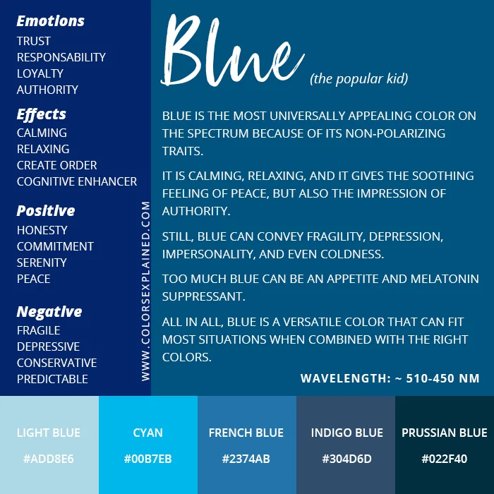
Not all blues are created equal. The specific hex code a brand chooses can fundamentally alter the brand’s personality and the audience it attracts.
Navy and Deep Blues: The Traditionalist
Darker shades, such as navy or midnight blue, are the hallmarks of the traditionalist. These shades are common in the legal, financial, and corporate consulting worlds. They suggest a brand that is established, conservative (in the sense of risk-aversion), and highly disciplined. A navy blue logo says, “We have a legacy of excellence.” It is a color that doesn’t need to shout to be heard.
Sky and Bright Blues: The Innovator
Light blue, cerulean, and bright cyan communicate a very different message. These shades are associated with the sky, openness, and forward-thinking. This is the domain of software startups and creative agencies. Lighter blues feel “airy” and modern. They suggest that the brand is approachable, transparent, and focused on the future rather than the past. While navy blue looks back at a legacy, sky blue looks forward toward innovation.
The Luxury of “Tiffany Blue”
One of the most famous examples of color branding is Tiffany & Co.’s “Robin’s Egg Blue.” This specific shade has become so synonymous with the brand that it is a trademarked color (Pantone 1837). In this context, blue doesn’t just mean trust; it means exclusivity, luxury, and high-end retail. By consistently using a very specific, unconventional shade, Tiffany transformed a common color into a proprietary asset that triggers an immediate emotional response associated with celebration and status.
The Future of Blue in Digital and Physical Branding
As we move further into a digital-first economy, the meaning of blue continues to evolve, particularly concerning user experience (UX) and digital accessibility.
Digital Accessibility and Dark Mode
In digital design, blue plays a critical role in accessibility. Because it is a color that most people—including many with color vision deficiencies—can distinguish, it is often used for hyperlinks and primary action buttons. However, the rise of “Dark Mode” has forced brands to rethink their shades of blue. A deep navy that looks professional on a white letterhead may disappear on a black smartphone screen. Brands are now forced to develop “responsive palettes” where their signature blue can shift in luminosity to remain legible across different digital environments.
The Sustainability Movement
Interestingly, blue is beginning to challenge green as the color of sustainability. As global attention shifts toward ocean conservation and “Blue Carbon” initiatives, brands focused on water purity, marine logistics, and sustainable shipping are reclaiming the color. For these brands, the meaning of blue is environmental stewardship. It represents the protection of our most vital natural resource—water—signaling a commitment to the planet that goes beyond traditional “green-washing.”
In conclusion, the meaning of blue in the world of branding is a sophisticated blend of primal psychology and strategic positioning. It is the color of the “safe bet” and the “expert.” Whether a brand is looking to project the ironclad security of a global bank or the limitless innovation of a tech startup, blue remains the most versatile tool in the brand strategist’s arsenal. By selecting the right shade and understanding the cultural and psychological underpinnings of the hue, a brand can communicate its values instantly, silently, and globally. Blue is not just a color; it is a promise of consistency in an ever-changing market.
aViewFromTheCave is a participant in the Amazon Services LLC Associates Program, an affiliate advertising program designed to provide a means for sites to earn advertising fees by advertising and linking to Amazon.com. Amazon, the Amazon logo, AmazonSupply, and the AmazonSupply logo are trademarks of Amazon.com, Inc. or its affiliates. As an Amazon Associate we earn affiliate commissions from qualifying purchases.