
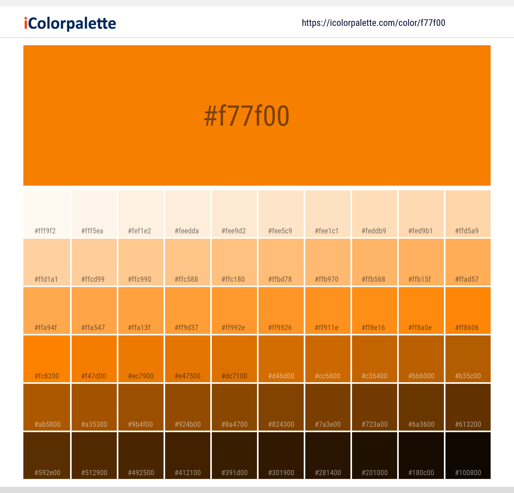
The specific hexadecimal value that defines the iconic UTK Orange is #FF8200. This precise code is more than just a sequence of alphanumeric characters; it represents the digital cornerstone of a powerful brand identity, embodying decades of tradition, spirit, and recognition for the University of Tennessee, Knoxville. Understanding the significance of this hex value delves deep into the strategic importance of brand colors, consistency, and their pervasive impact across all aspects of corporate identity and marketing.
The Strategic Significance of Brand Color: Beyond Mere Aesthetics
In the intricate world of branding, color transcends simple aesthetics to become a potent, non-verbal communicator of identity, values, and emotion. A brand’s chosen hue is often the first point of recognition, a silent ambassador that imprints itself on the collective consciousness. For institutions like the University of Tennessee, Knoxville, a specific color becomes an invaluable asset, deeply intertwined with its legacy and future.

Defining Corporate Identity Through Color
A distinctive brand color serves as the visual anchor for an organization’s corporate identity. It’s the hue that consumers, stakeholders, and communities immediately associate with a particular entity, often before any logo or tagline is processed. This immediate recognition fosters a sense of familiarity, trust, and belonging. For the University of Tennessee, Knoxville, the vibrant UTK Orange isn’t merely a color; it’s a living symbol of its athletic prowess, academic excellence, and the vibrant community it cultivates. It evokes passion, energy, and a deep sense of pride among students, alumni, and fans. When one sees that specific shade of orange, there’s an instant mental connection to the Volunteers, Neyland Stadium, and the rich history of the university. This emotional resonance is a testament to the power of a well-chosen and consistently applied brand color. It differentiates the institution in a crowded educational landscape, making it instantly identifiable and memorable.
The Precision of Digital Color: Why Hex Values Matter
While the emotional impact of a brand color is profound, its practical application, especially in the digital age, relies on absolute precision. This is where hexadecimal values, or hex codes, become indispensable. A hex code is a six-digit, three-byte hexadecimal number used in computing applications, primarily in HTML, CSS, and other web design contexts, to represent colors. Each pair of digits corresponds to the intensity of red, green, and blue (RGB) in the color spectrum, ranging from 00 (no intensity) to FF (full intensity). For UTK Orange, the hex value #FF8200 precisely defines its digital representation.
The importance of this precision cannot be overstated. In an era where a brand’s presence is predominantly digital – spanning websites, social media, mobile apps, and online advertising – maintaining absolute color fidelity is crucial. Without a specific hex code, a brand’s color could appear differently across various screens and platforms due to variations in color rendering engines or display settings. This inconsistency can dilute brand recognition, erode trust, and create a disjointed user experience. By defining UTK Orange as #FF8200, the University ensures that whether viewed on a smartphone, a desktop monitor, or a digital billboard, the color remains unmistakably and consistently “UTK Orange.” This digital standardization is a critical component of a robust brand strategy, guaranteeing that the visual integrity of the brand is upheld across every single digital touchpoint.
UTK Orange: A Case Study in Brand Consistency
The longevity and widespread recognition of UTK Orange provide a compelling case study in the power of brand consistency. Far from being a fleeting trend, this particular shade has been meticulously maintained and propagated across generations, solidifying its place as an integral part of the university’s identity.
A Legacy in Color
The history of UTK Orange is steeped in tradition, tracing its origins back to the late 19th century when students adopted the daisy as the university’s official flower, and its orange petals inspired the selection of orange and white as the official school colors. Over more than a century, this color has transcended its floral beginnings to become a powerful emblem. It adorns everything from athletic uniforms and merchandise to academic regalia, campus signage, and all official digital assets. This pervasive presence is not accidental; it is the result of deliberate and consistent application, ensuring that every interaction with the university, whether physical or digital, reinforces the iconic color. This historical embedding illustrates how a specific hue can evolve into a cultural touchstone, recognized and revered by countless individuals connected to the institution.
Maintaining Visual Integrity Across Channels
One of the greatest challenges in brand management is ensuring visual integrity across diverse media. Print materials, such as brochures, stationery, and posters, rely on color models like CMYK (Cyan, Magenta, Yellow, Key/Black) or Pantone Matching System (PMS) Spot Colors. Digital media, as discussed, primarily uses RGB and hex codes. The slight variations inherent in these different color reproduction methods can pose a significant threat to brand consistency if not meticulously managed.
This is precisely why comprehensive brand guidelines are indispensable. For UTK Orange, these guidelines would specify not only the hex value (#FF8200) for digital use but also its corresponding RGB values (255, 130, 0), CMYK breakdown, and a precise Pantone match. By providing these multiple specifications, the University ensures that regardless of the medium – from a glossy magazine advertisement to a website banner or a branded social media post – the orange displayed is always the correct, instantly recognizable UTK Orange. This meticulous attention to detail prevents color drift, which can subtly undermine brand recognition and perceived professionalism over time. Adherence to these guidelines by designers, marketers, and vendors alike reinforces a unified and professional brand image, projecting reliability and unwavering identity to all audiences.
The Psychology and Impact of Brand Orange
Colors possess an inherent psychological power, capable of evoking specific emotions, associations, and even behaviors. The choice of orange for the University of Tennessee, Knoxville, is not arbitrary; it aligns with widely recognized psychological attributes that resonate deeply with the institution’s values and desired perceptions.

Orange in Branding: Energy, Enthusiasm, and Innovation
Psychologically, the color orange is frequently associated with energy, enthusiasm, creativity, warmth, and friendliness. It’s a vibrant hue that often signifies optimism, excitement, and a zest for life. In a branding context, these associations are invaluable. For a university, aligning with these attributes projects an image of a dynamic learning environment, a welcoming community, and a forward-thinking institution. UTK Orange, with its bright and assertive tone, effectively communicates the spirited nature of the university’s athletic programs, the innovative drive of its research, and the passionate engagement of its student body. It’s a color that stimulates, motivates, and captures attention, reflecting the energetic pursuit of knowledge and excellence that defines the University of Tennessee.
Differentiating in a Crowded Landscape
In today’s highly competitive educational landscape, differentiation is paramount. A distinctive brand color like UTK Orange serves as a powerful tool for standing out from the multitude of institutions vying for attention. While many universities may utilize variations of blue, red, or green, the bold and unique shade of orange provides an immediate visual distinction. This strong differentiation contributes significantly to brand recall; people don’t just remember “a university with orange,” they remember the University of Tennessee’s orange.
Beyond mere recognition, this strong visual identity plays a crucial role in fostering a sense of belonging and loyalty. For students, alumni, and fans, “wearing orange” becomes an act of solidarity and pride. It strengthens their connection to the university community, creating a shared identity that transcends individual experiences. This emotional connection, facilitated by the consistent presence of UTK Orange, is a significant factor in building a robust and engaged alumni network, attracting prospective students, and galvanizing support for the university’s various endeavors. The color becomes a symbol of shared experience, collective achievement, and enduring allegiance.
Implementing Brand Colors in Digital Strategy
The digital realm is where a brand’s hex value truly comes to life, informing every visual element and contributing to a cohesive online presence. Strategic implementation of #FF8200 is crucial for the University of Tennessee’s digital footprint.
Web Design and User Experience
In web design, the hex value #FF8200 would be meticulously integrated into the university’s CSS (Cascading Style Sheets) to define colors for crucial elements. This includes headers, navigation menus, hyperlinks, call-to-action buttons, and accent graphics. Consistent use of UTK Orange across these elements ensures a unified visual experience, reinforcing the brand at every click and scroll. This consistency is not just about aesthetics; it significantly impacts user experience. A well-designed website with a consistent color palette feels professional, trustworthy, and easy to navigate.
Furthermore, adherence to accessibility standards is vital. While UTK Orange is vibrant, designers must ensure that its application, especially in text or interactive elements, meets contrast ratio guidelines to be legible for users with visual impairments. Tools can assess the contrast between #FF8200 and background colors to ensure compliance, demonstrating a commitment to inclusive design alongside brand fidelity.
Social Media and Digital Marketing Assets
Social media platforms and digital marketing campaigns offer vast opportunities for brand exposure, but they also demand strict adherence to visual guidelines. Profile pictures, cover photos, digital advertisements, and content graphics all represent opportunities to deploy UTK Orange. Using #FF8200 consistently across these diverse assets creates an instant connection with the university. A unified color palette makes campaigns instantly recognizable in a crowded social feed, enhancing brand recall and making marketing efforts more effective.
Digital marketing tools and ad platforms often require precise color inputs, making the hex value an essential piece of information for marketing teams. Whether creating a new banner ad or designing an Instagram story, the exact hex code ensures that the brand’s visual identity remains cohesive, professional, and impactful, regardless of the platform or audience.
Beyond the Hex: The Full Spectrum of Brand Identity Management
While #FF8200 is a critical component, it is part of a larger, holistic approach to brand identity management. The hex value acts as a precise directive, but its effectiveness is amplified when integrated into comprehensive guidelines and a strategic vision.
Comprehensive Brand Guidelines
A university’s brand style guide is the authoritative document that details every aspect of its visual and verbal identity. For the University of Tennessee, Knoxville, this guide would not only enumerate #FF8200 for digital orange but also specify its corresponding RGB, CMYK, and Pantone values, ensuring consistency across all media. Beyond color, it would dictate logo usage (clearance, minimum size, approved variations), typography (primary and secondary fonts, usage rules), imagery styles, and tone of voice. This comprehensive documentation is distributed to all internal departments, external agencies, vendors, and partners, serving as a non-negotiable standard. It eliminates ambiguity, prevents misinterpretation, and ensures that every communication piece, regardless of its creator, aligns perfectly with the university’s core brand identity.
The Return on Investment of Brand Consistency
Investing in rigorous brand identity management, including the precise application of elements like the UTK Orange hex value, yields significant returns. Strong brand consistency builds trust and credibility, as a unified and professional image suggests reliability and competence. This consistency leads to increased brand recognition, making the university more memorable and distinguishable in the minds of prospective students, faculty, donors, and the broader community. Ultimately, a strong, consistently presented brand fosters deeper emotional connections, driving enrollment, facilitating fundraising, attracting talent, and cultivating enduring loyalty among its vast network of stakeholders. The #FF8200 hex value, therefore, is not merely a technical specification; it is a foundational element in building and sustaining a powerful, resonant, and successful brand.
aViewFromTheCave is a participant in the Amazon Services LLC Associates Program, an affiliate advertising program designed to provide a means for sites to earn advertising fees by advertising and linking to Amazon.com. Amazon, the Amazon logo, AmazonSupply, and the AmazonSupply logo are trademarks of Amazon.com, Inc. or its affiliates. As an Amazon Associate we earn affiliate commissions from qualifying purchases.