For the millions of users who interact with an iPhone daily, the clarity and legibility of text are often taken for granted. Whether you are reading a long-form article, scrolling through social media, or navigating system settings, the way text appears on your screen is the result of decades of meticulous engineering and design philosophy. One of the most common questions from new users or those troubleshooting display issues is: What is the default text size on iPhone?
By default, the iPhone ships with its text size set to the middle notch (the fourth position from the left) on the standard Dynamic Type scale. While this might seem like a simple UI choice, it represents the cornerstone of Apple’s “San Francisco” typeface strategy, designed to balance information density with high-level readability.
In this comprehensive guide, we will explore the technical nuances of the iPhone’s default text settings, how the Dynamic Type engine functions, and how you can optimize your device’s display for your specific visual needs.
Understanding the iPhone’s Default Typography Standards
Apple’s approach to typography is rooted in the concept of “legibility first.” Unlike earlier iterations of mobile operating systems that used generic fonts, modern iOS is built around a proprietary system that adapts to the hardware it lives on.
The San Francisco Typeface: Apple’s Secret Weapon
Since the release of iOS 9, the default font for all iPhones has been “San Francisco.” This sans-serif typeface was developed specifically for digital screens. Before San Francisco, Apple used Helvetica Neue, which, while beautiful, was often criticized for being difficult to read at smaller sizes due to its tight letter spacing.
San Francisco is a “variable font.” This means the system can automatically adjust the tracking (spacing between letters) and the weight of the font based on the point size. At the default text size, the system ensures that characters like ‘e’, ‘a’, and ‘s’ have open apertures to prevent them from looking like blobs on a high-resolution Retina display.
Identifying the “Default” Setting in iOS
If you navigate to your iPhone’s settings, you won’t see a specific pixel count or point size labeled as “Default.” Instead, Apple uses a slider. On the standard “Text Size” slider, there are seven notches. The fourth notch is the factory default.
Technically, for developers building apps, this default is often referred to as the “Body” style, which typically renders at 17 points (pt) on most modern iPhones. This size is considered the “sweet spot” for the average human eye at a viewing distance of 10 to 12 inches.
Why 100% Scale Matters for User Experience
The default text size is not an arbitrary choice. It is the baseline from which all other UI elements are scaled. When an iPhone is set to its default size, the relationship between icons, buttons, and text is perfectly balanced according to Apple’s Human Interface Guidelines (HIG). If you move away from this default, some third-party apps may experience “layout breaking,” where text overflows out of its designated container or buttons become too small to tap accurately.
How to Manage and Adjust Text Size Settings
While the default setting is optimized for the general population, individual vision needs vary. Apple provides a robust suite of tools within iOS to customize how text is rendered without sacrificing the overall aesthetic of the software.
Step-by-Step: Changing Text Size via Settings
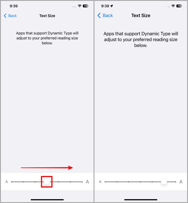
If you find the default size too small or perhaps too large for your taste, you can adjust it globally.
- Open the Settings app.
- Scroll down and tap on Display & Brightness.
- Select Text Size.
- Use the slider at the bottom to find your preferred level.
Moving the slider to the left decreases the size, allowing more content to fit on the screen. Moving it to the right increases the size, making it easier to read for those with minor visual impairments.
Utilizing the Control Center for On-the-Fly Adjustments
One of the most powerful “pro” features in iOS is the ability to change text size on a per-app basis. For example, you might want your email to have large text but prefer your social media feed to remain at the default size.
- Go to Settings > Control Center.
- Add the Text Size control (represented by a small and large ‘A’).
- Now, swipe down from the top-right corner of your screen to open the Control Center while inside any app.
- Tap the ‘AA’ icon. You can choose to apply the change to “All Apps” or “Only [Current App].”
Resetting to Factory Defaults
If you have experimented with your settings and find that your layout looks cluttered, resetting is easy. Simply return to the Text Size menu in Settings and move the slider back to the fourth notch. The notch will usually snap into place or be highlighted subtly to indicate it is the system default.

The Technology Behind Dynamic Type
At the heart of the iPhone’s text management is a technology called Dynamic Type. This is an API (Application Programming Interface) provided by Apple that allows developers to create apps that respect the user’s preferred text size.
What is Dynamic Type?
Dynamic Type is more than just a font-scaling tool; it is an intelligent layout engine. When a user changes their text size in the iOS settings, the Dynamic Type engine sends a notification to every running app. If the app is programmed correctly, it will instantly re-render its text and adjust the surrounding UI elements—such as cell heights in a list or the size of a search bar—to accommodate the new text dimensions.
How iOS Coordinates Scaling Across Apps
The magic of iOS lies in its consistency. Because Apple mandates the use of specific text styles (such as Large Title, Headline, Body, and Caption), the system can coordinate scaling across the entire OS. When you increase the text size, it isn’t just the “Body” text that gets bigger; the “Headline” increases proportionally, ensuring that the visual hierarchy of the information remains intact.
Challenges for Third-Party Developers
Despite Apple’s robust tools, implementing Dynamic Type is a challenge for developers. It requires “auto-layout” configurations that can handle extreme variations. If an app doesn’t support Dynamic Type, its text will remain stuck at the default size even if the user has requested larger text for accessibility reasons. This is why some apps look different from others when you change your system-wide settings.
Advanced Display and Accessibility Features
For many users, the standard seven notches on the text size slider are not enough. This is where Apple’s industry-leading accessibility features come into play.
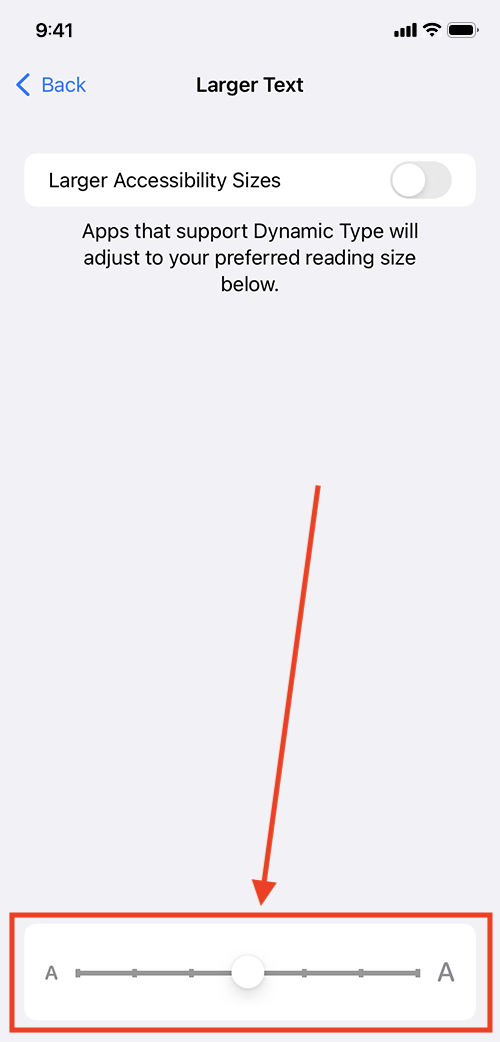
Larger Accessibility Sizes for Vision Impairment
If the largest setting on the standard slider is still too small, you can unlock even larger options:
- Go to Settings > Accessibility.
- Tap on Display & Text Size.
- Select Larger Text and toggle the Larger Accessibility Sizes switch to “On.”
This unlocks an extended slider with much larger options, designed for users with significant visual impairments. At these sizes, iOS will often shift the layout significantly, such as stacking icons vertically instead of horizontally, to ensure the text remains legible.
Bold Text and Contrast Enhancements
Sometimes the issue isn’t the size of the text, but the weight. The San Francisco font is naturally quite thin. By toggling Bold Text (found in the Display & Brightness menu), you can increase the stroke width of every character across the system. This provides a higher contrast against the background, which is particularly useful on OLED screens where the blacks are true black.
The Impact of Display Zoom on Text Rendering
In addition to text size, the iPhone offers a feature called Display Zoom. Located at the bottom of the “Display & Brightness” menu, this feature allows you to choose between “Standard” and “Larger Text” (previously called Zoomed).
Unlike Dynamic Type, which only changes the text size, Display Zoom scales the entire user interface—icons, buttons, and text—as if you were using a smaller screen with a magnifying glass. This is a great “global” solution for users who find the overall interface of the iPhone too “dense” at its default resolution.
Future Trends in iOS Typography and Interface Design
As we look toward future iterations of iOS and the integration of more advanced display technologies, the concept of “default text size” continues to evolve.
Personalization vs. Standardization
We are moving away from a world where one default fits all. With the introduction of the Always-On display and the StandBy mode in recent iOS updates, Apple is experimenting with how text scales in different environmental contexts. In the future, we may see AI-driven text adjustment, where the iPhone uses the TrueDepth camera to detect how far your eyes are from the screen and adjusts the text size in real-time to maintain optimal legibility.
The Role of AI in Readability
With the rise of Apple Intelligence and more sophisticated on-device processing, the iPhone might soon be able to analyze the complexity of the text you are reading. For instance, if you are reading a technical white paper, the device might subtly increase line spacing and font weight to reduce cognitive load, all while staying within the framework of your “default” preferences.
Conclusion
The default text size on an iPhone is more than just a setting; it is a carefully calibrated balance of design, technology, and accessibility. By setting the default to the fourth notch on the Dynamic Type scale, Apple provides a baseline that works for the majority of users while offering the most sophisticated customization engine in the smartphone industry.
Whether you stick with the factory default or utilize the deep accessibility features to tailor your experience, understanding how iOS handles typography allows you to get the most out of your device. In a digital age where we spend hours staring at screens, the “size” of our text is a fundamental component of our digital health and productivity.
aViewFromTheCave is a participant in the Amazon Services LLC Associates Program, an affiliate advertising program designed to provide a means for sites to earn advertising fees by advertising and linking to Amazon.com. Amazon, the Amazon logo, AmazonSupply, and the AmazonSupply logo are trademarks of Amazon.com, Inc. or its affiliates. As an Amazon Associate we earn affiliate commissions from qualifying purchases.