
In the realm of brand perception, every visual element contributes to the overarching narrative you wish to communicate. From the meticulously crafted logo on your website to the thoughtfully arranged furniture in your reception area, each detail plays a role in shaping an audience’s impression. Often overlooked, yet profoundly impactful, is the strategic placement of art and photographs. It’s not merely about filling a blank wall; it’s about curating an environment that reinforces your brand identity, enhances user experience, and communicates professionalism and intentionality. The seemingly simple question, “What is the correct height for hanging pictures?” unlocks a deeper discussion about visual harmony, psychological impact, and the unspoken language of design in branding.

For businesses, well-placed artwork can elevate a corporate space from merely functional to inspiring, reflecting core values like innovation, sophistication, or community. For individuals, personal branding extends to the ambiance of one’s home office or living space, influencing how clients, colleagues, or even guests perceive your aesthetic and attention to detail. This article delves into the principles governing optimal picture height, not as rigid rules, but as strategic guidelines to empower your brand’s visual story.
The Unseen Language of Visual Design: How Picture Placement Shapes Perception
Design is a silent communicator, constantly broadcasting messages about quality, attention to detail, and underlying values. The height at which a picture is hung is far more than an arbitrary choice; it’s a deliberate design decision that impacts visual comfort, guides the eye, and contributes significantly to the overall aesthetic and emotional tenor of a space. When executed thoughtfully, picture placement can underscore your brand’s professionalism and commitment to excellence.
Establishing Visual Harmony and Flow
The primary goal of correct picture placement is to create visual harmony and a natural flow within a room. When art is hung too high, it appears disconnected from the furniture and the human scale, forcing viewers to strain their necks and creating an awkward, floating effect. Conversely, if hung too low, it can feel dwarfed, cluttered, or too subservient to the furniture below. The “correct” height seeks a balance, integrating the artwork seamlessly into the existing design framework. This integration is vital for brand spaces, as it ensures that the environment feels coherent, intentional, and thoughtfully curated—qualities that resonate deeply with positive brand attributes.
Consider a corporate lobby: if the impressive abstract art is hung too high, it diminishes its impact, making the space feel less inviting and the art less approachable. If it’s perfectly positioned, it elevates the room, subtly communicating sophistication and an appreciation for culture, thereby enhancing the corporate brand image. Similarly, in a personal brand context, a home office where art is impeccably placed speaks volumes about the individual’s professionalism and dedication to an organized, inspiring workspace.
The Psychological Impact on Viewers
The way we experience a space is heavily influenced by subtle design cues. Eye-level placement is crucial because it aligns with our natural viewing habits, making the artwork more accessible and engaging. When a piece of art is comfortably viewed, it allows the viewer to absorb its message, appreciate its details, and connect with it on an emotional level. This engagement is a powerful tool for branding.
In a retail environment, strategic art placement can draw customers deeper into a store, highlighting product displays or creating alluring focal points. In an educational institution, inspirational pieces hung at the right height can foster a sense of belonging and intellectual curiosity. For any brand, ensuring that visual assets are easily digestible and aesthetically pleasing contributes to a positive customer or client experience, reinforcing brand values of care, consideration, and quality. A brand that invests in creating a visually comfortable and engaging environment demonstrates an implicit respect for its audience.
Establishing Your Aesthetic: Core Principles for Brand-Centric Picture Hanging
While specific measurements can vary, fundamental principles guide the strategic placement of artwork to ensure it supports and enhances your brand’s aesthetic. These principles are rooted in human perception and design psychology, ensuring that your chosen pieces communicate effectively within their environment.
The 57-60 Inch Rule: A Foundation for Visual Communication
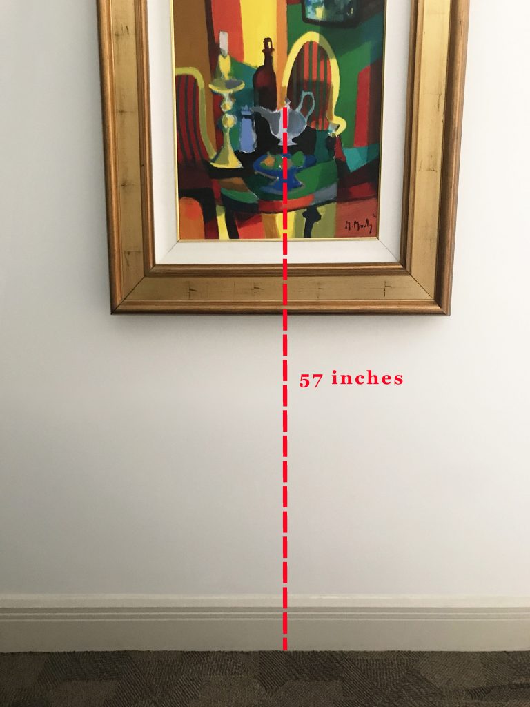
The most widely accepted guideline, often referred to as the “museum height,” suggests that the center of the artwork should be approximately 57 to 60 inches (145-152 cm) from the floor. This range is based on the average human eye level, ensuring that the artwork is comfortably viewable for most individuals without needing to look up or down excessively. This standard is particularly valuable in commercial settings, such as galleries, corporate offices, or public spaces, where consistent visual access for a diverse audience is paramount for maintaining a uniform brand experience.
Why this matters for your brand: Adhering to this rule in a business setting communicates professionalism and a sophisticated understanding of spatial design. It ensures that every visitor has an optimal viewing experience, reinforcing an image of thoughtful consideration and attention to detail. For a personal brand, this standard elevates your home or office space, presenting it with gallery-like precision and an air of cultured refinement. It’s a subtle signal that you value aesthetic quality and visual accessibility.
Considering Context: Furniture, Ceilings, and Sightlines
While the 57-60 inch rule is an excellent starting point, it’s not a rigid mandate. The context of the wall and the room is crucial.
- Furniture: When hanging art above furniture (sofas, credenzas, beds), ensure there’s enough space between the bottom of the frame and the top of the furniture to prevent it from looking cluttered or cramped. A good rule of thumb is to leave 6-8 inches (15-20 cm) of space. The artwork should relate to the furniture it’s above, acting as a cohesive unit rather than a separate entity. This creates visual weight and anchors the wall, contributing to a balanced and professional look.
- Ceiling Height: In rooms with very high ceilings, rigidly sticking to 57-60 inches might make the artwork feel too low, disproportionate to the grand scale of the room. In such cases, the artwork can be hung slightly higher, though never so high as to disconnect it from the human scale. The goal is always to find a balance that feels proportionate to the entire vertical space.
- Sightlines and Traffic Flow: Consider where people will be viewing the art from. In a hallway, where people are typically walking, the art might be hung slightly higher to catch the eye as they pass. In a dining area, where people are seated, ensuring the art is comfortably viewed from a seated position can be an important consideration. These subtle adjustments ensure that the artwork always serves its purpose in enhancing the brand’s environment.
Gallery Walls and Groupings: Curating a Narrative for Your Brand
When dealing with multiple pieces, whether it’s a curated gallery wall or a grouping of complementary artworks, the “center” rule still largely applies, but for the entire collection as a single unit. Treat the collection as one large piece of art and find its visual center, positioning that center at the 57-60 inch height.
Strategic Implications for Branding:
- Gallery Walls: A well-designed gallery wall can tell a powerful brand story. For a creative agency, it might showcase client work, company milestones, or inspirational imagery, creating a dynamic visual narrative. For a personal brand, it can display personal achievements, family moments, or cherished memories, adding depth and authenticity. The arrangement itself speaks volumes about order, creativity, or eclectic charm.
- Art Groupings: Symmetrical groupings convey order, professionalism, and classical elegance—perfect for a financial institution or a law firm. Asymmetrical groupings can signal creativity, innovation, and modern flair, suitable for tech startups or design studios. The deliberate choice of arrangement reinforces the desired brand attributes, making the space not just decorated, but branded.
Beyond the Rule of Thumb: Tailoring Picture Height to Diverse Spaces and Brand Narratives

The general rules provide a solid foundation, but truly effective brand design requires adaptability. The optimal height for hanging pictures will invariably shift based on the specific function and atmosphere of a space, each contributing to a unique brand narrative.
Residential vs. Commercial Spaces: Subtle Yet Significant Differences
While the core principles remain, the application of picture hanging height often diverges between residential and commercial environments due to differing objectives and audience expectations.
- Residential Spaces (Personal Branding): In a home, particularly areas like a living room or bedroom, the emphasis is often on comfort, intimacy, and personal expression. Artwork might be hung slightly lower to accommodate seated viewing, fostering a cozier atmosphere. The “correct” height here is more forgiving, prioritizing personal connection with the art and integrating it into the fabric of daily life. The goal is to project a personal brand that is inviting, warm, and reflective of individual taste. A lower hang in a reading nook, for instance, makes the art feel like an intimate companion, rather than a formal display.
- Commercial Spaces (Corporate Identity): In corporate offices, retail environments, or hospitality settings, the focus shifts towards consistency, professionalism, and broad appeal. The 57-60 inch museum height becomes more critical as it ensures a standardized, optimal viewing experience for a diverse range of visitors. Here, art is often part of a larger design strategy to reinforce corporate identity—projecting stability, innovation, or luxury. Artwork might be part of wayfinding, or to delineate specific zones within an open-plan office. Precision in height and alignment is crucial to convey meticulousness and a high standard of operation, all vital aspects of a strong corporate brand.
High Traffic Areas: Durability, Safety, and Brand Resilience
In areas with significant foot traffic—think hallways, corridors, or public waiting areas—the considerations extend beyond mere aesthetics to include durability and safety. Artwork needs to be securely mounted to prevent accidental dislodgement, and its placement should not impede movement or create hazards.
- Secure Mounting: For these areas, using robust hanging hardware is non-negotiable. Art that is easily bumped or dislodged can pose a safety risk and detract significantly from a brand’s image of care and reliability.
- Strategic Placement: Artwork in high-traffic zones should be placed at heights that are visible but not obstructive. This might mean adhering strictly to the eye-level rule to maximize visibility while ensuring adequate clearance from doors, corners, and passing individuals. The intentionality here speaks to a brand that values not just aesthetics, but also the safety and comfort of its patrons.
Digital Displays and Physical Art: Blending Modernity with Tradition
In today’s increasingly digital world, many brands integrate digital displays alongside traditional framed art. The challenge and opportunity lie in creating a cohesive visual experience that marries both.
- Cohesive Visual Language: When physical art and digital screens (e.g., displaying brand videos, interactive content) share a wall, their heights should ideally align to maintain visual continuity. Treating a digital screen as another piece of “art” in terms of its placement can create a harmonious and sophisticated blend of traditional and modern brand communication.
- Strategic Layering: Sometimes, a digital display might be purposefully offset or placed slightly lower to serve as an interactive element, drawing viewers in. In such cases, the surrounding physical art must be positioned to complement this focal point, not compete with it. This strategic layering reinforces a brand’s adaptability and forward-thinking approach, showcasing its ability to blend heritage with innovation.
Executing with Precision: Tools and Techniques for Professional Presentation
Achieving the “correct” height for hanging pictures, especially when upholding brand standards, requires more than just an educated guess. It demands precision, the right tools, and an understanding of secure installation techniques. This final stage is where theoretical design principles translate into tangible brand impact.
Measuring and Marking for Flawless Execution
Accuracy is paramount. Eyeballing distances often leads to subtle misalignments that, while individually small, cumulatively detract from a professional aesthetic.
- Tools of the Trade: A laser level is invaluable for ensuring perfectly straight lines, especially for gallery walls or multiple pieces. A measuring tape, pencil, and painter’s tape are also essential. Painter’s tape can be used to temporarily mark the top corners of your artwork on the wall, allowing you to visualize placement before making permanent marks.
- The Math of Hanging: To determine the hanging point, measure the distance from the top of the frame to the hanging wire or hook. Then, add this measurement to your desired center height (e.g., 57 inches) and subtract half the total height of the artwork. This calculation ensures the center of your art aligns with your target eye level. For items with two D-rings or sawtooth hangers, measure the distance between the hangers and from the top of the frame to the top of the hangers. This attention to detail prevents costly mistakes and ensures a clean, professional finish, which is a hallmark of strong brand execution.
Hardware Selection: Supporting Your Vision and Brand Integrity
The choice of hanging hardware is often overlooked but critical for both aesthetics and longevity. It directly impacts the safety and stability of your artwork, particularly in commercial or high-traffic areas.
- Weight Capacity: Always select hardware rated for the weight of your artwork. Overloading a hook or wire can lead to costly damage and a negative perception of your brand’s attention to quality control.
- Wall Type: Different wall materials (drywall, plaster, brick) require specific fasteners. Using the correct anchors or screws ensures a secure hold. For heavy pieces, wall anchors or even professional picture rail systems are advisable.
- Aesthetics and Concealment: In most professional settings, hanging hardware should be discreet or completely concealed. Exposed, mismatched, or flimsy hardware can undermine the polished look you’re trying to achieve, communicating sloppiness rather than sophistication. The choice of hardware reflects a brand’s commitment to quality from the visible to the invisible.
Professional Installation: Ensuring Longevity and Impact
For significant pieces, extensive gallery walls, or installations in commercial spaces, hiring professional art installers is a wise investment. They possess the expertise, tools, and insurance to ensure flawless execution.
- Precision and Efficiency: Professionals can navigate complex layouts, uneven surfaces, and integrate various art forms (including sculptures or multi-panel displays) with efficiency and precision that aligns with stringent brand guidelines.
- Safety and Security: They ensure artworks are securely mounted, reducing the risk of damage or injury, which protects not only the art but also the brand’s reputation.
- Consistency Across Locations: For multi-location businesses, professional installers can maintain a consistent brand aesthetic across all venues, ensuring that the visual experience is uniform and on-brand, regardless of location. This consistency is fundamental to a strong corporate identity.
In conclusion, the “correct” height for hanging pictures transcends a mere numerical value. It is a strategic design decision, a subtle yet potent element in the broader narrative of your brand. By understanding and applying these principles—from visual harmony and psychological impact to meticulous execution—you empower your spaces to communicate professionalism, curated taste, and an unwavering commitment to excellence, ultimately enhancing your brand’s lasting impression.
aViewFromTheCave is a participant in the Amazon Services LLC Associates Program, an affiliate advertising program designed to provide a means for sites to earn advertising fees by advertising and linking to Amazon.com. Amazon, the Amazon logo, AmazonSupply, and the AmazonSupply logo are trademarks of Amazon.com, Inc. or its affiliates. As an Amazon Associate we earn affiliate commissions from qualifying purchases.