
In the competitive landscape of modern branding, color is not merely an aesthetic choice; it is a fundamental tool for communication, psychological influence, and market positioning. When designers and brand strategists ask, “What is the complementary color of red?” they are looking for more than a simple answer from a primary school color wheel. They are seeking a method to balance intensity with harmony, to command attention without causing visual fatigue, and to build a visual identity that resonates with a specific target audience.
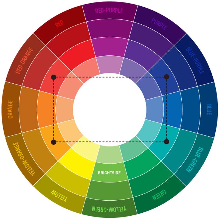
The complementary color of red is green. On a standard RYB (Red, Yellow, Blue) color wheel, green sits directly opposite red. This relationship creates the highest possible level of visual contrast, a phenomenon known as simultaneous contrast. In the world of brand strategy and corporate identity, understanding how to leverage this high-stakes relationship is essential for creating logos, marketing materials, and user interfaces that pop while remaining sophisticated.

The Strategic Importance of High-Contrast Pairing in Branding
The relationship between red and green is one of the most powerful tools in a brand designer’s arsenal. Because they are functional opposites, placing them together creates a visual vibration. This effect occurs because the cones in the human eye are pushed to their limits when processing these two wavelengths simultaneously. For a brand, this translates to immediate visibility.
The Psychology of Visual Vibration
When red and green are used in their most saturated forms, they compete for the viewer’s attention. Red is the color of urgency, passion, and action. It triggers a physical response, often increasing heart rate and stimulating appetite. Green, conversely, represents growth, stability, and tranquility. It is the most restful color for the human eye to process.
When a brand strategist combines these two, they are effectively balancing “The Push” (red’s demand for action) with “The Anchor” (green’s sense of reliability). However, if not managed correctly, this “vibration” can become overwhelming. Professional brand identity design often relies on adjusting the values—the lightness or darkness—of these colors to ensure they complement rather than collide.
Establishing Brand Hierarchy
In corporate identity, red is frequently used as a primary brand color because of its ability to stand out in a crowded marketplace. However, a brand that is entirely red can feel aggressive or exhausting. By introducing green—either as a secondary color or as part of a seasonal campaign—a brand can soften its image. This strategic pairing allows a company to maintain its high-energy persona while suggesting a commitment to sustainability, health, or financial growth.
Navigating the Emotional Spectrum: Red vs. Green
For a marketing professional, color is a silent language. Red and green carry heavy cultural and psychological baggage that must be carefully navigated to ensure the brand message is clear.
Red: The Language of Action and Appetite
Red is arguably the most dominant color in branding. It is the color of Coca-Cola, Netflix, and Target. It demands to be seen. From a marketing perspective, red is used to create a sense of urgency (think “Sale” signs) or to stimulate primal urges. In the food industry, red is strategically utilized to increase hunger. It is a color of heat and speed, making it ideal for brands that want to be perceived as innovative, fast-moving, or bold.
Green: The Language of Prosperity and Peace
Green occupies a very different space in the consumer’s mind. It is the color of Starbucks, Whole Foods, and Shopify. It suggests organic growth, environmental consciousness, and financial security. In branding, green acts as a “permission” color. It tells the consumer that the brand is safe, natural, and trustworthy. It provides a psychological “cool down” to the heat of red.
Synthesis in Corporate Identity
When a brand successfully integrates red with its complement, green, it creates a “complete” emotional experience. For example, a financial app might use a deep forest green to establish trust and security, while utilizing a bright red for its “Trade” or “Alert” buttons. This uses the complementary relationship to guide the user’s eye exactly where the brand wants it to go, creating a seamless path to conversion.
Implementing the Red-Green Palette Without the “Holiday” Trap
One of the greatest challenges for brand designers working with red and its complement is avoiding the “Christmas effect.” Because red and green are so deeply associated with the holiday season in Western culture, using them together in a corporate identity can accidentally make a brand look like a seasonal promotion. Professional brand strategy avoids this through three specific techniques: adjusting saturation, altering temperature, and introducing neutral anchors.
Adjusting Saturation and Value
A brand does not have to use “primary red” and “primary green.” By shifting the values, a designer can create a palette that feels modern and high-end. For instance, a luxury brand might pair a deep burgundy (a shade of red) with a muted sage or olive (a tone of green). This maintains the complementary relationship but moves the aesthetic into a space of sophistication and timelessness rather than festive cheer.
Shifting the Temperature
Not all reds and greens are created equal. A “cool” red with blue undertones (like crimson) pairs beautifully with a “warm” green that has yellow undertones (like lime or chartreuse). This mismatch of temperatures prevents the visual vibration from becoming annoying and instead makes the palette feel curated and intentional.
Utilizing Neutral Anchors
To prevent a red-green palette from overwhelming the viewer, successful brands often use “bridge” colors. White, charcoal gray, or cream can act as a buffer between the two high-contrast colors. This is particularly important in web design and UI/UX. If a website has a green background and red text, it is nearly unreadable. However, a white interface with green navigation bars and red call-to-action buttons creates a clean, professional, and highly functional user experience.
Digital Accessibility and the Red-Green Complement
In modern branding, inclusivity is a core pillar of corporate identity. One of the most significant hurdles when working with the red-green complementary pair is color vision deficiency (CVD), specifically protanopia and deuteranopia. Red-green color blindness is the most common form of color deficiency, affecting a significant portion of the global population.
Designing for Inclusivity
When a brand relies solely on red and green to communicate meaning—such as using a red light for “stop” and a green light for “go” in an app—they risk alienating a portion of their audience who cannot distinguish between the two. Strategic branding solves this by using secondary cues.
This might involve adding icons (like an ‘X’ or a checkmark) to the colors or ensuring there is a significant difference in lightness between the two. For example, a very dark green paired with a very light, bright red ensures that even a color-blind user can perceive the difference in contrast, even if they cannot see the hue.
Contrast Ratios in Web Design
For digital-first brands, adhering to Web Content Accessibility Guidelines (WCAG) is mandatory. The red-green complement presents a challenge for text contrast. Brands must ensure that their color choices meet specific contrast ratios to ensure readability for all users. This often means that the “brand” colors are slightly modified for the digital environment, ensuring that the visual identity is both beautiful and functional for every consumer.
Case Studies: Successful Red and Green Branding
Several global brands have mastered the use of these complementary opposites, proving that when handled with precision, red and green can build iconic equity.
Gucci: The Luxury of Contrast
Gucci is perhaps the most famous example of a luxury brand that uses red and green as a core part of its corporate identity. Their signature stripe—a red line sandwiched between two green lines—is recognized globally. Gucci avoids the “holiday” look by using specific, saturated shades (Forest Green and Deep Red) and pairing them with high-end materials like leather and gold hardware. Here, the complementary relationship signals heritage, craftsmanship, and Italian flair.
Starbucks: Evolution of a Palette
While Starbucks is primarily a green brand, they frequently use red as a complementary accent during specific marketing pushes. Their “Red Cup” campaign is a masterclass in using color to signify a shift in brand narrative. By temporarily introducing red into their predominantly green ecosystem, they create a sense of excitement and limited-time urgency that drives massive foot traffic.
Mountain Dew: The Energy of Vibrancy
Mountain Dew utilizes a neon-leaning green with red accents to communicate high energy, youth, and “extreme” lifestyle choices. In this case, the brand wants the visual vibration. They use the clashing nature of the complementary colors to reflect the adrenaline-fueled nature of their target demographic. It is loud, unapologetic, and highly effective for their market positioning.

Conclusion: Balancing the Paradox
What is the complementary color of red? In the realm of branding, it is the key to balance. Green provides the equilibrium to red’s intensity. Whether it is a tech startup looking for a “disruptive” look or a corporate entity seeking a “stable yet energetic” identity, the red-green relationship offers a spectrum of possibilities. By mastering the nuances of saturation, value, and accessibility, brand strategists can harness the power of these visual opposites to create identities that are not only seen but remembered. The secret lies not in the colors themselves, but in the strategic tension between them.
aViewFromTheCave is a participant in the Amazon Services LLC Associates Program, an affiliate advertising program designed to provide a means for sites to earn advertising fees by advertising and linking to Amazon.com. Amazon, the Amazon logo, AmazonSupply, and the AmazonSupply logo are trademarks of Amazon.com, Inc. or its affiliates. As an Amazon Associate we earn affiliate commissions from qualifying purchases.