
In the world of corporate identity and marketing, color is rarely a matter of mere aesthetics. It is a psychological tool, a silent communicator, and a strategic asset. When a brand designer asks, “What is the complementary color of blue?” they are not simply looking for a visual pairing; they are looking for a way to create visual tension, drive consumer action, and establish a memorable presence in a crowded marketplace.
To answer the question directly: the complementary color of blue is orange. On a standard color wheel, these two hues sit directly opposite one another. This opposition creates the highest possible contrast, a phenomenon known in design as “simultaneous contrast.” For brand strategists, understanding how to harness the relationship between blue and its fiery counterpart is essential for building a brand that feels both balanced and bold.

The Foundations of Color Theory in Brand Strategy
Before diving into the specific applications of the blue-orange dyad, one must understand the mechanics of color theory within the context of brand strategy. Color theory is the marriage of science and art, dictating how humans perceive visual stimuli and how those stimuli influence decision-making.
The Science of Opposites
In the traditional RYB (Red, Yellow, Blue) color model used by designers for centuries, orange is the secondary color created by mixing the other two primaries. Because orange contains no blue, it provides the maximum visual shift possible for the human eye. This is why a blue logo on an orange background—or vice versa—seems to “pop” or even vibrate. In branding, this vibration is a tool used to capture the “eye-share” of a consumer in a split second.
RGB vs. RYB in Digital Branding
It is important for modern brand managers to distinguish between traditional print theory and digital display theory. In the digital space (the RGB model used for screens), the exact “mathematical” complement of blue is often a bright, vivid yellow-orange or amber. Regardless of the slight shift in shade, the strategic intent remains the same: using the warmth of the orange spectrum to balance the inherent coolness of blue.
Establishing Visual Hierarchy
A brand that uses only blue can appear stable and trustworthy, but it may also fade into the background. By introducing its complementary color, a strategist can create a visual hierarchy. The blue serves as the foundation (representing the corporate “soul”), while the orange serves as the “call to action” or the focal point that directs the viewer’s gaze toward specific information.
Why Orange? The Psychological Synergy of Blue’s Complement
Every color carries a psychological weight. Blue is globally recognized as the color of trust, intelligence, and stability. It is the color of the sky and the ocean—constant and vast. However, the very stability that makes blue so popular can also make it feel cold, detached, or uninspired. This is where the complementary power of orange becomes a strategic necessity.
Balancing Trust with Energy
Orange is the psychological antithesis of blue. Where blue is calm, orange is energetic. Where blue is professional, orange is playful. By pairing blue with orange, a brand can communicate a complex identity: “We are a stable, reliable company (Blue) that is also innovative, approachable, and fast-moving (Orange).” This balance is vital for tech startups and financial services that want to appear both secure and modern.
The “Call to Action” Color
In marketing and UI/UX (User Experience) design, orange is often referred to as the “aggressive” color. Because it stands out so vividly against blue—the most common color used in corporate digital interfaces—it has become the gold standard for “Buy Now,” “Sign Up,” or “Contact Us” buttons. Strategic branding uses the complementary nature of these colors to guide a customer through the sales funnel without the need for excessive text.
Emotional Resonance and Consumer Memory
Studies in color psychology suggest that high-contrast pairings are more easily encoded into long-term memory. A brand that utilizes the blue-orange complementary scheme is statistically more likely to be remembered by a consumer than a brand that uses a monochromatic or analogous (colors next to each other) scheme. The “visual shock” of the complement helps the brand mark “stick” in the subconscious mind.
Designing for Dominance: Practical Applications of Blue and Orange
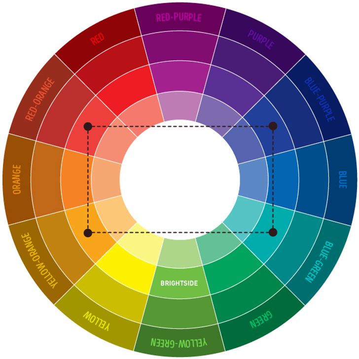
Knowing that orange is the complement of blue is the first step; knowing how to apply it to a brand’s visual identity is where the strategy truly begins. A 50/50 split of blue and orange is often too jarring for the human eye. Effective branding requires a more nuanced approach.
The 60-30-10 Rule in Corporate Identity
Professional brand designers often utilize the 60-30-10 rule to ensure a balanced aesthetic. In a blue-based brand, 60% of the visual space might be a dominant blue (trust), 30% might be a neutral white or grey (clarity), and the remaining 10% is reserved for the complementary orange. This 10% is used for the “hero” elements—the logo accent, the tagline, or the primary interaction point. This ensures that the orange remains a powerful accent rather than an overwhelming distraction.
Variation in Value and Saturation
Not all blues and oranges are created equal. A navy blue paired with a neon orange creates a high-energy, modern tech feel. Conversely, a light baby blue paired with a burnt sienna or terracotta orange creates a sophisticated, artisanal, or “organic” brand vibe. Strategic branding involves selecting the specific shade of the complement to align with the brand’s specific personality.
Accessibility and the User Experience
From a digital brand perspective, the contrast between blue and orange is excellent for accessibility. For users with certain types of visual impairments, the high contrast between these two colors ensures that text and icons remain legible. A brand that prioritizes accessibility through smart color theory is not only socially responsible but also expands its potential market reach.
Case Studies: Brands that Mastered the Blue-Orange Dynamic
To see the theory in practice, one only needs to look at some of the most successful corporate identities in the world. These organizations have leveraged the complementary relationship of blue and orange to build global recognition.
Firefox: The Digital Pioneer
The Mozilla Firefox logo is one of the most famous examples of complementary color usage. The “Fox” (Orange/Red) encircles the “Globe” (Blue). The orange represents the speed and heat of the browser’s engine, while the blue represents the global reach and stability of the internet. The high contrast makes the icon instantly recognizable on a cluttered desktop or mobile screen.
Gulf Oil: The Heritage of Performance
In the world of automotive and industrial branding, Gulf Oil’s powder blue and bright orange racing livery is legendary. The blue provides a sense of cleanliness and corporate professionalism, while the orange evokes the heat of the engine and the thrill of the race. This combination became so iconic that it moved beyond the company itself to become a symbol of “cool” in the broader culture of design.
The New York Knicks and Professional Sports
In sports branding, the goal is to foster tribalism and high energy. The New York Knicks utilize a primary blue and orange palette. The orange provides the “vibrancy” required for a high-intensity sport, while the blue provides the “prestige” of a legacy New York institution. On the court, these colors ensure the players are highly visible against the hardwood, aiding both fans and teammates.
Strategic Integration: Moving Beyond the Basics
As a brand evolves, the use of its complementary color palette must also evolve. Strategy is not static; it must adapt to changing consumer tastes and new media formats.
Digital Dark Mode and Color Shifting
With the rise of “Dark Mode” in mobile applications and websites, brand strategists must reconsider how blue and its complement interact. A deep navy blue background requires a more luminous, “glowing” orange to maintain the same level of impact that a standard orange has on a white background. This requires a flexible brand guidelines document that accounts for various digital environments.
Seasonal and Campaign-Specific Accents
A brand does not always need to use its complement in its primary logo. Many sophisticated brands use blue as their core identity but introduce orange during specific marketing campaigns—such as “Flash Sales” or “Summer Product Launches”—to create a sense of urgency. This “seasonal” use of the complementary color keeps the brand feeling fresh without requiring a total visual overhaul.

Conclusion: The Strategic Advantage of Color Harmony
Understanding that orange is the complementary color of blue is more than a trivia point for designers; it is a foundational pillar of effective brand strategy. By embracing this contrast, a brand can achieve a rare balance of qualities: it can be both reliable and exciting, stable and innovative, foundational and eye-catching.
In an era where consumers are bombarded with thousands of visual messages daily, the strategic use of complementary colors offers a “shortcut” to the brain’s attention center. Whether you are building a personal brand, a tech startup, or a corporate empire, mastering the relationship between blue and its orange opposite ensures that your identity is not just seen, but felt and remembered. In the visual language of business, contrast is not just a design choice—it is a competitive advantage.
aViewFromTheCave is a participant in the Amazon Services LLC Associates Program, an affiliate advertising program designed to provide a means for sites to earn advertising fees by advertising and linking to Amazon.com. Amazon, the Amazon logo, AmazonSupply, and the AmazonSupply logo are trademarks of Amazon.com, Inc. or its affiliates. As an Amazon Associate we earn affiliate commissions from qualifying purchases.