
The term “linen” evokes a specific sensory experience: crisp, breathable, and timeless. However, when it comes to the visual identity of this material, the answer is far more nuanced than a simple shade. In the world of design and brand identity, the “colour of linen” is not merely a pigment; it is a strategic choice that communicates luxury, sustainability, and minimalism. Understanding this colour profile is essential for designers and brand strategists aiming to capture the essence of natural sophistication.
The Spectrum of Natural Linen
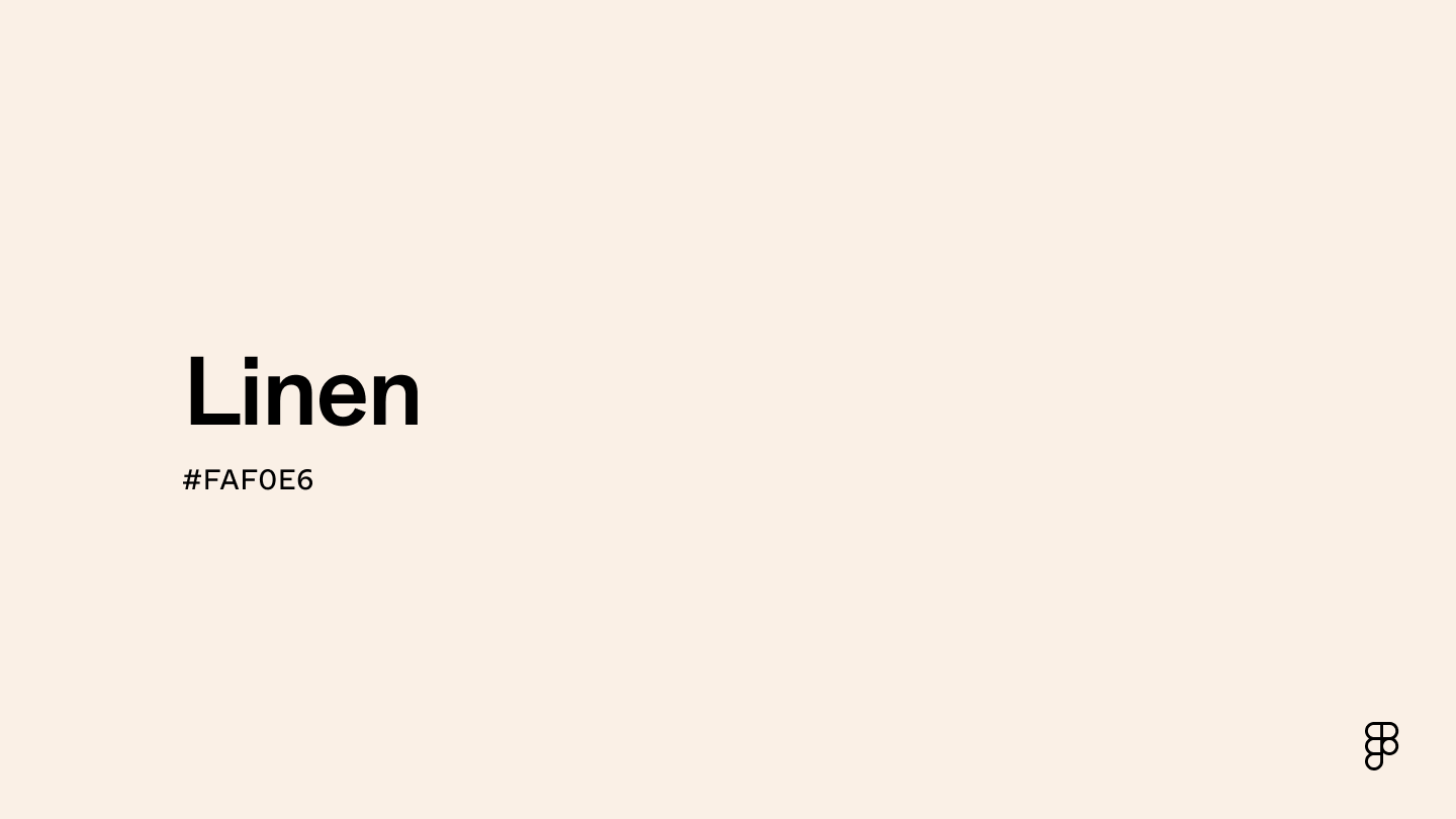
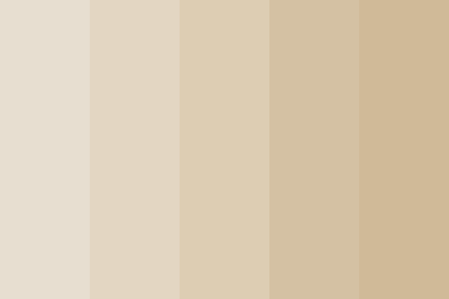
In its raw state, linen is defined by the flax plant from which it is derived. The natural colour of flax fibers is often described as “oatmeal,” “beige,” or “ecru.” This spectrum is not a flat, singular tone, but rather a textured landscape of off-whites, pale grays, and warm, sun-bleached yellows.
Understanding the Raw Aesthetic
When we discuss the “colour” of linen in a branding context, we are referring to a value of organic neutrality. Raw linen possesses an uneven, slightly variegated appearance, which is a hallmark of its authenticity. From a design perspective, this creates a visual anchor. It is a color that feels “unprocessed” and “grounded.” Brands that utilize this shade are signaling a commitment to transparency and slow production. Unlike stark, clinical white, natural linen suggests a human touch—a reminder that the product originated from the earth.
The Role of Pigmentation and Dye
While the natural state of linen is prized, the material is also highly receptive to dye. Because of its absorbency, linen takes on deep, muted earth tones exceptionally well. When a brand chooses “linen” as a signature color palette, they aren’t limited to beige. Instead, they often gravitate toward a curated spectrum of desaturated hues: sage greens, slate blues, terra-cotta, and soft charcoal. These colors share the characteristic “dustiness” of raw linen, creating a cohesive visual language that feels sophisticated, mature, and inherently high-end.
Linen as a Branding Tool: The Psychology of Neutrality
Why have so many premium brands shifted their entire identity toward the “linen” palette? The answer lies in the psychological impact of low-contrast, organic design. In an age of digital noise and hyper-saturated advertising, linen tones provide a visual sanctuary.
Cultivating an Image of Quiet Luxury
“Quiet luxury” has become the defining aesthetic for modern premium brands. It is the antithesis of the logomania that dominated the early 2000s. Linen, as a brand color, fits perfectly into this movement. It communicates wealth without the need for loudness. A website or packaging design utilizing a palette of ecru, stone, and sand suggests that the brand is confident enough to forgo traditional “attention-grabbing” colors. It signals that the quality of the product—the “fiber” of the business—is enough to stand on its own.
Minimalism and Cognitive Ease
From a UI/UX standpoint, the linen color palette is an exercise in cognitive ease. High-contrast, pitch-black text against stark-white backgrounds can be visually fatiguing. By replacing stark white with a soft linen off-white, brands create a more approachable digital experience. This “gentle” approach to design keeps the user engaged for longer periods, reducing the bounce rate by creating a comfortable visual environment. It is the design equivalent of a soft-spoken consultant: authoritative, yet incredibly easy to listen to.
Design Implementation: Building a Visual Identity Around Linen
Translating the concept of “linen” into a formal brand identity requires more than just picking a hex code. It requires a mastery of texture, contrast, and hierarchy.
Balancing Neutrals with Texture
The biggest challenge when working with a linen-inspired color palette is the risk of appearing “washed out” or invisible. To prevent this, successful brand design must compensate for the lack of high-chroma colors by introducing a heavy focus on texture. If the background is a flat linen shade, the typography might use a deep, matte-finish charcoal. The photography should feature organic light, soft shadows, and tangible surfaces. By emphasizing the “tactile” nature of the brand’s digital presence, you evoke the physical sensation of the fabric itself, even through a screen.
Establishing Contrast without “Black and White”
Many brands make the mistake of pairing linen tones with pure black. This destroys the organic harmony of the palette. Instead, use “near-blacks”—deep, cool-toned charcoals or dark espresso browns. These colors sit comfortably within the linen spectrum, maintaining the sophisticated, low-contrast aesthetic while ensuring the brand remains legible and professional.
Furthermore, consider the use of “white space.” In linen-based branding, white space should be treated as a physical component of the layout. It isn’t just empty space; it is the “fabric” of the design. By allowing elements to breathe, you reinforce the feeling of spaciousness and high-quality craftsmanship that linen represents.
The Strategic Advantage of Linen in Market Positioning
Choosing the colour of linen for your brand identity is a strategic move that carries specific market implications. It positions a brand as sustainable, durable, and timeless.
Sustainability and the “Earth-First” Narrative
In the current economic climate, consumers are increasingly skeptical of brands that appear overly “processed” or corporate. A brand identity built on the colors of linen—unbleached, natural, and raw—taps into the consumer’s desire for sustainability. It bypasses the need for elaborate “greenwashing” messaging because the design itself looks like it hasn’t been chemically altered. When a brand visually aligns itself with raw, natural colors, it creates a subconscious link to ecological responsibility.
Longevity and Timelessness
Trends in color change every season—neon lime, cobalt blue, or bright coral. A brand built on these colors is tethered to a specific moment in time. Linen, however, is timeless. It is the “neutral” that never goes out of style. By anchoring a brand in the linen spectrum, you are making a long-term investment in your visual identity. You are saying that your brand is not a fad; it is a staple. This longevity is invaluable for businesses looking to build lasting relationships with their customers, as it removes the need for frequent, jarring rebrands to keep up with shifting trends.

Conclusion: Embracing the Linen Standard
The “colour of linen” is more than just a aesthetic preference; it is a comprehensive design strategy. It represents a pivot toward intentionality, quality, and organic connection. Whether applied to the subtle tones of a website’s background or the curated hues of a corporate identity, the palette associated with linen speaks to a sophisticated audience that values substance over style. By understanding the intersection of color psychology, texture, and brand positioning, businesses can leverage the timeless appeal of linen to craft a visual identity that is as enduring as the fabric itself. In a world of infinite choices, choosing the quiet, refined path of linen is a bold statement of confidence and clarity.
aViewFromTheCave is a participant in the Amazon Services LLC Associates Program, an affiliate advertising program designed to provide a means for sites to earn advertising fees by advertising and linking to Amazon.com. Amazon, the Amazon logo, AmazonSupply, and the AmazonSupply logo are trademarks of Amazon.com, Inc. or its affiliates. As an Amazon Associate we earn affiliate commissions from qualifying purchases.