The question “What is the colour of brass?” might seem deceptively simple, conjuring immediate images of a warm, metallic hue. Yet, delving into its true nature, its variability, and its psychological implications reveals a far more complex and nuanced subject. For brands navigating the intricate landscape of visual identity and consumer perception, understanding the essence of brass color is not merely an aesthetic curiosity; it is a strategic imperative. This rich, golden-brown often evokes a sense of heritage, quality, and enduring value, making it a potent tool in the brand strategist’s arsenal. From the burnished patina of antique instruments to the polished sheen of modern luxury goods, the color of brass carries a distinct narrative that brands can leverage to communicate their core values and resonate with their target audiences.

The Spectral Spectrum and Perceptual Nuances of Brass
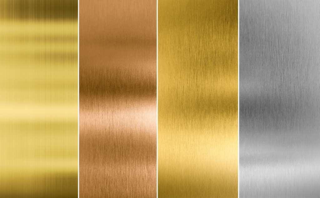
While often described as a singular color, brass is in reality a spectrum of hues influenced by its composition, finish, and the ambient light. Understanding this variability is crucial for any brand aiming to consistently represent its identity.
The Chemical Composition and its Coloristic Influence
Brass itself is an alloy primarily composed of copper and zinc. The ratio of these two metals significantly impacts the resulting color. Generally, brass alloys containing a higher percentage of copper tend towards a warmer, redder hue, often described as a richer gold or even a coppery-orange. Conversely, alloys with a higher zinc content will exhibit a paler, more yellowish-gold, sometimes leaning towards a lighter, almost pale yellow metallic sheen. For instance, cartridge brass, commonly used in ammunition, has a higher copper content (around 70%) and thus presents a warmer, more golden appearance than Muntz metal (around 60% copper), which is often described as reddish-brown.
Beyond the fundamental copper-zinc ratio, other elements can be introduced in smaller quantities, further subtly altering the color. Small additions of lead, for example, can improve machinability but may also impart a duller finish. Tin can be added to create more durable brasses, often resulting in a slightly paler, more silver-toned gold. The intricate dance of these elemental compositions creates a palette of brass colors, each with its own subtle character and associative meaning. Brands that select brass for their products or visual identity must be aware of these underlying metallurgical realities. A “classic brass” finish might be achieved with a specific alloy, while a “modern brass” aesthetic could stem from a different composition or even a carefully applied coating that mimics the desired hue. The precise shade chosen becomes a silent but powerful communicator of the brand’s intended persona – be it traditional craftsmanship or contemporary innovation.
The Impact of Patina and Finish
The “color” of brass is not static; it evolves over time and with exposure. Patina, the layer of oxidation that forms on the surface of copper alloys like brass, is a key factor in its perceived color. A freshly polished brass surface will gleam with a bright, reflective yellow-gold. However, as it ages, it develops a deeper, richer hue. This patina can range from a light, greenish-brown to a deep, dark, almost blackish-brown, depending on the environment, humidity, and exposure to atmospheric agents. This natural aging process imbues brass with a sense of history, authenticity, and character.
Brands can choose to embrace this natural evolution or to artificially control it. High-end luxury goods, for instance, might highlight a deliberately aged brass patina to convey a sense of heritage and timelessness, suggesting that the product has been crafted with enduring quality. Conversely, brands focused on a clean, minimalist aesthetic might opt for lacquered brass finishes that resist tarnishing and maintain a consistent, bright golden appearance. The choice between a polished, untouched sheen and a deliberately oxidized or lacquered finish is a critical branding decision. It dictates whether the brand communicates modernity and precision or tradition and artisanal depth. The subtle variations in light reflection, the warmth of the undertones, and the depth of the shadows all contribute to the overall perceptual experience of the brass color, and therefore, the brand itself.
Brass Color in Branding: A Symbol of Value and Heritage
The inherent qualities of brass – its metallic sheen, its warm tones, and its association with enduring craftsmanship – translate directly into powerful branding attributes. Its color evokes a sense of prestige, reliability, and a connection to the past, making it a compelling choice for a wide array of brand identities.
Evoking Trust and Quality Through Metallic Hues
In the visual language of branding, color plays a pivotal role in shaping consumer perception. The color of brass, with its rich golden undertones, is intrinsically linked to concepts of value, luxury, and durability. Gold itself is a universally recognized symbol of wealth and prestige, and brass, as a close relative, inherits some of these positive associations. When a brand incorporates brass-colored elements – whether in its logo, product design, packaging, or website – it subconsciously communicates a message of quality and trustworthiness.
Consider the prevalence of brass tones in the luxury goods sector. High-end watches often feature brass components or brass-colored accents, signaling craftsmanship and sophisticated design. Premium stationery brands might use brass for their pens or hardware, imbuing them with a tangible sense of elegance and permanence. Even in less overtly luxurious markets, the judicious use of brass color can elevate a brand’s perceived value. For example, a financial institution might use a warm, brassy gold in its branding to convey stability, trust, and a long-term perspective, mirroring the perceived enduring nature of the metal. The visual warmth of brass is also inherently inviting, creating a welcoming yet sophisticated impression that encourages consumer engagement. This is particularly effective for brands that want to project an image of reliability and timeless appeal, suggesting that their products or services are built to last.
Historical Resonance and the Appeal of Authenticity
Brass has a long and storied history, dating back to antiquity. It has been used for centuries in everything from tools and weaponry to musical instruments and decorative objects. This deep historical resonance lends brass an aura of authenticity and tradition that many brands find highly desirable. In an era where consumers often seek genuine experiences and products with a story, brands that leverage the color of brass can tap into this desire for authenticity.
A brand that chooses to incorporate brass into its identity can effectively communicate a narrative of heritage, craftsmanship, and enduring quality. Imagine a craft brewery using brass-colored labels to evoke the days of traditional brewing, or a furniture designer employing brass accents to suggest artisanal skill passed down through generations. The color of brass can be a powerful shortcut to conveying a sense of established excellence and time-tested expertise. This is especially potent for brands that aim to differentiate themselves in crowded markets by emphasizing their roots, their dedication to traditional methods, or their commitment to creating lasting products. The warm, inviting glow of brass, when associated with a brand, can create an emotional connection with consumers, fostering a sense of familiarity and trust based on perceived historical precedent and enduring value.
Strategic Applications of Brass Color in Brand Design
The application of brass color within a brand’s visual strategy requires careful consideration of its multifaceted symbolism and perceptual impact. From primary brand elements to subtle accent details, the way brass color is deployed can significantly influence consumer perception and brand resonance.
Logos and Visual Identity: Establishing a Golden Standard
The primary application of any brand color is often within its logo and overarching visual identity. For brands that choose brass hues, this decision carries substantial weight. A logo rendered in a deep, burnished brass can immediately convey a sense of gravitas and established authority. Think of financial institutions, law firms, or luxury heritage brands where stability and a long-standing reputation are paramount. The metallic sheen, even in a 2D representation, can suggest richness and solidity.
Conversely, a brighter, more polished brass tone might be employed by brands aiming for a more modern, aspirational, or even avant-garde feel, while still retaining a sense of premium quality. This could be seen in contemporary jewelry brands or high-end tech accessories. When considering the logo, designers must also think about the context of its reproduction. Will it be printed, embroidered, or displayed digitally? The chosen brass tone needs to translate effectively across all mediums. Furthermore, the specific shade of brass can be subtly adjusted to complement other brand colors, ensuring a cohesive and harmonious visual system. For instance, a deep brass might pair well with deep blues or greens to evoke a sense of classicism, while a lighter, more yellow brass could be combined with softer pastels or crisp whites for a more contemporary and airy feel. The strategic choice of brass in a logo is not just about aesthetics; it’s about embedding core brand values into the very fabric of its visual representation, creating an immediate and lasting impression of quality and distinction.

Product Design and Packaging: Tactile and Visual Reinforcement
Beyond static logos, the incorporation of brass color in product design and packaging offers a more tangible and interactive brand experience. When consumers physically interact with a product that features brass elements or a brass-like finish, the sensory impact is amplified. For example, a high-quality pen with a brass barrel not only looks sophisticated but also feels substantial and weighty in the hand. This tactile reinforcement of the visual cues associated with brass – durability, craftsmanship, and premium feel – can significantly enhance the perceived value of the product.
In packaging, brass colors can be used to create a sense of occasion and anticipation. A jewelry box lined with a brass-toned satin, or a wine bottle label featuring metallic brass foil, immediately signals that the contents are special. This is particularly effective for gifting occasions or for brands that aim to position their products as indulgences. The warmth and reflectivity of brass can draw the eye, making the product stand out on shelves and encouraging closer inspection. Moreover, the psychological association of brass with enduring quality can subtly reassure consumers about the longevity and value of their purchase. When a brand consistently uses brass color in its product design and packaging, it builds a consistent narrative of quality, heritage, and understated luxury, reinforcing its brand positioning with every touchpoint. This deliberate and strategic application ensures that the color of brass becomes an integral part of the brand’s tangible identity, fostering deeper consumer connection and loyalty.
aViewFromTheCave is a participant in the Amazon Services LLC Associates Program, an affiliate advertising program designed to provide a means for sites to earn advertising fees by advertising and linking to Amazon.com. Amazon, the Amazon logo, AmazonSupply, and the AmazonSupply logo are trademarks of Amazon.com, Inc. or its affiliates. As an Amazon Associate we earn affiliate commissions from qualifying purchases.