
In the intricate world of brand identity and visual communication, every color choice carries significant weight, influencing perception, evoking emotion, and shaping market positioning. Among the myriad hues available, “shale” emerges as a compelling and often underestimated player. Far from a mere drab grey, the color shale represents a sophisticated spectrum of earthy tones, drawing its essence from the sedimentary rock formations it’s named after. Understanding what the color shale truly is – its geological roots, visual characteristics, and psychological impact – is the first step toward strategically harnessing its power in brand design. This nuanced color offers brands an opportunity to convey messages of stability, authenticity, and understated elegance, making it a valuable asset in a thoughtful corporate identity strategy.

Decoding the Hue: Understanding Shale as a Color
The color shale is not a single, fixed shade but rather a family of tones that echo the natural variations found in shale rock. This geological origin provides the color with inherent characteristics that translate powerfully into brand perception.
The Geologic Origins and Visual Characteristics
Shale is a fine-grained, clastic sedimentary rock composed of mud that is a mix of clay minerals and tiny fragments of other minerals like quartz and calcite. Its formation over millions of years, often in quiet water environments, results in distinct layering and a muted, earthy palette. The color of natural shale can vary widely depending on its composition:
- Grey Shales: The most common perception, often seen in various shades of medium to dark grey, sometimes with a subtle bluish or greenish cast. This is typically due to the presence of carbonaceous material or iron compounds.
- Red and Brown Shales: Result from iron oxides, giving them warmer, rust-like or reddish-brown undertones.
- Green Shales: Occur when iron is in a reduced, ferrous state, leading to a softer, muted green-grey.
- Black Shales: High organic content can create very dark, almost black hues, rich with carbon.
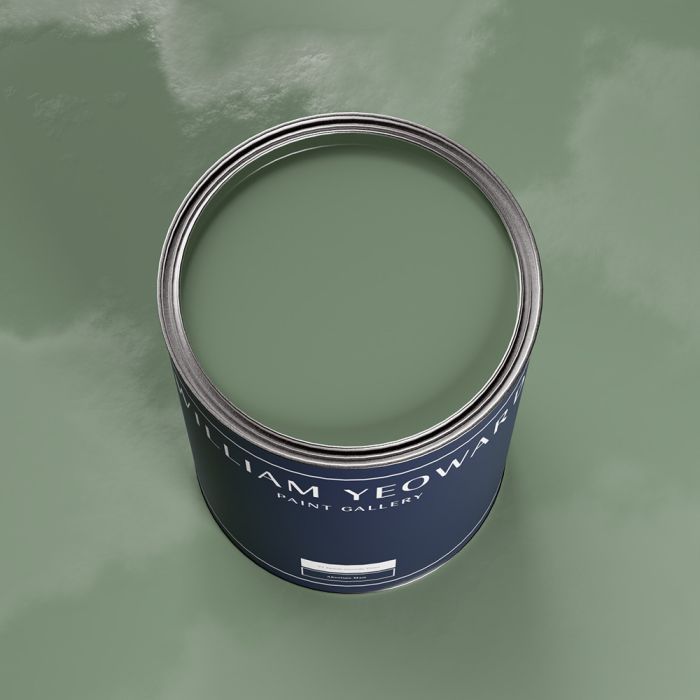
When we speak of “the color shale” in design, we are generally referring to these earth-bound, subdued tones—often a complex grey with hints of green, brown, or blue, characterized by a certain depth and maturity. It’s a color that feels grounded, authentic, and naturally occurring, distinguishing it from purely manufactured or synthetic shades.
A Spectrum of Sophistication: From Grey to Green to Brown
This inherent variability gives shale its sophisticated appeal. It avoids the starkness of pure black or white and the sometimes clinical feel of a flat grey. Instead, shale colors often possess:
- Depth and Texture: Even in a flat digital representation, the association with layered rock imbues shale with a sense of texture and substance.
- Subtlety: It rarely screams for attention but rather provides a solid, grounding presence.
- Versatility: Its complex nature allows it to harmonize with a wide array of other colors, acting as an exceptional neutral or a sophisticated primary shade.
Designers often leverage these subtle nuances. A “shale green” might be a muted, desaturated olive-grey, while “shale brown” could lean towards a cool, smoky taupe. This spectrum allows for great flexibility in creating brand palettes that feel both natural and refined.
Psychological Impact: Stability, Earthiness, and Understated Elegance
The psychological impact of the color shale is profoundly tied to its natural origins and muted characteristics.
- Stability and Reliability: Like the ancient rock it represents, shale conveys a sense of enduring strength, solidity, and dependability. Brands using shale can implicitly communicate their long-term vision and trustworthiness.
- Earthiness and Authenticity: It connects viewers to the natural world, suggesting authenticity, groundedness, and a lack of pretense. This resonates strongly with consumers increasingly seeking genuine experiences and sustainable products.
- Understated Elegance: Shale is sophisticated without being ostentatious. It suggests quiet confidence, professionalism, and a timeless quality, appealing to brands aiming for a classic, high-end, yet accessible image.
- Calmness and Serenity: Its subdued nature promotes a sense of calm and tranquility, making it suitable for brands that want to create a relaxing or professional environment.
These psychological associations make shale a potent choice for brands looking to establish a particular type of relationship with their audience—one built on trust, respect, and a shared appreciation for enduring quality.
Shale in Brand Identity: A Strategic Color Choice
Choosing shale for brand identity is a deliberate strategic move. Its multifaceted nature allows it to serve various functions within a brand’s visual language, from building trust to enhancing versatility.
Evoking Trust and Reliability: Industries that Benefit
Given its connotations of stability and groundedness, shale is an exceptional choice for industries where trust and reliability are paramount.
- Financial Services: Banks, investment firms, and insurance companies can use shale to project security, wisdom, and long-term vision, reassuring clients about their assets.
- Legal and Consulting: Law firms and business consultancies can leverage shale to convey professionalism, experience, and an authoritative yet approachable demeanor.
- Construction and Engineering: Brands in these sectors can use shale to directly link to the materials and foundations of their work, emphasizing durability, strength, and expert craftsmanship.
- Healthcare and Wellness: While not overtly warm, a softer shale can suggest competence, calm, and a scientific yet nurturing approach, particularly for clinics or wellness brands focused on natural therapies.
- Sustainable and Eco-friendly Brands: Shale naturally aligns with brands promoting environmental consciousness, organic products, or sustainable practices, reinforcing their connection to nature and authenticity.
In these sectors, shale acts as a visual anchor, providing a sense of gravitas and assurance that cuts through the noise of more vibrant or trend-driven palettes.
The Power of Neutrality: Versatility and Complementation
One of shale’s most significant strengths in branding is its superb performance as a neutral color. Unlike pure grey, its subtle undertones add warmth or coolness, preventing it from feeling bland.
- Backgrounds and Text: As a background color for websites, printed materials, or packaging, shale offers a soft, non-distracting canvas that allows other elements to pop. Its dark variations provide excellent contrast for lighter text, ensuring readability.
- Accent and Support Color: Shale works beautifully to ground more vibrant accent colors. Paired with a bold primary, it can create a sophisticated and balanced palette that is both energetic and refined. For instance, a brand could pair a deep shale with a bright coral or a rich emerald green to create a dynamic yet harmonious look.
- Subtle Brand Differentiation: In competitive markets where many brands use primary colors, a sophisticated shale palette can subtly differentiate a brand, positioning it as more refined, mature, or understatedly luxurious.
This versatility ensures that a shale-based brand identity can adapt across various applications, from digital interfaces to physical products, maintaining consistency and impact.
Distinguishing Shades: Warm vs. Cool Shale Palettes
Understanding the subtle differences between warm and cool shale tones is critical for brand designers.
- Cool Shale: These shades lean more towards blue or green undertones. They evoke a sense of calm, professionalism, and modernity. Cool shale works well for tech brands, corporate entities, or brands seeking a clean, minimalist aesthetic. It can feel sleek and intellectual.
- Warm Shale: These shades incorporate more brown, red, or yellow undertones. They feel more inviting, earthy, and organic. Warm shale is ideal for brands emphasizing comfort, tradition, natural products, or artisanal craftsmanship. It can evoke a sense of heritage and approachability.
A brand’s strategic color palette must consider these undertones, ensuring the chosen shale shade aligns perfectly with the desired brand personality and messaging.
Integrating Shale into Your Brand’s Visual Language
The effective integration of shale into a brand’s visual language extends beyond simply choosing a color; it involves a thoughtful application across all touchpoints to create a cohesive and impactful identity.
Logo Design and Typography: Foundations of First Impression
The logo is often the first visual encounter a consumer has with a brand, and typography reinforces its tone.
- Logo Design: A logo rendered in shale can immediately communicate seriousness, stability, and elegance. If the brand aims for a premium feel, a dark, rich shale can provide a sophisticated backdrop or be the primary color for a minimalist mark. Its inherent neutrality also allows for logo variations where it supports a more vibrant brand symbol.
- Typography: Using shale for body text or even headlines can soften the visual impact compared to pure black, making extended reading more comfortable while retaining a professional aesthetic. A cool shale for a modern sans-serif font can feel cutting-edge, while a warmer shale paired with a classic serif font can evoke timelessness and tradition.
The careful interplay between shale and other brand elements in the logo and typography sets the foundational tone for the entire brand identity.
Web and UI/UX Design: Creating Immersive Experiences
In digital environments, shale can play a crucial role in creating user-friendly and aesthetically pleasing experiences.
- Backgrounds and Layouts: A shale background on a website or app can reduce eye strain and provide a sophisticated canvas that makes content stand out. It creates a modern, clean look without feeling sterile.
- Interface Elements: Using shale for buttons, navigation bars, or card backgrounds can provide a sense of structure and professionalism. Its versatility allows it to be used for both primary and secondary UI elements, maintaining visual hierarchy.
- Contrast and Accessibility: When paired correctly with contrasting text colors (e.g., off-white, light grey, or a vibrant accent color), shale ensures optimal readability and meets accessibility standards, making the brand inclusive.
A well-implemented shale palette in UI/UX design can significantly enhance the user experience, making interactions feel intuitive, calm, and aligned with the brand’s sophisticated image.
Product Packaging and Merchandising: Tangible Brand Representation
For brands with physical products, packaging and merchandising are vital touchpoints where shale can truly shine, translating abstract brand values into tangible experiences.
- Premium Packaging: Shale on packaging can instantly elevate a product, suggesting quality, craftsmanship, and a premium price point. It works particularly well for luxury goods, artisanal foods, or high-end beauty products, where an understated elegance is desired.
- Sustainable Messaging: For eco-friendly brands, packaging in shale tones reinforces their commitment to natural materials and sustainability. It can evoke a sense of raw, unrefined beauty that aligns with ethical consumer values.
- Merchandising and Retail Environments: Using shale in retail displays, signage, or store interiors creates a sophisticated and calming atmosphere. It allows the products themselves to be the focal point while providing a grounded, elegant backdrop that enhances the overall brand experience.
In these contexts, shale moves beyond a mere color to become a tactile and experiential element of the brand, reinforcing its story through every interaction.
Case Studies: Brands Successfully Leveraging Shale
Numerous brands across diverse sectors have successfully integrated shale into their identity, demonstrating its versatility and strategic power.
From Tech Giants to Sustainable Startups
- Tech Industry: While many tech companies lean into bright, bold colors, some sophisticated players, particularly in enterprise software or hardware, opt for cooler, darker shale tones. This conveys reliability, data security, and serious innovation rather than fleeting trends. They use it in interfaces, branding for professional tools, or even hardware finishes to suggest robustness and advanced engineering.
- Sustainable Living Brands: Brands in organic food, sustainable fashion, or eco-conscious home goods often embrace warmer, greener shales. This directly links their brand to nature, authenticity, and responsible sourcing. Their packaging and digital presence frequently feature these earthy tones, reinforcing their core values.
Architectural and Interior Design Brands
- Architectural Firms: Many architectural and design studios use shale in their branding to symbolize the foundational elements of their work—concrete, stone, earth. It conveys a sense of structural integrity, timeless design, and sophisticated aesthetics. Their portfolios, websites, and office interiors often reflect a minimalist, shale-centric palette.
- High-End Furniture and Decor: Brands specializing in bespoke furniture, natural stone products, or artisanal home decor frequently incorporate shale. It highlights the natural beauty of materials, creating a luxurious yet understated appeal that resonates with discerning customers seeking quality and longevity.
Fashion and Lifestyle Brands
- Apparel and Accessories: In fashion, particularly for minimalist or high-end casual wear, shale-inspired colors are perennial favorites. They represent versatility, timelessness, and a chic, understated elegance. Brands use these tones for their core collections, packaging, and campaign visuals to project a sophisticated lifestyle.
- Luxury Lifestyle Products: From premium skincare to artisanal beverages, brands aiming for an elevated, refined image often turn to shale. It communicates quality ingredients, thoughtful craftsmanship, and an experience that is both exclusive and genuine.
These examples illustrate that shale is not confined to a niche but is a robust color choice for brands seeking to communicate depth, quality, and a lasting presence.
The Future of Earthy Tones in Branding
As consumer preferences evolve, the appeal of earthy tones like shale appears to be growing, driven by broader cultural shifts towards authenticity and sustainability.
Sustainability and Authenticity Trends
The increasing global awareness around environmental issues and a growing desire for genuine connections are powerful drivers for the continued relevance of shale. Brands that use these natural tones can tap into a consumer mindset that values:
- Eco-Consciousness: Visual cues that evoke nature resonate with consumers committed to sustainability.
- Transparency and Honesty: Earthy colors often feel less manufactured, suggesting an honest and straightforward brand ethos.
- Well-being and Mindfulness: The calming influence of natural colors aligns with the trend towards mindfulness and holistic well-being.
As these trends solidify, shale will likely remain a strong choice for brands wanting to communicate responsibility and genuineness.
Timeless Appeal vs. Fleeting Fads
Unlike certain vibrant or pastel trends that ebb and flow, the color shale possesses a timeless quality. Its foundation in natural geology ensures it transcends momentary fads, offering brands a long-term aesthetic investment. A brand built on a shale palette is less likely to feel dated quickly, providing consistency and reducing the need for frequent visual overhauls. This enduring appeal is invaluable for brands seeking to build a legacy rather than chasing fleeting attention.

Expert Tips for Mastering the Shale Palette
For brands considering shale, a few expert tips can ensure its masterful integration:
- Understand Your Undertone: Decide if your brand calls for a cooler, more modern shale or a warmer, more organic one. This decision will guide your entire palette.
- Pair with Purpose: Shale is excellent for grounding. Choose accent colors that either provide a sharp, intentional contrast (e.g., a bright white or a vibrant pop) or complement its earthiness (e.g., muted greens, terracottas).
- Consider Texture: Even in digital design, think about how shale evokes texture. Pairing it with tactile elements in packaging or subtle visual textures online can enhance its depth.
- Maintain Consistency: Apply your chosen shale shades consistently across all brand touchpoints—from your logo and website to your physical products and advertising—to build strong recognition and reinforce your brand’s core values.
- Test and Refine: Always test your shale palette in different contexts and lighting conditions to ensure it maintains its intended impact and legibility across various media.
The color shale is far more than just a muted grey. It is a sophisticated, versatile, and psychologically potent hue that, when strategically applied, can profoundly enhance a brand’s identity, communicate trust, and foster a lasting connection with its audience. Its enduring appeal lies in its inherent link to nature, stability, and understated elegance, making it an invaluable tool in the discerning brand designer’s palette.
aViewFromTheCave is a participant in the Amazon Services LLC Associates Program, an affiliate advertising program designed to provide a means for sites to earn advertising fees by advertising and linking to Amazon.com. Amazon, the Amazon logo, AmazonSupply, and the AmazonSupply logo are trademarks of Amazon.com, Inc. or its affiliates. As an Amazon Associate we earn affiliate commissions from qualifying purchases.