
The question “what is the best color for a bedroom?” transcends mere aesthetic preference; it delves into the realm of psychology, emotion, and, perhaps surprisingly, brand identity. While often considered a deeply personal choice, the principles governing color selection for a private sanctuary like a bedroom share striking similarities with strategic color deployment in brand building. Just as a corporate brand meticulously crafts its visual identity to evoke specific feelings and associations, an individual’s bedroom color palette can serve as a powerful tool for personal branding – reflecting values, influencing mood, and defining the essence of one’s private domain. Moreover, lessons from corporate branding in hospitality, where bedroom design directly impacts guest perception and brand recall, offer invaluable insights into creating truly impactful and effective color schemes.
In a world increasingly focused on curated experiences and authentic self-expression, understanding the “best” color for a bedroom transforms from a simple decor dilemma into an exercise in intentional design. This article will explore how color psychology, brand strategy, and the pursuit of personal authenticity converge to answer this question, offering a professional and insightful guide to crafting a bedroom that not only looks good but also powerfully communicates its intended message – be it tranquility, energy, luxury, or innovation.
The Psychology of Color: A Foundation for Brand Identity (and Your Bedroom)
At the heart of any effective branding strategy lies a deep understanding of human psychology, particularly how colors influence emotions, perceptions, and behaviors. This fundamental principle applies equally to selecting the “best” color for a bedroom. Every shade carries an intrinsic psychological weight, capable of shaping the atmosphere of a space and, by extension, the emotional state of its inhabitants. For brands, this translates into a powerful tool for forging connections; for a bedroom, it means creating a sanctuary that aligns with personal well-being and desired feelings.
Emotional Resonance and Brand Perception
Colors possess an extraordinary ability to evoke specific emotions and associations, often without conscious thought. A brand’s logo, website, or product packaging leverages this to communicate its core values instantly. Consider the calming blues often used by tech companies to convey reliability, or the vibrant reds of fast-food chains signaling energy and appetite. Similarly, in a bedroom, these same psychological principles are at play.
-
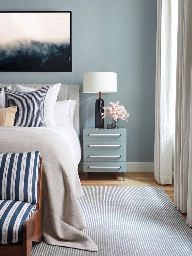
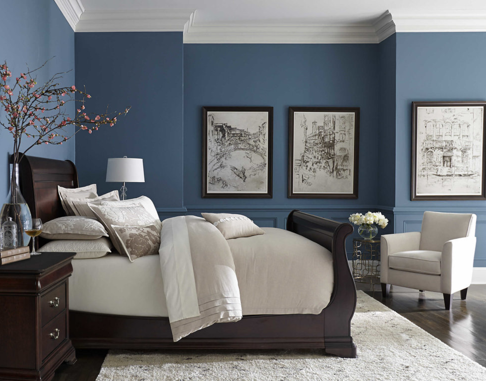
Blues: Widely associated with calm, stability, peace, and serenity. Often recommended for bedrooms due to their ability to lower heart rate and create a restful environment. For a personal brand aiming to project tranquility or intellectual depth, a blue bedroom can be a powerful statement.
-
Greens: Represent nature, growth, harmony, and renewal. They can be very soothing and balancing. A green bedroom might suit a personal brand focused on wellness, sustainability, or natural elegance.
-
Neutrals (Greys, Beiges, Whites): Convey sophistication, minimalism, and timelessness. They offer a versatile backdrop, allowing other elements to shine. For a personal brand emphasizing understated luxury, clarity, or modern simplicity, neutrals are ideal.
-
Warm Tones (Reds, Oranges, Yellows): Evoke energy, passion, warmth, and creativity. While reds can be too stimulating for a primary bedroom color, softer shades or accents can introduce vitality. Yellows can be uplifting and cheerful. These colors might align with a personal brand that is dynamic, creative, or overtly welcoming.
-
Purples: Often associated with luxury, creativity, wisdom, and spirituality. Lighter lavenders can be calming, while deeper purples add drama and richness. A purple bedroom could reflect a personal brand that is artistic, regal, or introspective.
Understanding these inherent emotional resonances is the first step in aligning your bedroom’s color with your personal brand aspirations, ensuring the space speaks volumes about who you are and how you wish to feel.
Universal Associations vs. Personal Interpretation
While many color associations are culturally universal (e.g., green for nature, blue for sky), personal experiences and individual preferences also play a significant role. A childhood memory tied to a specific color, for instance, can override universal perceptions. A “best” color for a bedroom, therefore, must balance these broader psychological principles with an individual’s unique subjective connection to color.
For brands, this translates into careful market research and audience segmentation. A brand targeting a global audience might opt for universally accepted color palettes, while a niche brand might leverage more specific cultural or subcultural color meanings. In your bedroom, this means trusting your gut feeling in addition to general advice. If a color traditionally considered stimulating (like a soft peach) genuinely makes you feel serene, then it is the “best” color for your bedroom. The ultimate goal is to create a harmonious environment that authentically reflects and supports your personal brand, combining psychological insights with individual intuition.
Crafting Your Personal Brand Through Bedroom Aesthetics
The concept of a “personal brand” extends beyond a professional resume or social media profile; it encompasses the authentic essence of who you are, what you value, and how you present yourself to the world. Your bedroom, as one of the most intimate and personal spaces, offers a unique canvas for expressing and reinforcing this personal brand. The colors you choose can consciously and subconsciously communicate your identity, values, and desired lifestyle, making your bedroom not just a place to sleep, but a strategic extension of your curated self.
Defining Your Personal Brand Persona
Before selecting a color, it’s crucial to define the core attributes of your personal brand persona. Are you a minimalist who values simplicity and order? A creative spirit thriving on vibrant energy? A serene individual seeking ultimate tranquility? Or perhaps a sophisticated personality drawn to classic elegance?
-
The Minimalist Brand: Focus on clean lines, decluttering, and a restrained color palette. Whites, light greys, and muted beiges create a calming, uncluttered aesthetic that speaks to clarity and focus.
-
The Creative Brand: Embrace unique color combinations, bold accents, or unexpected textures. Jewel tones, artistic murals, or a mix of complementary and contrasting colors can express individuality and innovation.
-
The Serene Brand: Prioritize soothing, muted tones. Soft blues, gentle greens, warm greys, and natural wood accents contribute to an atmosphere of peace and relaxation, reflecting a desire for calm.
-
The Luxurious Brand: Opt for rich, deep colors combined with sumptuous textures. Deep charcoals, emerald greens, navy blues, or even a touch of metallic gold can evoke opulence and refinement, enhancing a perception of high quality and sophistication.
By articulating these core characteristics, you can then bridge the gap between abstract values and tangible design choices, ensuring your bedroom’s aesthetic actively supports your personal brand narrative.
Translating Brand Values into Color Palettes
Once your personal brand persona is defined, the next step is to translate those values into a cohesive color palette for your bedroom. This involves not just choosing a dominant wall color, but also considering accent colors for bedding, artwork, furniture, and decorative elements. Think of this as developing your personal brand’s “color guidelines.”
-
Dominant Color: This sets the overall mood and is typically applied to the walls. It should be the primary expression of your core personal brand attribute (e.g., tranquil blue for serenity, crisp white for minimalism).
-
Accent Colors: These add depth, personality, and visual interest. They can highlight secondary aspects of your personal brand or introduce complementary energies. For a minimalist, a single vibrant art piece can hint at an underlying creative spark. For a serene brand, natural wood tones and plant greens can enhance the connection to nature.
-
Texture and Material: Color is not isolated. The finish (matte, gloss), texture (linen, velvet, wood), and material of your chosen colors also contribute significantly to the overall brand message. A matte blue wall feels different from a glossy one; a velvet throw in emerald green exudes a different kind of luxury than a cotton one.
By carefully integrating these elements, your bedroom transforms into a meticulously designed space that continuously reinforces your personal brand, providing an environment that nurtures your authentic self.
The Bedroom as a Reflection of Your Authentic Self
Ultimately, the “best” color for a bedroom is the one that most authentically reflects and supports your true self. It’s about creating a space where you feel completely at ease, energized, or soothed, depending on your needs. This authenticity is the cornerstone of powerful personal branding. A brand that feels inauthentic quickly loses credibility; similarly, a bedroom that doesn’t resonate with your true self can feel jarring or uninspiring.
When selecting colors, ask yourself: Does this color truly represent me? Does it evoke the feelings I want to experience in this space? Does it align with the personal brand I’m consciously or subconsciously building? Your bedroom should be a haven that revitalizes you, allowing you to recharge and be your most authentic self. The colors you choose are not just paint; they are a direct expression of your identity.
Corporate Branding in Hospitality: Lessons for Your Private Sanctuary

While your bedroom is a personal space, the strategic principles applied by major hotel chains and hospitality brands to their guest rooms offer invaluable insights into how color choices impact experience, perception, and brand loyalty. For these corporations, every design decision, especially color, is a calculated move to reinforce their brand identity and create a memorable guest experience. Learning from these masters of environmental branding can elevate your own bedroom design from mere decoration to a powerful, intentional statement.
Strategic Color Choices in Hotel Design
Leading hospitality brands understand that the bedroom (guest room) is their core product. The color palette of these rooms is never arbitrary; it’s a meticulously crafted element of their overall brand strategy.
-
Luxury Brands (e.g., Four Seasons, Ritz-Carlton): Often opt for sophisticated, muted palettes with rich, deep accent colors. Think warm greys, soft creams, deep blues, or subtle metallics. These colors convey elegance, tranquility, and exclusivity, aligning with their brand promise of unparalleled service and comfort.
-
Boutique/Lifestyle Brands (e.g., W Hotels, Kimpton Hotels): Embrace bolder, more vibrant colors, often with unique and trendy combinations. Their color choices reflect a desire to be fashionable, eclectic, and provide a distinctive, curated experience. The colors are part of their brand narrative of being cutting-edge and experiential.
-
Budget/Mid-Range Brands (e.g., Holiday Inn Express, Hampton Inn): Tend to use bright, clean, and often slightly energetic color palettes. Blues and greens mixed with crisp whites are common, aiming to convey freshness, reliability, and value. Their colors reinforce a brand promise of consistency and comfort without extravagance.
Each of these approaches is driven by a clear brand mission and target audience. For your bedroom, consider what “brand” experience you want to create for yourself. Do you seek the quiet luxury of a five-star hotel, the vibrant energy of a boutique stay, or the refreshing simplicity of a modern inn?
Enhancing Guest Experience and Brand Recall
A key objective for hospitality brands is not just to provide a place to sleep, but to deliver a consistent, memorable, and positive guest experience that encourages repeat visits and positive word-of-mouth. Color plays a critical role in achieving this. A well-chosen color palette can:
-
Influence Mood: A calming blue room helps guests relax after travel, aligning with the brand’s promise of a restful stay.
-
Define Atmosphere: A dramatic deep purple might create a romantic, intimate atmosphere, reinforcing a boutique hotel’s brand as a destination for couples.
-
Aid Navigation/Recognition: Consistent use of brand colors in rooms and public spaces helps guests subconsciously recognize and feel comfortable within the brand environment.
For your bedroom, translate “guest experience” to “your personal experience.” How do you want to feel when you wake up? How do you want to feel when you unwind? The colors should actively contribute to these desired states, making your bedroom a space that consistently “performs” for your well-being. A memorable bedroom experience, for you, means a space that continually nurtures and reflects your ideal self, fostering a sense of belonging and peace.
Consistency and Cohesion Across Spaces
Major brands ensure color consistency not only within each room but also across all their properties and marketing materials. This cohesion builds a strong, recognizable brand identity. A guest checking into a Marriott in London should feel the same underlying brand essence as in New York, partly due to consistent color applications.
While you don’t have multiple “properties,” you can apply this principle of consistency and cohesion within your own home. Your bedroom doesn’t exist in isolation. How does its color palette relate to the adjoining bathroom, hallway, or even your overall home aesthetic? Does it contribute to a harmonious flow, or does it clash?
Consider how your bedroom’s color scheme integrates with the broader “brand” of your home and, by extension, your lifestyle. A harmonious color flow can create a sense of calm and intentionality throughout your living space, reinforcing your overall personal brand message of thoughtfulness and design acumen. This holistic approach to color ensures that your bedroom is not just an island of design but an integral part of a larger, cohesive, and branded living environment.
Beyond Trend: Sustaining Your Brand’s (and Bedroom’s) Timeless Appeal
In the world of branding, chasing every fleeting trend can dilute a brand’s identity and lead to costly rebrands. The most successful brands build a core identity that is timeless, adaptable, and enduring. This principle is equally vital when selecting the “best” color for your bedroom. While incorporating subtle nods to current trends can keep a space feeling fresh, grounding your color choices in classic strategies ensures that your bedroom remains a relevant and comforting sanctuary for years to come, truly embodying a lasting personal brand.
Investing in Longevity: Classic Color Strategies
Certain color palettes have stood the test of time, proving their versatility and enduring appeal. These classic choices are the equivalent of a brand’s iconic logo or signature product – they don’t go out of style.
-
Neutrals as a Base: Whites, off-whites, greys, and beiges provide a timeless and versatile foundation. They are the “blank canvas” that allows for flexibility. A brand that uses a strong neutral base often communicates reliability, sophistication, and adaptability. In your bedroom, a neutral base allows you to update bedding, artwork, and accessories with ease, changing your “brand message” subtly without a full overhaul.
-
Earthy Tones: Soft greens, muted blues, terracotta, and warm browns connect us to nature and evoke a sense of calm and grounding. These colors rarely feel dated and are perfect for a personal brand that values natural connection, stability, or organic living.
-
Subtle Saturated Hues: Instead of neon brights, opting for richer, slightly desaturated versions of colors (e.g., dusty rose instead of hot pink, deep teal instead of bright aqua) can provide color without overwhelming the space or quickly becoming tiresome. These are the equivalent of a brand’s well-chosen corporate colors – distinctive yet not jarring.
Investing in these classic color strategies for your bedroom ensures that your personal brand’s aesthetic remains robust and elegant, transcending passing fads and maintaining a sense of enduring quality.
Adapting and Evolving Without Losing Core Identity
Even the most timeless brands evolve. They update their messaging, expand their product lines, or subtly tweak their visual identity to remain relevant. However, they always retain a core essence that is instantly recognizable. Similarly, your bedroom’s color scheme should be adaptable, allowing for personal growth and changing tastes without requiring a complete reinvention.
-
Layering and Accessories: A neutral wall color provides the ultimate flexibility. You can introduce new “brand expressions” through changeable elements like throw pillows, blankets, curtains, lamps, and artwork. These are the “seasonal campaigns” of your bedroom’s brand, allowing for fresh takes without altering the core structure.
-
Focus on Accent Walls: If you desire a bolder statement, an accent wall in a trendier color can be a fantastic solution. It allows you to experiment with a more dynamic “brand message” in a contained way, which is easier and less costly to update than an entire room.
-
Embracing Personal Evolution: Your personal brand isn’t static. It grows and changes as you do. Your bedroom’s color choices should be able to evolve with you, whether through minor updates or a thoughtful re-evaluation of your core aesthetic as your life stages shift.
This adaptive approach ensures your bedroom’s “brand” remains fresh and relevant, always reflecting your current self without losing sight of the timeless values that define you.
The Role of Lighting and Texture in Reinforcing Your Brand
Color rarely acts alone. In brand design, typography, imagery, and layout work in concert with color to create a holistic message. In your bedroom, lighting and texture are crucial allies to your chosen color palette, significantly amplifying its impact and reinforcing your personal brand.
-
Lighting: The way natural and artificial light interacts with your chosen colors can drastically alter their appearance and mood. A warm light bulb can make a cool blue feel more inviting, while bright white light can enhance the crispness of a neutral palette. Consider the “mood lighting” of your personal brand – is it soft and inviting, or bright and energizing? Strategic lighting can help achieve this.
-
Texture: Textural elements add depth, warmth, and sophistication, complementing your color choices. A plush rug, a linen duvet cover, wooden furniture, or metallic accents can elevate even the simplest color scheme. Textures communicate a sensory aspect of your personal brand – is it cozy, luxurious, rugged, or sleek?
By thoughtfully integrating lighting and texture with your chosen colors, you create a multi-sensory brand experience within your bedroom. This holistic approach ensures that your space is not just visually appealing but deeply resonant, reinforcing your personal brand through every detail. The “best” color for a bedroom, therefore, is never a singular choice, but rather a carefully composed symphony of color, light, and texture, all working in harmony to reflect and enhance the authentic brand of you.
aViewFromTheCave is a participant in the Amazon Services LLC Associates Program, an affiliate advertising program designed to provide a means for sites to earn advertising fees by advertising and linking to Amazon.com. Amazon, the Amazon logo, AmazonSupply, and the AmazonSupply logo are trademarks of Amazon.com, Inc. or its affiliates. As an Amazon Associate we earn affiliate commissions from qualifying purchases.