In the vast landscape of visual communication, few elements possess the primal, immediate impact of the color red. When we ask, “What does red mean?” in the context of brand strategy, we are not merely discussing a wavelength of light; we are analyzing a high-stakes tool used to influence human behavior, dictate market positioning, and evoke visceral emotional responses. In the world of branding, red is the ultimate disruptor. It is a color that refuses to be ignored, demanding attention and signaling everything from passion and energy to urgency and authority.
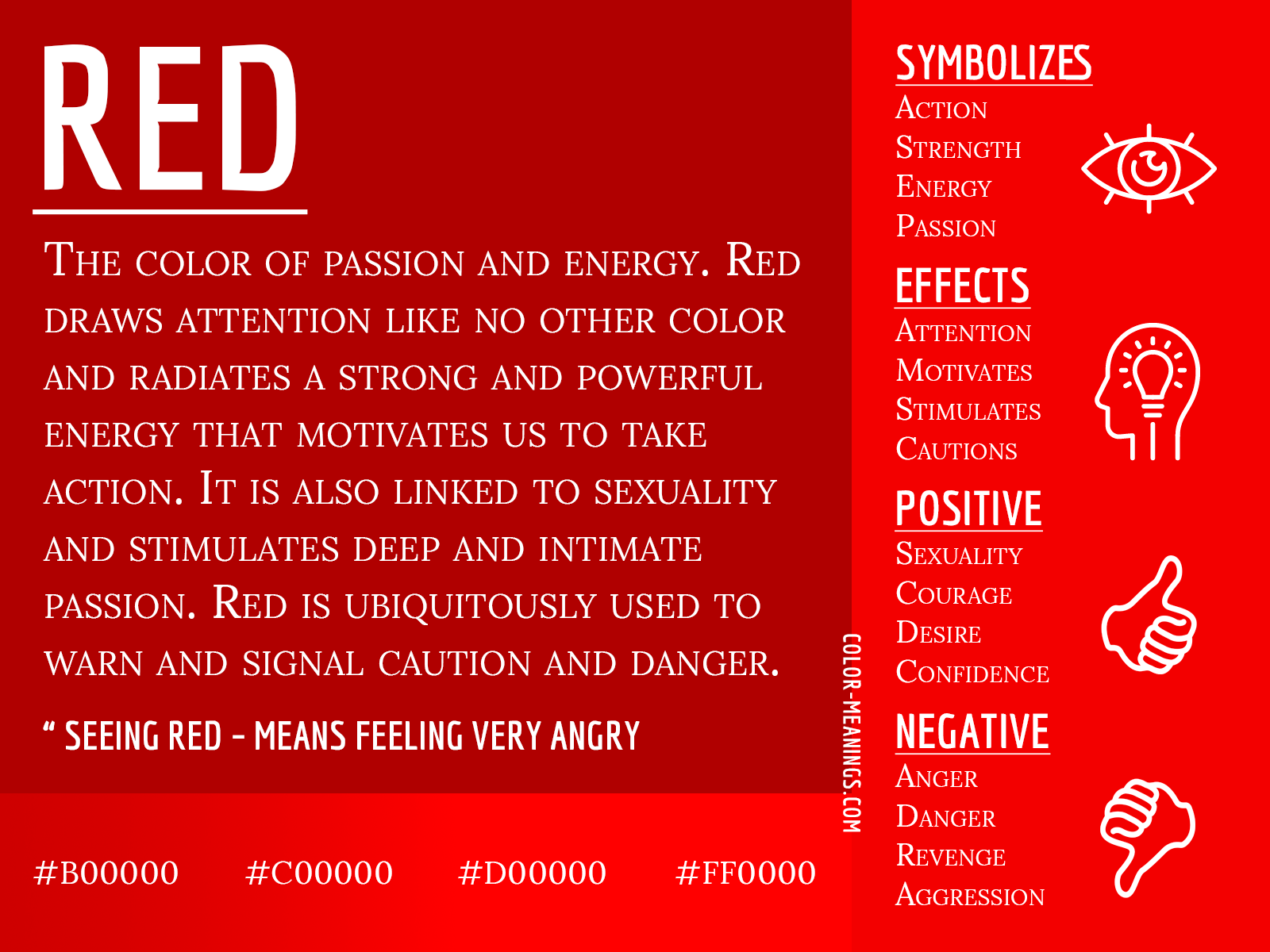
Understanding the strategic application of red requires a deep dive into psychology, cultural sociology, and market design. For a brand, choosing red is a declaration of intent. It suggests a brand that is bold, confident, and ready to lead. However, the misuse of this powerful hue can lead to associations with danger or aggression. This article explores the multifaceted role of red in branding, examining why it remains one of the most popular and effective colors in the corporate identity toolkit.
The Psychology of Red: Why It Commands Attention
To understand the strategic value of red, one must first understand how the human brain processes it. From an evolutionary perspective, red is hardwired into our survival instincts. It is the color of blood and fire—elements that signal both life-sustaining heat and life-threatening danger. Because of this, our eyes are naturally drawn to red faster than almost any other color in the spectrum.
Psychological Triggers and Emotional Response
In branding, red is used to stimulate physical arousal. Scientific studies have shown that exposure to red can actually increase a person’s heart rate and respiratory rate. This physiological response translates directly into consumer behavior. Red creates a sense of excitement and energy. It is the color of “doing” rather than “thinking.” This is why brands in the entertainment, food, and automotive industries frequently lean on red to foster a sense of dynamism and vitality.
Furthermore, red is deeply associated with passion and desire. It suggests a brand is “heart-centered” or intensely focused on its mission. When a consumer sees a red logo, the subconscious message is often one of warmth, intensity, and high stakes. It bypasses the analytical mind and speaks directly to the gut, making it an invaluable asset for brands that want to build an impulsive or emotional connection with their audience.
Red and the Physiology of Consumer Behavior
Beyond mere emotion, red has a functional impact on how we consume. It is a well-documented phenomenon in the hospitality and food industries that red stimulates appetite. By triggering the nervous system, it can make consumers feel hungrier and more decisive. This is not a coincidence; it is a calculated design choice. When a fast-food chain uses a red and yellow palette, they are using a “ketchup and mustard” theory to encourage quick decision-making and high turnover. In a retail environment, red signals a “sale” or a “clearance,” tapping into the fear of missing out (FOMO) and driving immediate action.
Strategic Implementation: When and How to Use Red in Brand Identity
Choosing to use red in a brand’s corporate identity is a significant strategic move. It is rarely used as a neutral background; instead, it is used to anchor a brand’s personality or to highlight specific calls to action. For a brand strategist, the question is not just whether to use red, but which shade and in what proportion.
Creating Urgency and Call-to-Action Efficiency
In the digital space, red is often the go-to color for buttons, notifications, and alerts. Because red signals “stop” or “look here,” it is exceptionally effective for conversion rate optimization (CRO). A red “Buy Now” button stands out against almost any background, creating a visual hierarchy that guides the user toward the desired outcome.
However, the “meaning” of red in this context is also about urgency. It suggests that the opportunity is fleeting. Brands that focus on flash sales, limited-time offers, or breaking news utilize red to create a high-velocity environment. By capitalizing on the color’s association with importance, these brands can cut through the noise of a crowded digital marketplace.
Red as a Tool for Market Differentiation
In industries dominated by “safe” colors like corporate blue or tech green, red serves as a powerful differentiator. Blue is the color of stability, trust, and calmness—used by banks and social media giants to make users feel secure. Red, conversely, is the color of disruption.
When a brand enters a saturated market and wants to position itself as the bold alternative, red is the primary choice. It signals that the brand is not there to blend in, but to lead. This “Red Ocean” strategy (as opposed to a “Blue Ocean”) involves competing in an existing industry where boundaries are defined, but using the color red to signal a more aggressive, high-energy, or premium approach to the competition.
Case Studies: Iconic Brands That Own the Red Space
To truly understand what red means in branding, we must look at the giants who have successfully claimed the color as their own. These brands don’t just use red; they have integrated it so deeply into their identity that the color itself evokes the brand name.

Coca-Cola: Consistency and Nostalgia
Coca-Cola is perhaps the most famous example of “owning” a color. The specific shade of “Coke Red” is legally protected and instantly recognizable worldwide. For Coca-Cola, red represents more than just energy; it represents a sense of classic Americana, joy, and social connection. By pairing red with white, the brand maintains a clean, timeless look that suggests both excitement and purity. The longevity of this color choice has allowed Coca-Cola to build an incredible amount of brand equity, where the sight of a red can alone can trigger a craving or a nostalgic memory.
Netflix: Innovation and the Cinematic Experience
Netflix uses red to bridge the gap between traditional cinema and modern digital streaming. The red in the Netflix logo is a nod to the “red carpet” and the velvet curtains of old movie theaters. It positions the brand as a premium provider of entertainment. In a digital interface that is primarily dark (the “dark mode” aesthetic), the vibrant red “N” pops, signifying a portal into a world of stories. For Netflix, red means “the show is starting,” effectively capturing the user’s attention in a crowded app tray.
Target: Transforming Retail with Visual Hierarchy
In the retail sector, Target uses red to distinguish itself from competitors like Walmart (blue) or Amazon (orange/black). The Target “Bullseye” is a masterpiece of minimalist branding. Here, red signifies precision, accessibility, and a slightly more “boutique” feel than other big-box retailers. Target’s use of red is comprehensive, from their store interiors to their shopping carts, creating a cohesive brand universe that feels energetic and organized.
Global Context: The Cultural Nuances of Red in International Marketing
While the psychological effects of red are somewhat universal, its cultural meanings vary significantly. For a global brand, understanding what red means in different territories is crucial to avoiding costly marketing blunders.
Western vs. Eastern Interpretations
In most Western cultures, red is the color of love, passion, and danger. It is the color of Valentine’s Day but also the color of a stop sign. However, in many Eastern cultures, particularly in China, red has a vastly different primary connotation. It is the color of luck, prosperity, and happiness. During the Lunar New Year, red envelopes are exchanged to symbolize good fortune.
For a brand like HSBC or AIA Insurance, using red in Asian markets is a strategic alignment with local values of wealth and success. Conversely, in some South African contexts, red is the color of mourning. A brand strategy that works in New York might resonate very differently in Johannesburg or Beijing. Therefore, “what red means” is often a question of geography.
Navigating Cultural Sensitivity in Global Campaigns
When brands go global, they must decide whether to maintain a standardized color palette or adapt to local preferences. Most major brands choose standardization to maintain a global identity, but they adjust their messaging. For instance, a red-branded luxury car might emphasize “passion and speed” in Europe, while emphasizing “status and prosperity” in China. Understanding these nuances allows a brand to use the same visual identity while tapping into different cultural “meanings” of the color.
The Future of Red: Digital Interfaces and High-Tech Branding
As we move further into a digital-first world, the application of red is evolving. With the rise of OLED screens and high-definition displays, the way we perceive color is shifting. Red, which can be eye-straining in large doses on a screen, is being used with more surgical precision.
Accessibility and Contrast in UX Design
In modern User Experience (UX) design, the meaning of red is being refined by the need for accessibility. Designers must ensure that red elements are distinguishable for users with color vision deficiencies (CVD). This has led to a shift toward specific shades of “accessible red” that maintain high contrast. In this context, red means “action,” but it must be paired with other cues—like icons or text—to ensure the message is clear.

The Transition from Print to Pixels
In the era of print, red was often expensive or difficult to replicate consistently across different materials. Today, digital branding allows for a vibrancy that was previously impossible. We are seeing a trend toward “Neon Red” or “Electric Red” in the tech and fintech sectors. These hyper-saturated reds signal innovation, “future-proofing,” and a break from the dull, muted tones of the past. As AI and software companies look to stand out, they are increasingly reclaiming red as the color of the “new guard” in technology.
In conclusion, “what red means” in the world of branding is a complex interplay of biology, psychology, and culture. It is a tool of immense power that, when used correctly, can propel a brand to the forefront of the consumer’s mind. Whether it is used to stimulate an appetite, signal a sale, or define a cinematic experience, red remains the most vibrant and essential weapon in the brand strategist’s arsenal. To wear the red logo is to accept the challenge of being bold, being seen, and being remembered.
aViewFromTheCave is a participant in the Amazon Services LLC Associates Program, an affiliate advertising program designed to provide a means for sites to earn advertising fees by advertising and linking to Amazon.com. Amazon, the Amazon logo, AmazonSupply, and the AmazonSupply logo are trademarks of Amazon.com, Inc. or its affiliates. As an Amazon Associate we earn affiliate commissions from qualifying purchases.