
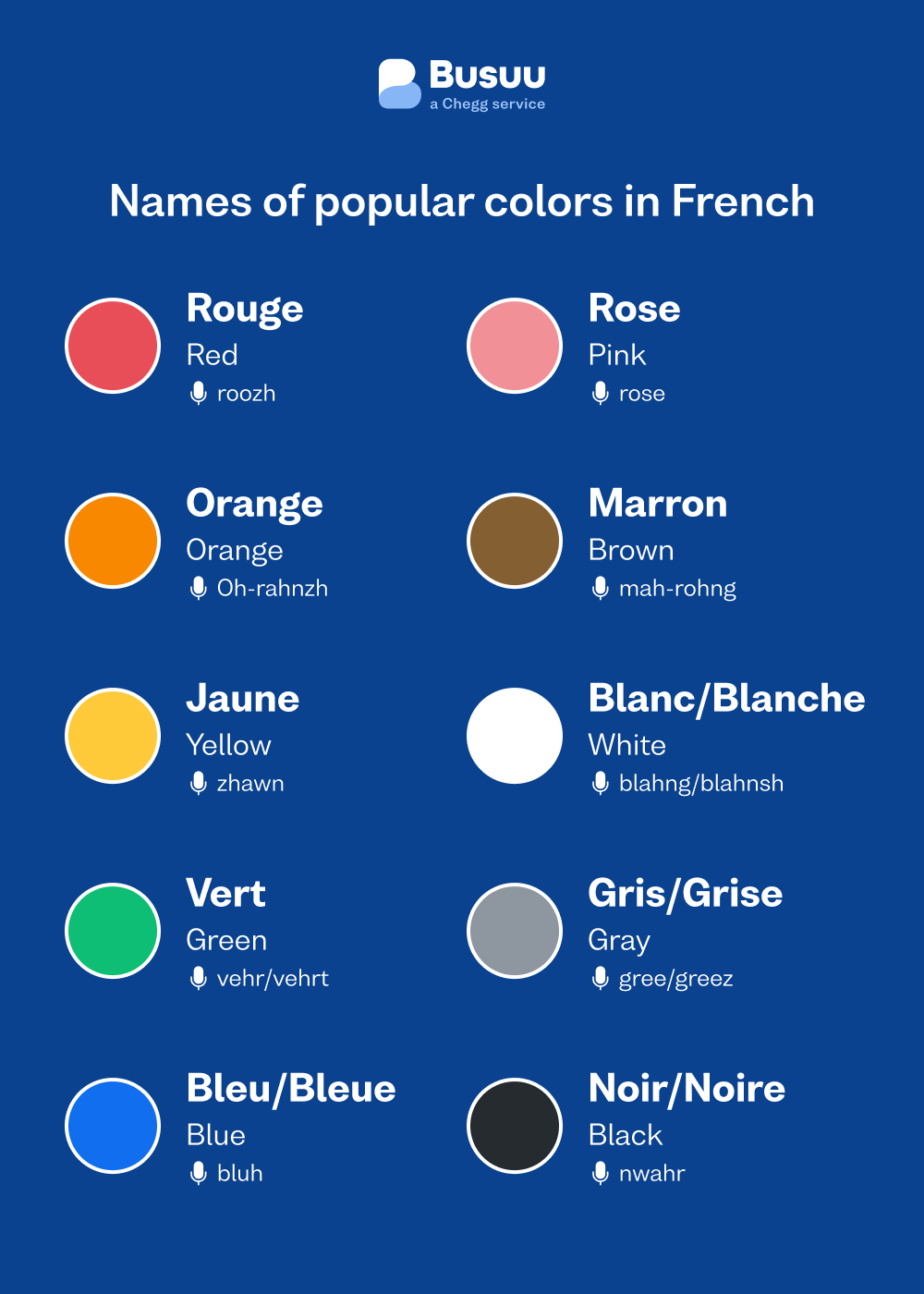
In the world of international brand strategy, a translation is never just a word-for-word exchange. When a business leader asks, “What is red in French?”, they may be looking for the linguistic answer—rouge—but the strategic answer is far more complex. In the context of global branding, “red” in the French market represents a sophisticated tapestry of historical revolution, high-end luxury, emotional intensity, and specific consumer expectations. To succeed in France and other Francophone territories, a brand must understand that visual identity is a language of its own.
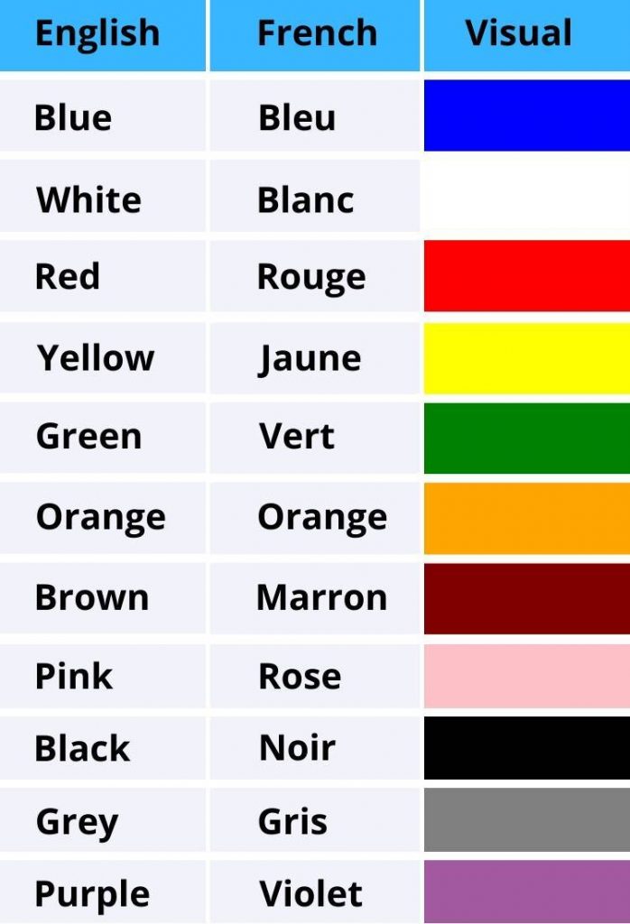
Navigating the French market requires more than a localized website; it requires an appreciation for the semiotics of color. Red is perhaps the most powerful tool in a designer’s arsenal, but its application in the Hexagon (mainland France) differs significantly from its use in North America or Asia. For a brand to resonate, it must master the nuances of le rouge and understand how this primary color dictates consumer behavior, brand loyalty, and perceived value.
The Semiotics of “Rouge”: More Than Just a Color
In branding, semiotics is the study of signs and symbols and their interpretation. In France, red is not merely a hue; it is a cultural signifier with deep historical roots. Unlike the American association of red with “clearance sales” or “fast food,” the French association often leans toward prestige, culinary excellence, and intellectual passion.
Historical Significance of Red in French Culture
To understand the French consumer, one must understand the French flag—the Tricolore. The red stripe on the French flag historically represents the blood of the people and the heat of the revolution. This gives the color a sense of “power to the people” and a grassroots vitality that is distinct from the imperial reds of other nations. When a brand uses a bold, primary red in France, it can evoke a sense of national pride and democratic energy.
However, there is a duality. Red is also the color of the monarchy’s theater curtains, the velvet of the opera house, and the wax seals of ancient aristocracy. This duality allows brands to pivot between being “of the people” and “for the elite.” A brand strategist must decide which side of the red spectrum they are tapping into: the revolutionary red of social change or the velvet red of Parisian heritage.
Psychological Triggers: Energy, Passion, and Taste
In the French psychological landscape, red is intrinsically linked to the senses. It is the color of a Bordeaux wine, a ripe strawberry from a provincial market, and the “femme fatale” aesthetic of Parisian fashion. For brands in the food and beverage industry, red in France signifies “terroir” (the soul of the land) and artisanal quality.
Furthermore, red is the color of la passion. In French marketing, emotional resonance often outweighs purely functional messaging. Brands that use red are expected to tell a story of desire, craftsmanship, or intense experience. If your brand strategy involves red, your messaging must be equally bold; a timid brand using a red palette will face a cognitive dissonance with the French consumer.
The Red Sole and the Red Box: Case Studies in High-End Brand Assets
The most successful brands in France have not just used red; they have “owned” it. Through rigorous brand protection and consistent visual storytelling, certain French entities have made specific shades of red synonymous with their corporate identity.
Christian Louboutin: The Power of the Red Sole
Perhaps no brand better exemplifies the strategic use of red than Christian Louboutin. The “Panton 18-1663 TPX” vibrant red used on the soles of Louboutin shoes is a masterclass in personal branding and corporate identity. In the French market, this flash of red is a “coded” signal of luxury. It is subtle yet unmistakable.
Louboutin’s strategy was to take a color associated with passion and apply it to a hidden area of the product, creating a sense of “exclusive discovery.” The legal battles Louboutin has fought to trademark the red sole across Europe highlight how valuable a color can become. For this brand, red is not just a design choice; it is the primary asset that distinguishes a multi-thousand-dollar product from its competitors.
Cartier: The Luxury of the Red Box
While Louboutin owns the sole, Cartier owns the box. The “Cartier Red” is a deeper, more crimson shade that evokes the feeling of a treasure chest. In French luxury branding, the packaging is often as important as the product. The red leatherette box with gold detailing serves as a brand ambassador.
When a consumer sees a Cartier red box, the emotional response is immediate. It signifies a milestone—an engagement, an anniversary, or a significant achievement. This use of red leverages the color’s association with “the heart” and “permanence.” For a global brand looking to enter the French market, the lesson here is consistency. Cartier has not wavered from this shade for decades, building a “color equity” that is virtually impenetrable.
Cultural Context: When Red Means Revolution vs. Romance
Strategic branding requires an understanding of context. The meaning of red can shift depending on the industry and the specific demographic being targeted. A “red” strategy for a fintech startup in Station F (Paris’s tech hub) will look very different from a “red” strategy for a fragrance house in Grasse.
Red in the Professional and Financial Sector
In many Western markets, “red” in finance is negative—the color of debt and “red ink.” However, in the French corporate identity landscape, red can signify dynamism and leadership. Many major French institutions, such as Société Générale, utilize a red and black palette. This combination suggests a balance of strength (black) and energy (red).
For a brand entering the French professional services space, using red can be a way to stand out against the “safe” blues and greys of international competitors. It signals a brand that is not afraid to take a stand or lead the market. However, the shade must be carefully selected; a bright, neon red may feel “cheap,” whereas a deep matte red suggests stability and sophistication.
The Romantic Aesthetic and the Lifestyle Market
In the lifestyle, beauty, and hospitality sectors, red is the language of romance. This is particularly relevant for the “Made in France” (Origine France Garantie) branding. International consumers often associate France with the “red lip” or the “red rose.”
When branding a product for the French lifestyle market, red should be used to evoke the “Art de Vivre.” This is not about the aggressive red of a “sale” sign; it is about the “rouge” of a lifestyle that prioritizes pleasure, aesthetics, and the senses. Branding here should be tactile—using textures like matte paper, embossed logos, and high-quality pigments to ensure the red feels “premium.”
Strategic Implementation: Building a Visual Identity for the Francophone Consumer
If you are developing a brand identity for the French-speaking world, your “red” must be intentional. This involves more than just selecting a HEX code; it involves a holistic approach to design and communication.
Design Principles for the French Aesthetic
The French aesthetic often favors “clarté” (clarity) and “élégance.” When incorporating red into a brand’s visual identity:
- Use Red as an Accent: Often, the most effective French branding uses a neutral palette (whites, creams, blacks) with red as the “pop” of color. This mirrors the classic Parisian fashion sensibility.
- Mind the Typography: Red is a heavy color visually. Pairing it with delicate, serif typography (like Didot or Garamond) can balance the boldness of the color with a sense of French heritage.
- Consistency Across Touchpoints: Whether it is the favicon on a website or the ribbon on a physical gift, the shade of red must be identical. The French consumer is discerning and sensitive to “brand drift.”
Digital Branding and UI/UX for French Consumers
In digital design, “red” has functional meanings—error messages, deletions, or warnings. When building a French-language app or website, a brand must be careful that its brand-red does not get confused with functional-red.
In the French digital landscape, there is a growing trend toward “minimalist luxury.” Red is used sparingly for Call-to-Action (CTA) buttons to signify importance without being overwhelming. Furthermore, when localizing content, the word “rouge” itself can be used in marketing copy to evoke specific imagery. Phrases like le fil rouge (the common thread) are common in French business storytelling to describe the core strategy of a project.

Conclusion: The “Rouge” Strategy
To answer the question “What is red in French?” is to embark on a journey through the heart of French identity. For a brand, rouge is a tool of immense power. It can signal the revolutionary spirit of a new tech startup, the timeless elegance of a luxury maison, or the sensory richness of a culinary brand.
The key to a successful “red” strategy in France lies in nuance. It is the difference between the red of a discount sticker and the red of a Louboutin sole. By understanding the historical, psychological, and cultural layers of the color, a brand can move beyond simple translation and achieve true cultural integration. In the French market, if you want to be seen, you use red. If you want to be remembered, you must master le rouge.
aViewFromTheCave is a participant in the Amazon Services LLC Associates Program, an affiliate advertising program designed to provide a means for sites to earn advertising fees by advertising and linking to Amazon.com. Amazon, the Amazon logo, AmazonSupply, and the AmazonSupply logo are trademarks of Amazon.com, Inc. or its affiliates. As an Amazon Associate we earn affiliate commissions from qualifying purchases.