In the rapidly evolving landscape of technology, the term “colorblind” has migrated from the halls of ophthalmology clinics into the core of software development and user experience (UX) design. Known scientifically as Color Vision Deficiency (CVD), colorblindness affects approximately 1 in 12 men and 1 in 200 women globally. In the context of technology, being “colorblind-aware” is no longer a niche design choice; it is a fundamental requirement for building inclusive, high-performing digital products.
When we ask “what is colorblind” within the tech sector, we are essentially asking: How do we ensure that information transmitted via light and color remains accessible to every user, regardless of their physiological visual hardware? This article explores the technical dimensions of color vision deficiency, the frameworks for inclusive design, and the emerging technologies aimed at bridging the gap between digital content and visual perception.
Decoding Colorblindness in the Digital Age
To address colorblindness in technology, we must first understand the technical breakdown of how users interact with screens. Most digital displays rely on the RGB (Red, Green, Blue) color model. However, for a user with CVD, the data transmitted by these sub-pixels is processed differently by the brain due to overlapping or missing photopigments in the eye.
The Science of Color Vision Deficiency (CVD)
In the tech world, we categorize CVD into three primary technical buckets:
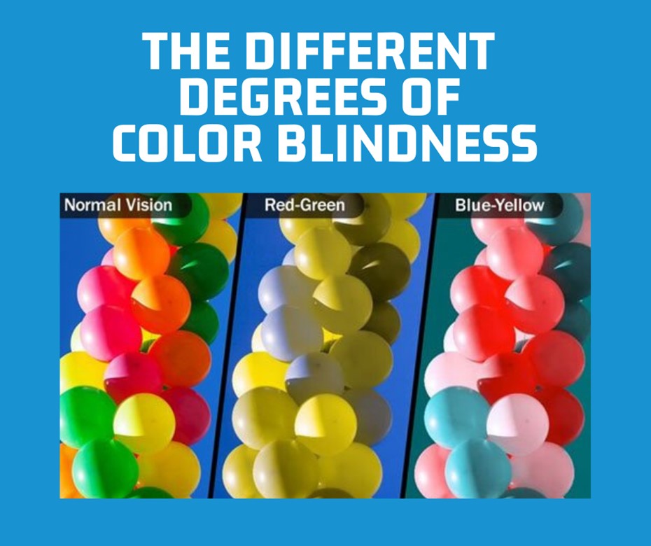
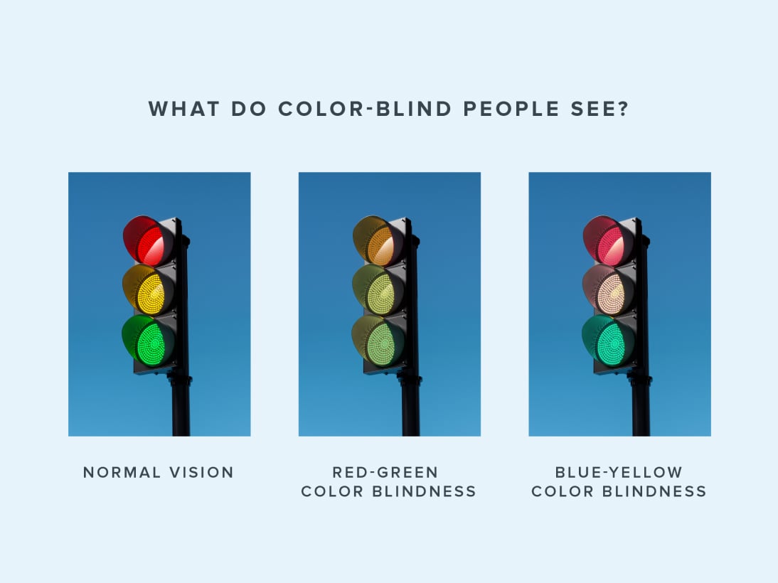
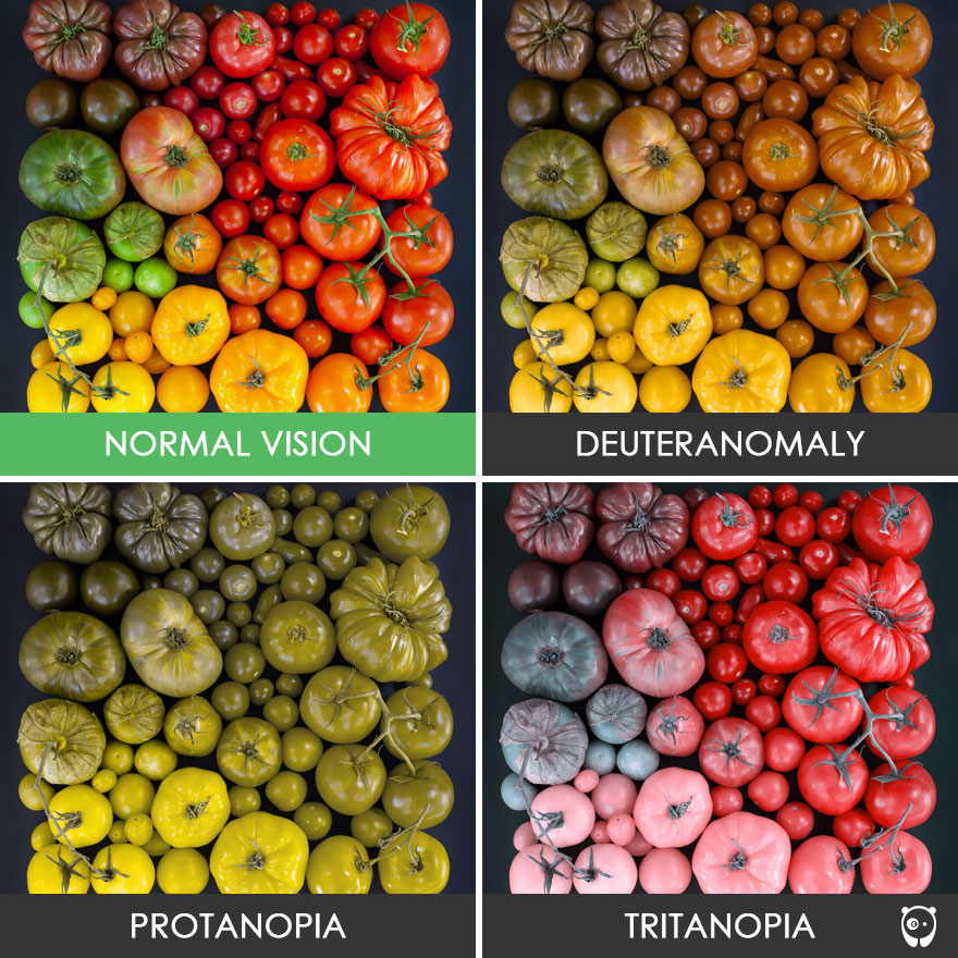
- Protanopia and Deuteranopia (Red-Green Deficiency): This is the most common form. For software developers, this means that “Green for Go/Success” and “Red for Stop/Error” are virtually indistinguishable if color is the only signifier.
- Tritanopia (Blue-Yellow Deficiency): This rarer form affects the ability to distinguish between blues and greens, or yellows and violets.
- Monochromacy (Total Colorblindness): While extremely rare, users see the world in grayscale. This requires a design strategy that relies entirely on luminance and contrast rather than hue.
Why Tech Professionals Must Care
From a software engineering perspective, ignoring CVD leads to “functional blindness” within an app. If a navigation bar uses color-coded alerts to indicate system status, a colorblind user may miss critical security updates or error logs. In the era of Big Data and complex dashboards, information density is at an all-time high. If the “Tech Stack” of a brand’s digital presence isn’t optimized for colorblindness, the company risks alienating a significant percentage of its user base and potentially facing legal hurdles regarding digital accessibility.
Implementing Color-Agnostic Design in UI/UX
The solution to colorblindness in technology is not to stop using color, but to ensure that color is never the only carrier of information. This is known as “Color-Agnostic” or “Inclusive Design.” By decoupling information from specific hues, developers create more robust interfaces that benefit all users, including those in high-glare environments or those using low-quality displays.
Beyond the Palette: Using Texture, Shape, and Contrast
The most effective tech products utilize “redundant coding.” This involves using multiple visual cues to convey a single message.
- Icons and Labels: Instead of just turning a form field red when there is an error, inclusive tech adds an “X” icon or a text label that says “Required.”
- Contrast Ratios: The Web Content Accessibility Guidelines (WCAG) provide specific mathematical formulas for contrast. For instance, a contrast ratio of at least 4.5:1 is required for standard text. In tech development, this is a non-negotiable metric that ensures readability against various background colors.
- Patterns and Textures: In data visualization software (like Tableau or Power BI), using dashed lines versus solid lines, or cross-hatched patterns in bar charts, allows colorblind users to distinguish between data sets without needing to identify the specific colors.
The Role of WCAG Guidelines in Software Development
The World Wide Web Consortium (W3C) has established the Web Content Accessibility Guidelines (WCAG), which serve as the “ISO standards” for digital accessibility. For a tech company, achieving WCAG 2.1 or 2.2 compliance (Level AA or AAA) is a badge of technical excellence.
- Success Criterion 1.4.1: This specifically states that color should not be used as the only visual means of conveying information, indicating an action, prompting a response, or distinguishing a visual element.
- Technical Implementation: Modern CSS (Cascading Style Sheets) and ARIA (Accessible Rich Internet Applications) labels allow developers to programmatically define elements so that screen readers and assistive technologies can interpret color-based information for the user.
Essential Tools and Technologies for Colorblind Accessibility
As the demand for inclusive tech grows, a suite of tools has emerged to help developers and designers simulate and solve for colorblindness during the production cycle. These tools act as “empathy engines,” allowing sighted developers to see their products through the lens of a user with CVD.
Simulation Software for Designers
Before a single line of code is pushed to production, design teams use simulation software to “stress-test” their UI.
- Adobe Color & Stark: These are industry-standard plugins for Figma and Adobe XD. They allow designers to toggle between different types of colorblindness in real-time, highlighting areas where contrast fails or where two colors bleed into one another.
- Browser Emulation: Google Chrome and Firefox now include built-in vision deficiency simulators in their Developer Tools. By opening the “Rendering” tab, a developer can view their entire website as it would appear to someone with Protanopia, ensuring that the “Add to Cart” button remains distinct from the background.
AI-Powered Vision Enhancement and Apps
The next frontier of “What is Colorblind” in tech involves Artificial Intelligence and Augmented Reality (AR).
- Real-Time Color Shifting: New mobile apps and browser extensions use AI to shift colors in real-time. For example, if a user is looking at a map where red and green lines overlap, the software can shift the red toward magenta and the green toward cyan, making them distinguishable.
- Computer Vision: AI tools like “Seeing AI” by Microsoft use the smartphone camera to describe colors and objects to the user. This tech is particularly useful for hardware technicians who need to identify color-coded wiring or server status lights in a data center.
- Smart Glasses: Wearable tech companies are developing AR glasses that apply digital filters to the wearer’s field of vision, physically correcting the light waves to enhance color separation for those with CVD.
The Business Case for Digital Accessibility
Beyond ethics and empathy, there is a compelling “Money and Tech” argument for addressing colorblindness. In the tech industry, “User Friction” is the enemy of conversion. If a user cannot navigate a checkout page because the “selected” state is indistinguishable from the “unselected” state, that is a direct loss of revenue.
Expanding User Base through Inclusive Design
When tech products are built with colorblindness in mind, the “curb-cut effect” often takes place. Much like how sidewalk ramps (designed for wheelchairs) benefit people with strollers and luggage, color-agnostic design benefits everyone. High-contrast modes, clear iconography, and logical layouts make software easier to use for elderly populations, people in bright sunlight, and users with temporary visual impairments. By designing for the 8% of men with CVD, a tech company often improves the UX for 100% of its users.
Legal Compliance and Technical Standards
In many jurisdictions, including the US (Section 508 of the Rehabilitation Act) and the EU (European Accessibility Act), digital accessibility is a legal requirement for public-facing entities and many private enterprises. Tech firms that fail to address “what is colorblind” in their software architecture face significant litigation risks. Conversely, companies that lead in accessibility—such as Microsoft, Apple, and Google—gain a competitive advantage, as their products become the “gold standard” for government and corporate procurement.
Conclusion: The Future of Color-Conscious Technology
Understanding “what is colorblind” in the modern era requires a shift from viewing it as a medical condition to viewing it as a technical challenge. As we move deeper into the realms of the Metaverse, Virtual Reality, and complex AI interfaces, the stakes for visual accessibility will only increase.
For the tech professional, the goal is clear: create a digital world where information is liberated from the constraints of color. By leveraging WCAG standards, utilizing advanced simulation tools, and integrating AI-driven assistance, we can ensure that technology remains a tool for empowerment rather than a barrier to entry. In the end, the most sophisticated technology is not the one with the most vibrant colors, but the one that can be used by everyone, regardless of how they perceive the spectrum.
aViewFromTheCave is a participant in the Amazon Services LLC Associates Program, an affiliate advertising program designed to provide a means for sites to earn advertising fees by advertising and linking to Amazon.com. Amazon, the Amazon logo, AmazonSupply, and the AmazonSupply logo are trademarks of Amazon.com, Inc. or its affiliates. As an Amazon Associate we earn affiliate commissions from qualifying purchases.