
A color scheme, often referred to as a color palette, is a carefully selected combination of colors used across all visual aspects of a brand’s identity, design projects, or artistic endeavors. Far more than just a random assortment of hues, a well-conceived color scheme is a strategic decision that underpins a brand’s visual communication, evokes specific emotions, and establishes a consistent, recognizable identity in the marketplace. In the realm of branding and marketing, a color scheme serves as a foundational element, influencing everything from logo design and website aesthetics to packaging, advertising campaigns, and even the ambiance of physical retail spaces. It is the visual language through which a brand speaks to its audience, conveying its personality, values, and offerings without uttering a single word.
The Foundation of Visual Identity
At its core, a color scheme is the blueprint for a brand’s visual presence. It’s the deliberate choice of a primary color, secondary colors, and accent colors that work harmoniously to create a distinct and memorable impression. This strategic selection goes beyond mere aesthetic preference; it’s deeply rooted in design principles and the psychology of color, aiming to establish a powerful and consistent narrative for the brand.
Defining a Color Scheme
A robust brand color scheme typically comprises a core set of 3-5 colors, though variations exist. This includes a dominant primary color that often represents the brand’s main identity, one or two secondary colors that provide versatility and support the primary, and one or more accent colors used sparingly to highlight key elements or add a touch of dynamism. Each color is chosen not only for its individual appeal but for how it interacts with the others within the scheme, ensuring visual balance, contrast, and overall coherence. The careful definition of these colors ensures that whether a customer encounters the brand online, in print, or through a physical product, the visual experience remains unified and reinforces brand recognition. This consistency builds trust and familiarity, making the brand more identifiable and memorable over time.
The Psychology of Color in Branding
The power of a color scheme lies significantly in the psychological impact of color. Different colors evoke distinct emotional responses and carry cultural associations that brands can leverage to their advantage. For instance:
- Blue often conveys trustworthiness, stability, and professionalism (common in finance and tech).
- Red signals passion, energy, and urgency (often used for sales and high-energy brands).
- Green is associated with nature, growth, and health (popular in eco-friendly and wellness sectors).
- Yellow radiates optimism, cheerfulness, and warmth.
- Black denotes sophistication, luxury, and power.
- White signifies purity, simplicity, and cleanliness.
By understanding these associations, brands can select a color scheme that aligns with their desired perception and resonates emotionally with their target audience. This psychological resonance is a critical component in forging strong consumer connections and influencing purchasing decisions.
Beyond Aesthetics: Strategic Intent
While aesthetics are undoubtedly important, a brand’s color scheme is fundamentally a strategic tool. It’s about communicating core values, differentiating from competitors, and influencing consumer behavior. A coherent and thoughtfully chosen color scheme can:
- Improve Brand Recognition: Consistent use of colors makes a brand instantly recognizable.
- Evoke Brand Personality: Colors can convey whether a brand is playful, serious, innovative, traditional, luxurious, or budget-friendly.
- Establish Brand Trust: Professional and consistent color use signals reliability and attention to detail.
- Guide User Experience: Colors can direct attention, highlight calls to action, and organize information on websites and apps.
- Influence Purchasing Decisions: Colors can stimulate appetite, convey urgency, or suggest value, impacting consumer choices.
Therefore, selecting a color scheme is not merely an artistic exercise but a crucial strategic decision that underpins a brand’s entire marketing and communication efforts.
Common Types of Color Schemes in Design
Understanding different types of color schemes provides a framework for selecting a palette that effectively communicates a brand’s message. Each type offers distinct visual characteristics and psychological effects, making them suitable for various branding objectives.
Monochromatic
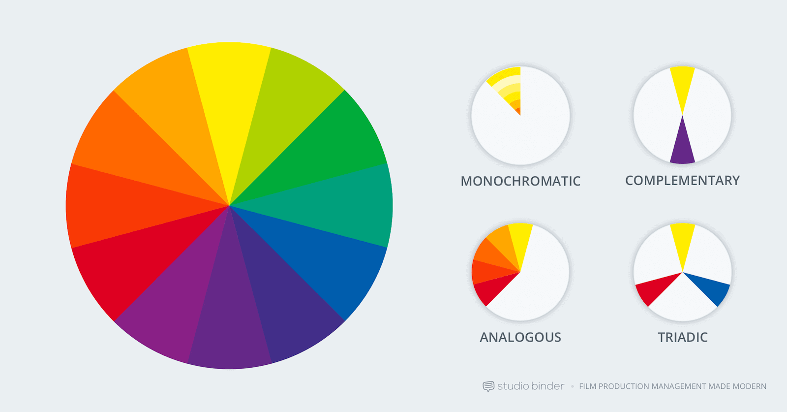
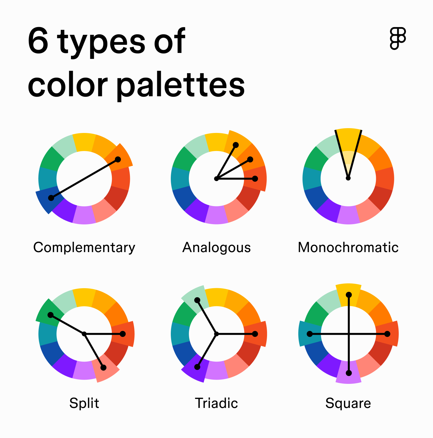
A monochromatic scheme uses different shades, tones, and tints of a single base color. This approach creates a sense of harmony, elegance, and sophistication. Brands employing monochromatic schemes often aim for a clean, minimalist, and unified look. While offering less contrast than other schemes, the subtle variations in lightness and saturation can create depth and visual interest without overwhelming the viewer. It’s particularly effective for brands that prioritize simplicity, focus, and a serene or luxurious feel.
Analogous
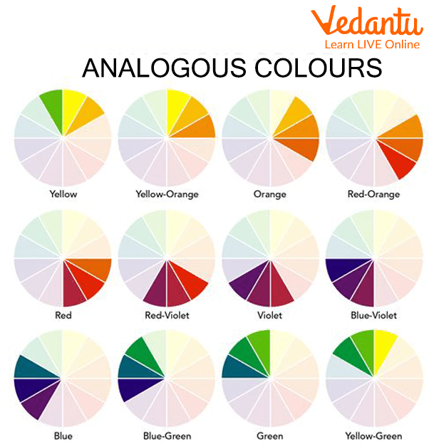
Analogous color schemes are composed of colors that are next to each other on the color wheel. Typically, three to five colors are chosen, with one being dominant, another supporting, and a third used as an accent. This scheme is known for its inherent harmony and natural appeal, as these color combinations are often found together in nature. Analogous palettes create a cohesive and comfortable visual experience, suggesting calmness, continuity, and an organic flow. Brands looking to convey friendliness, approachability, or a connection to nature often gravitate towards analogous schemes.
Complementary
Complementary color schemes involve two colors that are directly opposite each other on the color wheel, such as red and green, blue and orange, or yellow and purple. This combination creates high contrast and visual dynamism, as the colors tend to make each other appear brighter and more intense. Complementary schemes are excellent for creating strong focal points, drawing attention to specific elements, and conveying energy or excitement. However, they must be used carefully to avoid overwhelming the viewer; often, one color is dominant, and the complementary color is used as an accent to create impact without visual tension. They are ideal for brands seeking to make a bold statement or capture immediate attention.
Triadic
A triadic color scheme uses three colors that are equally spaced around the color wheel, forming an equilateral triangle. Examples include red, yellow, and blue, or orange, green, and purple. This scheme offers a rich, vibrant, and balanced palette with good contrast while maintaining harmony. Triadic schemes are often seen as playful, energetic, and engaging, making them suitable for brands that want to project a dynamic and creative image. Due to their inherent vibrancy, careful balancing of saturation and brightness is key to ensure the scheme remains cohesive and pleasing to the eye, preventing it from appearing chaotic.
Tetradic (Rectangular/Square)
Tetradic schemes are the most complex, involving four colors. A rectangular scheme uses two sets of complementary pairs, while a square scheme uses four colors equally spaced around the color wheel. These schemes offer a wide range of creative possibilities due to their inherent richness and diversity. They can create very dynamic and visually appealing results, but also pose the greatest challenge in achieving balance and harmony. Brands that employ tetradic schemes often aim for a complex, multifaceted identity, but they require a sophisticated understanding of color relationships to ensure one color remains dominant and the others act as supporting roles to maintain a cohesive brand message.
Crafting Your Brand’s Color Narrative
Developing an effective color scheme for a brand is a deeply strategic process, extending far beyond simply choosing “pretty” colors. It involves a profound understanding of the brand’s core identity, its competitive landscape, and the practicalities of applying the scheme across diverse mediums.
Understanding Your Brand’s Personality
The journey begins with an introspective look at the brand itself. What is its mission? What are its core values? What kind of personality does it embody – is it innovative, traditional, luxurious, playful, trustworthy, or rebellious? Crucially, who is the target audience, and what emotions or perceptions should the brand evoke in them? A luxury fashion brand aiming for sophistication and exclusivity might lean towards deep blues, blacks, and metallic accents, while a children’s toy brand would opt for bright, primary, and secondary colors to convey fun and energy. The color scheme must be an authentic reflection of the brand’s essence, speaking directly to its intended demographic. Without this foundational understanding, any color choices risk being arbitrary and ineffective in communicating the brand’s true identity.
Competitor Analysis and Differentiation
In a crowded marketplace, standing out is paramount. A thorough analysis of competitors’ color schemes is essential to avoid blending in or causing confusion. If all direct competitors use variations of blue to convey trust, a new brand might consider an alternative primary color (perhaps green or purple, depending on the niche) to carve out a unique visual identity while still conveying relevant attributes. The goal is not merely to be different for the sake of it, but to strategically differentiate the brand in a way that aligns with its unique selling proposition. This differentiation helps customers instantly recognize and distinguish the brand, reinforcing its individual place in the market.
Practical Application Across Touchpoints
A brand’s color scheme isn’t just for the logo; it permeates every single customer touchpoint. This requires a systematic approach to application:
- Logo Design: The most concentrated expression of the brand’s colors.
- Website and Digital Interfaces: Ensuring consistency in buttons, backgrounds, text, and interactive elements.
- Marketing Materials: Brochures, flyers, advertisements, social media graphics all adhering to the palette.
- Packaging: Product packaging often presents a primary interaction point where colors significantly influence perception and purchase intent.
- Retail Environment/Office Space: Physical spaces can also be designed to reflect the brand’s color scheme, creating an immersive experience.
- Uniforms and Merchandise: Extending the brand identity to physical items.
Consistent application across all these elements creates a cohesive and immersive brand experience, reinforcing recognition and solidifying the brand’s visual identity in the consumer’s mind. Deviations can dilute the brand message and create a disjointed perception.
Tools and Best Practices for Implementation
Once a brand’s color scheme is meticulously defined, its successful implementation requires attention to technical details and adherence to best practices to ensure consistency, impact, and accessibility across all platforms.
Digital vs. Print Considerations
The way colors are rendered differs significantly between digital and print mediums, necessitating careful management.
- RGB (Red, Green, Blue): This additive color model is used for digital screens (websites, apps, televisions). Colors are created by combining varying intensities of red, green, and blue light.
- CMYK (Cyan, Magenta, Yellow, Key/Black): This subtractive color model is used for print. Colors are created by inks absorbing light. Converting RGB to CMYK can sometimes result in slight color shifts, as CMYK has a smaller color gamut.
- Pantone (PMS – Pantone Matching System): This is a standardized color reproduction system that provides specific, numbered colors, ensuring consistent color reproduction across different printers and materials. Many brands specify Pantone colors for their primary brand hues to guarantee fidelity in print, especially for critical elements like logos.
Brand guidelines must specify the exact color values (hex codes for web, RGB values, CMYK percentages, and corresponding Pantone codes) for each color in the scheme to ensure accurate reproduction regardless of the medium.
Accessibility and Inclusivity
A crucial, yet often overlooked, aspect of color scheme implementation is accessibility. Color choices must ensure that content is readable and usable by everyone, including individuals with visual impairments or color blindness.
- Contrast Ratios: Web Content Accessibility Guidelines (WCAG) recommend specific contrast ratios between text and its background color to ensure readability. Tools are available to check if chosen color combinations meet these standards.
- Color Blindness Considerations: Designers should avoid relying solely on color to convey information (e.g., using only red to indicate an error or green for success). Icons, text labels, or different patterns should supplement color cues to ensure information is universally understood.
- Cultural Nuances: While the psychology of color has general applications, cultural interpretations can vary significantly. A color that signifies purity in one culture might signify mourning in another. Brands with a global audience must consider these nuances to avoid unintended messages.
Prioritizing accessibility broadens a brand’s reach and demonstrates an inclusive approach, reinforcing a positive brand image.
Iteration and Evolution
A brand’s color scheme, while foundational, isn’t necessarily set in stone forever. Markets evolve, trends shift, and brands themselves may grow and expand their offerings or target demographics.
- Brand Guidelines: A comprehensive brand style guide is essential, documenting the primary, secondary, and accent colors, their usage rules, and all corresponding color codes. This ensures consistent application by internal teams and external agencies.
- Flexibility within the Scheme: While core colors remain consistent, a well-designed scheme often allows for minor variations or seasonal palettes that can be used for specific campaigns without diluting the core brand identity.
- Periodic Review: Brands should periodically review their color scheme’s effectiveness and relevance. This doesn’t mean changing it capriciously, but rather ensuring it still resonates with the target audience and accurately reflects the brand’s current positioning. A brand refresh, including a subtle or significant update to the color scheme, can inject new life into an established brand and help it stay relevant and modern.
The careful definition, strategic application, and diligent management of a brand’s color scheme are indispensable components of building a powerful, recognizable, and enduring brand identity.
aViewFromTheCave is a participant in the Amazon Services LLC Associates Program, an affiliate advertising program designed to provide a means for sites to earn advertising fees by advertising and linking to Amazon.com. Amazon, the Amazon logo, AmazonSupply, and the AmazonSupply logo are trademarks of Amazon.com, Inc. or its affiliates. As an Amazon Associate we earn affiliate commissions from qualifying purchases.