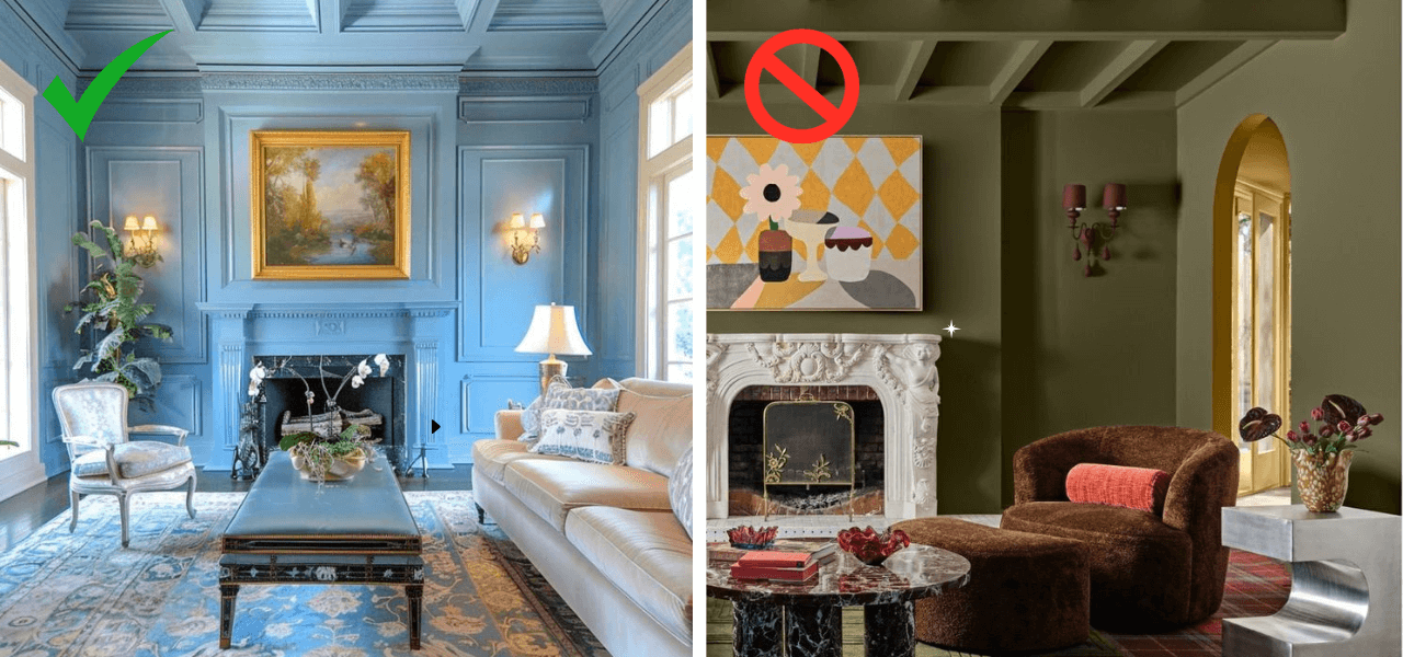
In the hyper-competitive landscape of global marketing, the battle for consumer attention is no longer fought merely with slogans or features. It is fought with emotion, atmosphere, and visual resonance. One of the most potent, yet often misunderstood, strategies emerging in the design and branding world is “color drenching.” While the term originated in the world of interior design—referring to the practice of painting walls, ceilings, and woodwork in a single, enveloping hue—it has evolved into a sophisticated tool for brand strategists.
Color drenching in a brand context is the intentional application of a single, saturated color across every possible touchpoint of a brand’s identity. It is an exercise in minimalism and maximalism simultaneously: minimal in its palette, but maximal in its impact. This article explores how color drenching serves as a cornerstone of modern brand strategy, creating immersive experiences that foster deep psychological connections and instant market recognition.

Defining Color Drenching for the Brand Landscape
To understand color drenching, one must look beyond the simple choice of a “brand color.” Most brands have a palette—a primary color supported by secondary and tertiary accents. Color drenching rejects this traditional hierarchy in favor of a monolithic approach. It is about creating a visual “soak” that removes distractions and forces the viewer to exist entirely within the brand’s chosen atmosphere.
From Interior Design to Visual Identity
In interior design, color drenching is used to make a room feel expansive yet cozy, blurring the lines between surfaces to create a seamless environment. In branding, this concept translates to a seamless consumer journey. When a brand “drenches” its identity, it means that from the Instagram grid to the product packaging, and from the website UI to the physical retail space, the user is enveloped in one specific wavelength of light. This consistency eliminates the cognitive load required to identify the brand, making the brand synonymous with the color itself.
The Psychology of Saturated Environments
Human psychology is deeply influenced by color. We don’t just see red; we feel urgency or passion. We don’t just see blue; we feel trust or calm. Color drenching leverages this by amplifying the emotional output of a brand. By removing contrasting colors, the brand intensifies the psychological effect of its primary hue. A “drenched” brand environment doesn’t just suggest an emotion; it enforces it. This creates a “flow state” for the consumer, where the brand’s values are felt viscerally rather than processed intellectually.
The Strategic Advantages of a Monochromatic Approach
Why would a brand choose to limit itself to a single hue? In an era where brands are constantly told to be “dynamic” and “flexible,” color drenching seems counterintuitive. However, the strategic benefits of this commitment are immense, particularly regarding brand equity and market positioning.
Instant Brand Recall and Recognition
In a crowded marketplace, the most valuable asset a brand can own is a “distinctive brand asset” (DBA). Color is the most easily recognized DBA. According to research, color increases brand recognition by up to 80%. When a brand utilizes color drenching, it effectively “claims” a portion of the color spectrum. Think of the specific orange used by Hermès or the particular purple of Milka chocolate. By drenching their assets in these colors, these brands ensure that even a glimpse of their packaging or a corner of their store is enough for the consumer to identify them without ever seeing a logo.
Creating Emotional Cohesion
Inconsistency is the enemy of brand trust. If a brand’s social media feels energetic and bright, but its retail stores feel cold and sterile, the consumer experiences a “brand fracture.” Color drenching acts as a powerful connective tissue. By applying a singular color philosophy across all platforms, a brand creates a sense of reliability and prestige. It suggests a level of confidence—a brand that knows exactly who it is and does not need to rely on the “noise” of multi-colored graphics to get its point across.
Simplification in an Overcrowded Market
We live in an age of “choice overload.” Consumers are bombarded with thousands of visual stimuli every hour. Color drenching provides a visual “quiet.” Paradoxically, a bright, monochrome environment can be less exhausting to the brain than a cluttered, multi-colored one. By simplifying the visual language to a single hue, a brand makes it easier for the consumer to focus on the product and the message. It creates a “hero” out of the brand’s identity, allowing the products themselves to shine against a unified, cohesive backdrop.
Implementing Color Drenching Across Brand Touchpoints
The execution of a color drenching strategy requires meticulous attention to detail. It is not enough to simply “paint everything blue.” One must understand how that blue translates across different materials, lighting conditions, and digital screens.
Digital Interfaces and User Experience (UX)
In the digital realm, color drenching is seen in the rise of “immersive UI.” This involves moving away from the standard white backgrounds and black text toward interfaces where the background, buttons, and even the imagery are tinted with the brand’s core color. This technique is particularly effective in mobile apps, where it can create a “walled garden” feel, making the user feel like they have entered a specific digital world unique to that brand. However, designers must balance this with accessibility standards, ensuring that contrast ratios remain high enough for readability while maintaining the monochromatic aesthetic.
Retail and Experiential Marketing
Physical retail is perhaps where color drenching is most visible and effective. Luxury brands have mastered this by creating “monochrome pop-ups” where every surface—the floors, the clothing racks, the mannequins, and the ceiling—is the same shade. This transforms a retail store into a curated art installation. When a customer walks into a drenched environment, the outside world disappears. This level of immersion is a powerful tool for experiential marketing, turning a simple shopping trip into a shareable, “Instagrammable” event that drives organic social media reach.
Packaging and Product Design
In packaging, color drenching means the box, the tissue paper, the ribbon, and the labels all share the exact same hue. This creates a high-end “unboxing” experience. It communicates that the brand has considered every detail. For direct-to-consumer (DTC) brands, this is often the only physical touchpoint they have with their customers, making it essential that the color drenching feels intentional and premium. It transforms the packaging from a protective vessel into a tangible piece of the brand’s identity.
Case Studies: Brands That Drenched the Market
To see color drenching in action, we can look at several iconic brands that have used this strategy to dominate their respective niches.
Tiffany & Co.: The Power of Robin’s Egg Blue
Perhaps the most famous example of color drenching is Tiffany & Co. Their use of “Tiffany Blue” (Pantone 1837) is legendary. From the iconic boxes to their “Blue Box Cafe” and global advertisements, the brand uses this color to signify luxury, exclusivity, and romance. By drenching their identity in this single shade, they have created a scenario where the box is often as coveted as the jewelry inside. It is a masterclass in using color to create a proprietary emotional atmosphere.
Glossier: The Millennial Pink Phenomenon
In the mid-2010s, the beauty brand Glossier utilized color drenching to build a cult-like following. By drenching their packaging, showrooms, and marketing in a specific, soft pink, they didn’t just sell skincare; they sold an aesthetic. “Glossier Pink” became a cultural shorthand for a specific type of modern, minimalist femininity. The brand’s physical locations were designed to be completely pink environments, encouraging fans to take photos and share them, effectively turning their customers into brand ambassadors for their color palette.
Hermès: Ownership of the Orange
The Hermès orange is another example of a brand owning a color through drenching. Originally a result of a paper shortage during World War II, the brand leaned into the vibrant orange for its packaging. Today, the brand uses this orange across its boxes, bags, and boutique details. The color drenching strategy here serves to balance the brand’s heritage with a bold, modern energy. It is instantly recognizable across a crowded airport terminal or a high-end shopping street, signaling “Hermès” without the need for a single word.
The Future of Color-Centric Branding
As we look toward the future of brand strategy, color drenching is likely to become even more prevalent as brands seek ways to stand out in the metaverse and other virtual environments.
Adapting for Digital-First Platforms
As brands move into virtual reality (VR) and augmented reality (AR), the concept of “drenching” will take on new dimensions. In a VR space, a brand can literally drench the user’s entire field of vision in a specific color, controlling the atmosphere more completely than ever before. Brand strategists will need to consider how these colors behave in 3D spaces and how they interact with virtual lighting to maintain the desired emotional impact.
Avoiding “Visual Fatigue”
The primary challenge of color drenching is the risk of visual fatigue. If every brand adopts this strategy, the market could become a blur of competing neon and pastel boxes. To avoid this, brands must focus on texture and materiality. A “drenched” brand isn’t just one flat color; it’s the interplay of matte, glossy, velvet, and metallic finishes all within the same hue. This adds depth and sophistication to the identity, ensuring that while the color is consistent, the visual experience remains rich and engaging.
In conclusion, color drenching is far more than a design trend; it is a rigorous brand strategy. By committing to a singular hue, brands can cut through the noise of the modern world, foster deep emotional connections, and build a visual identity that is both immersive and unforgettable. In the world of brand strategy, sometimes the most powerful way to speak is to let color do all the talking.
aViewFromTheCave is a participant in the Amazon Services LLC Associates Program, an affiliate advertising program designed to provide a means for sites to earn advertising fees by advertising and linking to Amazon.com. Amazon, the Amazon logo, AmazonSupply, and the AmazonSupply logo are trademarks of Amazon.com, Inc. or its affiliates. As an Amazon Associate we earn affiliate commissions from qualifying purchases.