In the modern landscape of digital marketing and visual storytelling, few movements have undergone a more fascinating transformation than City Pop. Once a localized soundtrack to Japan’s economic miracle in the late 1970s and 1980s, City Pop has transitioned from a forgotten musical genre into a powerful, multi-sensory brand identity. Today, “City Pop” is more than just a sound; it is a meticulously curated aesthetic, a symbol of urban sophistication, and a masterclass in how nostalgia can be leveraged to create a global brand presence in the 21st century.
For brand strategists, designers, and marketers, understanding City Pop is essential. It represents the intersection of corporate identity, escapist lifestyle branding, and the power of digital algorithms to resurrect and repackage history for a modern audience.
The Foundations of the City Pop Brand: Sophistication and Urban Optimism
To understand City Pop as a brand, one must first understand its origin as the sonic reflection of “Brand Japan” during the bubble economy. Unlike the folk music that preceded it, City Pop was intentionally designed to sound expensive, international, and technologically advanced. It was a product of a nation that was rapidly becoming the world’s leader in technology and luxury.
The Corporate Synergy of the 1980s
During its peak, City Pop was inextricably linked with corporate branding. Japanese corporations—ranging from automotive giants like Toyota and Honda to cosmetics firms like Shiseido—used the breezy, upbeat sounds of artists like Tatsuro Yamashita and Mariya Takeuchi to sell a specific vision of the “New Life.” This was a lifestyle of leisure, seaside drives, and neon-lit nights.
The music was often commissioned specifically for television commercials (CMs). This created a symbiotic relationship where the brand identity of a consumer product (like a high-end stereo system or a sleek coupe) and the artist’s musical identity became indistinguishable. This early form of lifestyle marketing laid the groundwork for how we perceive City Pop today: as a premium, curated experience.
Positioning: The Western Influence and Local Adaptation
From a strategic positioning standpoint, City Pop was a brilliant “hybrid brand.” It took the polished production values of American AOR (Adult Oriented Rock), Jazz Fusion, and Disco, and infused them with a distinctly Japanese melodic sensibility. By positioning itself as a Western-adjacent yet uniquely Japanese product, the genre appealed to a domestic audience that was eager to see itself as part of a global, cosmopolitan elite. This “global-local” (glocal) approach is a foundational principle in modern brand strategy, allowing a brand to feel familiar yet exotic.
Visual Identity: The Graphic Design Language of City Pop
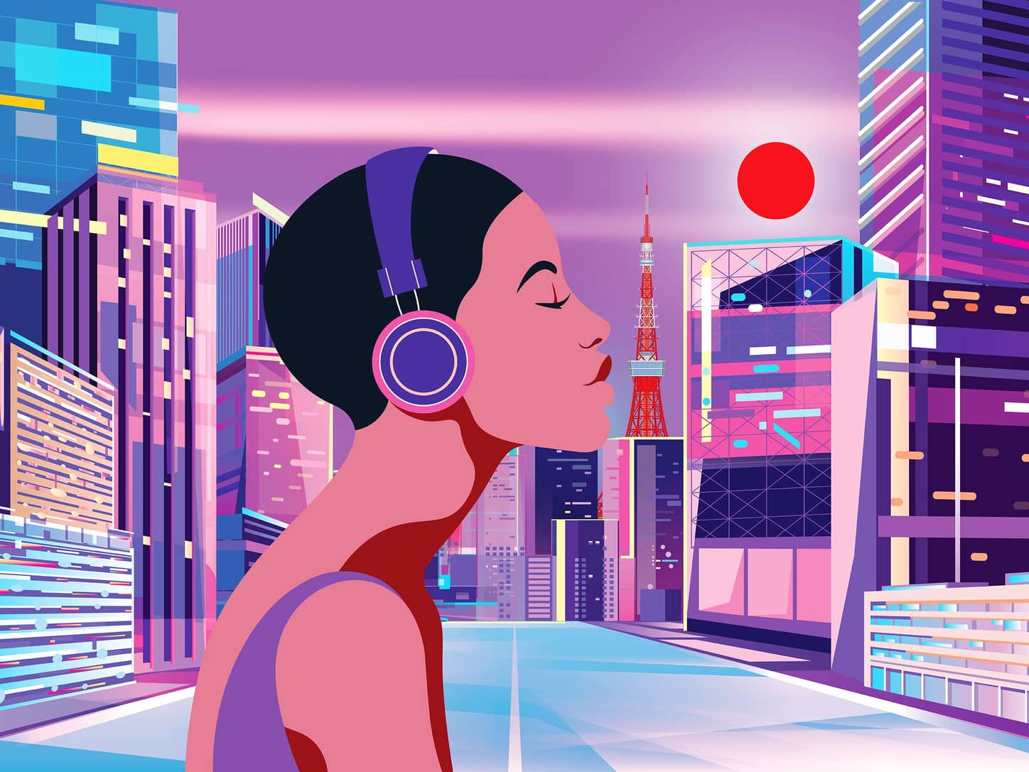
A brand is defined by its visual cues, and City Pop possesses one of the most recognizable visual identities in the world. The genre’s resurgence in the 2010s was driven as much by its album art as it was by the music itself. The visual language of City Pop communicates a sense of “eternal summer” and urban luxury that resonates deeply with modern consumers seeking an escape from the mundane.
The Illustrative Style of Hiroshi Nagai and Eizin Suzuki
If City Pop has a Chief Creative Officer, it is arguably the illustrator Hiroshi Nagai. His work—characterized by deep blue skies, stark architectural shadows, palm trees, and vintage convertibles—defines the visual brand. Alongside Eizin Suzuki, Nagai created a world that looked like a dream of Los Angeles seen through a Tokyo lens.
In branding terms, these illustrations provide a consistent visual “moat.” When a consumer sees a high-contrast illustration of a swimming pool at dusk, they immediately associate it with the City Pop aesthetic. This level of visual consistency is what modern brands strive for; it creates an immediate emotional response and instant recognition without the need for text or logos.
Color Palettes and Emotional Branding
The City Pop brand utilizes a specific color palette: “Plastic” pinks, neon purples, cobalt blues, and sunset oranges. These colors evoke a specific emotional state—nostalgia for a time the viewer may not have even lived through. This is “anemoia,” or nostalgia for a time you’ve never known. From a marketing perspective, tapping into anemoia is a powerful tool. It allows brands to bypass cynical barriers and connect with audiences on a purely emotional, aspirational level.
The Digital Rebrand: How the Internet Repackaged a Lost Era
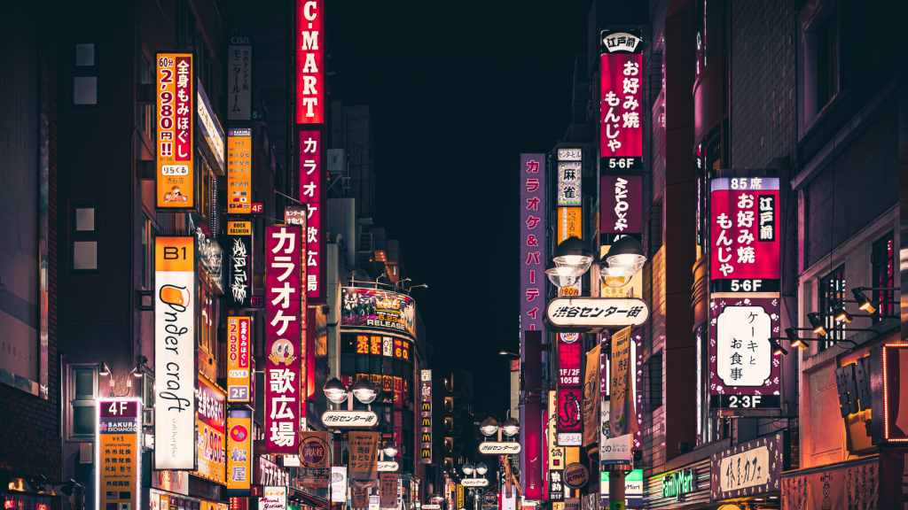
The most remarkable aspect of the City Pop story is its second life as a digital-first brand. Through the 2010s, the genre was “rebranded” by internet subcultures, specifically through the Vaporwave movement and the YouTube recommendation algorithm. This transition offers profound insights into how brands can evolve and thrive in a decentralized digital environment.
The “Plastic Love” Effect and Algorithmic Marketing
The catalyst for City Pop’s global revival was Mariya Takeuchi’s “Plastic Love.” A low-resolution upload of the song, featuring a striking black-and-white photo of Takeuchi, became a viral sensation due to YouTube’s recommendation engine.
This wasn’t just a musical trend; it was a masterclass in digital packaging. The thumbnail of the video became the “logo” for the entire genre. It proved that in the age of the algorithm, a brand’s success often depends on its ability to fit into a specific “vibe” or “aesthetic” that the software can categorize and distribute to interested niches. City Pop didn’t need a multi-million dollar ad budget; it had a cohesive brand identity that the algorithm found irresistible.
Curation as a Branding Strategy
The revival was led not by the original record labels, but by “curator brands”—YouTube channels like Artzie Music or Van Paugam. These curators acted as brand managers, selecting the best “products” (songs), pairing them with consistent visuals (often loops from 80s anime like Sailor Moon or California Crisis), and presenting them to a new audience.
For modern businesses, this highlights the importance of curation. A brand is no longer just what you say it is; it is how your product is curated and shared by the community. City Pop’s “rebrand” was successful because it allowed for fan participation while maintaining its core aesthetic values.
Applying City Pop Strategy to Modern Branding
What can modern entrepreneurs and brand managers learn from City Pop? The genre’s journey provides a blueprint for building a brand that is both timeless and adaptable.
1. Consistency Across Touchpoints
City Pop’s enduring appeal lies in its consistency. Whether it is the production quality of the music, the style of the cover art, or the fashion of the artists, every touchpoint reinforces the same brand promise: sophisticated, urban escapism. Modern brands must ensure that their visual identity, tone of voice, and product quality are in perfect alignment to build a similar level of brand equity.
2. The Power of “Vibe” Over Features
In a saturated market, competing on features is a race to the bottom. City Pop competes on “vibe.” It doesn’t just sell a song; it sells the feeling of driving through Roppongi in 1984. Brands that can sell a feeling or a lifestyle—think of Apple’s “Creative” identity or Nike’s “Athletic Excellence”—are far more resilient than those that simply sell a utility.
3. Leveraging Retro-Futurism
City Pop is a prime example of retro-futurism—looking at the past’s vision of the future. This is a potent branding tool because it feels both safe (nostalgic) and exciting (futuristic). Brands can leverage this by taking “heritage” elements of their identity and updating them with modern technology or contemporary social values, creating a “best of both worlds” scenario for the consumer.
The Future of Retro-Branding in a Post-Digital World
As we move further into the 21st century, the City Pop brand continues to evolve. It has moved beyond YouTube into high-end fashion collaborations, luxury vinyl reissues, and even influencing modern Western pop stars like The Weeknd and Dua Lipa.
Sustainability of the Aesthetic
The longevity of the City Pop brand suggests that “the aesthetic” is the new “loyalty.” In an era of fleeting attention spans, consumers are loyal to aesthetics that provide a consistent emotional sanctuary. City Pop offers a “brand world” that people want to inhabit. The future of branding lies in creating these immersive worlds—utilizing music, art, and digital space to create a holistic experience that transcends the product itself.
Conclusion: The Lasting Legacy of City Pop
City Pop is a testament to the enduring power of a well-defined brand identity. It survived the collapse of the Japanese bubble economy, decades of obscurity, and a complete shift in how media is consumed. By maintaining a clear visual language and a specific emotional resonance, it transformed from a local commercial product into a global cultural icon.
For those looking to build the next great brand, the lesson of City Pop is clear: define your world, stay consistent in your visuals, and never underestimate the power of a beautifully packaged dream. Whether you are selling software, a personal brand, or a luxury product, the principles of City Pop—sophistication, escapism, and impeccable curation—are the keys to capturing the modern imagination.
aViewFromTheCave is a participant in the Amazon Services LLC Associates Program, an affiliate advertising program designed to provide a means for sites to earn advertising fees by advertising and linking to Amazon.com. Amazon, the Amazon logo, AmazonSupply, and the AmazonSupply logo are trademarks of Amazon.com, Inc. or its affiliates. As an Amazon Associate we earn affiliate commissions from qualifying purchases.