
In the world of design and brand identity, color is not merely an aesthetic choice; it is a strategic tool used to communicate values, establish atmosphere, and influence consumer psychology. Among the more nuanced shades in a designer’s palette, “buff” holds a unique position. Often misunderstood or conflated with beige or tan, buff is a distinct, historically significant color that serves as a cornerstone for brands aiming to convey sophistication, reliability, and organic authenticity. Understanding the nature of buff color is essential for anyone involved in corporate identity, marketing, and interior design, as it provides a bridge between high-end luxury and grounded, approachable utility.
The Chromatic DNA of Buff
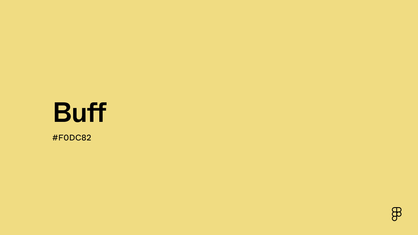
To master the use of buff in a brand strategy, one must first deconstruct what the color actually represents. At its core, buff is a pale, yellow-brown shade. It sits firmly within the neutral family but carries more warmth than a cool grey or a sterile white. Its origins are deeply rooted in the natural world, historically mimicking the color of undyed, dressed leather—specifically the hide of a buffalo, from which the term is derived.
Historical Context and Evolution
The term “buff” entered the English lexicon in the 17th century, primarily associated with the durable, tanned leather used in military uniforms. Because the leather was left in its natural state without artificial dyes, it became synonymous with resilience and utility. In modern design, this history informs the color’s personality. When a brand chooses a buff-leaning color palette, it taps into a subconscious narrative of heritage, durability, and craftsmanship. Unlike synthetic neon colors or aggressive primaries, buff suggests a product that has been honed by time and experience.
Technical Composition
From a technical standpoint, buff is a complex neutral. On the color wheel, it is characterized by a low saturation and a high-to-mid luminosity. Depending on the specific brand application, buff can lean toward a “golden buff” (with more yellow undertones) or a “grey buff” (leaning toward a stony, architectural quality). For brand designers working with CMYK or RGB formats, achieving the perfect buff requires a delicate balance. It is rarely a single, static hex code; instead, it is a range of warm, desaturated tones that serve as the perfect “quiet” backdrop for more vibrant accent colors.
The Strategic Power of Buff in Brand Identity
In the crowded landscape of modern marketing, brands are increasingly moving away from the “loud” aesthetic of the 2010s. We are witnessing a shift toward “Quiet Luxury”—a design philosophy where the brand’s power is communicated through subtlety, quality materials, and understated color palettes. Buff is the ideal color for this transition.
Communicating Authenticity and Trust
Why do high-end skincare brands, sustainable fashion houses, and architectural firms flock to buff? Because it is the visual equivalent of an honest conversation. When a customer encounters a packaging design or a website landing page rendered in shades of buff, they do not feel the immediate “alert” signals triggered by red or the clinical, cold distance often associated with stark white. Instead, buff feels human. It is the color of recycled paper, raw linen, and sun-bleached stone—materials that imply a commitment to sustainability and ethical production.
Buff as a Neutral Foundation
In corporate identity systems, the “hero” color is often tasked with drawing attention, but the “foundation” color is tasked with retention. Buff acts as an impeccable anchor. It provides enough contrast to make bold typography in charcoal or deep navy pop, while remaining soft enough to be used across large-scale applications, such as interior wall coverings in a flagship store or the background of a brand’s primary digital interface. By using buff, brands create a cohesive ecosystem that feels curated and professional without trying too hard to be trendy.

Psychological Impact and Consumer Perception
The psychology of color suggests that neutrals influence our sense of comfort and stability. Because buff occupies that specific space between the warmth of the sun and the stability of the earth, it induces a state of calm. This is why it is becoming a dominant color in the “lifestyle brand” sector.
The Perception of Value
There is a long-standing association between buff and premium quality. Think of high-end stationery, thick, textured business cards, or the unboxing experience of a luxury watch. Buff shades imply a level of “archival quality.” It suggests that the object is meant to last, rather than being a disposable commodity. When a brand adopts buff as its primary color, it subtly tells the consumer that their product is an investment. It suggests longevity, heritage, and a rejection of the “fast-paced, low-quality” cycle of mass production.
Balancing Sophistication and Approachability
One of the hardest challenges in brand strategy is being seen as both professional and approachable. Brands that are too formal can feel cold and untouchable, while brands that are too informal can lose their sense of authority. Buff hits the “goldilocks” zone. It is sophisticated enough for legal or financial consulting firms that want to move away from the traditional, drab grey, yet it is warm enough for wellness brands that need to feel supportive and nurturing.
Implementation: How to Use Buff in Modern Design
Successfully integrating buff into your brand assets requires more than just picking a shade; it requires a deep understanding of color ratios and material textures.
Pairing and Contrast
The beauty of buff lies in its versatility. It plays exceptionally well with high-contrast pairings:
- Buff + Charcoal/Black: The classic “sophisticated” pairing. This combination is common in editorial design and luxury fashion branding. The black provides structure, while the buff provides the warmth that keeps the design from feeling too industrial.
- Buff + Forest Green or Deep Navy: This combination leans into the “natural heritage” vibe. It is perfect for outdoor brands or organizations that want to emphasize a commitment to the environment.
- Buff + Terracotta or Ochre: For a more Mediterranean or earthy aesthetic, pairing buff with warm, rusty tones creates a cohesive, organic feel that is currently trending in interior design and boutique hospitality branding.
Materiality and Texture
In branding, color is inseparable from the surface upon which it is printed or displayed. Buff is a color that demands texture. If you print a buff color on a glossy, synthetic plastic, it loses its soul. If you print that same buff on a tactile, heavy-stock, matte paper, it comes alive. When designing digital assets, use subtle gradients or “paper-grain” overlays to bring that sense of texture back into the screen. This depth adds a layer of authenticity that flat, solid colors simply cannot achieve.

The Future of Buff in Design Trends
As we move toward a future where brand experiences are expected to be more immersive and human-centric, the reliance on harsh, digital-first colors will likely decline. Brands will seek to build physical and digital environments that feel like a sanctuary. Buff fits perfectly into this movement. It is the color of the “slow movement”—intentional, conscious, and enduring.
For brand strategists, the lesson is clear: color is a communication channel. If your goal is to build a brand that stands the test of time, speaks to the sophisticated needs of the modern consumer, and roots itself in the values of quality and authenticity, buff is not just a color choice—it is a strategic necessity. Whether you are building a new identity from the ground up or refreshing an existing visual system, consider how the subtle, confident strength of buff can elevate your brand message. It is a color that does not need to shout to be heard; instead, it commands attention through its calm, undeniable presence.
aViewFromTheCave is a participant in the Amazon Services LLC Associates Program, an affiliate advertising program designed to provide a means for sites to earn advertising fees by advertising and linking to Amazon.com. Amazon, the Amazon logo, AmazonSupply, and the AmazonSupply logo are trademarks of Amazon.com, Inc. or its affiliates. As an Amazon Associate we earn affiliate commissions from qualifying purchases.