
In the competitive landscape of corporate identity, the concept of “axes of symmetry” transcends the boundaries of Euclidean geometry to become a foundational pillar of brand strategy. While a mathematician defines an axis of symmetry as an imaginary line that divides a shape into two identical, mirror-image parts, a brand strategist views it as a psychological tool used to communicate stability, reliability, and aesthetic harmony. In a world where consumers process visual information in milliseconds, the presence—or intentional absence—of symmetry serves as a silent communicator of a brand’s values and promise.
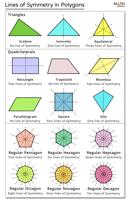
Understanding the axes of symmetry in design is not merely about creating a “pretty” logo; it is about leveraging the human brain’s inherent preference for order. From the iconic golden arches to the balanced emblems of luxury automotive manufacturers, symmetry acts as a visual anchor that allows a brand to achieve instant recognition and long-term trust.
The Geometry of Trust: Why Symmetry Defines Visual Identity
The human brain is evolutionarily hardwired to find symmetry appealing. This biological preference is rooted in our perception of health, vitality, and balance in the natural world. When applied to brand strategy, these geometric principles trigger a subconscious response that associates a company with organized professionalism and structural integrity.
Biological Preference and Brand Recognition
Research in cognitive psychology suggests that symmetrical shapes are processed more quickly by the visual cortex than asymmetrical ones. This efficiency is vital in a modern marketing environment where brands fight for attention on crowded social media feeds and physical billboards. A symmetrical logo, centered on a clear vertical axis, provides a sense of “closure” and completeness.
For a brand, this rapid processing translates to higher recall rates. When a consumer can easily “map” the two halves of a brand mark across an axis of symmetry, the mental load required to store that image is reduced. This is why many of the world’s most enduring corporate identities utilize reflectional symmetry to ensure that their visual presence is both memorable and calming.
The Golden Ratio and Mathematical Precision
Beyond simple mirroring, the most sophisticated brand identities employ multiple axes of symmetry governed by the Golden Ratio (approximately 1.618). This mathematical constant creates a “divine proportion” that feels naturally balanced to the human eye.
When a design team establishes the axes of symmetry for a new corporate identity, they are setting the “DNA” of the brand. By adhering to these strict geometric guidelines, a brand ensures that its visual assets remain cohesive, whether they are scaled down to a mobile app icon or scaled up to a skyscraper-sized advertisement. Precision in symmetry signals precision in business operations, creating an unspoken promise of quality to the consumer.
Implementation of Symmetrical Axes in Corporate Identity
The application of symmetry in branding is rarely accidental. It is a deliberate choice that dictates how a brand is perceived in terms of its market position and personality. Different types of symmetry—vertical, horizontal, and radial—offer different psychological cues.
Vertical Symmetry: Stability and Authority
The most common application of symmetry in brand strategy is the vertical axis. A logo that is identical on the left and right sides conveys a sense of groundedness and authority. This is why vertical symmetry is the preferred choice for financial institutions, law firms, and heritage brands.
Take, for example, the logos of high-end fashion houses or traditional banks. These organizations want to project an image of being “unshakeable.” By centering their visual identity on a strong vertical axis, they mimic the structural stability of classical architecture (like the Parthenon). This suggests that the brand is built on a solid foundation and is capable of withstanding market volatility.
Horizontal and Radial Symmetry in Logo Systems
While vertical symmetry provides stability, horizontal and radial symmetry offer different strategic advantages. Horizontal symmetry—where the top mirrors the bottom—is less common but can be found in brands that want to emphasize reflection, transition, or dual-purpose functionality.
Radial symmetry, which involves a central point from which all elements radiate (like a star or a wheel), is often used to symbolize community, inclusivity, and global reach. Companies that position themselves as hubs of connectivity—such as telecommunications firms or international non-profits—frequently use radial axes to demonstrate their role as a central point of a larger network. These axes suggest a brand that is dynamic yet centered, capable of expanding in all directions without losing its core identity.
Beyond the Logo: Symmetry in Brand Messaging and User Experience
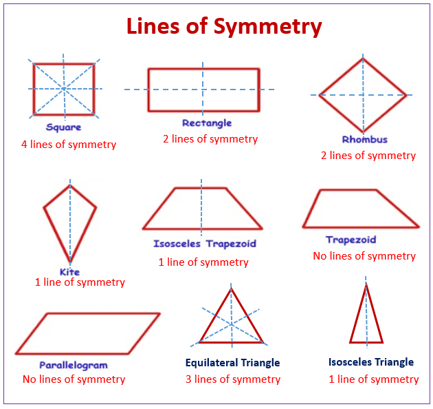
While the logo is the most visible application of the axes of symmetry, the concept extends deep into the overall brand experience. A balanced brand strategy ensures that every touchpoint reflects the same level of equilibrium found in the visual identity.
Consistency Across Touchpoints
A brand that utilizes symmetry in its logo but presents a chaotic, disorganized website or marketing collateral creates “cognitive dissonance” for the consumer. Strategic branding requires that the physical layout of digital interfaces and print materials respect the same principles of balance.
In modern UI/UX design, the use of a symmetrical grid system allows brands to present complex information in an approachable way. By aligning content along central axes, designers can guide the user’s eye naturally through the “brand story.” This organizational symmetry builds a “seamless” experience, which is a hallmark of high-performing brands like Apple or Google. When the customer feels that the brand’s digital environment is balanced, they extend that feeling of “ease” to the product or service itself.
The Interplay Between Symmetry and Asymmetry in Modern Marketing
It is important to note that the most effective brand strategies often use symmetry as a baseline from which they can strategically deviate. If perfect symmetry represents stability, then “tensioned asymmetry” represents movement, innovation, and disruption.
Many tech startups and “disruptor” brands intentionally break the axis of symmetry in their visual language to signal that they are different from the established status quo. However, even in these cases, the “invisible axis” remains. Designers often use “optical balance” rather than mathematical symmetry to ensure that an asymmetrical logo doesn’t feel “top-heavy” or “leaning.” This sophisticated use of geometry allows a brand to feel energetic and forward-thinking while still maintaining a professional sense of gravity.
Case Studies: World-Leading Brands and Their Use of Symmetry
Examining the giants of industry reveals how the axes of symmetry are used to dominate market perception and create a lasting legacy.
Technology Giants and the Pursuit of Perfection
In the technology sector, symmetry is often synonymous with “perfection” and “user-centric design.” Consider the evolution of the Apple logo. While the current logo is famously asymmetrical (due to the “bite” taken out of the side), the overall shape is constructed using a series of circular arcs that respect a rigorous geometric grid. The balance of the “leaf” against the body of the apple creates a sense of organic symmetry that makes the brand feel approachable and intuitive.
Contrast this with the Microsoft “Windows” logo—a perfect example of four-fold symmetry. The four squares represent windows into different worlds of productivity. The use of clear horizontal and vertical axes suggests a platform that is reliable, organized, and essential for the corporate world.
Luxury Markets and the Elegance of Balance
Luxury branding is perhaps the most frequent user of perfect symmetry. Brands like Chanel, Gucci, and Louis Vuitton utilize interlocking symmetrical symbols that imply exclusivity and timelessness. In the luxury sector, asymmetry is often seen as “trendy” or “fleeting,” whereas symmetry is perceived as “eternal.”
The Chanel “double C” logo is a masterclass in the use of a vertical axis of symmetry. By mirroring the two letters, the brand creates a monogram that is perfectly balanced. This symmetry is then carried through to their packaging, retail stores, and even the stitching on their products. This level of geometric consistency creates a “prestige” effect, where the consumer perceives the product as a piece of art rather than a mere commodity.
Future-Proofing Brand Design Through Symmetrical Integrity
As we move into an era dominated by AI-generated content and rapid-fire digital consumption, the foundational principles of symmetry are becoming more important than ever. In an ocean of visual noise, symmetry acts as a lighthouse—a point of clarity and calm.
Future-proofing a brand involves creating a visual language that can adapt to new mediums (like AR, VR, and wearable tech) without losing its essence. A brand built on strong axes of symmetry is inherently modular. It can be rotated, layered, or animated across three-dimensional spaces while maintaining its core recognizable “silhouette.”
Furthermore, as brands strive for global expansion, the “universal language” of symmetry becomes an asset. Unlike color or typography, which can have different cultural meanings across the globe, the psychological comfort of a balanced, symmetrical form is a human universal. By centering a brand identity on these geometric truths, a company ensures that its message of stability and quality translates across every border and every culture.
In conclusion, “what is axes of symmetry” in the context of branding is not just a question of lines on a page. It is a question of how a brand intends to exist in the mind of the consumer. By mastering the axes of symmetry, a brand moves beyond being a simple vendor and becomes a trusted, recognizable, and permanent fixture in the global marketplace. Symmetry is the silent architecture of brand loyalty, providing the structural integrity needed to build a legacy that lasts.
aViewFromTheCave is a participant in the Amazon Services LLC Associates Program, an affiliate advertising program designed to provide a means for sites to earn advertising fees by advertising and linking to Amazon.com. Amazon, the Amazon logo, AmazonSupply, and the AmazonSupply logo are trademarks of Amazon.com, Inc. or its affiliates. As an Amazon Associate we earn affiliate commissions from qualifying purchases.