
In the realm of digital word processing and software interface design, the term “tab stop” often evokes a sense of nostalgia for the mechanical typewriter era. However, far from being an archaic relic, the tab stop remains a foundational element of modern document architecture, user experience (UX) design, and technical writing. For anyone working extensively with software like Microsoft Word, Google Docs, or even integrated development environments (IDEs), understanding the mechanics of tab stops is the difference between a document that looks professional and one that collapses under the weight of manual formatting errors.

A tab stop is a horizontal position marker that tells a word processor or text editor exactly where the cursor should jump when the “Tab” key is pressed. While it seems simple on the surface, the technical logic behind these stops allows for sophisticated alignment, structured data presentation, and visual hierarchy that the spacebar simply cannot replicate.
The Mechanics of Tab Stops in Modern Word Processing
To master the technical side of document design, one must first understand that not all tab stops are created equal. Modern software provides several distinct types of tab stops, each engineered for a specific structural purpose.
Left and Right Tab Stops
The Left Tab Stop is the most common variety. When you press the Tab key, the text begins at the stop and extends to the right. This is the default behavior in most text editors and is used for basic indentation and aligning lists.
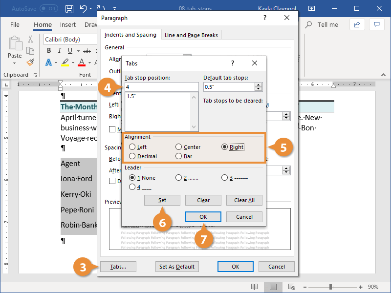
Conversely, the Right Tab Stop is a powerful tool for professional layout. When a Right Tab is set, the text you type moves to the left of the stop, ending at the marker. This is essential for creating headers where the author’s name or date needs to be perfectly flushed against the right margin, or for creating table-of-contents entries where page numbers must align vertically on the right.
Center and Decimal Tab Stops
For titles or specialized lists, the Center Tab Stop anchors the middle of the text string to a specific horizontal point. As you type, the text expands equally to the left and right of the marker, ensuring perfect symmetry regardless of the string’s length.
The Decimal Tab Stop is perhaps the most “technical” of the bunch. It is designed specifically for financial data and mathematical columns. Regardless of how many digits are in a number, the software will align the figures based on the decimal point. This ensures that columns of currency or scientific measurements remain readable and mathematically structured, preventing the visual chaos of misaligned numbers.
The Bar Tab
Unlike the other stops, the Bar Tab does not position text. Instead, it inserts a vertical line at the tab stop position. In many technical manuals and legal documents, this is used to create a visual separation between columns without the complexity of inserting a full table structure.
Beyond Simple Indentation: Why Tab Stops Outperform the Spacebar
A common pitfall for casual software users is the “multi-space” habit—pressing the spacebar repeatedly to align text. From a technical and architectural standpoint, this is a catastrophic error in document design.
Precision and Proportional Fonts
Most modern fonts are “proportional,” meaning a “w” takes up more horizontal space than an “i.” Because spaces are also characters with specific widths, using the spacebar to align text across multiple lines is mathematically inconsistent. What looks aligned on your screen may appear completely broken when printed or viewed on a different device.
Tab stops solve this by using absolute coordinates on the horizontal ruler. When you set a tab stop at 3.5 inches, the cursor jumps to exactly 3.5 inches from the margin, regardless of the characters preceding it. This ensures “pixel-perfect” alignment that survives font changes, size adjustments, and software exports.
Document Flexibility and Global Edits
If a document is built using tab stops, it remains dynamic. If you decide that a list needs to be shifted half an inch to the right, you don’t need to manually edit every line. By simply dragging the tab stop on the ruler, every line associated with that formatting shift moves in unison. This technical scalability is a hallmark of efficient digital workflows, allowing for rapid iterations in professional environments.

Technical Accessibility (Section 508 Compliance)
In the context of digital security and accessibility, tab stops play a vital role. Screen readers and assistive technologies interpret the “Tab” character as a structural jump. When a document uses 20 spaces to indent a line, a screen reader may announce “space, space, space…” to a visually impaired user, creating a poor experience. Proper tab stops ensure that document structures are clean, navigable, and compliant with modern accessibility standards.
Mastering Advanced Tab Stop Features
Once the basic types are understood, technical power users can leverage advanced features to automate document aesthetics and functional layouts.
Implementing Tab Leaders
A “leader” is a character (usually a dot, dash, or solid line) that fills the empty space created by a tab jump. You see this most often in a Table of Contents, where a dotted line leads your eye from the chapter title on the left to the page number on the right.
Technically, leaders are handled by the software’s layout engine. They are not “typed” dots; they are generated dynamically. This means if the title of a chapter gets longer, the leader automatically shortens to compensate, maintaining the exact position of the page number.
Default vs. Custom Tab Stops
Every word processor comes with default tab stops—usually every 0.5 inches. While these are convenient, they are often insufficient for complex technical documentation. Learning to clear default stops and set custom “manual” stops allows a user to define the precise architecture of their page. Custom stops override defaults, giving the user total control over the white space and information density of the document.
The Logic of the Ruler and Dialog Boxes
While many users interact with tab stops by clicking on the horizontal ruler at the top of their software, the “Tabs Dialog Box” offers granular control. Here, you can type in exact measurements (e.g., 3.42 inches) and assign leaders with precision. For technical writers creating specifications or blueprints, this level of mathematical accuracy is non-negotiable.
Tab Stops in the Digital Era: Coding, CSS, and Web Design
The concept of the tab stop extends beyond word processing and into the very fabric of web development and software engineering.
Tabs in Integrated Development Environments (IDEs)
In coding, indentation isn’t just about aesthetics; in languages like Python, it is a functional requirement of the syntax. Developers must choose between “Hard Tabs” (the tab character) and “Soft Tabs” (spaces that mimic a tab). Most modern IDEs allow developers to set “Tab Stops” that determine how many spaces a tab character represents (usually 2 or 4). This technical setting ensures that code remains readable across different team members’ machines.
CSS and Web Typography
On the web, the tab-size property in CSS allows developers to control the width of the tab character in browser-rendered text. This is particularly important for displaying code snippets or technical documentation on websites. By defining tab stops via CSS, developers ensure that the structural integrity of the text is maintained across different screen sizes and resolutions.
The Role of “Tab Order” in UX Design
In software interface design, “tab stops” refer to the sequence in which interactive elements (like buttons and text fields) receive focus when a user presses the Tab key. This is a critical component of user experience (UX). A logical tab stop flow allows a user to navigate a form or a dashboard without ever touching a mouse. Engineering a proper tab order is a fundamental task for front-end developers, ensuring that the software is both efficient and accessible.
Conclusion: The Enduring Relevance of Precise Formatting
The tab stop is more than a simple keyboard command; it is a sophisticated tool for spatial organization in a digital landscape. Whether you are a technical writer drafting a 500-page manual, a developer structuring a new application, or an office professional seeking to improve the readability of a report, mastering tab stops is essential.
By moving away from manual spacing and embracing the technical precision of tab stops, you ensure that your work is stable, accessible, and professional. In an era where data density and clear communication are paramount, the humble tab stop remains one of the most powerful—and underutilized—assets in the modern tech toolkit. It represents the intersection of historical typography and modern software logic, proving that even in the age of AI and automated formatting, the fundamental principles of structure and alignment remain unchanged.
aViewFromTheCave is a participant in the Amazon Services LLC Associates Program, an affiliate advertising program designed to provide a means for sites to earn advertising fees by advertising and linking to Amazon.com. Amazon, the Amazon logo, AmazonSupply, and the AmazonSupply logo are trademarks of Amazon.com, Inc. or its affiliates. As an Amazon Associate we earn affiliate commissions from qualifying purchases.