
In the early days of personal computing, navigating software was a clinical, text-heavy experience. Users relied on cascading drop-down menus—File, Edit, View, and Insert—that required multiple clicks to find specific tools hidden deep within sub-menus. As software grew more complex, these traditional menus became cluttered, leading to “menu fatigue” and a steep learning curve for new users.
This changed fundamentally in 2007 when Microsoft introduced the “Ribbon” interface. Originally met with skepticism, the Ribbon has since become the gold standard for productivity software, design tools, and operating system navigation. But what exactly is a Ribbon in a computer context, and why did it revolutionize the way we interact with digital tools?
The Core Components of the Ribbon Interface
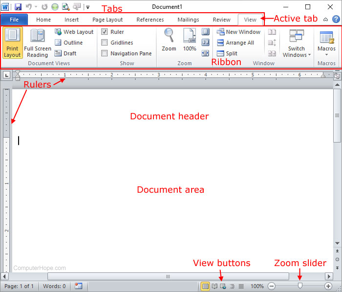
The Ribbon is a graphical user interface (GUI) element that combines the traditional menu bar and toolbars into a single, tabbed pane at the top of a window. It is designed to help users find, understand, and use commands efficiently and directly, with a heavy emphasis on visual cues. To understand how it works, we must break it down into its three primary structural elements.
Tabs: The Top-Level Categorization
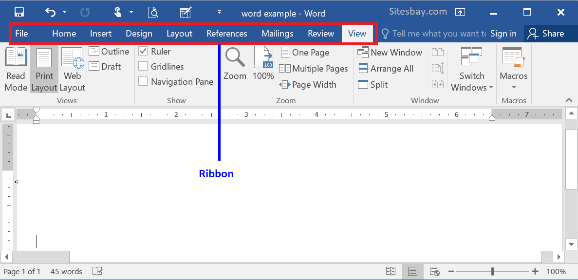
At the very top of the Ribbon are the Tabs. These function similarly to the headings in a traditional menu but act as the primary filter for the user’s current task. For example, in a word processor, the “Home” tab contains the most frequently used formatting tools, while the “Insert” tab is dedicated to adding external elements like tables, images, and headers. By categorizing commands by task rather than by name, the Ribbon allows users to switch contexts quickly without losing their place in the document.
Groups: Logical Sub-divisions
Within each Tab, commands are further organized into Groups. Groups cluster related commands together, often separated by thin vertical lines. In the “Home” tab of a spreadsheet application, you might see groups labeled “Font,” “Alignment,” and “Number.” This hierarchy makes it easier for the human eye to scan the interface. Instead of looking through a list of fifty icons, the user looks for the “Font” group and then identifies the specific bold or italic button they need.
Commands and Galleries: Visual Execution
The final layer consists of the actual buttons, checkboxes, and “Galleries.” Unlike old-school icons that were often tiny and cryptic, Ribbon commands can vary in size. Frequently used commands are often represented by large, prominent icons, while less common ones are smaller. “Galleries” are a particularly powerful feature of the Ribbon; they provide a visual preview of a style or formatting option—such as a specific heading style or a table design—before the user even clicks on it.
The History and Evolution of Ribbon Design
The Ribbon didn’t appear overnight. It was the result of extensive usability testing and a realization that software was becoming too powerful for its own good. By the mid-2000s, Microsoft Office had thousands of commands, but data showed that most users only utilized a tiny fraction of them because they couldn’t find the rest.
The Transition from Classic Menus
Before the Ribbon, the “WIMP” (Windows, Icons, Menus, Pointers) paradigm ruled supreme. While functional, it was inefficient for feature-rich applications. To perform a complex task, a user might have to navigate three levels deep into a “Format” menu. The Ribbon was designed to bring these “buried” features to the surface. It replaced the static menu bar with a dynamic interface that could adapt to what the user was doing.
The Introduction of the Fluent User Interface
The Ribbon was the centerpiece of what Microsoft called the “Fluent User Interface” (not to be confused with the later Fluent Design System). When it debuted in Office 2007, it was a radical departure. It removed the familiar “File” menu and replaced it with the “Office Button.” While the initial reaction from power users was mixed—largely due to the disruption of muscle memory—the efficiency gains were undeniable. It reduced the number of clicks required for common tasks and made the software feel more approachable to beginners.
Adoption Across the Windows Ecosystem
Following its success in productivity suites, Microsoft began integrating the Ribbon into the Windows operating system itself. With the release of Windows 8 and Windows 10, the “File Explorer” (formerly Windows Explorer) adopted a Ribbon interface. This allowed users to perform complex file management tasks—like zipping files, sharing documents, or changing folder views—without needing to right-click or hunt through top-level menus.
Why the Ribbon Matters: Usability and Efficiency
The transition to the Ribbon interface was more than just an aesthetic choice; it was rooted in cognitive science and human-computer interaction (HCI) principles. The goal was to reduce “cognitive load”—the amount of mental effort required to use the software.
Enhancing Feature Discoverability
One of the greatest challenges in software development is “feature discoverability.” If a user doesn’t know a feature exists, it might as well not be there. The Ribbon solves this by placing the most relevant tools in plain sight. Because it uses larger icons and descriptive labels, users often “stumble upon” useful features they never knew existed in older versions of the software.
Contextual Tabs: Dynamic Functionality
Perhaps the most intelligent aspect of the Ribbon is the “Contextual Tab.” These are tabs that only appear when a specific object is selected. For example, if you are editing a document and you click on a picture, a new tab labeled “Picture Format” suddenly appears at the end of the Ribbon. Once you click away from the picture, the tab vanishes. This keeps the interface clean and ensures that the user is only presented with tools that are relevant to the object they are currently manipulating.
Accessibility and Touch-Friendly Design
As computing moved toward hybrid devices and tablets, the Ribbon proved to be more adaptable than traditional menus. Small, text-based drop-down menus are difficult to navigate with a finger or a stylus. The larger, tile-like buttons of the Ribbon provide a much better “hit target,” making software accessible on Microsoft Surface devices and other touch-screen laptops.
Customizing the Ribbon for Productivity
While the Ribbon is designed to be intuitive out of the box, one of its strengths is its flexibility. Tech-savvy users often find that they can significantly boost their workflow by tailoring the Ribbon to their specific needs.
The Quick Access Toolbar (QAT)
For those who miss the simplicity of a single row of icons, the Quick Access Toolbar is a vital feature. Usually located either above or below the Ribbon, the QAT is a small, customizable area where you can pin your most-used commands, such as “Save,” “Undo,” or “Print.” This allows you to access these tools regardless of which Ribbon tab you currently have open.
Hiding and Expanding the Ribbon
On devices with smaller screens, the Ribbon can sometimes take up valuable vertical real estate. Most applications allow users to “collapse” the Ribbon, leaving only the Tab names visible. When you need a tool, you click the tab, the Ribbon drops down, you select your tool, and it automatically tucks itself away again. This “Auto-hide” functionality provides a minimalist environment for focused work while maintaining full power just one click away.
Creating Custom Tabs and Groups
Most modern implementations of the Ribbon allow for deep customization. Users can right-click the Ribbon to enter a customization menu where they can create their own Tabs. For instance, a data analyst might create a tab called “Monthly Reports” and populate it with specific tools from the Data, Insert, and Developer tabs, creating a bespoke workspace that eliminates the need to switch tabs entirely.
The Future of the Ribbon: Minimalism and AI Integration
As software design trends shift toward “flat” and “minimalist” aesthetics, the Ribbon is once again evolving. We are moving away from the crowded, heavy Ribbons of the 2010s toward a more streamlined experience.
The Shift Toward the “Simplified Ribbon”
In recent versions of Microsoft 365 and web-based applications, we see the rise of the “Simplified Ribbon.” This version reduces the Ribbon to a single row of icons, occupying much less space while retaining the tabbed logic. It prioritizes the most essential commands and uses “overflow” menus (the three dots icon) for less common tasks. This reflects a modern understanding that users want a “distraction-free” environment without losing professional-grade functionality.

AI-Powered Contextual Suggestions
The next frontier for the Ribbon is the integration of Artificial Intelligence. Imagine a Ribbon that doesn’t just react to what you click on, but predicts what you are about to do. Using machine learning, future software interfaces may reorganize the Ribbon in real-time based on your habits. If the software senses you are creating a financial chart, it might automatically surface the “Data Analysis” group or suggest specific AI-generated formatting styles.
In conclusion, the Ribbon is far more than a decorative bar at the top of a screen. It is a sophisticated organizational system that bridged the gap between the complex software of the past and the user-centric design of the present. By balancing power with accessibility, the Ribbon has shaped a generation of computing, proving that even as software grows more capable, it can also become easier to use.
aViewFromTheCave is a participant in the Amazon Services LLC Associates Program, an affiliate advertising program designed to provide a means for sites to earn advertising fees by advertising and linking to Amazon.com. Amazon, the Amazon logo, AmazonSupply, and the AmazonSupply logo are trademarks of Amazon.com, Inc. or its affiliates. As an Amazon Associate we earn affiliate commissions from qualifying purchases.