
Understanding your skin’s undertone is one of the most critical elements in effective personal branding, visual design, and professional image management. Whether you are building a personal brand identity, selecting a wardrobe for high-stakes meetings, or defining a consistent color palette for your digital presence, knowing whether you have a “cool” skin tone is a foundational step in aesthetic strategy. In the world of visual communication, color is not merely decorative; it is a psychological tool that influences how you are perceived by clients, colleagues, and audiences.
Defining the Cool Undertone Spectrum
To master your personal or corporate image, you must first distinguish between “surface tone” and “undertone.” Surface tone—or overtone—is the color you see when you look in the mirror (fair, medium, deep, olive). This can change due to sun exposure, environmental factors, or health. The undertone, however, is the constant, subtle hue underneath the surface of your skin. It is the color foundation upon which your entire visual identity is built.
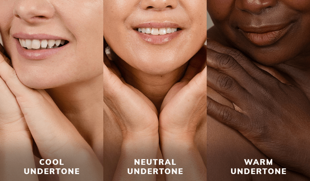
A cool undertone is characterized by subtle hints of blue, pink, or violet beneath the skin’s surface. Unlike warm undertones, which lean toward gold, peach, or yellow, cool undertones reflect the light spectrum in a way that aligns with “cool” colors. Identifying this is not about matching your skin to a foundation shade, but about understanding which color families harmonize with your biological base to project authenticity, confidence, and professionalism.
The Vein and Jewelry Diagnostic
The most common professional methodology for identifying a cool undertone is the “vein test.” Examine the veins on the inside of your wrist under natural, indirect sunlight. If your veins appear predominantly blue or purple, it is a hallmark indicator of a cool undertone. If they appear green, your skin is likely warm.
A second diagnostic tool involves the “jewelry test.” Individuals with cool undertones typically look more vibrant and cohesive when wearing silver, platinum, or white gold. These metals harmonize with the natural blue/pink base of the skin, whereas warm-toned individuals often find that gold enhances their complexion more effectively. In the context of personal branding, these accessory choices influence how your audience interprets your attention to detail and your ability to curate a polished, cohesive aesthetic.
The Contrast Factor
Cool skin tones often exhibit a higher degree of contrast between the iris, the hair, and the skin. This contrast is a powerful design element. If you have cool undertones, your visual strategy should lean into this contrast rather than working against it. Recognizing your skin’s temperature allows you to make informed decisions about photography lighting, makeup application, and digital avatar design, ensuring your image remains sharp and professional across all media platforms.
Color Theory for the Cool-Toned Professional
Once you have identified a cool undertone, your color palette becomes a strategic asset. In branding, color conveys authority, reliability, and emotional intelligence. For those with cool skin, the goal is to choose colors that brighten the complexion and reduce the appearance of sallowness or fatigue.
Leveraging the Jewel Tone Strategy
The “cool” palette is dominated by colors inspired by gemstones and the winter landscape. Think of deep emeralds, royal blues, berry reds, icy violets, and charcoal grays. These hues provide a sharp, clean contrast against cool-toned skin, creating a look that is both sophisticated and authoritative.
In a professional setting, a charcoal gray suit or a crisp, cool-white blouse can elevate your presence significantly more than earthy tones like mustard yellow, warm terracotta, or olive green—which can often make cool-toned skin appear washed out. By aligning your attire with your biological color profile, you reduce visual “noise,” allowing your message and expertise to take center stage.
The Psychology of Cool Colors
From a brand strategy perspective, the colors you wear send a psychological signal. Blues are universally associated with trust, logic, and serenity. Since cool skin tones naturally harmonize with blue-based pigments, wearing blue is not just a stylistic choice; it is an amplification of your brand’s core values. When your appearance matches the message of your brand, you create a subconscious “congruency” that makes you more persuasive and trustworthy.
Design-wise, if you are selecting a color palette for your website, logo, or presentation slides, keep your skin tone in mind. Choosing colors that suit your undertone makes you look more vibrant in videos and headshots, which is essential for building a personal brand in an era dominated by digital communication.

The Role of Lighting and Image Consistency
In a digital-first economy, your “image” is often a series of pixels. Whether you are on a Zoom call, shooting a LinkedIn headshot, or filming a social media reel, lighting is the bridge between your physical reality and your digital brand.
Lighting Temperature and Your Brand
Lighting temperature is measured in Kelvins. “Cool” lighting (high Kelvin) emits a blue-white light, while “warm” lighting (low Kelvin) is more orange or yellow. For individuals with cool skin tones, professional studio lighting should be balanced to complement those blue-pink undertones. If you use lighting that is too warm, you risk making your complexion look muddy or unnatural.
When setting up your home office or studio, invest in adjustable LED lighting. Aim for a “daylight” setting (around 5000K to 5600K). This neutral-to-cool balance will ensure that your skin looks consistent with your chosen branding colors. A high-quality image where your skin tone is accurately rendered builds credibility and reflects a professional standard of excellence.
Consistent Aesthetics across Media
Consistency is the heartbeat of a successful brand. If your logo uses bright, cool-toned blues, but your professional headshots are edited with a warm, sepia-toned filter, you are creating a “disconnect.” Your audience may not consciously identify the reason, but they will sense that something feels “off.”
By understanding that you have a cool undertone, you can instruct your photographers and graphic designers to maintain a consistent aesthetic. Use color-grading tools in your software to ensure that your digital content always leans into cool, crisp tones. This intentionality reinforces your brand identity and makes you instantly recognizable in a crowded digital marketplace.
Strategic Application in Personal Branding
Developing a personal brand is about managing the perception others have of you. Your skin tone is a static variable in your brand toolkit—it is a constant that you should learn to leverage rather than ignore.
Curating a Professional Wardrobe
Think of your wardrobe as an extension of your visual communication. If you are a consultant, an executive, or a creative, your clothing acts as a uniform for your brand. A cool-toned professional should focus on a “capsule” wardrobe that prioritizes jewel tones, stark blacks, navies, and pure whites.
Avoid “autumnal” palettes that feature heavy golds, oranges, and warm browns, as these can conflict with your skin’s natural chemistry, creating a visual distraction. By streamlining your closet to focus on colors that harmonize with your skin, you simplify your morning routine while ensuring you always look your most polished, energized, and ready for business.
Makeup and Grooming for the Camera
For those who wear makeup, the cool-toned strategy is equally vital. Foundation and concealer should be chosen with pink or neutral bases rather than yellow bases. Blush should lean toward cool pinks or berry shades, and lipstick should veer away from warm, brick-orange reds toward blue-based, berry, or plum reds.
These details matter in the context of personal branding because they are indicators of how you manage your own image. Someone who understands their own aesthetic profile is often perceived as someone who possesses high attention to detail—a quality that is highly valued in leadership and client-facing roles.
Conclusion: Integration as Strategy
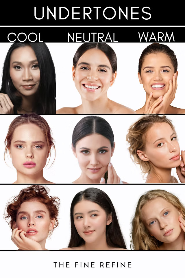
Ultimately, identifying that you have a cool skin tone is an exercise in strategic self-awareness. In the realm of personal branding and professional identity, every visual choice communicates something. By aligning your wardrobe, your digital presence, and your overall aesthetic with your biological reality, you cease to fight against your own features and start to amplify them.
This is not about vanity; it is about efficiency. When you know which colors make you look your best, you spend less time second-guessing your choices and more time focusing on your professional output. A well-curated visual identity, consistent with your unique skin tone, acts as a force multiplier for your professional brand, ensuring that when you step in front of the camera or into a boardroom, your physical presentation is perfectly aligned with the expert you are.
aViewFromTheCave is a participant in the Amazon Services LLC Associates Program, an affiliate advertising program designed to provide a means for sites to earn advertising fees by advertising and linking to Amazon.com. Amazon, the Amazon logo, AmazonSupply, and the AmazonSupply logo are trademarks of Amazon.com, Inc. or its affiliates. As an Amazon Associate we earn affiliate commissions from qualifying purchases.