
In the dynamic world of web development, creating maintainable, scalable, and reusable CSS is a persistent challenge. As websites grow in complexity, so too does the stylesheet, often leading to a tangled web of interdependent rules, naming collisions, and a general state of “CSS chaos.” Enter BEM—Block Element Modifier—a methodology designed to bring structure and predictability to CSS development.
BEM is a component-based approach that helps developers organize CSS classes into independent, reusable modules. Originating from Yandex, a Russian technology giant, BEM provides a strict, unambiguous naming convention that clearly defines the relationship between different parts of a UI component. Its core purpose is to ensure that every CSS class serves a specific, well-understood role, making it easier for individual developers and teams to build, maintain, and scale front-end projects without encountering the common pitfalls of unmanaged CSS. By enforcing a clear separation of concerns and a consistent nomenclature, BEM fundamentally transforms how developers approach styling, fostering a more robust and collaborative development environment.
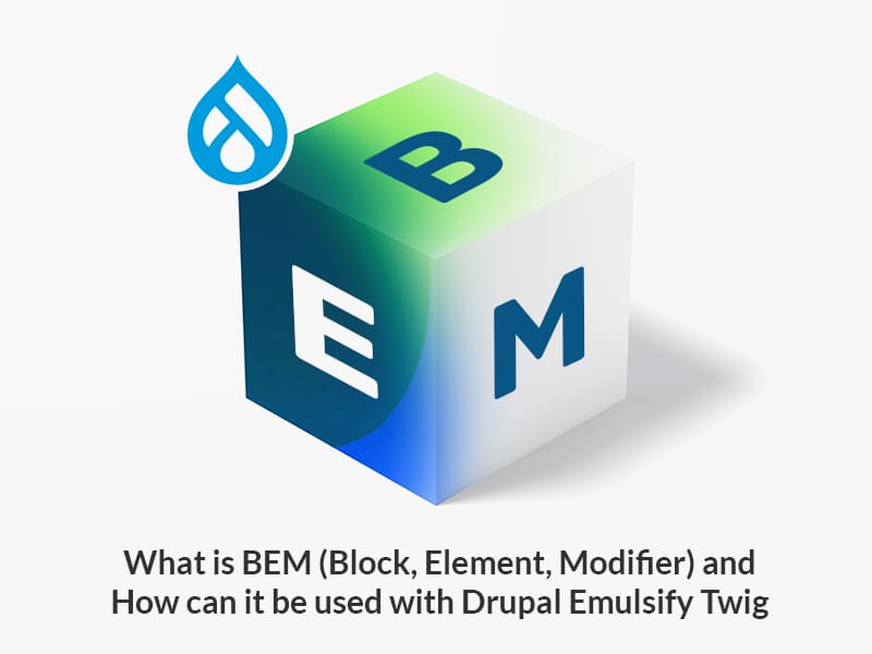
Deconstructing BEM: Blocks, Elements, and Modifiers
At the heart of the BEM methodology lies its triumvirate of concepts: Blocks, Elements, and Modifiers. Understanding these three distinct entities and their prescribed naming conventions is crucial to effectively implementing BEM.
Blocks: The Independent Components
A Block is an independent, standalone entity that is meaningful on its own. It represents a reusable component of the UI. Blocks can be simple, like a button or input, or more complex, such as a header, menu, or card. The key characteristic of a Block is its independence; it should be able to function and be styled correctly regardless of its position on the page or the context in which it appears.
-
Characteristics:
-
Reusable: Blocks are designed to be moved and reused across different parts of a project without breaking.
-
Independent: They should not rely on their surroundings for their styling. All necessary styles for a block should be self-contained within its own class.
-
Context-agnostic: A block should look and behave consistently whether it’s in a sidebar, a main content area, or a footer.
-
-
Naming Convention: Block names are simple, single words or hyphen-separated words in lowercase (e.g.,
header,button,search-form). -
Example:
<div class="header">...</div>

<button class="button">...</button>

<form class="search-form">...</form>
Elements: Parts of a Block
An Element is a part of a Block that has no standalone meaning and is semantically tied to its parent Block. Elements cannot be used outside the context of their Block. For instance, a menu block might have menu__item elements, or a button block might have a button__icon element. The Element’s existence is contingent upon its Block; if you remove the Block, the Element loses its purpose.
-
Characteristics:
-
Context-dependent: Elements are always part of a Block and derive their meaning from it.
-
Not reusable independently: An Element class cannot be applied directly without its parent Block.
-
Directly related to Block: An Element should directly belong to a Block, not to another Element (avoid deep nesting of Elements).
-
-
Naming Convention: Element names are formed by appending two underscores (
__) to the Block name, followed by the Element name (e.g.,block__element). -
Example:
<ul class="menu">

  <li class="menu__item">...</li>

  <li class="menu__item">...</li>

</ul>


<button class="button">

  <span class="button__icon">...</span>

  <span class="button__text">Click Me</span>

</button>
Modifiers: Changing Appearance or Behavior
A Modifier is a flag on a Block or an Element that alters its appearance or behavior. It describes a state, an attribute, or a different version of a Block or Element. For example, a button block could have a button--large modifier to make it bigger, or a menu__item element could have a menu__item--active modifier to indicate its selected state. Modifiers are typically applied alongside the original Block or Element class.
-
Characteristics:
-
Alters existing entity: Modifiers change the styling or behavior of an existing Block or Element, rather than creating a new one.
-
Describes state or variation: They indicate a specific condition (e.g.,
disabled,active) or an alternative style (e.g.,large,primary). -
Additive: Modifiers are added to the existing Block or Element class, not replacing it.
-
-
Naming Convention: Modifier names are formed by appending two hyphens (
--) to the Block or Element name, followed by the Modifier name (e.g.,block--modifierorblock__element--modifier). -
Example:
<button class="button button--large">...</button>

<button class="button button--primary">...</button>


<ul class="menu">

  <li class="menu__item menu__item--active">...</li>

  <li class="menu__item">...</li>

</ul>
Why Choose BEM? The Advantages of a Structured Approach
Adopting BEM is more than just a naming convention; it’s a strategic decision that brings profound benefits to web development projects, particularly as they grow in size and complexity. The structured approach offered by BEM addresses many common pain points associated with CSS maintenance and scalability.
Enhanced Maintainability and Scalability
One of BEM’s most significant advantages is its ability to create a highly maintainable and scalable codebase. Each CSS class name clearly indicates its purpose and relationship within the component, significantly reducing the chances of unintended side effects when making changes.
-
Predictable Class Names: With BEM,
button--primaryclearly tells you it’s a primary version of a button. There’s no guesswork about which styles might be affected. This predictability makes it easier for developers to locate and modify styles without fear of breaking other parts of the UI. -
Reduced Conflicts: BEM’s unique and explicit class names virtually eliminate naming collisions, which are a common source of bugs in larger CSS projects. Each component’s styles are scoped to its Block, preventing styles from leaking out and affecting unrelated elements.
-
Easier Onboarding: New team members can quickly grasp the structure of the CSS. The consistent naming scheme acts as a clear map, allowing them to understand the codebase faster and contribute effectively from day one. This significantly lowers the barrier to entry for collaboration.
-
Facilitates Large-Scale Projects: For applications with hundreds or thousands of components, BEM provides the necessary organizational framework to keep the stylesheet manageable, preventing it from spiraling into an unmaintainable mess.
Improved Reusability
BEM’s design inherently promotes the creation of highly reusable UI components, leading to a more efficient development process and a leaner codebase.
-
Independent Blocks: Because Blocks are designed to be independent and self-contained, they can be easily reused across different pages or even different projects. A
cardblock, for instance, can be dropped into a marketing page, a dashboard, or an e-commerce listing, knowing it will maintain its intended appearance and functionality. -
Reduced CSS Duplication: By fostering reusable components, BEM helps reduce the need to write redundant CSS. Instead of restyling similar elements from scratch, developers can simply reuse existing Blocks and apply Modifiers for specific variations, saving time and reducing the overall stylesheet size.
-
Component-Based Development: BEM aligns perfectly with modern component-based development paradigms (like React, Vue, or Angular), where UIs are built from encapsulated, reusable parts. This synergy makes it a natural choice for many contemporary front-end stacks.
Clearer Communication and Collaboration
In team environments, ambiguity can be a major productivity killer. BEM mitigates this by providing a common language for describing UI components.
-
Shared Vocabulary: The BEM naming convention establishes a shared, unambiguous vocabulary for discussing UI elements. When a designer or developer refers to a
product-card__image--small, everyone on the team knows exactly which element and specific variation they are talking about. -
Reduced Ambiguity: By explicitly defining relationships (Block, Element, Modifier), BEM removes the guesswork from understanding the structure and intent behind CSS rules. This clarity minimizes misinterpretations and leads to more efficient discussions and fewer errors.
-
Streamlined Code Reviews: During code reviews, the BEM structure makes it easier to assess the impact of changes, ensure adherence to coding standards, and identify potential issues, as the class names themselves convey significant structural information.
Better Performance (via Specificity)
While not its primary goal, BEM’s approach to class naming can indirectly contribute to better CSS performance.
-
Low Specificity: BEM primarily relies on single class selectors (e.g.,
.block,.block__element,.block--modifier). This keeps CSS specificity low and flat. High specificity (often caused by ID selectors, nested tag selectors, or!important) can lead to longer cascade resolution times and make overriding styles difficult. -
Simplified Cascade: With low specificity, the CSS cascade becomes more predictable. Styles are applied more directly, reducing the browser’s work in calculating which rules apply to which elements. This can lead to minor performance improvements in rendering, especially on complex pages.
-
Faster Repaint/Reflow: Although the impact is often negligible for most applications, a flatter and more predictable CSS structure can contribute to slightly faster repaint and reflow cycles, as the browser has less complex computations to perform when elements change state or content.
Implementing BEM: Best Practices and Considerations
Implementing BEM effectively goes beyond just knowing the naming rules; it involves adopting certain best practices and understanding when it might or might not be the optimal solution.
Consistency is Key
The power of BEM largely stems from its strict consistency. Deviating from the conventions can undermine its benefits.
-
Adhere Strictly to Naming Conventions: Always use
block,block__element, andblock--modifierorblock__element--modifier. Avoid mixing BEM with other naming conventions or inventing new delimiters. -
Establish Team Guidelines: For larger teams, it’s crucial to document and agree upon how BEM will be applied. This includes decisions on acceptable block names, how to handle complex components, and when to use modifiers versus creating new blocks.
-
Leverage Linting Tools: Integrate CSS linters (like Stylelint) configured with BEM rules into your development workflow. These tools can automatically flag inconsistencies and help enforce the methodology across the team.
Avoiding Over-nesting and Over-modifying
While BEM provides structure, it’s possible to misuse it through excessive nesting or an explosion of modifiers.
-
Elements Should Directly Relate to Their Parent Block: Resist the urge to create elements of elements (e.g.,
block__element__sub-element). If a part of an element needs its own distinct children, it might be a candidate for its own Block. For instance,card__footer__buttonshould likely becard__footer(an element) containing abutton(a block), orcard__buttonif the button’s context is directly the card. -
Modifiers Should Alter, Not Redefine: Modifiers are for variations, not fundamentally different components. If a “modifier” significantly changes the structure or adds too many new properties, it might be better to create a new Block or a more specific Element. A
button--primaryis good; abutton--super-complex-layoutmight be indicative of a new Block. -
Prefer Composition Over Deep Nesting: In modern component-based UIs, it’s often better to compose components (Blocks) together rather than creating deeply nested BEM structures. For example, a
modalblock can contain aheaderblock and abutton-groupblock, rather thanmodal__headerandmodal__button-group.
Integration with Preprocessors and Frameworks
BEM plays well with many modern front-end tools, enhancing their capabilities.
-
Sass/Less/Stylus: CSS preprocessors greatly simplify BEM class generation. You can nest styles within a Block’s definition, using parent selectors (
&) to automatically create Element and Modifier names. This makes writing BEM-structured CSS much more concise..block { // Block styles &__element {// Element styles}
&--modifier {
// Modifier styles}
}
-
UI Frameworks: While some UI frameworks (like Bootstrap) have their own component naming systems, BEM can still be applied to custom components within those frameworks. For example, if you build a custom
data-tablewithin a Bootstrap project, you can use BEM for yourdata-table__rowanddata-table__cell--highlightedto keep your custom CSS organized. BEM can also serve as a foundational methodology for building your own design systems, providing the underlying structure for components that are framework-agnostic.
When BEM Might Not Be the Best Fit
While powerful, BEM is not a universal panacea for all CSS problems.
-
Small, Simple Projects: For very small, static websites with minimal styling and no need for extensive scalability, the overhead of strictly applying BEM might outweigh its benefits. A simpler approach might suffice.
-
Existing Legacy Projects: Introducing BEM into an already large, deeply ingrained, and unstructured CSS codebase can be a daunting and potentially risky refactoring effort. It might be more practical to adopt BEM for new components or gradually refactor.
-
Overly Dynamic/Fluid Styles: If your styles are heavily reliant on very granular, context-sensitive styling that changes frequently based on JavaScript, BEM’s rigid structure might sometimes feel restrictive. However, even in such cases, BEM can provide a strong foundation for the core components, while dynamic styles are handled via inline styles or utility classes.
Beyond the Basics: Advanced BEM Concepts
Once the core principles of Blocks, Elements, and Modifiers are mastered, there are a few additional concepts and considerations that can further refine your BEM implementation.
Mixes (Optional but useful)
A “mix” in BEM refers to the ability to apply multiple BEM entities to a single DOM node. This allows a component to inherit styles and behaviors from several blocks or an element to also behave as a block. While less commonly emphasized in strict BEM, mixes can be useful for sharing common behaviors or visual styles without creating deep inheritance chains or redundant CSS.
-
Purpose: To combine the functionality or appearance of different BEM entities on a single HTML element. For example, a
search-formblock might contain abuttonthat also needs the styles of asearch-form__submitelement. -
Example:
<form class="search-form">

  <input class="search-form__input" type="text">

  <button class="button search-form__submit">Search</button>

</form>
Here, the
buttonelement is a Block (.button) and simultaneously an Element of thesearch-formBlock (.search-form__submit). This allows the button to maintain its general button styles while also getting specific styling relevant to its role within the search form.
BEM and JavaScript Integration
BEM encourages a clear separation of concerns, which extends to JavaScript interaction.
-
CSS for Styling, JS for Behavior: BEM classes should primarily be used for styling. For JavaScript interactions, it’s often recommended to use separate, dedicated JavaScript hook classes (e.g.,
js-toggle,data-modal-open) or data attributes (data-js-toggle). This ensures that changes to CSS class names for styling purposes won’t inadvertently break JavaScript functionality, and vice versa. -
Modifying State with JS: JavaScript can easily interact with BEM by adding or removing modifier classes to Blocks or Elements to reflect changes in state. For example, clicking a menu item could trigger JS to add
menu__item--activeto that item.
Tooling and Ecosystem
The popularity of BEM has led to a supportive ecosystem of tools that aid in its implementation and enforcement.
-
Linters: Tools like Stylelint can be configured with specific rules to validate BEM naming conventions, ensuring consistency across a project.
-
Build Tools: Task runners and bundlers can integrate with preprocessors to compile BEM-structured SASS/LESS into efficient CSS.
-
Design Systems: Many modern design systems and UI libraries implicitly or explicitly use BEM-like structures for their components, recognizing its value in creating scalable and maintainable interfaces.

Conclusion
BEM (Block Element Modifier) stands as a robust and widely adopted methodology for structuring CSS in large-scale web development. By imposing a clear, consistent, and predictable naming convention, BEM tackles the perennial challenges of CSS maintainability, scalability, and reusability head-on. It empowers development teams to collaborate more effectively, onboard new members with greater ease, and build complex user interfaces with confidence, knowing that their styles are organized, isolated, and less prone to unintended side effects.
While BEM requires a disciplined approach and might initially feel verbose, the long-term benefits in terms of code quality, development efficiency, and project longevity are undeniable. Whether building a small component library or an enterprise-level application, embracing BEM can transform CSS from a source of frustration into a powerful, predictable tool for crafting beautiful and functional web experiences. By understanding and diligently applying its core principles, developers can unlock a new level of control and clarity in their front-end work, making “CSS chaos” a relic of the past.
aViewFromTheCave is a participant in the Amazon Services LLC Associates Program, an affiliate advertising program designed to provide a means for sites to earn advertising fees by advertising and linking to Amazon.com. Amazon, the Amazon logo, AmazonSupply, and the AmazonSupply logo are trademarks of Amazon.com, Inc. or its affiliates. As an Amazon Associate we earn affiliate commissions from qualifying purchases.