
The way art is positioned on a wall is the difference between a curated space and a disorganized collection of items. In professional interior design and brand styling, the placement of art is not merely a matter of personal preference; it is a calculated decision based on human ergonomics, spatial geometry, and the psychological impact of visual hierarchy. Whether you are staging a corporate office to reflect a specific brand identity or curating a home gallery to enhance an interior aesthetic, understanding the technical specifications of art installation is essential to creating a cohesive environment.

The Standard Rule: The 57-Inch Principle
In professional design, the most widely accepted standard for hanging art is the “57-inch rule.” This principle dictates that the center of the artwork should be positioned 57 inches from the floor. This measurement is derived from the average human eye level, ensuring that the focal point of the image aligns naturally with a standing viewer’s gaze.
Why 57 Inches Works
The objective of interior design is to create a seamless flow that minimizes visual friction. When art is hung too high, the viewer must crane their neck, creating an immediate physical disconnect. When hung too low, the work feels diminished and disconnected from the surrounding furniture. By consistently placing the midpoint of a piece at 57 inches, you create a baseline that allows the eye to travel across a gallery wall with ease, lending a sense of institutional professionalism to the space.
Adjusting for Contextual Variables
While 57 inches is the gold standard, branding and spatial design often require minor deviations. For example, if your brand identity relies on a minimalist or “gallery-style” aesthetic, you may choose to lower the center point to 55 or 56 inches to make the space feel more intimate and grounded. Conversely, in high-traffic commercial spaces where people primarily view art from a distance, or in hallways with vaulted ceilings, adjusting upward by an inch or two can help compensate for the increased perspective angle.
Furniture Integration and Spatial Anchoring
Art does not exist in a vacuum; it exists in relation to the furniture, lighting, and architectural features of a room. A common design failure is treating the wall as a blank canvas separate from the floor plan. To establish a sophisticated interior brand, art must act as a visual anchor that ties individual elements—such as a sofa, a console table, or a desk—together into a unified composition.
Hanging Over Furniture
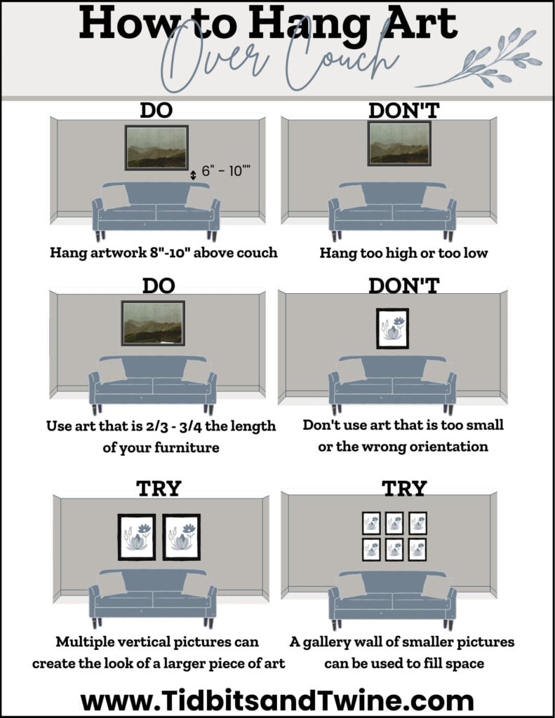
When placing art above a piece of furniture, the 57-inch rule often takes a backseat to the relationship between the art and the object below it. A piece that is hung too high above a sideboard creates an uncomfortable visual gap, effectively “floating” the art in space and destroying the composition’s cohesion.
Ideally, the bottom edge of the frame should sit between 6 and 10 inches above the top of the furniture. This proximity grounds the artwork, signaling that the piece is part of the furniture’s “zone” rather than a separate, accidental inclusion. If you are hanging a large piece over a sofa, ensure that the frame width spans at least two-thirds to three-quarters the width of the sofa itself to maintain visual balance and proportion.
Considering Vertical Proportions
For narrow wall segments—such as those between two doorways—the 57-inch midpoint rule may not be achievable due to limited space. In these instances, focus on centering the art vertically within the available architectural frame. If the vertical space is significantly taller than the art, prioritize a position that aligns the center of the artwork with the eye level of someone sitting or standing in that specific transit zone.
Creating Dynamic Gallery Walls and Groupings
Gallery walls are a powerful tool for visual storytelling and brand messaging. They allow for the display of diverse media, scales, and colors. However, without a systematic approach, a collection of frames can quickly devolve into visual clutter. When installing multiple pieces, the goal is to treat the collective group as a single, large-scale unit.
Maintaining Uniform Spacing
The secret to a polished gallery wall is not just the placement of the pieces, but the consistency of the “negative space” between them. As a rule of thumb, maintain a 2-inch to 3-inch gap between each frame. This uniform spacing creates a rhythmic visual flow that guides the eye across the entire arrangement.
Before committing to wall hardware, lay your pieces out on the floor. Use the 57-inch rule to determine where the center of the entire collection should land. From that anchor point, build outward, ensuring that the outer perimeter of the collection feels balanced.
Symmetrical vs. Asymmetrical Layouts
If your brand leans toward a traditional or conservative identity, a symmetrical grid layout provides a sense of order and reliability. Ensure the gaps are mathematically identical in both horizontal and vertical directions. If your brand identity is more creative or avant-garde, an asymmetrical layout allows for a more fluid, organic feel. In an asymmetrical arrangement, prioritize “visual weight” over geometric perfection. Ensure that larger, darker, or more complex pieces are distributed evenly across the grouping so that one side of the wall does not feel “heavier” than the other.
Technical Considerations: Hardware and Safety
Beyond aesthetics, the longevity of your art installation depends on the technical execution of the hanging process. Professional installation avoids the common pitfalls of improper weight distribution and wall damage, which can undermine the integrity of your interior design.
Selecting the Right Hardware
The hardware should always be chosen based on the weight of the frame and the material of the wall. For drywall, use high-quality picture hooks or specialized wall anchors. Avoid basic nails where possible, as they can loosen over time, leading to shifted artwork or potential wall damage. If you are hanging heavy, framed pieces, utilize two attachment points on the back of the frame to prevent the art from tilting. This dual-point system also helps maintain the level of the piece, as it is less prone to shifting when doors are slammed or floors vibrate.
Measuring and Marking
Precision is non-negotiable. Do not measure from the top of the frame, as the placement of the wire or D-ring on the back varies. Instead, use a measuring tape to determine the distance from the top of the frame to the point where it catches the hook.
- Calculate the target center point (e.g., 57 inches from the floor).
- Measure the height of your artwork and divide by two.
- Add that measurement to your 57-inch target.
- Subtract the distance from the top of the frame to the hanging hardware.
- This final number is the exact location where your hook or nail needs to be placed.

Architectural Sightlines
Always account for sightlines from common vantage points. When you walk into a room, where is your eye naturally drawn? The most impactful art should be placed in areas that serve as natural focal points—directly across from the primary entrance or centered on the most prominent wall in the room. In a corporate environment, consider the view from the doorway to ensure the art reinforces the brand’s desired message immediately upon entry. By applying these standards of height, spatial integration, and technical precision, you transform a wall from a structural necessity into an intentional component of your design identity.
aViewFromTheCave is a participant in the Amazon Services LLC Associates Program, an affiliate advertising program designed to provide a means for sites to earn advertising fees by advertising and linking to Amazon.com. Amazon, the Amazon logo, AmazonSupply, and the AmazonSupply logo are trademarks of Amazon.com, Inc. or its affiliates. As an Amazon Associate we earn affiliate commissions from qualifying purchases.