
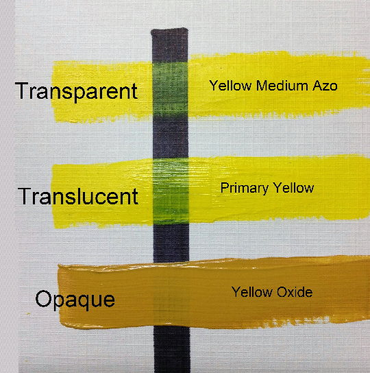
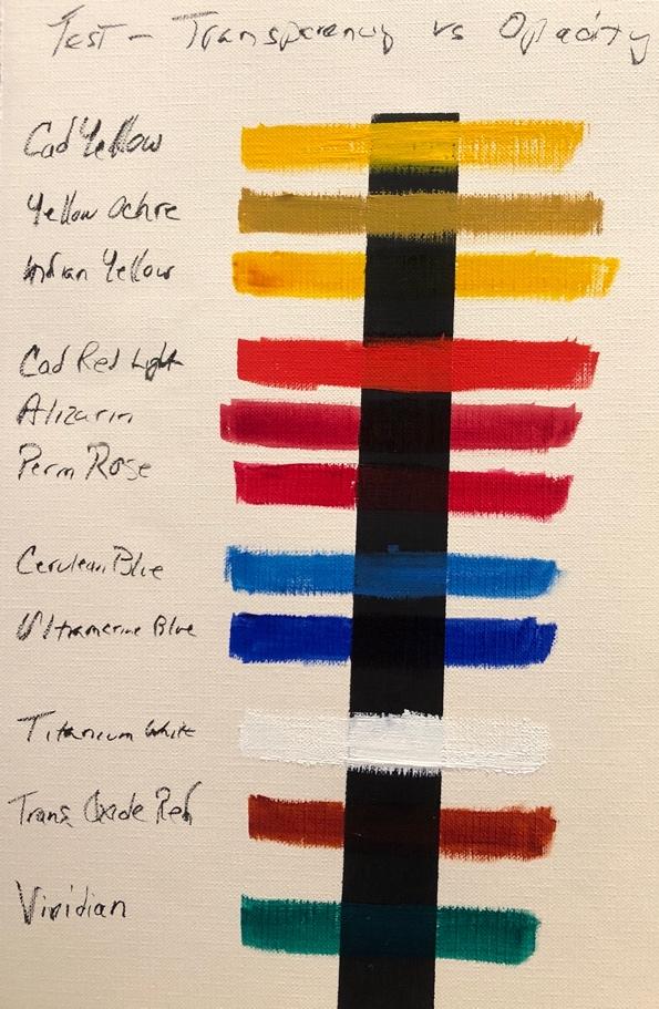
In the traditional art world, transparency refers to the physical property of a medium that allows light to pass through it, revealing what lies beneath. From the delicate washes of a Renaissance watercolor to the layered glazes of an oil masterpiece, transparency has always been a tool for creating depth, luminosity, and realism. However, when we transition from the canvas to the boardroom, the definition of “transparent” in art evolves into a powerful metaphor and a cornerstone of modern brand strategy.
In the context of brand design and corporate identity, transparency is both a visual technique and a philosophical stance. It is the intersection where aesthetic choices meet consumer psychology. For a brand, being “transparent” means using visual art and design to communicate honesty, accessibility, and modernism. It is no longer just about the opacity of a layer in Photoshop; it is about how that visual choice builds a bridge of trust between a corporation and its audience.
The Aesthetics of Opacity: Transparency as a Modern Design Language
The visual application of transparency in brand art is one of the most significant shifts in graphic design over the last two decades. As brands moved from the static world of print to the dynamic world of digital interfaces, the “art” of the brand had to adapt to screens that offer infinite layers of depth.
From Layers to Legacy: The Evolution of Visual Overlays
In the early days of corporate branding, logos were often solid, heavy, and opaque. This reflected an era of industrial permanence—brands wanted to appear like unshakeable pillars of society. However, as the digital revolution took hold, the “art” of branding began to embrace the overlay. By using transparent layers where colors overlap to create new hues, designers began to signal a different set of values: collaboration, connectivity, and agility.
The use of transparency in a logo or a visual system suggests that the brand is not a closed box. It implies an “open-source” mentality, even for companies that are strictly proprietary. When a consumer sees colors blending through transparent shapes, they subconsciously perceive a brand that is multifaceted and integrated into their world, rather than one that stands apart from it.
The Rise of Glassmorphism in Digital Brand Identity
One of the most prominent trends in contemporary brand art is “glassmorphism.” This design style uses transparency, background blur, and subtle borders to create an effect that looks like frosted glass. Used extensively by tech giants in their operating systems and brand ecosystems, this artistic choice serves a specific strategic purpose.
By making elements of a brand’s digital presence transparent, designers reduce the “cognitive load” on the user. Transparency allows for a sense of hierarchy without the need for harsh lines or heavy blocks of color. In brand strategy, this translates to a “frictionless” experience. The art of transparency here is used to make complex technology feel lightweight, approachable, and integrated.
The Psychology of Transparency: Building Trust Through Design
Beyond the technical execution of a design, transparency in art functions as a powerful psychological trigger. In an era where consumers are increasingly skeptical of corporate “smoke and mirrors,” the visual representation of openness has become a vital asset for brand equity.
Cognitive Ease and Minimalist Aesthetics
Transparent art in branding often goes hand-in-hand with minimalism. When a brand strips away opaque layers and busy textures, it reveals its “true self.” This aesthetic choice is rooted in the principle of cognitive ease—the idea that humans prefer information that is easy to process.
A transparent design feels breathable. It suggests that the brand has nothing to hide. This is why we see a surge in transparent packaging in the retail sector and transparent UI elements in the financial services sector. By visually showing “the inside,” whether it is the product itself or the data behind a service, the brand uses art to validate its claims of honesty.
Transparency vs. Opacity: Communicating Brand Authority
While transparency communicates accessibility, it must be balanced with enough opacity to maintain authority. A brand that is entirely “see-through” may lack the visual weight necessary to be taken seriously. The strategic use of transparency involves a careful calibration of what to show and what to obscure.
In professional branding, transparency is often used in accents—watermarks, ghosted backgrounds, or glass-like icons—to suggest sophistication. This artistic balance tells the consumer: “We are open and honest, but we are also a solid, stable entity.” Mastering this balance is the difference between a brand that feels flimsy and one that feels modern and trustworthy.
Case Studies in Branding: When Transparency Becomes the Identity
To understand what transparency means in art within a commercial context, we must look at the brands that have successfully integrated this concept into their core visual strategy.
The Mastercard Evolution: Connectivity Through Color Overlap
Perhaps the most famous example of transparency in brand art is the Mastercard logo. Originally consisting of two solid interlocking circles, the brand evolved its identity to use a transparent overlap where the red and yellow meet to create orange.
This was not a random aesthetic choice. The transparency represents the “seamless” nature of modern transactions and the “connectivity” of a global financial network. By making the center of their logo transparent, Mastercard moved from being a symbol of a physical “card” to a symbol of a digital “gateway.” The art reflected the shift in the business model from hardware to software.
Software Ecosystems: How Tech Giants Use Depth to Simplify Complexity
Companies like Apple and Microsoft have redefined their brand identities through the use of transparency. Apple’s “Vibrancy” effect in iOS and macOS uses transparency to pull the colors of the user’s wallpaper into the interface. This makes the software feel like it belongs specifically to the user.
From a brand strategy perspective, this use of transparent art fosters a sense of personal ownership. The brand “disappears” into the user’s life, becoming a transparent lens through which they view their world. This is the ultimate goal of modern brand art: to be so well-integrated and transparent that the user no longer perceives the brand as an external intruder, but as a natural extension of their own identity.
Implementing Transparency in Your Brand Strategy
For business leaders and designers, incorporating transparency into a brand’s visual language requires more than just lowering the “Opacity” slider in a design tool. It requires a thoughtful alignment between the visual art and the brand’s core values.
Balancing Visual Interest with Functional Legibility
The primary challenge of using transparency in art is maintaining legibility. In branding, the message must always be clear. A common mistake is using too much transparency, which leads to “visual mud”—a state where overlapping elements become unreadable or messy.
Strategic transparency should enhance the message, not obscure it. This means using high-contrast backgrounds behind transparent elements or using “blur” filters to ensure that text remains readable. In the world of high-end branding, transparency is used with surgical precision to highlight specific “hero” elements while keeping the overall identity grounded.
Designing for Multi-Platform Consistency
Transparency behaves differently across different mediums. What looks like a sophisticated frosted-glass effect on a high-resolution OLED screen might look like a grey smudge on a printed business card or a low-quality billboard.
A “transparent” brand identity must be designed with “fallback” versions. This is where the art of branding becomes a technical discipline. Designers must create rules for how transparency translates to solid colors when the medium doesn’t support alpha channels. This ensures that the brand’s “spirit of openness” remains intact regardless of whether it is being viewed on a smartphone or a shipping crate.

The Future of Transparent Art in Corporate Communications
As we look toward the future, the concept of transparency in art will likely move beyond 2D screens and into 3D environments, such as Augmented Reality (AR) and Virtual Reality (VR). In these spaces, transparency will be literal. Brands will exist as digital overlays on the physical world.
The strategic importance of this cannot be overstated. When a brand exists as a transparent layer over a consumer’s actual reality, the level of trust required is immense. The “art” will need to be even more refined—less intrusive, more helpful, and perfectly clear.
In conclusion, “transparent” in the context of brand art is far more than a visual setting. It is a visual shorthand for a company’s relationship with its audience. It represents a move away from the opaque, “top-down” corporate structures of the past and toward a future defined by clarity, connectivity, and mutual trust. By mastering the art of transparency, brands can create a visual identity that doesn’t just sit on a surface, but lives, breathes, and connects with the world around it.
aViewFromTheCave is a participant in the Amazon Services LLC Associates Program, an affiliate advertising program designed to provide a means for sites to earn advertising fees by advertising and linking to Amazon.com. Amazon, the Amazon logo, AmazonSupply, and the AmazonSupply logo are trademarks of Amazon.com, Inc. or its affiliates. As an Amazon Associate we earn affiliate commissions from qualifying purchases.