
When assessing the visual landscape of global symbols, few designs command as much immediate recognition as the Texas flag. To the casual observer, the answer to “what does the texas flag look like” is a simple description of colors and a single star. However, from the perspective of brand strategy and corporate identity, the Texas flag represents a masterclass in minimalism, emotional resonance, and strategic design. It is not merely a piece of fabric; it is a highly optimized visual identity that has sustained its relevance for nearly two centuries.
In the world of branding, we often look for “The North Star”—a guiding principle that makes a brand unforgettable. The Texas flag, known officially as the Lone Star Flag, provides a blueprint for how a simple graphic arrangement can create a powerful, scalable, and enduring brand equity.
The Anatomy of the Lone Star Design: Simplicity and Hierarchy
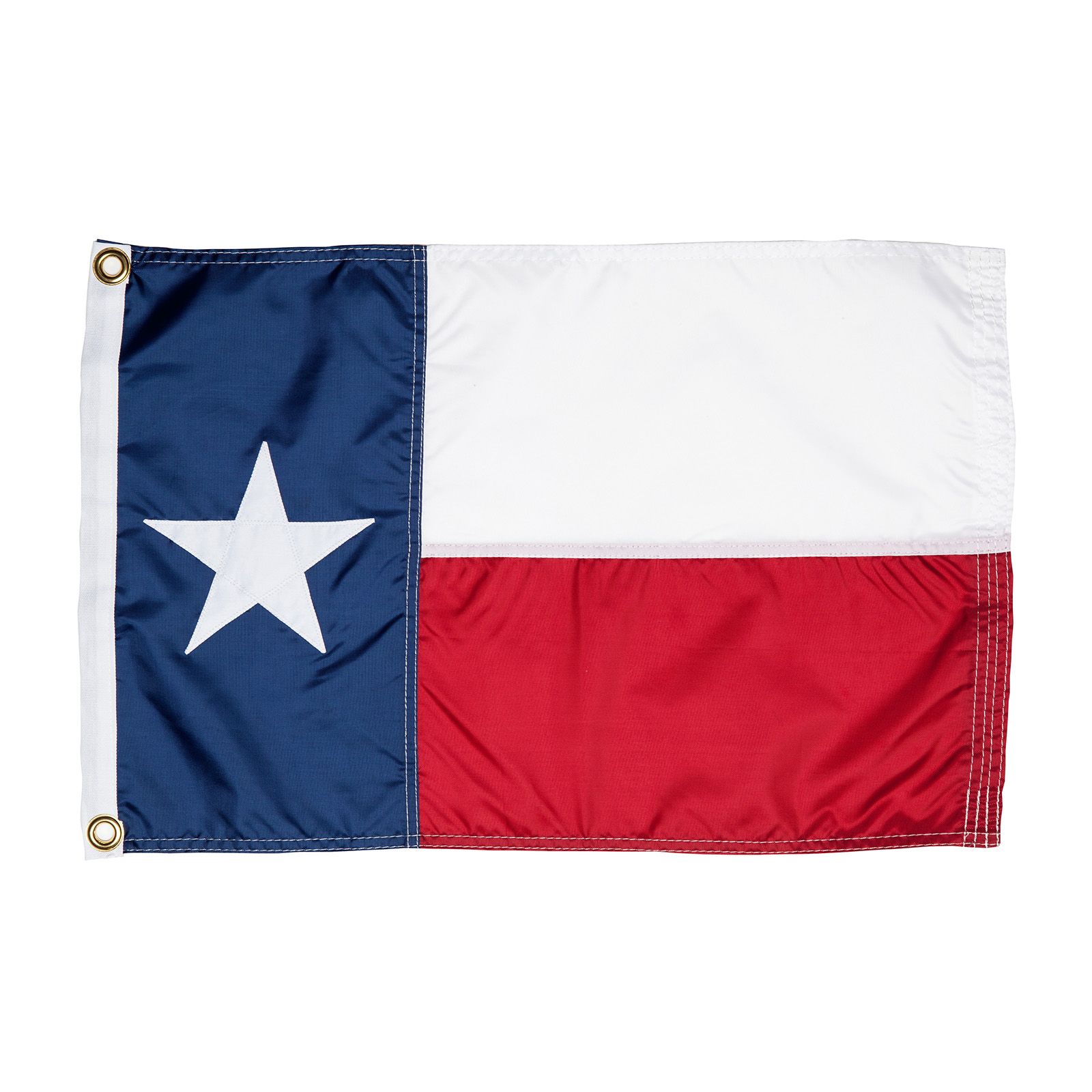
The visual composition of the Texas flag is defined by a rigorous adherence to geometric balance. To understand what the flag looks like is to understand the core principles of effective logo design. It consists of a vertical blue stripe on the left (the hoist side) that takes up one-third of the flag’s length. In the center of this blue field sits a single, white, five-pointed star. The remaining two-thirds of the flag are divided into two horizontal stripes: a white stripe on top and a red stripe on the bottom.
The Power of Minimalism
Modern brand strategists often preach the “KISS” principle (Keep It Simple, Stupid), and the Texas flag is the historical antecedent to this movement. By utilizing only three primary colors and one central icon, the design avoids the “visual noise” that plagues many other state and corporate identities. In branding, simplicity equates to recall. Because the Texas flag is composed of basic shapes and high-contrast colors, it is easily reproducible across any medium—from a tiny digital favicon to a massive physical billboard.
Visual Hierarchy and the “Rule of Thirds”
The flag utilizes a sophisticated visual hierarchy. The blue vertical bar acts as a grounding element, providing a weighted anchor for the design. The white star, placed dead center within that blue field, serves as the primary focal point (the “hero” element). This use of negative space around the star ensures that the eye is immediately drawn to the most important symbol of the brand. For a brand strategist, this is a lesson in directing the viewer’s attention toward the core message without distraction.
Color Psychology and the Strategic Palette
In brand identity design, colors are never chosen at random. They are selected to evoke specific emotions and convey a brand’s “voice.” The Texas flag utilizes a palette that is both classic and assertive, mirroring the values of the region it represents.
Blood, Purity, and Loyalty: The Narrative Palette
The specific shades used in the Texas flag are identical to those in the United States national flag: Old Glory Blue, Old Glory Red, and white. However, the way they are partitioned creates a distinct narrative.
- Blue (Loyalty): The blue vertical stripe represents the virtue of loyalty. In branding, blue is often used to establish trust, stability, and professionalism (think IBM, Facebook, or Chase Bank).
- White (Purity): The white stripe and the star represent purity and strength of purpose. In design, white space (or negative space) is essential for clarity and “breathability.”
- Red (Bravery): The red stripe represents bravery. Red is an “action” color, designed to stimulate the senses and convey energy and passion.
High-Contrast Branding
From a technical design standpoint, the juxtaposition of red, white, and blue offers maximum contrast. This ensures that the identity remains legible even in low-visibility conditions or when viewed from a distance. For a corporate brand, high contrast is a functional requirement for signage and mobile applications. The Texas flag’s color blocking is so effective that even when the star is removed, the arrangement of colors remains a recognizable shorthand for the “Texas” brand.

The “Lone Star” as a Global Corporate Identity
The single star is perhaps the most successful “brand icon” in American history. It is a singular, focused image that differentiates Texas from the “stripes and multiple stars” of the national flag. In the realm of brand strategy, this is known as a “Unique Selling Proposition” (USP) translated into a visual asset.
Differentiation in a Crowded Market
In a marketplace of 50 different state identities, many flags are indistinguishable “seals on a blue bedsheet.” The Texas flag stands out because it opted for a bold, graphic approach rather than a complex, illustrative one. This is the same strategy used by companies like Apple or Nike; they moved away from complex imagery toward a single, iconic shape. The “Lone Star” has become such a potent brand asset that it is now used by thousands of independent businesses to signal quality, independence, and regional pride.
Scalability and Versatility
A hallmark of a great brand is its ability to be “deconstructed.” The Texas flag is so well-designed that its elements can be used independently while still maintaining brand recognition. You can take the five-pointed star, place it on a red-and-white background, and the consumer immediately associates it with the Texas identity. This level of “brand elasticity” is what every corporate identity designer strives to achieve. It allows the brand to live on merchandise, apparel, digital interfaces, and physical architecture without losing its soul.
Leveraging Regional Identity: The Texas Flag as a Marketing Powerhouse
Beyond its visual components, the Texas flag functions as a “trust signal.” In marketing, a trust signal is a visual cue that reassures the customer they are making a safe or culturally aligned choice. The Texas flag has been successfully “co-branded” with the state’s economy, creating a “Made in Texas” aura that businesses leverage globally.
The Halo Effect in Branding
When a brand incorporates the Texas flag or its likeness into its logo, it is attempting to capture the “Halo Effect.” The positive associations people have with Texas—independence, friendliness, resilience, and scale—are transferred to the product. This is why you see the flag’s design language reflected in the branding of companies like H-E-B, Whataburger, and Shiner Beer. These brands don’t just sell products; they sell an identity that is inextricably linked to the visual language of the Lone Star.
Cultural Continuity and Brand Loyalty
The Texas flag succeeds because it fosters a sense of “membership.” In the world of brand strategy, the highest level of achievement is “Brand Advocacy,” where consumers become fans. The ubiquity of the Texas flag on t-shirts, trucks, and tattoos is proof of a brand that has transcended commerce to become a part of a person’s self-identity. It is a reminder that effective branding isn’t about what you sell, but about what you represent.
Strategic Takeaways for Modern Brand Identity Designers
By analyzing “what the texas flag looks like,” we can extract several critical lessons for contemporary brand building and design.
- Prioritize the Icon: A single, strong icon (the Star) is more memorable than a series of complex images. In an era of shrinking attention spans, the “instant read” is king.
- Own a Color Story: The specific arrangement of red, white, and blue in the Texas flag is distinct enough that it cannot be easily confused with other “patriotic” brands. Consistency in color application is the foundation of brand recognition.
- Design for the Medium: The flag’s bold lines and simple shapes were designed for the medium of wind and cloth, but they work perfectly for the medium of the smartphone screen. Always design your identity for its most challenging environment.
- Connect to a Larger Narrative: The flag isn’t just a design; it’s a story of independence. Brands that tap into a larger cultural or historical narrative often find much deeper resonance with their audience than those that focus purely on aesthetics.
In conclusion, the Texas flag is a masterwork of visual communication. It answers the question of identity with clarity, boldness, and a strategic use of symbolism that has allowed it to become one of the most recognizable brands in the world. Whether you are designing a logo for a startup or a corporate identity for a multinational conglomerate, the principles found within the red, white, and blue of the Lone Star Flag remain the gold standard for iconic branding.
aViewFromTheCave is a participant in the Amazon Services LLC Associates Program, an affiliate advertising program designed to provide a means for sites to earn advertising fees by advertising and linking to Amazon.com. Amazon, the Amazon logo, AmazonSupply, and the AmazonSupply logo are trademarks of Amazon.com, Inc. or its affiliates. As an Amazon Associate we earn affiliate commissions from qualifying purchases.