In the landscape of modern software, few applications have had as profound an impact on human interaction as Tinder. Since its inception, the app has become a case study in intuitive User Interface (UI) design, popularizing the “swipe” mechanic that has since been adopted by industries ranging from e-commerce to news aggregators. However, as the platform has evolved from a simple matching tool into a complex ecosystem of premium features, its iconography has grown increasingly dense.
Understanding what the symbols on Tinder mean is more than a lesson in digital literacy; it is an exploration of how software developers use visual shorthand to guide user behavior, manage algorithmic queues, and monetize social interactions. This guide provides a deep dive into the technical and functional significance of Tinder’s visual language.

1. The Core Interaction Tier: Swiping Mechanics and Primary Icons
At its heart, Tinder operates on a binary logic system—Yes or No—facilitated by a set of globally recognized symbols. These icons are the primary touchpoints for the app’s core functionality, representing the basic inputs that feed into its proprietary matching algorithm.
The Green Heart and the Red ‘X’
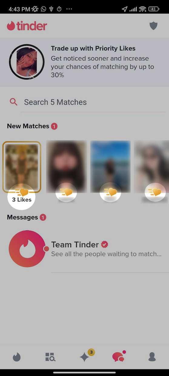
The green heart and the red ‘X’ (often referred to as the “Nope” button) are the pillars of Tinder’s UI. Technically, these represent the “Like” and “Pass” functions. When a user taps the heart or swipes right, the app records a positive signal in the database for that specific user ID pair. If the sentiment is mutual, the system triggers a “Match” event. From a software design perspective, these symbols are color-coded to align with universal traffic signals—green for go/positive, red for stop/negative—minimizing the cognitive load on the user.
The Blue Star: The Super Like
The blue star represents the “Super Like,” a feature designed to bypass the standard stack. When a user employs a Super Like, their profile is prioritized in the recipient’s queue, often highlighted with a bright blue border and the star icon itself. From a technical standpoint, the Super Like is a “high-signal” interaction. It signals to the server that a match is highly desired, often resulting in a notification sent directly to the recipient’s device, provided their privacy settings allow it.
The Yellow Rewind Arrow
The yellow circular arrow is the “Rewind” symbol. This is a premium-tier function that allows users to undo their last swiping action. In terms of data management, this requires the app to maintain a temporary local cache or a brief history of the user’s recent “Nope” actions on the server, allowing the state to be reverted. It is a safety net for accidental inputs, a common issue in fast-paced mobile UI environments.
2. Monetization and Performance: The Purple Bolt and Gold Diamond
Tinder’s business model relies heavily on “freemium” features, and its iconography is carefully crafted to distinguish between standard organic use and paid algorithmic advantages.
The Purple Lightning Bolt: Tinder Boost
The purple lightning bolt symbolizes “Boost” or “Super Boost.” When activated, this icon indicates that the user’s profile is being “boosted” to the top of the stack in their geographical area for a set duration (usually 30 minutes).
Technically, this is an algorithmic override. During a Boost, the backend logic shifts the user’s visibility parameters, increasing the frequency with which their profile object is served to other users’ clients. The lightning bolt is a metaphor for speed and power, signaling a temporary surge in the user’s digital presence within the app’s ecosystem.
The Gold Diamond: Top Picks
The gold diamond icon represents the “Top Picks” feature. This is a curated list of profiles that the Tinder algorithm identifies as highly compatible with the user based on swiping patterns and profile data.
The use of a diamond—a symbol of value and rarity—is a deliberate UI choice to denote “high-quality” data processing. Behind the scenes, Top Picks utilize machine learning models that analyze user preferences, keywords in bios, and historical interaction data to present a filtered subset of the database, theoretically increasing the probability of a successful match.
The Gold Heart: Likes You
If you see a gold heart (often appearing in the bottom navigation bar or on a specific profile), this signifies the “Likes You” feature, exclusive to Tinder Gold and Platinum subscribers. This symbol allows users to see who has already swiped right on them before they commit to a swipe. In database terms, this is a simple query of “received likes” that have not yet been matched or rejected, presented through a specialized UI view.
3. Trust, Safety, and Identity: Verification and Status Symbols
In the realm of digital security and user trust, Tinder employs specific badges to verify the authenticity of its users. These symbols are critical for maintaining the integrity of the platform’s social graph.
The Blue Checkmark: AI-Driven Verification
The blue checkmark is perhaps the most important security symbol on the app. It indicates that a profile has been “Photo Verified.” Tinder uses a sophisticated AI-assisted process where users are asked to take a series of real-time selfies in specific poses.
The software then uses facial recognition technology to compare the geometry of the user’s face in the real-time selfies against the uploaded profile pictures. Once the system (and sometimes a human moderator) confirms a match, the blue checkmark is appended to the user’s profile object. This serves as a cryptographic-like proof of identity, reducing the prevalence of “catfishing” and bot accounts.
The Red Dot: Activity Status
A small red or green dot appearing next to a user’s name indicates their recent activity status. A green dot typically means the user has been online within the last 24 hours. From a software perspective, this is a real-time (or near-real-time) status update triggered by the user’s last “session start” timestamp. This feature is designed to increase user engagement by showing which profiles are currently active participants in the network.
The Shield Icon: Safety Toolkit
Located within the messaging interface or on profile views, the shield icon represents Tinder’s “Safety Toolkit.” This is the gateway to the app’s digital security features, including reporting tools, unmatching capabilities, and “Does This Bother You?” AI prompts. The shield is a universal symbol for protection, housing the logic required to flag problematic content or block users, which in turn informs the app’s moderation algorithms.
4. The UI/UX Philosophy Behind the Symbols
To understand why Tinder uses these specific symbols, one must look at the broader trends in software development and mobile UX. The move toward an icon-driven interface is a strategic choice to facilitate global scalability and rapid interaction.
Reducing Cognitive Friction
In the “attention economy,” apps compete for every millisecond of a user’s focus. Text-based buttons require the brain to process language, which is slower than recognizing a shape or color. By using symbols like the heart, the star, and the bolt, Tinder creates a “frictionless” experience. Users can navigate the entire functional breadth of the app without reading a single word of instruction. This design philosophy is known as “recognition over recall,” a staple of modern tech design.
Gamification and Visual Feedback
The symbols on Tinder are not static; they are deeply tied to the app’s gamification strategy. When a user taps the Super Like star, the screen often explodes in blue animation. When a match occurs, the UI changes entirely to celebrate the event. These visual cues serve as “variable rewards,” a psychological hook used in game design and social media to encourage repeated use. The icons are the triggers for these feedback loops, making the act of “managing a database” feel like playing a game.
Consistent Design Language
Tinder maintains a strict “Design Language System” (DLS). This ensures that the gold of the diamond, the purple of the boost, and the blue of the verification check are consistent across iOS, Android, and web platforms. For a tech company, this consistency is vital for brand identity and user retention. It ensures that as the app introduces new features (such as “Explore” or “Vibes”), the user can leverage their existing knowledge of the app’s symbols to navigate new sections of the software intuitively.
![]()
Conclusion
The symbols on Tinder are the visual manifestations of a complex technological stack. From the AI-driven verification of the blue checkmark to the algorithmic priority of the purple lightning bolt, each icon represents a specific function designed to optimize user experience and platform efficiency.
By deconstructing these symbols, we gain insight into how modern software bridges the gap between human desire and digital data. For the user, these icons are tools for connection; for the developer, they are the UI components that drive engagement, security, and revenue in the competitive landscape of the app economy. Understanding this visual shorthand is essential for anyone looking to master the digital language of the 21st century.
aViewFromTheCave is a participant in the Amazon Services LLC Associates Program, an affiliate advertising program designed to provide a means for sites to earn advertising fees by advertising and linking to Amazon.com. Amazon, the Amazon logo, AmazonSupply, and the AmazonSupply logo are trademarks of Amazon.com, Inc. or its affiliates. As an Amazon Associate we earn affiliate commissions from qualifying purchases.