
The Anatomy of Mystique: Decoding Sleep Token’s Core Visual Identity
In an era saturated with explicit brand messaging and transparent corporate identities, the British band Sleep Token has forged a distinct and compelling brand presence through an intentional embrace of anonymity, ritual, and enigma. At the heart of this meticulously crafted identity lies their ubiquitous symbol, an emblem that functions not merely as a logo but as a central pillar of their entire brand strategy. For any brand architect or marketing professional studying the landscape of contemporary identity, Sleep Token offers a masterclass in how visual elements, when steeped in mystique and deployed with consistency, can transcend conventional recognition to become a powerful, almost totemic, signifier of a deeply immersive experience.
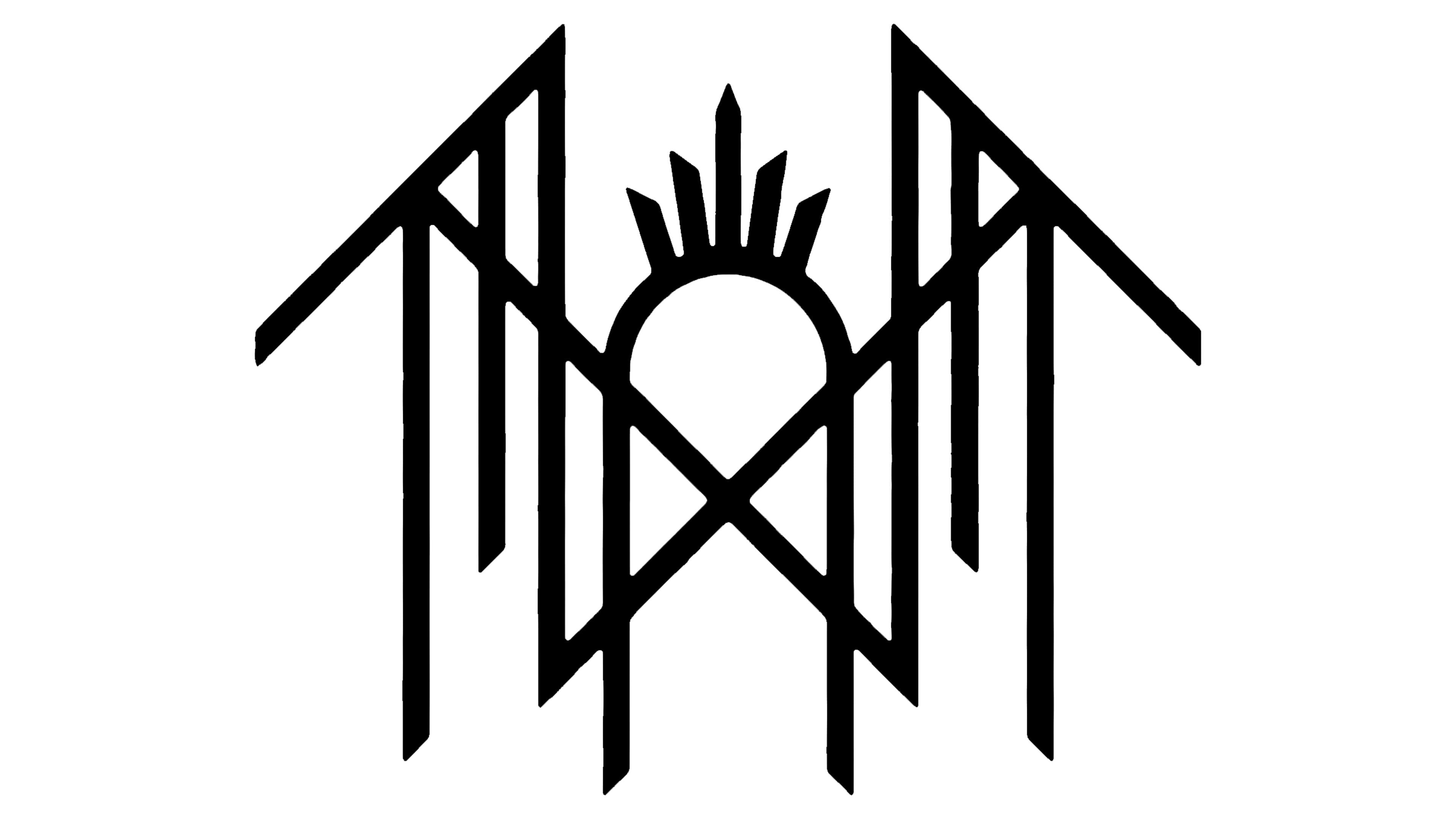
Sleep Token’s brand is built on a foundation of “worship,” a term they use to describe their performances and thematic universe, centered around a deity figure known as “Vessel.” The band members perform masked and cloaked, their identities concealed, shifting the focus entirely to the collective experience and the narrative they weave. In this context, their primary symbol becomes invaluable. Without individual faces or names to anchor their identity, the symbol serves as the direct visual representation of the Sleep Token entity itself. It appears across all their touchpoints – album art, merchandise, social media profiles, and live stage backdrops – becoming the singular, undeniable mark of their presence.
Unlike many band logos that are either textual or explicitly illustrative of their genre or name, the Sleep Token symbol is abstract, often described as a geometric sigil or an arcane mark. Its power lies precisely in this ambiguity and its departure from literal representation. It doesn’t tell you what Sleep Token is in a conventional sense; instead, it evokes what Sleep Token feels like. It resonates with themes of ancient ritual, cosmic order, and esoteric knowledge, aligning perfectly with the band’s carefully constructed lore. This strategic ambiguity forces the audience to engage on a deeper, interpretative level, transforming passive consumption into active participation in the brand’s narrative. The symbol is thus not just a mark, but an invitation into a world—a highly effective technique for brands aiming to build communities rather than just customer bases.
Design Principles and Brand Language: Form, Function, and Fan Engagement
The efficacy of the Sleep Token symbol as a potent brand asset can be attributed to several core design principles and a strategic understanding of human psychology in relation to visual language. Far from being a random assortment of lines, its construction speaks to a deliberate intention to convey depth, order, and a sense of the sacred, all without uttering a single word.
Geometric Precision and Sacred Geometry
The symbol itself often features clean lines, symmetry, and specific geometric forms that evoke a sense of ancient wisdom and timelessness. In branding, geometric precision is often associated with stability, order, and modernism, while symmetry creates balance and aesthetic appeal. However, in Sleep Token’s context, these elements delve into the realm of “sacred geometry”—the belief that certain geometric shapes have divine or profound meaning. Circles, triangles, and intersecting lines, when arranged thoughtfully, can tap into universal archetypes. This choice isn’t accidental; it reinforces the band’s ritualistic narrative and spiritual undertones. For a brand, leveraging such foundational visual language grants an immediate gravitas and a subconscious connection to concepts larger than itself, making the identity feel established and significant from the outset. This careful design ensures that the symbol is not only visually striking but also inherently imbued with layers of potential meaning, making it memorable and endlessly fascinating.
The Power of the Sigil: Brand as an Enigmatic Mark
Beyond mere geometry, the symbol often carries the weight and appearance of a sigil—a magically charged symbol created for a specific purpose. Historically, sigils are meant to represent intentions or entities in a condensed, potent visual form, often designed to be somewhat cryptic to the uninitiated. This concept perfectly mirrors Sleep Token’s brand strategy. Their symbol functions like an esoteric emblem, hinting at hidden meanings and a deeper reality known only to those within the “worship” collective. By presenting their primary identifier as a sigil rather than a straightforward logo, the band elevates its brand from a commercial entity to an almost spiritual movement. This evokes a sense of belonging and exclusivity for fans who feel they are part of decoding the mystery. Brands that wish to foster deep loyalty and a sense of shared identity can learn from this approach, understanding that an enigmatic mark can be far more compelling than an overt statement, inviting active interpretation rather than passive acceptance.
Cultivating Interpretation: The Brand Co-Creation Strategy
Perhaps the most ingenious aspect of the Sleep Token symbol’s design is its open-ended nature. The band provides no explicit, canonical explanation for its meaning, deliberately leaving it open to interpretation. This isn’t a design flaw; it’s a profound strategic advantage. By withholding definitive meaning, the band encourages its audience to project their own understanding, theories, and emotional connections onto the symbol. This transforms fans from passive consumers into active participants in the brand’s narrative. Discussions about the symbol’s meaning proliferate across online forums, social media, and fan communities, generating organic engagement and strengthening communal bonds. This co-creation of meaning deepens fan investment and loyalty, making the brand experience highly personal and profoundly impactful. For any modern brand, fostering this level of interactive engagement and shared interpretation is a powerful method for building a dedicated and passionate community, demonstrating that sometimes, the most potent brand messaging is that which allows the audience to complete the story.
Consistency and Evolution: The Symbol Across the Brand Ecosystem
A symbol’s power is amplified not just by its inherent design but also by its pervasive and consistent application across every facet of a brand’s presence. Sleep Token excels in deploying its central symbol with unwavering coherence, ensuring that it is unmistakably linked to their identity, while also allowing for subtle variations that reflect their ongoing narrative. This dual approach of rigorous consistency married with nuanced evolution provides a blueprint for effective brand management in any industry.
Omnipresent Identity: Application Across Touchpoints
From the stark black-and-white aesthetic of their album covers to the intricate details of their stage design, the Sleep Token symbol is a constant. It appears on merchandise, social media headers, music video intros, and promotional materials, always rendered with the same reverence and visual weight. This relentless consistency is paramount in building strong brand recognition, especially for an entity that intentionally obscures individual identities. When a brand’s core visual identifier is seen repeatedly, in a uniform manner, it drills into the subconscious, creating an instant connection and recall. This strategy ensures that regardless of the context—be it a Spotify playlist, a live show, or a fan’s t-shirt—the presence of the symbol immediately signifies “Sleep Token.” For brands aiming for indelible recognition and a cohesive identity, the lesson is clear: consistent application across all consumer touchpoints is non-negotiable for establishing a strong visual brand language.
Subtle Shifts and Narrative Arcs

While the core symbol remains largely unchanged, its presentation and surrounding iconography often evolve subtly with each album cycle or thematic “era” of the band. These shifts might involve variations in color palette, textural treatments, or the inclusion of supplementary visual motifs that complement the central symbol. For instance, the symbol might be presented within an intricate, ancient-looking border for one album, or starkly isolated against a minimalist background for another, reflecting the specific narrative or emotional tone of that particular body of work. This dynamic approach allows the brand to maintain its core identity while signaling growth, change, and the progression of its overarching story. It demonstrates that brand consistency doesn’t necessitate static imagery; rather, it’s about maintaining a recognizable core while allowing for intelligent contextual adaptation. This keeps the brand feeling fresh and evolving without sacrificing its fundamental recognition, a delicate balance many brands strive to achieve.
Reinforcing the Narrative: Visual Storytelling Without Words
The symbol, through its consistent and evolving application, acts as a powerful tool for visual storytelling. Each appearance, whether etched into a mask or glowing on a stage screen, reinforces the band’s lore, its aesthetic, and its emotional weight. It becomes a shorthand for the entire Sleep Token universe, communicating themes of ritual, surrender, devotion, and mystery without requiring explicit verbal explanation. This ability to convey complex narratives purely through visual identity is a hallmark of sophisticated branding. For businesses, this translates into creating a logo or visual mark that not only represents their product or service but also embodies their values, their mission, and the experience they offer. The Sleep Token symbol proves that a well-crafted visual identity can transcend mere decoration to become a primary medium for communicating a brand’s deepest narratives and fostering an immersive world for its audience.
Strategic Ambiguity: A Masterclass in Modern Branding
In a marketplace increasingly characterized by brands striving for explicit clarity and direct communication, Sleep Token’s strategic use of ambiguity through its central symbol stands out as a powerful, counter-intuitive masterclass in modern branding. This intentional lack of a fixed meaning is not a weakness but a cornerstone of its strength, fostering deeper emotional connections and robust community engagement.
Beyond Literal Meaning: The Emotional Resonance
The Sleep Token symbol’s greatest asset is its capacity for emotional resonance rather than literal interpretation. It functions much like abstract art, bypassing the analytical mind to connect directly with feelings, intuition, and subconscious associations. For fans, the symbol might evoke feelings of comfort, mystery, belonging, or even a sense of the divine, all without the band ever dictating a specific message. This emotional depth is far more potent than any explicitly defined meaning could be. Strong brands understand that true connection often transcends mere functionality or clear-cut statements; it resides in the emotions and experiences they evoke. By allowing their symbol to be a vessel for personal emotional projection, Sleep Token transforms it into an incredibly powerful and adaptable brand asset, capable of meaning something unique and profound to each individual follower.
The Enigma as a Marketing Asset
In an age of endless content and diminishing attention spans, enigma is a rare commodity. Sleep Token leverages the deliberate lack of definitive meaning for its symbol as a potent marketing asset. It fuels curiosity, prompts discussion, and encourages fans to delve deeper into the band’s world in search of answers. This continuous quest for meaning generates invaluable organic buzz, social media engagement, and fan-created content (theories, analyses, fan art). This stands in stark contrast to brands that over-explain, leaving little to the imagination. The mystery surrounding the symbol creates a perpetual point of conversation, making the brand inherently more compelling and shareable. For marketers, this highlights the often-underestimated power of a well-managed enigma: it can cultivate a far more engaged and vocal audience than transparent, but perhaps less captivating, clarity.
Building a Cult Brand: Loyalty Through Shared Understanding
The shared journey of interpreting the Sleep Token symbol is a powerful community-building mechanism. Fans who actively engage with the symbol’s mystery, sharing their theories and insights, develop a strong sense of collective identity and belonging. They are not just consumers of music; they are participants in a shared quest, members of an exclusive “worship” community. This active participation fosters a deep, almost familial, loyalty to the brand. This is the essence of building a “cult brand” in the positive sense: a brand that inspires fierce devotion and creates a subculture around its offerings. The symbol, therefore, acts as a unifying emblem, a flag under which this dedicated community rallies, bound by a shared fascination and a common pursuit of meaning. This strategic ambiguity, far from being a weakness, is the very force that galvanizes their fervent following and positions Sleep Token as a compelling case study in brand loyalty.
Lessons for Contemporary Brands: The Sleep Token Case Study
The meticulous and intentional deployment of the Sleep Token symbol offers a wealth of strategic insights for brands operating across any sector, proving that thoughtful design and a courageous approach to identity can yield profound results. Their success is not merely a testament to their musical talent but a masterclass in brand building.
Firstly, the Sleep Token symbol underscores the undeniable power of a truly unique and well-designed visual identity. In a crowded marketplace, a distinctive emblem that encapsulates a brand’s essence without relying on overt messaging can cut through the noise more effectively than words. It demonstrates that visual assets are not secondary to verbal communication but can be primary drivers of brand recognition and emotional connection. Investing in a singular, memorable, and adaptable visual mark should be a priority for any brand aiming for long-term impact.
Secondly, the band’s strategic embrace of mystique and ambiguity around their symbol highlights the potent value of the unknown. In an era of constant information flow, a brand that dares to leave certain aspects open to interpretation can captivate and engage audiences far more deeply. This approach taps into fundamental human curiosity, encouraging active participation and fostering a sense of discovery that makes the brand experience richer and more personal. For brands looking to create deeper relationships with their audience, consider where strategic ambiguity might spark curiosity rather than confusion.
Thirdly, Sleep Token’s unwavering consistency in applying its symbol across all touchpoints is a fundamental lesson in brand integrity. Whether on an album cover, a piece of merchandise, or a digital avatar, the symbol’s presence is uniform and unmistakable. This relentless coherence builds strong recognition, reinforces brand values, and creates a seamless experience across the entire brand ecosystem. Brands must ensure their core identifiers are deployed with precision and consistency to build trust and familiarity.
Finally, the band’s ability to foster a passionate, loyal community through shared interpretation of their symbol offers a compelling blueprint for modern engagement. By allowing their audience to co-create meaning, Sleep Token has transformed passive consumers into active participants and advocates. This approach moves beyond transactional relationships to forge deep, emotional bonds, turning customers into fervent followers. Brands that encourage dialogue, provide platforms for shared experience, and invite their audience into the narrative can cultivate highly dedicated communities.
In essence, the Sleep Token symbol is far more than just a band logo; it is a masterstroke of brand design and strategy. It illustrates how a powerful, enigmatic visual identity, deployed with consistent intentionality, can create a deeply immersive brand experience, foster unparalleled loyalty, and stand as a beacon in the complex landscape of contemporary identity.
aViewFromTheCave is a participant in the Amazon Services LLC Associates Program, an affiliate advertising program designed to provide a means for sites to earn advertising fees by advertising and linking to Amazon.com. Amazon, the Amazon logo, AmazonSupply, and the AmazonSupply logo are trademarks of Amazon.com, Inc. or its affiliates. As an Amazon Associate we earn affiliate commissions from qualifying purchases.