
In the palm of our hands, we carry sophisticated supercomputers capable of processing billions of data points to answer a single, daily question: “Do I need an umbrella?” Yet, despite the incredible advancements in meteorological software and satellite imaging, the most common metric used—the “rain percentage”—remains one of the most misunderstood data points in the tech world.
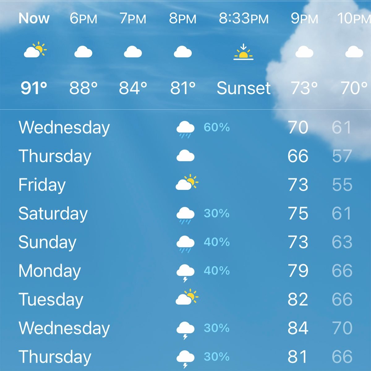
When a weather app displays a “40% chance of rain,” the average user often interprets this as a 40% chance of precipitation occurring at their specific location, or perhaps that it will rain for 40% of the day. In reality, that number represents a complex calculation known in the tech community as the Probability of Precipitation (PoP). Understanding this percentage requires a deep dive into the algorithms, data modeling, and user interface (UI) design choices that define modern weather technology.
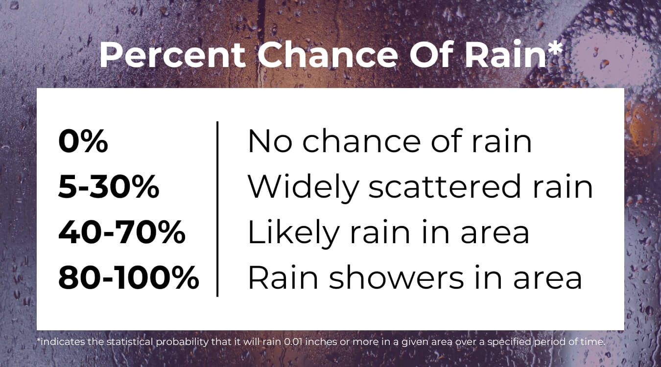
The Algorithmic Reality of the Probability of Precipitation (PoP)
At its core, the rain percentage is not a single guess, but the output of a mathematical formula that combines two distinct variables: confidence and area. In the realm of software engineering and data science, this is a classic example of how raw data is synthesized into a simplified consumer-facing metric.
The Formula Behind the Percentage
The standard formula used by organizations like the National Oceanic and Atmospheric Administration (NOAA) and integrated into most major weather APIs is:
PoP = C x A
In this equation, C stands for the “Confidence” that precipitation will occur somewhere in the forecast area, and A represents the “Area” that will receive measurable precipitation (at least 0.01 inches).
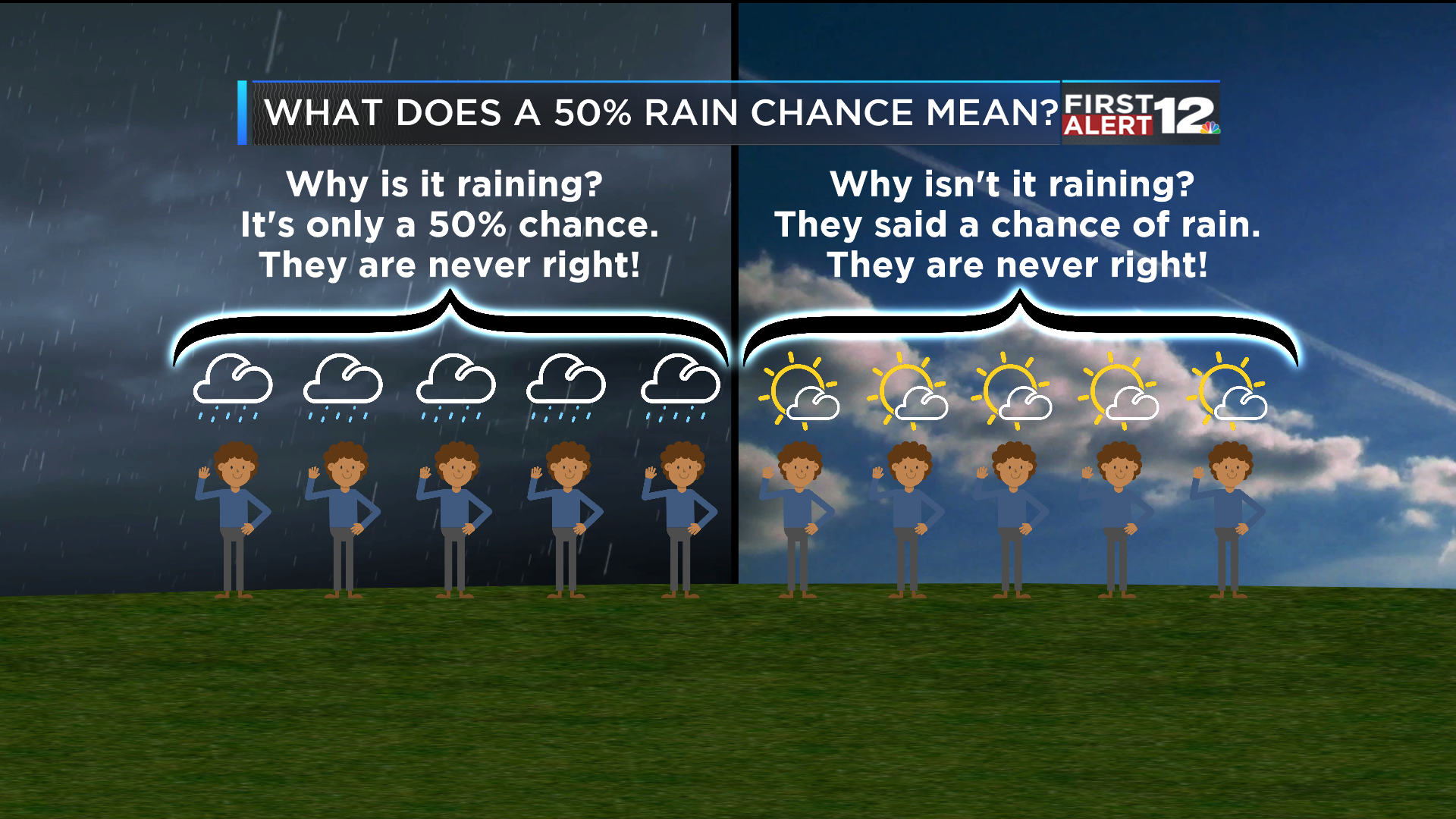
If a meteorologist or an AI model is 100% confident that it will rain over 40% of the city, the app shows 40%. Conversely, if they are only 50% confident that rain will develop, but if it does, it will cover 80% of the area, the calculation (0.5 x 0.8) also results in 40%. This reveals a significant “tech gap” in communication: the user sees the same number (40%) for two vastly different meteorological scenarios.
Confidence vs. Coverage: The Data Scientist’s Dilemma
From a data science perspective, the PoP metric is a compromise. Engineers must decide how to present high-dimensional data (spatial probability, temporal probability, and intensity) in a two-digit format suitable for a small mobile screen.
When software designers build weather platforms, they face the dilemma of whether to break these numbers down. Some advanced Pro-tier weather apps are now beginning to offer “coverage maps” and “confidence intervals” as separate data layers, recognizing that for tech-savvy users, the “C x A” simplification may be insufficient for high-stakes decision-making, such as managing autonomous drone fleets or logistics networks.
The Evolution of Meteorological Software and Data Models
The “rain percentage” we see today is powered by a massive technological infrastructure that has evolved from simple barometric readings to Global Forecasting Systems (GFS) and European Integrated Forecast Systems (IFS). These models are some of the most computationally expensive programs running on earth today.
From Manual Observations to High-Performance Computing (HPC)
Until the late 20th century, weather forecasting was largely a manual process of mapping pressure systems. Today, it is a big-data industry. Modern weather tech relies on High-Performance Computing (HPC) clusters that run numerical weather prediction models. These models divide the atmosphere into a three-dimensional grid, calculating physical equations for fluid dynamics and thermodynamics at every grid point.
The percentage you see is the result of “Ensemble Forecasting.” Instead of running the model once, a supercomputer runs it dozens of times with slightly different initial conditions. If 4 out of 10 model runs show rain in a specific grid, the software might output a 40% probability. This ensemble approach is a cornerstone of modern software reliability, accounting for the inherent “chaos” in atmospheric data.
The Role of AI and Machine Learning in Precision Forecasting
A significant trend in weather tech is the shift from purely physics-based models to AI-driven “nowcasting.” Tech giants like Google (with GraphCast) and NVIDIA (with FourCastNet) are leveraging machine learning to predict precipitation with higher accuracy and lower computational cost than traditional methods.
Unlike traditional models that solve complex differential equations, AI models are trained on decades of historical satellite and radar data. They identify patterns—much like an image recognition algorithm identifies a face—to predict how a storm system will move over the next six hours. This AI integration is what allows apps to send “hyper-local” alerts, telling you that “Rain will start in 7 minutes at your exact location.”
User Experience and the “App Gap”: Why Different Weather Apps Show Different Percentages
If you have ever compared the Apple Weather app with AccuWeather or The Weather Channel, you likely noticed they often show different rain percentages for the same hour. This discrepancy is not a bug; it is a result of proprietary software stacks and different data sources.
Proprietary Algorithms and Private Weather Data Networks
While many apps pull foundational data from government sources like the National Weather Service, “Big Weather” companies often overlay this with their own proprietary algorithms. For instance, IBM-owned The Weather Company uses its “GRAF” system (Global High-Resolution Atmospheric Forecasting), which utilizes crowd-sourced data from millions of smartphones’ pressure sensors to refine local forecasts.
Each company’s “secret sauce” lies in how they weight different models. One app might prioritize the European model (often considered more accurate for long-range forecasts), while another might lean on high-resolution rapid-refresh (HRRR) models for immediate updates. This creates a competitive market where “accuracy” is a key branding feature, and the “rain percentage” becomes a proprietary output of a company’s specific tech stack.
The UI/UX Challenge of Communicating Complex Probabilities
The design of a weather app is a masterclass in data visualization. Designers must decide how to display the PoP without overwhelming the user. Should it be a bar chart? A percentage next to a cloud icon? Or a text-based summary?
In recent years, the trend in UI/UX has moved toward “contextual forecasting.” Instead of just a 40% icon, apps are using natural language processing (NLP) to provide sentences like, “Expect light rain for 20 minutes starting at 2:15 PM.” This shifts the focus from a confusing statistical probability to an actionable insight, hiding the underlying complexity of the PoP formula behind a user-friendly interface.
IoT and Hyper-Local Forecasting: The Future of Precipitation Data
The future of the “rain percentage” lies in the expansion of the Internet of Things (IoT) and the move away from centralized station data toward decentralized, hyper-local sensing.
Connected Sensors and the Power of Crowd-Sourced Weather Data
The limitation of traditional forecasting is the “grid.” Most models look at 9km to 25km squares. If you are on one side of a mountain and the sensor is on the other, your “40%” might be 0% in reality. Enter the IoT revolution.
Smart home weather stations, connected cars with automated windshield wipers, and even the barometers built into every iPhone act as a massive, decentralized sensor network. This data is fed back into the cloud (Edge-to-Cloud computing), allowing software to generate a “micro-climate” forecast. In this scenario, the rain percentage becomes hyper-granular, shifting from a city-wide average to a block-by-block probability.
Edge Computing in Micro-Climate Prediction
As we move toward a world of smart cities and autonomous vehicles, the latency of sending weather data to a central supercomputer and back becomes a bottleneck. We are beginning to see “Edge Computing” solutions where local weather data is processed on-site—perhaps by a neighborhood 5G node—to provide instant updates.
For an autonomous vehicle, a “10% chance of rain” might trigger a change in braking sensitivity parameters. In this high-tech context, the rain percentage is no longer just a tip for a pedestrian; it is a critical input variable for autonomous systems.
Conclusion: Understanding the Digital Atmosphere
The next time you glance at your smartphone and see a rain percentage, remember that you are looking at the culmination of a century of scientific progress and billions of dollars in technological investment. That single number is the interface between chaotic atmospheric physics and the clean, organized world of digital software.
It is a metric that balances confidence and area, powered by supercomputer ensembles, refined by artificial intelligence, and delivered through sophisticated cloud infrastructures. While the “40% chance” might still feel ambiguous when you’re caught in a downpour, the tech behind it is working tirelessly to turn the unpredictable nature of our planet into a stream of actionable data. As AI and IoT continue to evolve, we can expect the “rain percentage” to become less of a confusing statistic and more of a precise, hyper-local tool for navigating our digital and physical worlds.
aViewFromTheCave is a participant in the Amazon Services LLC Associates Program, an affiliate advertising program designed to provide a means for sites to earn advertising fees by advertising and linking to Amazon.com. Amazon, the Amazon logo, AmazonSupply, and the AmazonSupply logo are trademarks of Amazon.com, Inc. or its affiliates. As an Amazon Associate we earn affiliate commissions from qualifying purchases.