
In the hyper-competitive landscape of global marketing, symbols serve as the shorthand for a brand’s soul. Among the most potent and enduring icons utilized in contemporary design is the Om (or Aum). While its origins are deeply rooted in ancient Vedic traditions, representing the primordial vibration of the universe, its migration into the sphere of brand strategy reveals a fascinating intersection of spirituality, consumer psychology, and corporate identity. For a modern brand, the Om represents more than a religious icon; it is a powerful semiotic tool used to communicate holistic values, inner peace, and a commitment to the “mindfulness economy.”
As businesses pivot toward purpose-driven models, understanding the nuances of the Om symbol—and what it represents in a commercial context—is essential for brand architects looking to build resonance with a global audience seeking authenticity.
The Semiotics of Transcendence: Decoding the Om in Brand Identity
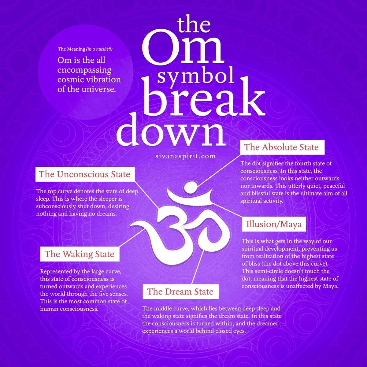
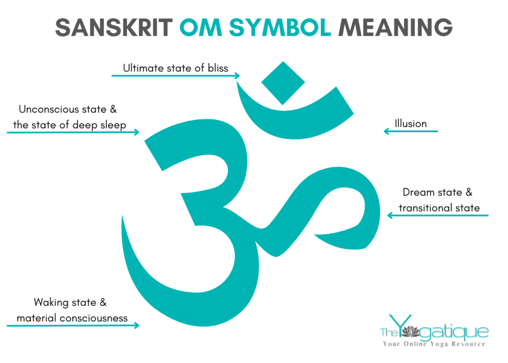
To understand what the Om represents in branding, one must first look at its visual and philosophical anatomy. In brand strategy, semiotics is the study of signs and symbols and how they create meaning. The Om is visually complex, consisting of three curves, one semicircle, and a dot. Each of these elements carries a specific psychological weight that can be translated into a brand’s narrative.
The Five States of Being as a Consumer Framework
In traditional philosophy, the components of the Om symbol represent different states of consciousness: the waking state (the large lower curve), the dreaming state (the middle curve), the deep sleep state (the upper curve), the state of illusion/Maya (the semicircle), and the absolute state of consciousness (the dot).
In a branding context, these states can be mapped to the customer journey. The “waking state” represents the consumer’s daily problems and needs. The “dreaming state” represents their aspirations and the lifestyle they desire. The “absolute state”—the dot at the top—represents the brand promise: the ultimate solution or the feeling of enlightenment provided by the product. By utilizing the Om, brands subconsciously signal that they offer a path from the mundane to the extraordinary, positioning their products as tools for personal evolution rather than simple commodities.
Visual Geometry and the Power of Fluidity
From a design perspective, the Om represents organic fluidity. Unlike the sharp, rigid lines often found in technology or financial logos, the Om is composed of soft, rounded strokes. This visual language communicates accessibility, nature, and flow. For brands in the wellness, organic food, or sustainable apparel sectors, this geometry is invaluable. It softens the “corporate” edge, making the brand feel more human-centric and less predatory.
The Mindfulness Economy: Leveraging the Om for Market Authority
We are currently witnessing the rise of the “mindfulness economy,” a multi-billion dollar sector encompassing mental health apps, yoga retreats, holistic skincare, and ethical investing. In this market, the Om represents a seal of authority and a shorthand for quality.
Branding Peace in a High-Stress Marketplace
Modern consumers are increasingly “identity-buying.” They are not just purchasing a yoga mat; they are purchasing a piece of an identity that values tranquility over chaos. When a brand integrates the Om—or even elements inspired by its silhouette—into its visual identity, it immediately signals a “slow living” philosophy. This is a strategic counter-positioning against the high-speed, high-stress nature of the digital age. In this context, the Om represents a sanctuary. It tells the consumer: “This brand understands your need for silence.”
From Niche to Global: The Scalability of Spiritual Symbols
The Om has transitioned from a niche symbol found in local ashrams to a global icon recognized by millions who may not even practice Hinduism or Buddhism. This scalability makes it an attractive asset for lifestyle brands. It functions as a “universal language.” Just as the Nike swoosh represents motion or the Apple logo represents innovation, the Om represents “wholeness.” For a brand looking to expand internationally without the barriers of language, the Om provides an instant emotional connection that transcends borders.

Cultural Stewardship: Navigating Ethics and Authenticity
While the Om offers significant branding potential, its use represents a high-stakes challenge in cultural stewardship. In brand strategy, there is a fine line between “inspiration” and “appropriation.” For a brand to successfully use the Om, it must represent a genuine alignment with the values the symbol embodies.
The Risk of Commodity Fetishism
If a brand uses the Om merely as an aesthetic “vibe” without backing it up with ethical business practices, it risks being accused of commodity fetishism—stripping a sacred symbol of its meaning for the sake of profit. In the age of social media accountability, this can lead to significant brand erosion. In this sensitive environment, the Om represents a “commitment to integrity.” Brands that use the symbol effectively often pair it with transparent supply chains, fair-trade certifications, and community-focused initiatives. They prove that they aren’t just selling the symbol; they are living the philosophy.
Best Practices for Cross-Cultural Brand Integration
For corporate identity designers, the Om represents a call for research and respect. Many modern brands opt for “abstracted” versions of the Om—taking its essence (the curves and the dot) and reinterpreting them through a modern lens. This approach often feels more respectful and “design-forward” than a direct copy-paste of the traditional Sanskrit character. By abstracting the symbol, a brand can pay homage to the Om’s origins while creating a unique, trademarkable asset that belongs to the company’s specific story.
Designing the Infinite: Practical Applications for Modern Graphic Systems
Integrating a symbol as ancient as the Om into a modern digital brand requires a sophisticated approach to graphic design. It is not enough to simply place the symbol on a package; it must be woven into the brand’s visual DNA.
Minimalism and the Deconstruction of the Om
The current trend in brand strategy is toward minimalism—reducing a brand to its most essential elements. When applying this to the Om, designers often focus on the “Bindu” (the dot) and the “Chandra” (the crescent). These elements represent the point of origin and the infinite, respectively. By using these two shapes, a brand can evoke the feeling of the Om without being literal. This creates a more sophisticated, “quiet luxury” brand identity that appeals to a high-end, discerning demographic.
Typography and the Breath of the Brand
The Om is inherently tied to the concept of “Prana” or breath. In branding, this translates to the use of white space and “breathable” typography. A brand that centers its identity around the Om will typically avoid cluttered layouts and heavy, oppressive fonts. Instead, it will use light-weight sans-serifs or elegant, flowing serifs that mimic the curves of the symbol. In this design system, the Om represents “the space between thoughts.” The branding becomes an extension of the meditative experience, providing the consumer with a visual sense of relief.
The Future of the Om in Corporate Identity
As we move further into the 21st century, the definition of “value” is changing. Consumers are looking for brands that offer more than utility; they are looking for brands that offer meaning. In this environment, the Om represents the ultimate brand aspiration: the fusion of the material and the spiritual.
For brand strategists, the lesson of the Om is clear: symbols carry weight. When used with intention, respect, and strategic clarity, the Om can transform a brand from a mere vendor into a trusted guide. It represents a promise of harmony in a fragmented world, making it one of the most powerful—and responsible—choices a brand can make in its journey toward building a lasting legacy.
Ultimately, the Om in branding represents the “Universal Sound” of a company that has found its true voice. It is a visual mantra that, when executed correctly, resonates at a frequency that consumers can not only see but feel, fostering a level of brand loyalty that is, quite literally, transcendent.
aViewFromTheCave is a participant in the Amazon Services LLC Associates Program, an affiliate advertising program designed to provide a means for sites to earn advertising fees by advertising and linking to Amazon.com. Amazon, the Amazon logo, AmazonSupply, and the AmazonSupply logo are trademarks of Amazon.com, Inc. or its affiliates. As an Amazon Associate we earn affiliate commissions from qualifying purchases.