
In the world of brand strategy and corporate identity, a logo is more than just a graphic; it is a vessel for history, values, and future aspirations. When we transition from the corporate sector to the geopolitical stage, no brand asset is more powerful than a national flag. To answer the question “what does the Iranian flag look like” is to engage in a deep dive into semiotics, color theory, and the strategic construction of a visual identity that seeks to unify a population while projecting a specific image to the global community.

The current flag of Iran, adopted in 1980 following the Islamic Revolution, is a masterclass in how visual elements can be used to pivot a brand’s entire philosophy. It serves as the primary touchpoint for the nation’s “brand identity,” replacing monarchical symbols with revolutionary and religious motifs.
The Core Elements of National Identity Design
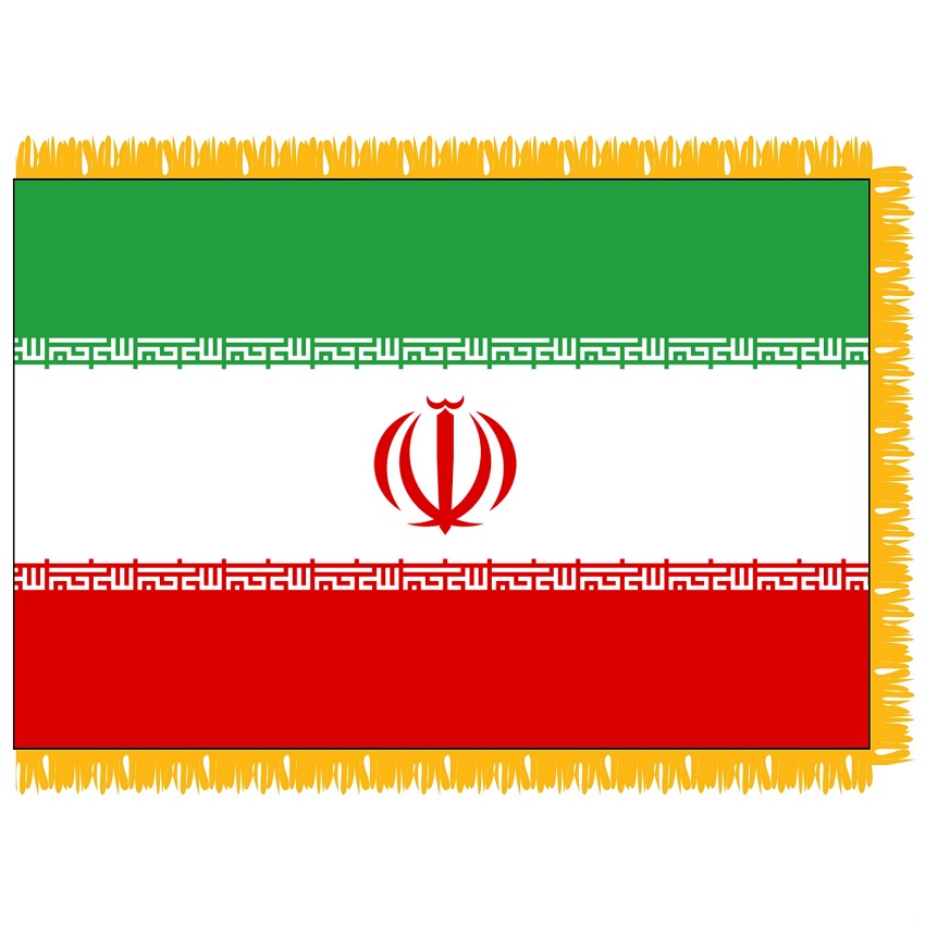
A successful brand identity relies on immediate recognition and a cohesive color palette. The Iranian flag utilizes a horizontal tricolor of green, white, and red—a palette that has deep roots in Persian history but was “rebranded” in 1980 to align with contemporary ideological shifts.
Color Psychology: Green, White, and Red
In design, color is the first thing the human brain processes. The Iranian “brand” uses these three colors to communicate a specific narrative:
- Green: Historically associated with growth, vitality, and most significantly, Islam. Within the context of national branding, the green band represents the Persian culture and the vitality of the faith that underpins the state.
- White: Positioned in the center, white represents peace and purity. From a design perspective, it acts as a neutral canvas that allows the central emblem to stand out, ensuring high contrast and legibility.
- Red: This color is a universal signifier for courage, sacrifice, and the blood of those who died for the country. In branding, red is used to evoke passion and urgency, signaling a nation that is prepared to defend its identity.
The Central Emblem: A Case Study in Minimalist Graphic Design
The most striking feature of the Iranian flag is the red emblem in the center. Designed by Hamid Nadimi, this is not merely a decorative flourish; it is a highly sophisticated logo. The emblem is a stylized version of the word “Allah” (God) and is designed to resemble a tulip, a symbol of martyrdom in Iranian culture.
From a brand strategy perspective, this emblem is a triumph of multi-layered meaning. It is composed of four crescents and a central sword, which together form a symmetrical shape that conveys balance and strength. The symmetry ensures that the “brand mark” is recognizable even from a distance or when the flag is fluttering, a key requirement for any effective visual identity.
Typography and Pattern: The Kufic Script as a Brand Asset
One of the most unique aspects of the Iranian flag’s design is the use of “brand patterns” along the borders of the color bands. Unlike many flags that use simple stripes, the Iranian flag incorporates stylized typography that acts as a decorative yet meaningful border.
The Geometric Repetition of the Takbir
If you look closely at the edges where the green and red bands meet the white band, you will see a white, blocky pattern. This is the Kufic script, the oldest calligraphic form of the Arabic alphabet. It repeats the phrase “Allahu Akbar” (God is Great) 22 times—11 times on the green stripe and 11 times on the red stripe.
This repetition is a strategic choice. In branding, repetition builds familiarity and reinforces the message. The number 22 is significant because it refers to the 22nd day of the 11th month (Bahman) in the Iranian calendar, the date the revolution succeeded. This is “experiential branding” woven directly into the fabric of the visual identity, ensuring that the date of the brand’s “launch” is forever immortalized in its logo.
Balancing Complexity and Symmetry in Visual Identity
Maintaining a clean look while including detailed typography is a challenge for any designer. The Iranian flag solves this by using a highly stylized, geometric version of the Kufic script. It looks more like a decorative architectural frieze than standard handwriting. This allows the flag to maintain a modern, clean aesthetic from a distance, while revealing deeper layers of brand storytelling upon closer inspection. This “layered” approach is something modern corporate brands often use to engage consumers on multiple levels.
Strategic Consistency: The Evolution of the Iranian Flag’s Brand
Brand evolution is a delicate process. Organizations must decide what to keep (brand equity) and what to change to reflect a new era. The transition of the Iranian flag is one of the most drastic examples of “rebranding” in the 20th century.
From the Lion and Sun to the 1980 Redesign
Prior to 1980, the Iranian flag featured the “Lion and Sun” (Shir-o-Khorshid) at its center. This was a symbol of the monarchy and ancient Persian heritage. When the brand strategy of the nation shifted from a secular monarchy to an Islamic Republic, the visual identity had to follow suit.
The decision to keep the green, white, and red tricolor was a strategic move to maintain “brand continuity.” The colors were familiar to the populace and provided a sense of historical stability. However, the replacement of the Lion and Sun with the new emblem and the Kufic script signaled a total shift in “corporate” values. It was a clear message to the world that the “Brand of Iran” had been fundamentally restructured.
Maintaining Brand Equity through Historical Continuity
Even though the central symbols changed, the preservation of the tricolor palette ensured that the “Iranian” brand was not entirely lost. In brand management, this is known as leveraging “heritage equity.” By keeping the colors that had represented the nation since the early 20th century, the new government ensured that the flag still felt “Iranian,” even as it promoted a radical new ideology.
Lessons for Modern Brand Designers from National Symbols
Analyzing the Iranian flag provides several insights that are applicable to modern brand strategy and graphic design. Whether you are designing a logo for a startup or a corporate identity for a multinational, the principles found in national flags are highly relevant.
Scalability and Recognition
A flag must be recognizable from a distance, in low light, and while moving. This is the ultimate test of a logo’s “scalability.” The Iranian flag’s use of bold, high-contrast colors and a centralized, symmetrical emblem ensures that its “brand” is visible in any environment. Modern brands often fail by making their logos too intricate; the Iranian flag reminds us that bold shapes and clear silhouettes are the keys to longevity.
Storytelling through Abstract Shapes
The central emblem of Iran is brilliant because it is abstract yet representative. It is a word, a flower, and a set of crescents all at once. This allows the “audience” (the citizens and the world) to project meaning onto the symbol. For brand designers, the lesson is that a logo doesn’t always have to be literal. An abstract mark that carries deep metaphorical weight can often be more powerful and enduring than a literal illustration.

Cultural Context in Design
Finally, the Iranian flag demonstrates the importance of cultural context. The use of Kufic script and the tulip symbol resonates specifically with the Iranian and Islamic identity. When building a brand, understanding the cultural “lexicon” of your target audience is essential. A brand that speaks the visual language of its audience—whether through typography, color, or symbolism—will always have a higher level of engagement and loyalty.
In conclusion, when we ask what the Iranian flag looks like, we are looking at a carefully constructed brand identity. It is a visual system that balances historical continuity with revolutionary change, using color psychology, geometric typography, and symbolic imagery to communicate a complex national narrative. For any brand strategist or designer, it serves as a compelling case study in the power of visual communication to define an entity’s place in the world.
aViewFromTheCave is a participant in the Amazon Services LLC Associates Program, an affiliate advertising program designed to provide a means for sites to earn advertising fees by advertising and linking to Amazon.com. Amazon, the Amazon logo, AmazonSupply, and the AmazonSupply logo are trademarks of Amazon.com, Inc. or its affiliates. As an Amazon Associate we earn affiliate commissions from qualifying purchases.