In the realm of global iconography, few symbols are as instantly recognizable or as deeply shrouded in intrigue as the Square and Compasses. At the heart of this emblem sits a solitary, capitalized letter: “G.” While most view this through a historical or esoteric lens, from a brand strategy perspective, the Masonic “G” represents one of the most successful examples of long-form visual identity and symbolic communication in human history. To understand what the “G” stands for is to understand the core pillars of an organization that has maintained a consistent global “brand” for centuries.
In the world of corporate identity and brand strategy, symbols are the shorthand for a brand’s values, promises, and heritage. The Masonic symbol, with its central “G,” functions as a masterclass in semiotics—the study of signs and symbols. It is not merely a decorative element; it is a strategic anchor that communicates the organization’s fundamental “Why.”
The Architecture of a Global Identity: Why Symbolism Matters in Branding
Every successful brand relies on a visual language that transcends linguistic barriers. Just as the “Swoosh” communicates movement and the “Apple” communicates innovation, the Square and Compasses with the central “G” communicates a specific set of virtues: precision, morality, and intellectual pursuit.
The Visual Language of the Square and Compasses
In brand design, the “frame” of a logo sets the tone. The Square represents the “earthly” or material realm—the need to square our actions by the square of virtue. The Compasses represent the “spiritual” or intellectual realm—the ability to circumscribe our desires and keep our passions within due bounds. For a brand, this represents the balance between operational excellence (the Square) and visionary leadership (the Compasses). These two tools create the geometric “stage” upon which the central brand promise—the “G”—is presented.
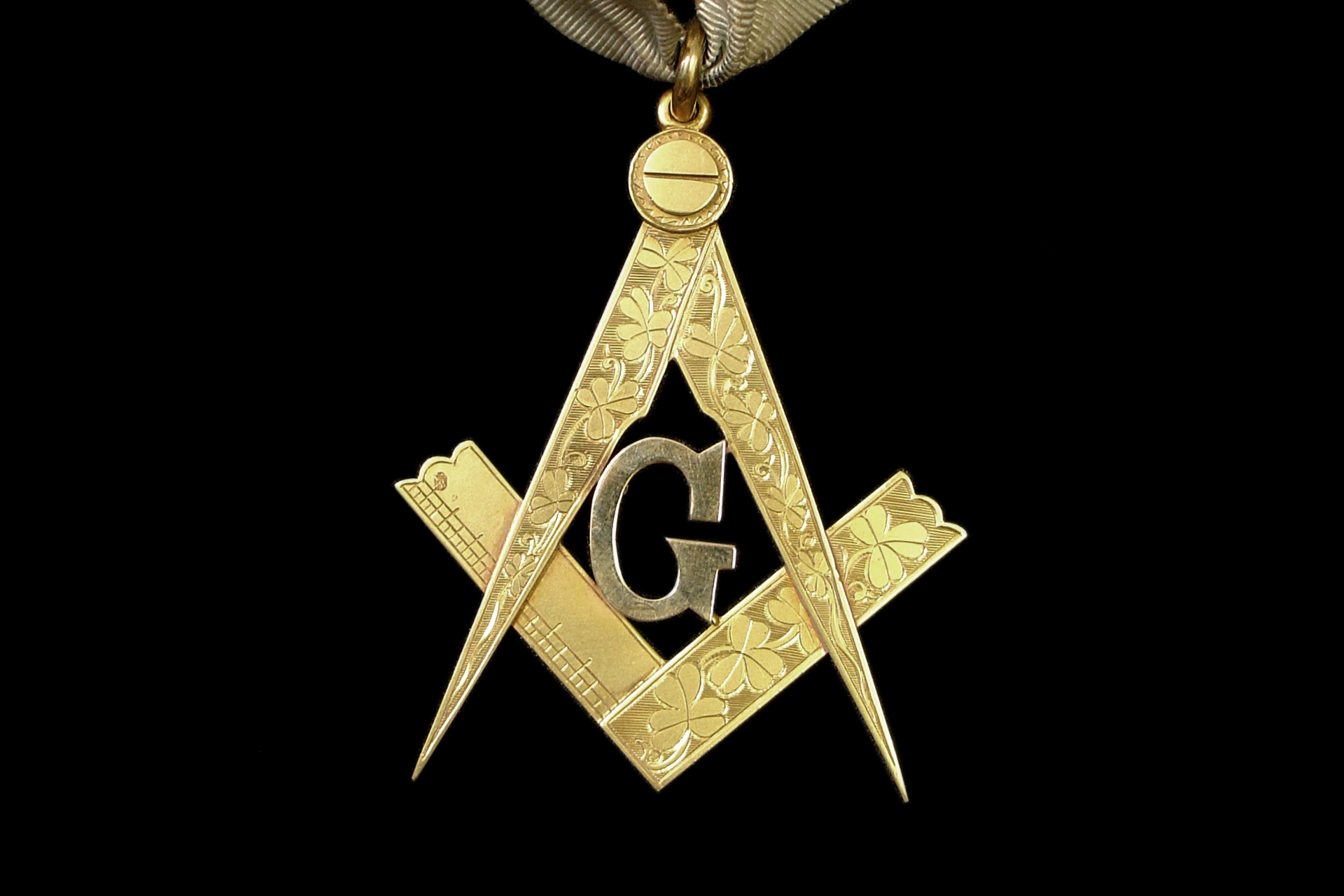
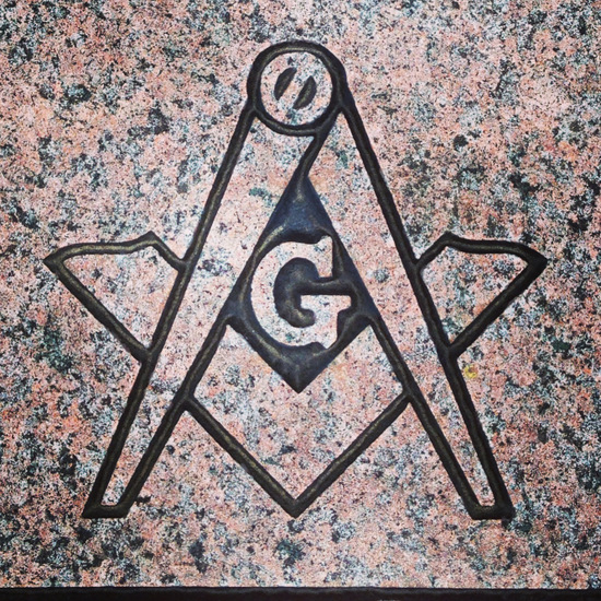
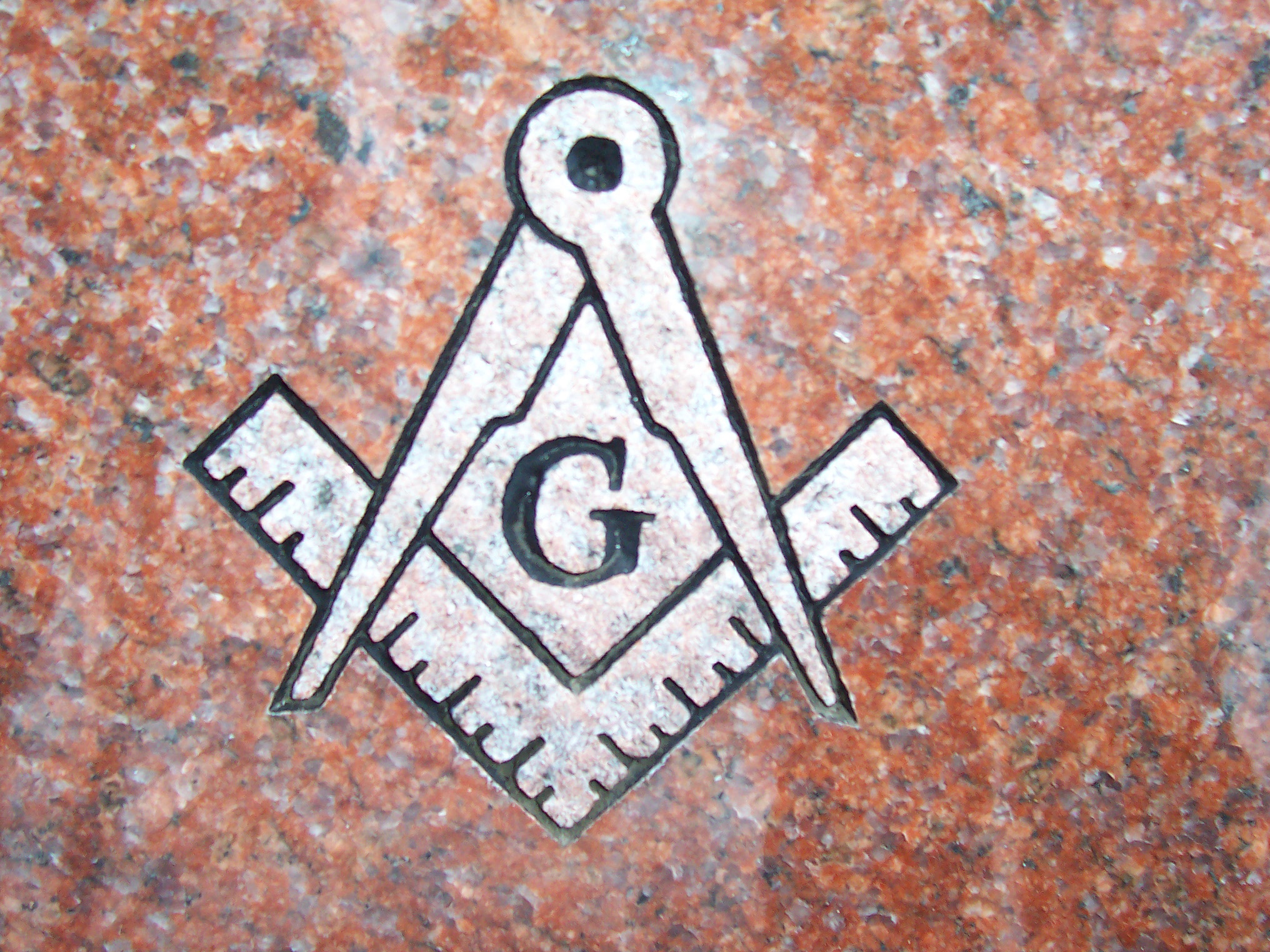
The Centrality of the “G”: Geometry and Divine Design
The “G” is the focal point, the “logo within the logo.” Historically and traditionally, the “G” stands for two primary concepts: Geometry and God (often referred to as the Grand Architect of the Universe). From a branding standpoint, this is a dual-purpose value proposition.
Geometry, the “noblest of sciences,” represents the technical foundation of the craft. In branding terms, this signifies the “product quality” and the rigorous standards to which members are held. The second meaning, representing a higher power, serves as the “brand purpose”—the higher calling that goes beyond mere membership. By placing the “G” at the center, the organization ensures that its core values are never obscured by the tools used to achieve them.
Building a Legacy Brand: Lessons from Masonic Iconography
The Freemasons have achieved what most modern corporations dream of: a brand that survives for centuries without losing its core essence. This longevity is not accidental; it is built into the way the symbol is deployed and protected.
Consistency Across Centuries
A key tenet of brand strategy is consistency. While the aesthetic style of the Square and Compasses might vary—appearing in gold on a signet ring or etched in stone on a lodge—the fundamental arrangement remains unchanged. This consistency creates “brand equity.” When a person sees the “G” within the square and compasses, the associations (secrecy, brotherhood, tradition, morality) are triggered instantaneously. This is the result of centuries of disciplined adherence to a visual standard.
The Power of Mystery and Exclusivity in Brand Positioning
Modern brands like Supreme or Ferrari use exclusivity to drive demand. The Masonic “brand” has utilized a similar strategy for hundreds of years. The “G” is a symbol that invites inquiry but requires “initiation” to fully comprehend. In branding, this is known as “high-context” communication. It creates an “in-group” and an “out-group.” The “G” acts as a beacon for those who belong, while maintaining a sense of prestige and mystery for those who do not. This reinforces the brand’s value through the psychological principle of scarcity and specialized knowledge.
The Dual Meaning of the “G”: Strategic Ambiguity in Communication
In brand marketing, “strategic ambiguity” allows a brand to appeal to a wider audience by allowing individuals to project their own values onto a symbol. The “G” is perhaps the most effective historical example of this.
Geometry: The Technical Foundation of the Craft
For the Enlightenment-era thinkers who formalized modern Masonry, Geometry was the key to understanding the laws of the universe. By having the “G” stand for Geometry, the brand positioned itself as an organization for the enlightened, the scientific, and the builder. This attracted the “early adopters” of the era—architects, scientists, and philosophers. It gave the brand a “functional benefit”: the pursuit of knowledge and the refinement of the self through the metaphor of masonry.
Gnosis and Growth: The Intellectual Component of the Brand
Beyond the literal translation, some scholars suggest the “G” also hints at Gnosis (knowledge). In the context of personal branding, this represents the “brand promise” of self-improvement. The organization does not just provide a community; it provides a path to personal “optimization.” In modern tech-branding parlance, Masonry is a “platform” for personal growth, and the “G” is the icon for the “knowledge module.” This internal brand meaning fosters deep loyalty among members, as the symbol becomes a mnemonic device for their own personal development journeys.
Applying Masonic Design Principles to Modern Corporate Identity
How can modern brand strategists and designers learn from the Masonic “G”? The answer lies in the balance between simplicity of form and depth of meaning.
Simplicity vs. Complexity in Logo Design
A common mistake in modern branding is over-complicating a logo. The Masonic symbol is composed of three simple elements: two tools and a letter. Yet, the arrangement creates a complex narrative. When designing a corporate identity, the goal should be “recognizable at a distance, meaningful upon inspection.” The “G” is easily identifiable from fifty feet away, but its layers of meaning—Geometry, God, Gnosis—require the viewer to lean in. This “layered engagement” is what turns a simple customer into a brand advocate.
Evoking Trust and Authority through Ancient Aesthetic
The “G” uses a Serif typeface or a stylized capital that evokes a sense of history and permanence. For brands in the finance, legal, or high-end luxury sectors, utilizing “monumental” typography and geometric symmetry can evoke the same sense of trust and authority that the Masonic symbol commands. By rooting a brand in the “sacred geometry” that the “G” represents, a company can signal that it is built on a foundation that is both stable and timeless.
Conclusion: The “G” as a Blueprint for Enduring Brand Equity
What does the “G” stand for in the Masonic symbol? It stands for a masterclass in brand integration. It represents the successful fusion of a technical skill (Geometry) with a higher purpose (the Grand Architect), housed within a visual container that has resisted the “rebranding” trends of several centuries.
For the brand strategist, the Masonic symbol serves as a reminder that the strongest brands are not those that change with every passing trend, but those that find a universal truth and anchor it in a simple, powerful icon. The “G” is more than just a letter; it is the cornerstone of a global identity system that prioritizes depth, consistency, and a clear sense of purpose. Whether a brand is a centuries-old fraternity or a 21st-century tech startup, the lessons of the “G” remain the same: define your center, balance your tools, and ensure that your symbol tells a story that is worth decoding.
aViewFromTheCave is a participant in the Amazon Services LLC Associates Program, an affiliate advertising program designed to provide a means for sites to earn advertising fees by advertising and linking to Amazon.com. Amazon, the Amazon logo, AmazonSupply, and the AmazonSupply logo are trademarks of Amazon.com, Inc. or its affiliates. As an Amazon Associate we earn affiliate commissions from qualifying purchases.