
In the realm of corporate identity and semiotics, few symbols have maintained as much enduring power, recognition, and intrigue as the Masonic Square and Compasses. Central to this emblem is the prominent letter “G.” While historians and scholars of Freemasonry debate the esoteric interpretations, from a branding and strategic identity perspective, the “G” serves as the ultimate anchor for the organization’s core values—a masterstroke of visual communication that has sustained brand loyalty for centuries.
The Semiotic Power of the Letter G
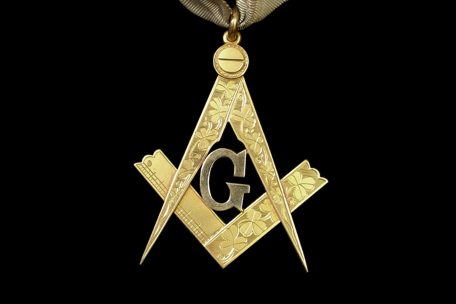
A brand’s logo acts as its visual shorthand. It must communicate complex ideologies through a single, distilled graphic element. In the Masonic emblem, the letter “G” is strategically positioned in the center, drawing the eye immediately. By integrating a character from the alphabet into a geometric icon, the organization created a hybrid symbol that is both linguistic and visual.
Architecture of Brand Recognition
From a design standpoint, the “G” performs a dual function. First, it balances the composition. Without the central character, the Square and Compasses would be purely abstract shapes—tools representing craftsmanship. The addition of the “G” grounds the design, transforming it from a representation of labor into a representation of philosophy.
The Role of Mystery in Branding
Effective branding often leverages the “curiosity gap.” By leaving the meaning of the “G” open to interpretation—often cited as “Geometry” or “God”—the symbol invites the viewer to engage with the brand. In modern marketing, this is akin to a “brand narrative” that is not explicitly stated but rather felt or discovered. When a brand allows its audience to participate in the derivation of its meaning, the psychological attachment to that brand deepens significantly.
Geometry: The Universal Language of Branding
If we analyze the “G” through the lens of Geometry, we see the foundation of a brand that prides itself on structural integrity and order. Freemasonry, historically rooted in the craft of stonemasonry, uses the tools of the trade to explain moral philosophy. As a brand strategy, this is brilliant: it anchors an abstract moral code in tangible, real-world utility.
Translating Values into Visual Identity
Every brand needs a “north star.” For the Masonic identity, the “G” as Geometry implies that there is a design to the universe. In a corporate sense, this represents the “systems” or “processes” that a company follows. When a brand aligns its visual identity with its functional reality, it builds trust. Consistency between what a brand represents (the philosophy) and what it does (the craft) is the hallmark of a resilient identity.
Precision as a Brand Pillar
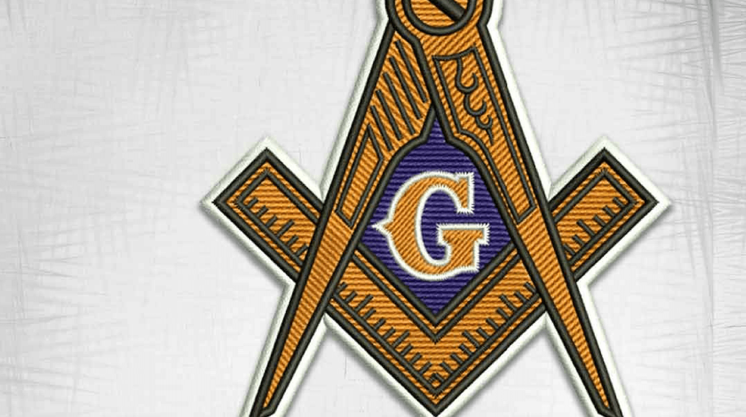
Geometry is the study of precision. By identifying with the geometric, the Masonic symbol communicates a commitment to accuracy, balance, and logical progression. For modern brand strategists, this is a lesson in positioning. If your brand promises precision, your identity should reflect geometric harmony—using grids, balanced whitespace, and clear, structured typography to reinforce the message that the brand is built on a stable foundation.
The Theological and Humanist Dimensions
While “God” is the most widely cited interpretation for the “G” in many jurisdictions—specifically referring to the “Grand Architect of the Universe”—it serves as an inclusivity mechanism within their brand architecture. By choosing a term that is broad and non-denominational, the organization created a “big tent” brand.
Inclusive Branding Strategies
The “G” functions as a placeholder for the individual’s own belief system. This is a masterful branding strategy: it provides a central, unifying focal point while remaining flexible enough to accommodate a diverse membership. In corporate branding, this is known as “universal appeal.” Brands that define themselves through rigid, narrow constraints often struggle to scale. Brands that define themselves through values that accommodate a wide spectrum of perspectives tend to endure.
Building an Identity Around Shared Purpose
The “G” acts as an anchor for the internal community. When members look at the symbol, they do not just see a letter; they see their connection to a shared purpose. This is the ultimate goal of corporate identity: to move beyond a product or a service and move into the territory of belonging. The “G” acts as a badge of membership, creating a psychological contract between the brand and the individual.
Sustaining Relevance Through Centuries
Why does a symbol designed centuries ago still carry weight today? It is not merely because of its aesthetic, but because of its adherence to fundamental branding principles: clarity, consistency, and a deep-seated narrative.
The Durability of Simple Symbols
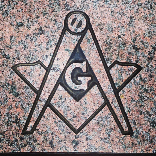
The “G” is simple. It does not suffer from the “over-design” trap that plagues many modern corporate identities. By sticking to a clean, typographic element nested within a geometric frame, the Masonic symbol remains legible at any size—whether embroidered on a lapel or etched into a stone building. Modern businesses could learn much from this: complexity is the enemy of recognition. If your brand cannot be recognized from a distance, or if its meaning is lost when the logo is shrunk to the size of a digital favicon, you have failed in the primary objective of visual communication.
Adaptability Without Compromise
One of the most impressive feats of the Masonic identity is how it has adapted across cultures without changing its core design. It is a “trans-cultural” symbol. The “G” is recognized internationally because the brand has been disciplined in its visual application. In the current global market, where brands are often forced to localize their identity to stay relevant, the Masonic emblem demonstrates that a truly strong brand identity can transcend borders by focusing on universal human archetypes rather than trends.
Conclusion: The “G” as a Blueprint for Brand Excellence
The “G” in the Masonic symbol is more than a letter; it is an exercise in strategic design. It represents the intersection of philosophy (the moral code) and practice (the geometric tools). It serves as a reminder to anyone involved in building a brand that the most successful identities are those that provide a clear visual anchor, remain open enough to invite audience participation, and reflect a fundamental, unwavering set of values.
Whether viewed as a symbol of geometry, a nod to a higher power, or a mark of the builder, the “G” forces us to ask what lies at the center of our own brand stories. Is there a core letter, a core concept, or a core purpose that holds the rest of your identity together? By identifying that “G”—that central, anchoring truth—a brand can move from being a mere collection of marketing tactics to becoming a legacy-defining identity that resonates across generations. The strength of the Masonic symbol lies not in the complexity of its design, but in the simplicity of its message: that everything, from the building of a cathedral to the building of a reputation, begins with a plan, a measurement, and a guiding principle.
aViewFromTheCave is a participant in the Amazon Services LLC Associates Program, an affiliate advertising program designed to provide a means for sites to earn advertising fees by advertising and linking to Amazon.com. Amazon, the Amazon logo, AmazonSupply, and the AmazonSupply logo are trademarks of Amazon.com, Inc. or its affiliates. As an Amazon Associate we earn affiliate commissions from qualifying purchases.