
Yellow, a hue that dances between the warmth of sunlight and the vibrancy of a ripe lemon, is far more than just a visually stimulating colour. In the realm of branding, it possesses a potent psychological impact, capable of evoking a spectrum of emotions and associations that can profoundly influence how a brand is perceived. Choosing yellow for a brand is a deliberate strategic decision, one that requires a deep understanding of its multifaceted significations. This article delves into the intricate ways yellow functions within brand strategy, corporate identity, marketing, and design, exploring its capacity to communicate optimism, attract attention, and foster a sense of joy and creativity, all while acknowledging its potential pitfalls.
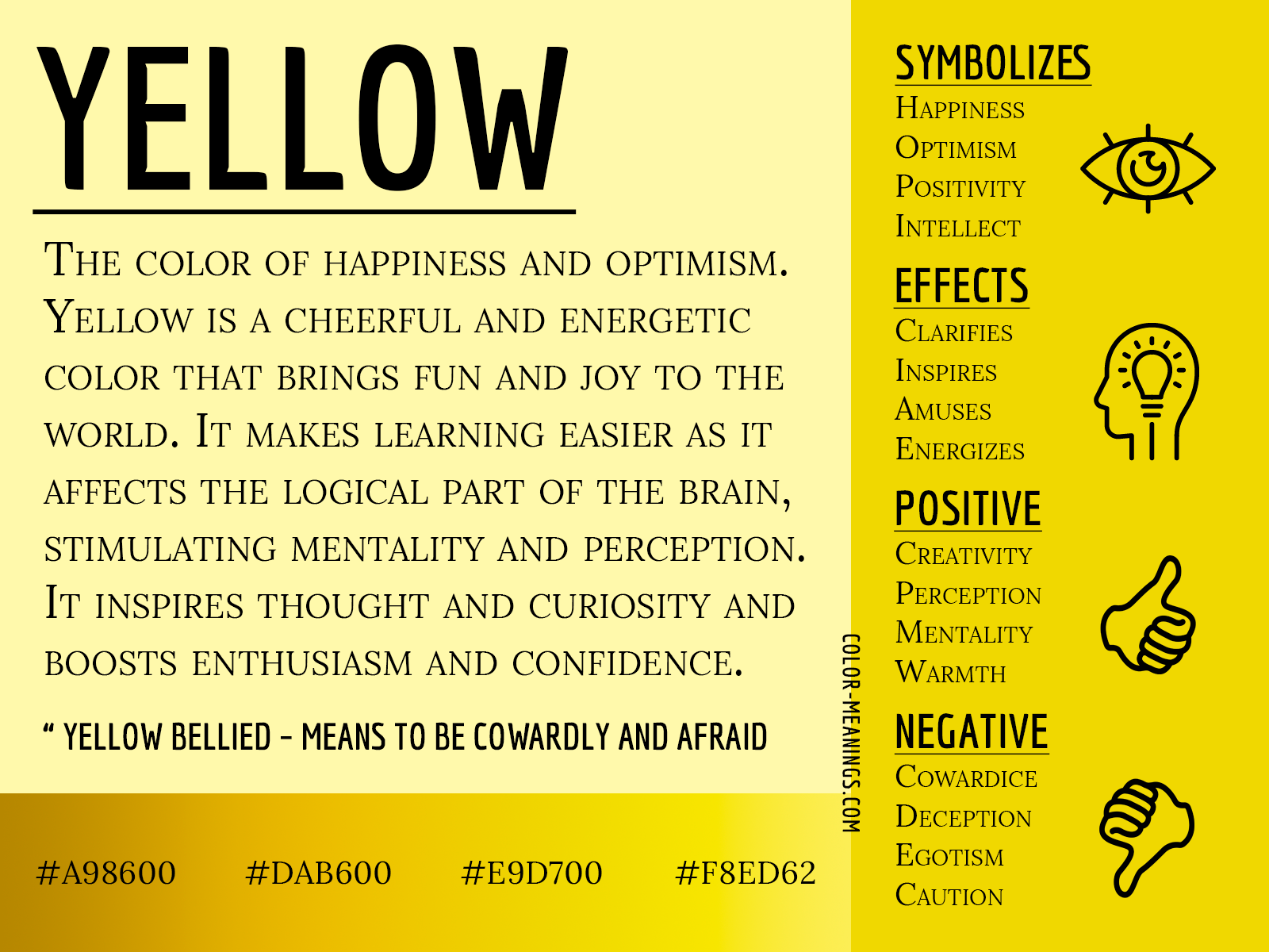
The Psychological Power of Yellow in Brand Perception
Yellow is a colour that immediately grabs attention. Its high visibility, second only to white, makes it an invaluable asset in a crowded marketplace. However, its impact extends far beyond mere visual prominence. Psychologically, yellow is intrinsically linked to happiness, optimism, and joy. It’s the colour of sunshine, a universal symbol of warmth, positivity, and the start of a new day. Brands that leverage yellow often aim to project an image of cheerfulness, approachability, and a generally optimistic outlook. This can be particularly effective for brands targeting families, children, or those seeking to create a lighthearted and memorable customer experience.
Evoking Happiness and Optimism
The association of yellow with happiness is deeply ingrained in human psychology. From a biological perspective, sunlight, which is predominantly yellow, is crucial for our well-being, stimulating the production of serotonin, a neurotransmitter associated with mood elevation. Brands that utilize yellow effectively tap into this innate positive response. Think of brands like McDonald’s, whose iconic golden arches are instantly recognizable and evoke feelings of comfort, familiarity, and a sense of playful indulgence. Similarly, the vibrant yellow of IKEA furniture, often used in their product photography and marketing materials, contributes to an image of affordability, accessibility, and a cheerful, do-it-yourself approach to home furnishing. These brands understand that yellow can be a powerful tool for emotional connection, fostering a positive brand sentiment that transcends mere product features.
Capturing Attention and Creating Memorability
In the competitive landscape of branding, standing out is paramount. Yellow, with its high luminosity and wavelength, is an exceptionally effective colour for drawing the eye. This makes it ideal for elements that need immediate attention, such as call-to-action buttons on websites, promotional banners, or product packaging on a crowded shelf. The effectiveness of yellow in grabbing attention is often exploited by brands in sectors where competition is fierce, such as the fast-food industry or discount retail. However, its attention-grabbing nature also means that overuse or improper application can lead to visual fatigue or be perceived as overly aggressive or even cheap. Therefore, the strategic deployment of yellow is crucial. A well-placed splash of yellow can highlight key information or create a focal point, ensuring that a brand’s message or offering is not overlooked. This strategic use of visual hierarchy, with yellow acting as a powerful accent, can significantly enhance brand recall and memorability.
Strategic Applications of Yellow in Corporate Identity and Marketing
The colour yellow, when incorporated into a brand’s visual identity, communicates a distinct personality. It can signal innovation, creativity, or a welcoming and friendly approach. The choice of yellow is not arbitrary; it’s a calculated decision rooted in the brand’s core values and target audience. Brands that align themselves with yellow often seek to convey energy, enthusiasm, and a forward-thinking mindset.
Conveying Energy and Creativity
Yellow is often associated with intellect, creativity, and innovation. It’s the colour of sparks of inspiration, brilliant ideas, and the boundless potential of the human mind. Brands in creative industries, educational sectors, or technology companies that want to project an image of innovation and forward-thinking might choose yellow. For instance, a software company developing cutting-edge AI tools might incorporate yellow into their logo or marketing to suggest intelligence, ingenuity, and a bright future. Similarly, a design agency could use yellow to convey their creative flair and ability to generate unique and impactful solutions. The association with mental energy and alertness makes yellow a powerful tool for brands aiming to position themselves as leaders in their respective fields, inspiring customers with a sense of progress and possibility.
Building Trust and Approachability
While yellow can be associated with attention-grabbing qualities, it can also foster a sense of approachability and trust when used thoughtfully. A softer, more muted shade of yellow, for example, can feel warm, inviting, and less demanding than a bright, saturated hue. Brands that prioritize customer service or aim to build strong community ties might employ yellow to signal their open and friendly nature. Think of brands that focus on providing helpful information or support; a touch of yellow in their branding can make them seem more accessible and less intimidating. It suggests a brand that is eager to engage, to share knowledge, and to build genuine connections with its audience. This is particularly important in industries where trust is a critical factor, such as finance or healthcare, where a yellow accent can soften a potentially austere corporate image and convey a more human-centric approach.

The Nuances and Potential Pitfalls of Using Yellow in Branding
Despite its numerous advantages, the use of yellow in branding is not without its challenges. The very qualities that make yellow so effective can also lead to its downfall if not handled with care. Understanding these nuances is critical for any brand considering incorporating this vibrant hue.
Overuse and the Perception of Cheapness
One of the most significant risks associated with yellow is the potential for overuse. A brand that is saturated in yellow, or uses it in an overwhelming manner, can quickly become visually jarring and off-putting. This can lead to the perception that the brand is cheap, garish, or lacking in sophistication. In certain luxury markets, for example, a strong emphasis on yellow might be seen as incongruous with an image of exclusivity and high quality. Brands need to be mindful of the specific shade and context in which yellow is used. A bright, neon yellow, while excellent for immediate attention, might be unsuitable for a high-end fashion brand. Conversely, a muted, golden yellow could convey richness and prestige. The key lies in balance and strategic application, ensuring that yellow enhances, rather than detracts from, the brand’s intended message.
Cultural Interpretations and Associations
It is crucial to acknowledge that the symbolism of colours can vary significantly across different cultures. While yellow generally signifies happiness and optimism in many Western cultures, its interpretations can differ elsewhere. In some Asian cultures, yellow has historically been associated with royalty, power, and prosperity. However, in other contexts, it can also be linked to illness or cowardice. For global brands, conducting thorough cultural research is paramount to ensure that the chosen colour palette resonates positively with diverse audiences. A seemingly innocuous choice of yellow in one market could inadvertently trigger negative associations in another, potentially undermining the brand’s efforts to build trust and rapport. Therefore, a nuanced understanding of cross-cultural colour psychology is essential for effective international branding.
Designing with Yellow: From Logos to Digital Interfaces
The application of yellow in branding extends to every touchpoint a consumer has with a brand, from its logo to its digital presence. Strategic design choices are crucial to harness yellow’s power effectively.
Logo Design and Brand Recognition
A logo is often the first visual impression a consumer has of a brand. When yellow is incorporated into a logo, it immediately imbues the brand with a certain character. Think of the iconic smiling face of the AA Milne’s Winnie the Pooh books, or the bold yellow of the National Geographic logo. These examples showcase how yellow can be used to create a distinct and memorable brand icon. The challenge in logo design is to balance the attention-grabbing nature of yellow with the need for timelessness and versatility. A logo that relies too heavily on a trendy shade of yellow might quickly become dated. Therefore, designers often opt for more classic yellow tones or use yellow as a strong accent colour to convey specific brand attributes while maintaining a broader appeal. The goal is to create a logo that is instantly recognizable, evokes the intended emotions, and stands the test of time.
Marketing Materials and User Experience
In marketing collateral, from websites and social media posts to advertisements and packaging, yellow can be used to create visual hierarchy, highlight key information, and evoke specific moods. On a website, for example, yellow can be used for call-to-action buttons to encourage user engagement. In social media campaigns, a bright yellow can help a post stand out in a busy feed. However, for user interfaces, especially in digital products, caution is advised. Excessive use of yellow in text or background can strain the eyes and make content difficult to read, negatively impacting user experience. Therefore, the use of yellow in digital design often involves careful consideration of contrast, accessibility, and the overall aesthetic. It might be used sparingly for accents, icons, or to draw attention to important alerts, ensuring that functionality and readability are prioritized while still leveraging the psychological benefits of the colour.
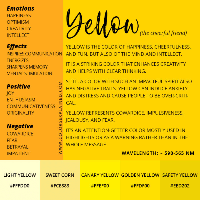
Conclusion: The Strategic Significance of Yellow in the Brand Palette
Yellow, a colour of immense visual impact and psychological resonance, offers brands a powerful tool to communicate optimism, attract attention, and foster a sense of creativity and joy. Its ability to evoke positive emotions and enhance memorability makes it an attractive choice for brands seeking to establish a distinctive and engaging identity. However, the effective utilization of yellow demands a nuanced understanding of its potential pitfalls, including the risks of overuse, the perception of cheapness, and the importance of cultural context. By strategically employing yellow in logos, marketing materials, and digital interfaces, brands can harness its inherent energy and warmth to build stronger connections with their audiences. The true power of yellow in branding lies not in its mere presence, but in its thoughtful and deliberate application, ensuring that it amplifies the brand’s message and contributes to a cohesive and impactful brand experience.
aViewFromTheCave is a participant in the Amazon Services LLC Associates Program, an affiliate advertising program designed to provide a means for sites to earn advertising fees by advertising and linking to Amazon.com. Amazon, the Amazon logo, AmazonSupply, and the AmazonSupply logo are trademarks of Amazon.com, Inc. or its affiliates. As an Amazon Associate we earn affiliate commissions from qualifying purchases.