
In the competitive landscape of modern commerce, visual identity is often the first point of contact between a brand and its audience. While many corporations default to the “safety” of blue—a colour associated with trust and stability—or the urgency of red, the colour pink has emerged as one of the most versatile and strategically potent tools in a brand designer’s arsenal. No longer confined to the rigid silos of “femininity” or “juvenile products,” pink has undergone a radical transformation. In the context of contemporary brand strategy, pink represents a sophisticated blend of disruption, emotional intelligence, and bold market positioning.
Understanding what pink represents requires moving beyond surface-level aesthetics and diving into the psychology of consumer perception and the mechanics of brand differentiation. For businesses looking to carve out a unique space in a saturated market, pink offers a way to signal innovation, approachability, and a forward-thinking ethos.
The Psychology of Pink: Beyond Gendered Marketing
For decades, the commercial application of pink was largely restricted by gendered stereotypes. However, modern brand strategy has reclaimed the colour, leveraging its deep psychological roots to evoke specific consumer responses that have nothing to do with traditional gender roles.
Compassion, Empathy, and Approachability
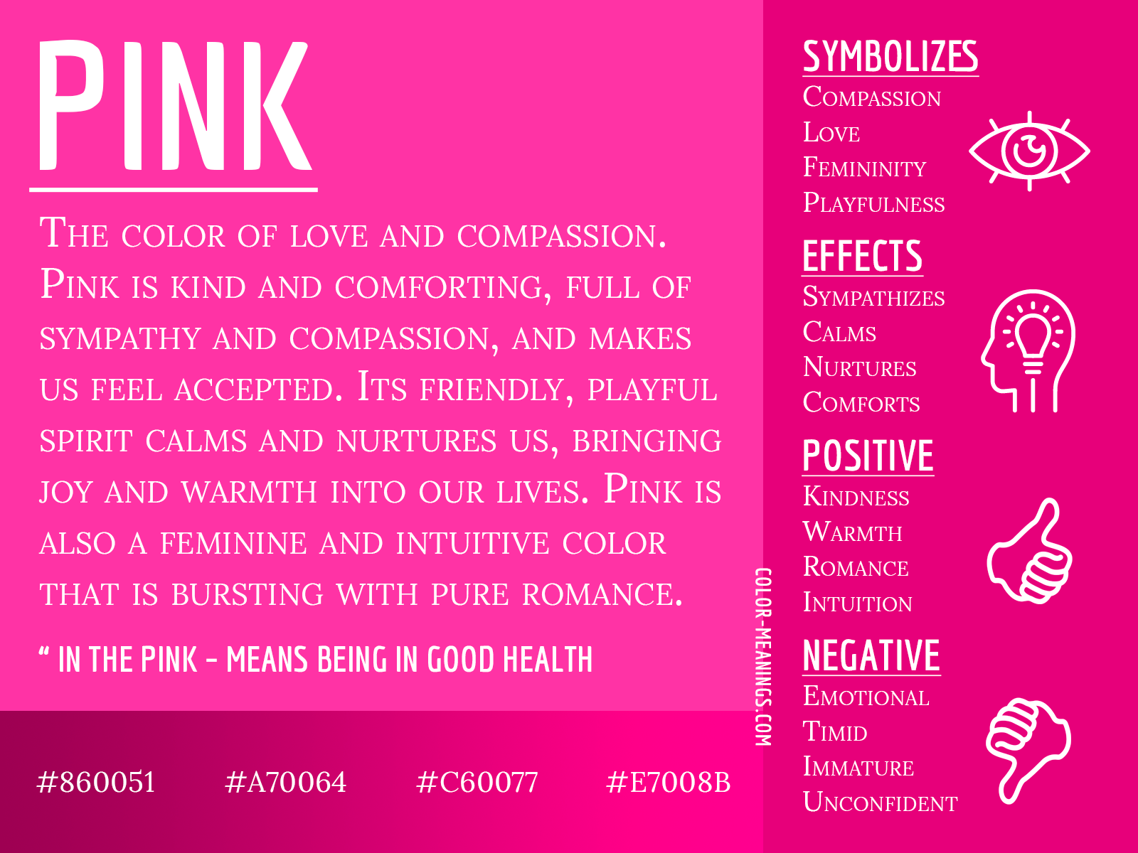
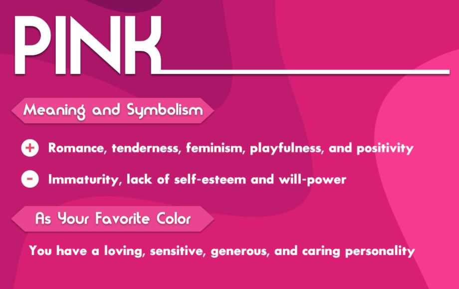
At its core, pink is a derivative of red, but it lacks red’s inherent aggression. While red signals “stop” or “danger,” pink signals “nurture” and “understanding.” In branding, this represents a high degree of emotional intelligence. Companies that use pink often position themselves as empathetic partners to their customers. This is particularly effective in service-based industries where building a rapport is essential. By utilizing softer shades of pink, a brand can lower a consumer’s defensive barriers, creating an atmosphere of safety and accessibility.
Sophistication and Modernity
In the last decade, particularly with the rise of the “Millennial Pink” trend, the colour has come to represent a minimalist, high-end aesthetic. This specific iteration—a dusty, muted rose—signals a departure from the loud, neon palettes of the early 2000s. In the world of premium lifestyle branding and direct-to-consumer (DTC) startups, pink represents a “new luxury.” It is clean, photogenic, and implies a sense of curated taste. This shift has allowed brands to use pink to target affluent, design-conscious demographics who value subtlety over overt opulence.
Pink as a Tool for Brand Differentiation
In brand strategy, the goal is often “distinctive brand assets”—elements that make a company instantly recognizable even without a logo present. Pink is a powerful tool for this because it is still underutilized in many heavy industries, such as telecommunications, finance, and logistics.
Disrupting Traditional Industry Palettes
When a brand enters a market dominated by a specific colour, choosing the opposite on the colour wheel is a classic disruptive move. For example, in a sea of corporate blues and greys, a splash of vibrant magenta or soft blush stands out immediately. This use of pink represents a “challenger brand” mentality. It signals to the consumer that this company does things differently, isn’t afraid to break conventions, and prioritizes creative thinking over traditional bureaucracy.
Creating Instant Brand Recognition
Because pink is a high-visibility colour with high “memory recall,” it serves as an excellent anchor for visual identity. When a consumer sees a specific shade of pink in a certain context, their brain makes a lightning-fast connection to the brand. This is a massive advantage in the “attention economy.” Whether it’s an app icon on a crowded smartphone screen or a physical package on a retail shelf, pink cuts through the visual noise, ensuring that the brand remains top-of-mind.
Cultural Shifts and the Evolution of Pink in Corporate Identity
The meaning of pink is not static; it evolves alongside cultural values. For a brand strategist, staying ahead of these shifts is crucial for maintaining a relevant identity.

The “Millennial Pink” Phenomenon and Digital-First Branding
The rise of “Millennial Pink” was more than just a fashion trend; it was a shift in how brands communicate in digital spaces. This shade became the hallmark of the “Instagrammable” brand. It represented a gender-neutral, inclusive, and aesthetically pleasing world. Brands like Glossier utilized this to build an entire community-led ecosystem. In this context, pink represents transparency and the breaking down of the “fourth wall” between the corporation and the consumer. It moved the brand identity away from “selling” and toward “sharing.”
Reclaiming Pink in Empowerment Branding
In recent years, pink has been used strategically to represent empowerment and social advocacy. No longer seen as “weak,” pink has become a colour of protest, strength, and collective action. Brands that align themselves with social causes often use pink to signal their commitment to progressivism. When a brand adopts pink in this manner, it represents a bold stance on social issues, transforming the company from a mere provider of goods into a cultural participant. This builds deep brand loyalty among consumers who share those same values.
Case Studies: Brands That Own the Pink Spectrum
To understand what pink represents in practice, we must look at global leaders who have successfully integrated the colour into their core identity, often spending millions of dollars to “own” a specific hue.
T-Mobile and the Magenta Monopoly
Perhaps the most famous example of pink in corporate branding is T-Mobile. Their use of “Process Magenta” is so integral to their identity that they have famously engaged in legal battles to protect the colour’s use in the telecom space. For T-Mobile, magenta represents energy, speed, and a radical departure from the “boring” identities of competitors like AT&T or Verizon. It positions them as the “Un-carrier”—the vibrant, youthful alternative to the established giants.
Lyft: Using Pink to Signal Trust and Safety
When Lyft entered the ride-sharing market, it faced the challenge of differentiating itself from Uber’s sleek, black-and-white “private driver” aesthetic. Lyft chose pink—specifically in the form of their original “glowstache” dashboard icons. In this instance, pink represented friendliness, community, and safety. It signaled that hitching a ride with a stranger was a social, human experience rather than a cold, transactional one. The colour helped humanize the tech platform, which was vital for early adoption.
Barbie: The Gold Standard of Heritage Pink
One cannot discuss pink without mentioning Mattel’s Barbie. For Barbie, “Barbie Pink” (Pantone 219C) represents a multi-generational legacy. While it began as a symbol of traditional femininity, the brand’s recent strategic evolution has used the colour to represent limitless potential and professional diversity. The 2023 Barbie movie marketing campaign demonstrated the power of “colour dominance,” where the mere presence of that specific pink was enough to signal the brand, proving that a colour can become a brand’s most valuable intellectual property.
How to Implement Pink in Your Brand Strategy
If you are considering incorporating pink into a brand identity, it must be a deliberate, strategic choice rather than a trend-chasing whim. The “wrong” shade of pink can miscommunicate your brand’s values entirely.
Finding the Right Shade for Your Target Audience
The spectrum of pink is vast, and each segment carries a different weight:
- Neon/Fuchsia: Represents high energy, youth, and digital innovation. Ideal for tech startups or creative agencies.
- Pale/Blush: Represents calm, luxury, and health. Ideal for wellness brands, skincare, or high-end lifestyle products.
- Dusty Rose/Mauve: Represents nostalgia, stability, and sophistication. Ideal for home goods or ethical fashion brands.
- Hot Pink: Represents boldness, confidence, and disruption. Ideal for brands that want to position themselves as leaders or rebels.
Balancing Pink with Complementary Palettes
To ensure pink remains professional and impactful, it is often best used in combination with a strong secondary palette. Pairing pink with navy blue adds a sense of corporate authority; pairing it with forest green creates a natural, organic feel; and pairing it with charcoal or black gives it a high-fashion, edgy appeal. In modern brand design, the “representation” of pink is often defined by the colours that surround it.
Conclusion
In the realm of brand strategy, the colour pink represents far more than a simple aesthetic choice. It is a nuanced tool for emotional connection, a bold statement of market disruption, and a symbol of cultural evolution. By understanding the psychological triggers and the historical context of the colour, brands can leverage pink to build identities that are not only visually striking but also strategically sound. Whether it is used to signal the empathy of a healthcare provider or the disruptive energy of a tech giant, pink remains one of the most powerful ways to communicate a brand’s unique value proposition in the modern age.
aViewFromTheCave is a participant in the Amazon Services LLC Associates Program, an affiliate advertising program designed to provide a means for sites to earn advertising fees by advertising and linking to Amazon.com. Amazon, the Amazon logo, AmazonSupply, and the AmazonSupply logo are trademarks of Amazon.com, Inc. or its affiliates. As an Amazon Associate we earn affiliate commissions from qualifying purchases.