
The national flag of any sovereign state is far more than a mere piece of fabric; it is the ultimate expression of its corporate identity, a visual shorthand for its history, values, and aspirations. For Italy, the Tricolore — green, white, and red — serves as a powerfully designed emblem, embodying a brand narrative deeply rooted in its revolutionary past and its enduring cultural legacy. Understanding what these colors represent is to grasp the very essence of Italy’s national brand strategy, a masterclass in visual communication and identity building.
The Genesis of a National Brand: Italy’s Tricolour
Every successful brand has an origin story, and Italy’s national brand, personified by its flag, is no exception. The Tricolore first emerged during a period of intense political fervor and national awakening, a testament to its role as a revolutionary symbol before becoming a state emblem.
Historical Roots and Revolutionary Ideals
The first Italian tricolour with horizontal stripes appeared in Reggio Emilia on January 7, 1797, during the Napoleonic era. This was the flag of the Cispadane Republic, one of the “sister republics” established by Napoleon in Italy. The choice of green, white, and red was not arbitrary; it echoed the French Tricolour (blue, white, red) but adapted it to reflect a distinctly Italian identity. At this nascent stage, the colors were already imbued with powerful symbolic meanings intended to unify diverse regional identities under a common cause.
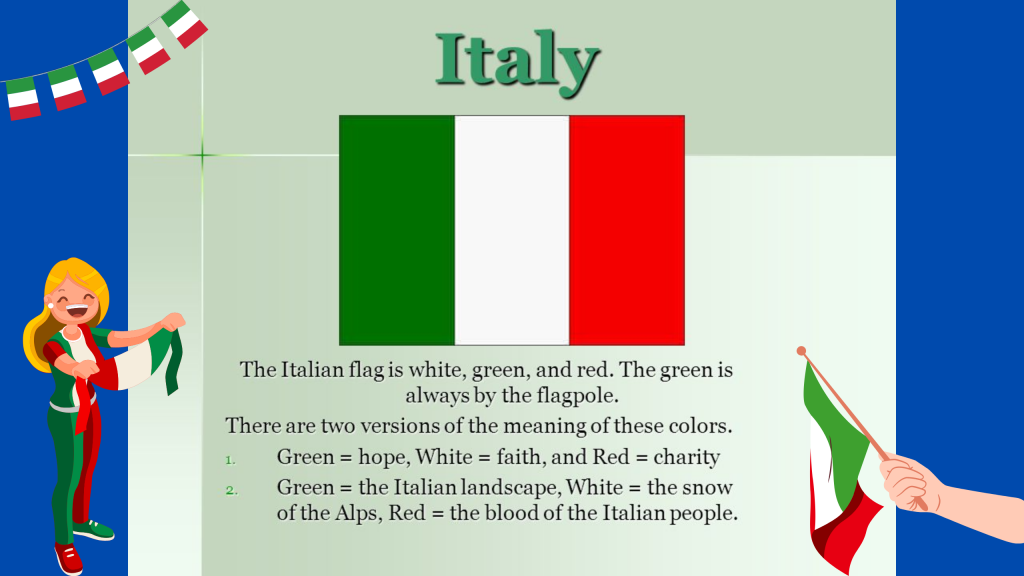
The green often represented the Italian landscape, its fertile plains and hills, but more profoundly, it was a color associated with hope for a better future and the ideals of freedom and equality that propelled the Risorgimento – the movement for Italian unification. White typically stood for the snow-capped Alps, a natural northern border, but also purity of intent and the spirit of peace. Red, the most evocative color, symbolized the blood shed by patriots in their fight for independence and unity, embodying courage, sacrifice, and the fervent passion for liberation.
This period was critical in establishing the initial brand associations for the Tricolore. It wasn’t just a design; it was a rallying cry, a visual manifesto for a nation struggling to be born. The flag became a tangible representation of shared goals and collective identity, a crucial first step in building a national brand from disparate elements.
The Power of Symbolism in Nation-Building
For emerging nations, especially those forged from previously independent states, establishing a cohesive national identity is paramount. The flag, through its design and inherent symbolism, plays a central role in this process. It acts as a primary identifier, simplifying complex historical narratives into an easily digestible and emotionally resonant form. The Italian Tricolore successfully harnessed this power.
Each color, while having its own meaning, contributes to an overarching brand narrative that speaks to unity, sacrifice, and the natural beauty of Italy. This layered symbolism allows for broad interpretation and deep personal connection, fostering a sense of belonging among its citizens and projecting a distinct image to the world. It’s an early example of how thoughtful design and strategic messaging can cultivate a strong “corporate” identity for a nation, capable of inspiring loyalty and recognition.
Decoding the Italian National Brand: Red, White, and Green
Just as a corporate logo’s colors are carefully chosen for their psychological impact and brand message, the colors of the Italian flag are rich with meaning, collectively forming the visual language of the Italian national brand.
Green: Hope, Landscape, and Unity
The green stripe, positioned nearest the flagpole (the hoist), is often interpreted in several powerful ways. From a literal perspective, it evokes the lush, fertile landscapes of Italy—the rolling hills of Tuscany, the verdant valleys, and the abundant olive groves. This connection to the land grounds the Italian brand in its natural beauty and agricultural heritage, elements that are still central to its global appeal (e.g., Italian food and wine).
Symbolically, green is universally associated with hope, growth, and renewal. For a young nation striving for unification and independence, this was a vital message. It represented the hope for a prosperous future, the growth of a unified identity, and the renewal of national spirit after centuries of foreign domination. In a branding context, this signifies forward-thinking, optimism, and a commitment to progress. Furthermore, some interpretations connect green to the concept of liberty, aligning it with the revolutionary fervor that birthed the flag. This intertwines individual freedom with national aspiration, a powerful brand promise.
White: Purity, Faith, and the Alps’ Snow
The central white stripe carries its own distinct set of meanings, contributing to the depth of the Italian brand. A common interpretation links the white to the snow-capped peaks of the Alps, forming Italy’s natural northern boundary. This physical association anchors the brand in its geography, emphasizing its unique topographical identity.
Beyond the literal, white is traditionally a color of purity, peace, and faith. In the context of the Italian flag, it can represent the pure intentions of the patriots who fought for unification, their unwavering faith in the cause, and the desire for peace following periods of conflict. From a brand perspective, purity speaks to authenticity and integrity—qualities that many nations aspire to project. Faith, whether religious or in the national ideal, highlights a deeply rooted set of values that underpin the national character. The combination of purity and peace creates an image of a nation striving for moral clarity and harmonious existence, a sophisticated layer within its brand identity.
Red: Charity, Blood, and Passionate Struggle
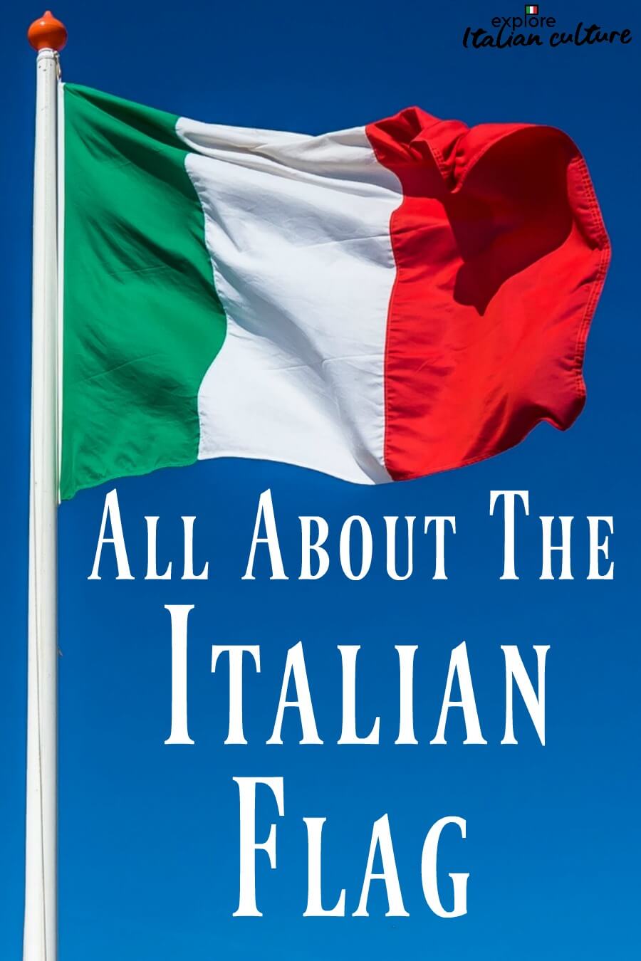
The red stripe, positioned at the fly (the outer edge), is perhaps the most emotionally charged of the three. Its primary and most enduring meaning is tied to the blood shed by Italian patriots during the wars of independence and unification—the Risorgimento. This sacrifice is a cornerstone of the Italian national narrative, establishing a legacy of courage, heroism, and an unyielding commitment to freedom. This aspect of the brand evokes a deep sense of historical memory and national pride.
Beyond sacrifice, red is also traditionally associated with charity (love of neighbor), passion, and vibrancy. These attributes resonate deeply with stereotypical perceptions of Italian culture: the passion for life, art, food, and family; the vibrant energy of its people; and the warmth of its hospitality. In a branding context, red injects dynamism, energy, and a human element into the national identity. It signifies a spirited and resilient nation, unafraid to fight for its values and full of an infectious joie de vivre. This powerful emotional appeal makes red a critical component in fostering a strong, memorable, and globally recognized Italian brand.
The Flag as a Masterpiece of National Design and Corporate Identity
The Italian Tricolore is not just a collection of symbols; it’s a meticulously designed visual asset that functions as the cornerstone of Italy’s corporate identity on the global stage. Its simplicity, distinctiveness, and inherent meaning make it an exemplary case study in national branding.
Visual Consistency and Recognition
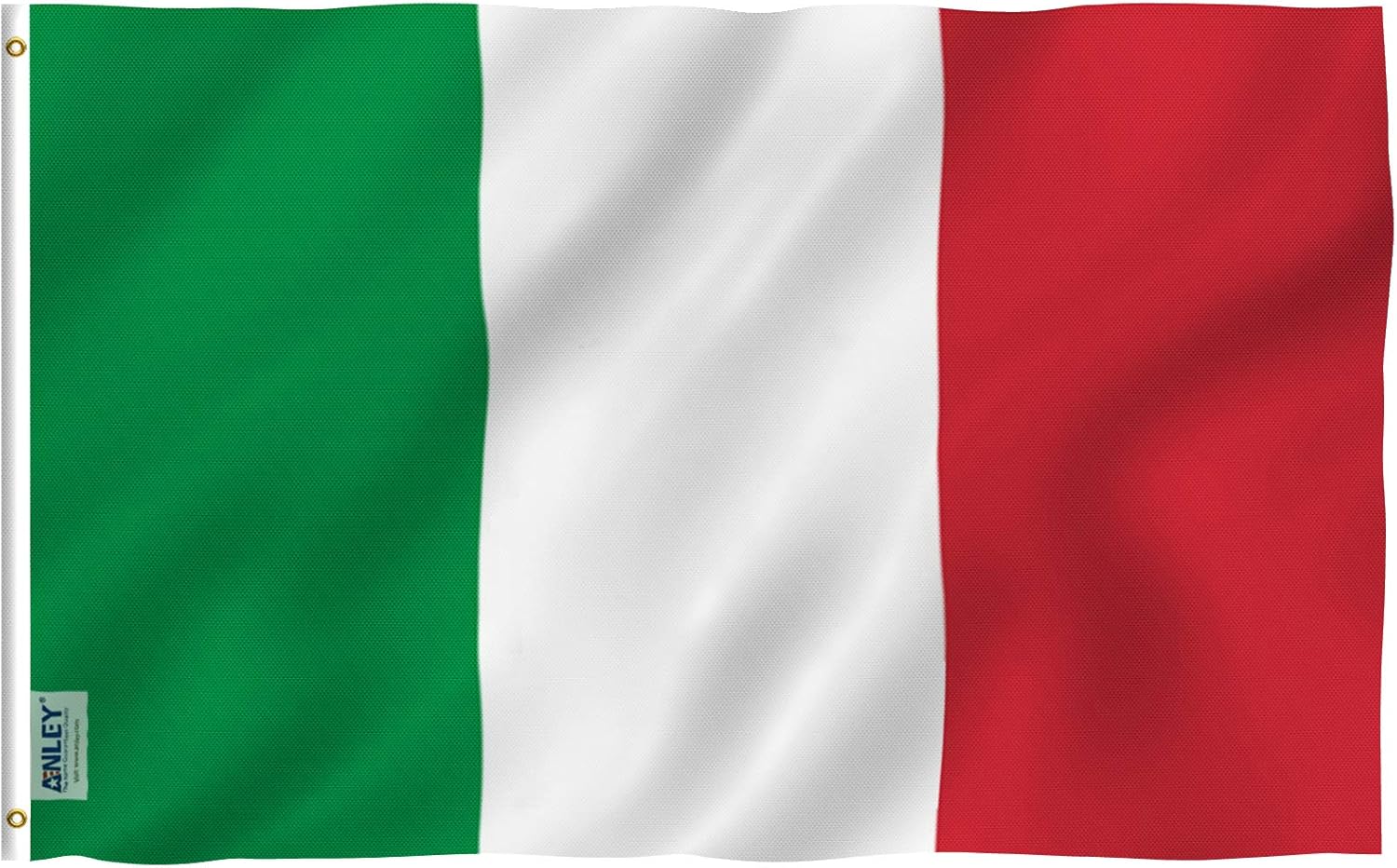
One of the hallmarks of strong corporate identity is instant recognition. The Italian flag achieves this through its simple, clean design: three equal vertical stripes of green, white, and red. This clear, unambiguous layout ensures that it is easily identifiable, whether seen at a sporting event, a diplomatic meeting, or as a motif in marketing materials. This visual consistency is crucial for brand recall and differentiation in a crowded global landscape.
The specific shades of green, white, and red are also important, though subject to slight variations over time. The official colors, defined more precisely in recent decades, aim for a consistent visual representation, much like a brand’s style guide ensures uniform application of its logo and color palette across all touchpoints. This meticulous attention to detail underscores the flag’s role as a primary brand asset.
Emotional Resonance and Brand Loyalty
A truly effective brand fosters an emotional connection with its audience, leading to loyalty and advocacy. The Italian flag, with its rich historical and symbolic meanings, deeply resonates with both Italian citizens and those around the world who admire Italian culture. For Italians, it evokes patriotism, shared history, and a sense of belonging. It is a powerful symbol of national unity that transcends regional differences.
For the international audience, the flag often triggers associations with Italy’s famed cultural exports: its art, fashion, cuisine, and landscapes. It becomes a badge of authenticity for “Made in Italy” products and experiences, lending an aura of quality, tradition, and passion. This emotional appeal translates into brand loyalty, whether it’s supporting the national football team, choosing Italian goods, or dreaming of a vacation in Italy. The flag facilitates this emotional transfer, linking the abstract concept of a nation to tangible feelings and desires.
Beyond the Flag: Extending the Italian Brand Identity
The Tricolore‘s influence extends far beyond its physical presence. Its colors and symbolism form the foundational palette for Italy’s broader national brand identity. From the uniforms of national athletes to the branding of governmental institutions, and even into the design language of Italian products, the green, white, and red are consistently echoed.
This strategic extension of the flag’s visual language reinforces the Italian brand across various sectors. For example, Italian luxury brands might subtly incorporate the colors or their underlying principles (e.g., passion, quality) into their marketing, leveraging the inherent positive associations with “Italianness.” This coherent brand strategy ensures that every touchpoint reinforces the core identity and values represented by the flag, creating a powerful, unified national image.
The Enduring Brand Value of a National Symbol
The Italian flag’s journey from a revolutionary banner to a universally recognized national symbol demonstrates the enduring power of effective branding. It’s a testament to how visual identity, imbued with deep meaning, can serve as an invaluable asset for a nation’s global standing and internal cohesion.
Cultural Diplomacy and Global Marketing
As a primary symbol, the Tricolore plays a critical role in Italy’s cultural diplomacy and global marketing efforts. It represents Italy at international events, in diplomatic relations, and within global organizations. Its presence communicates Italy’s sovereignty, its values, and its place in the world.
Furthermore, the flag acts as an unmissable marketing tool. It instantly conjures images and associations that drive tourism, attract foreign investment, and promote Italian culture worldwide. When the Tricolore is displayed, it signals Italy’s presence, sparking curiosity and reinforcing the nation’s positive attributes—from its rich history and artistic heritage to its culinary excellence and stylish innovation. This passive yet pervasive marketing power is a direct result of its strong, well-established brand identity.
Inspiring Creativity and Economic Soft Power
The colors and meanings of the Italian flag continue to inspire artists, designers, and entrepreneurs, both within Italy and abroad. The national identity it represents fuels creativity in fashion, design, and gastronomy, fields where Italy is a global leader. The “Made in Italy” label, often subtly or explicitly linked to the Tricolore‘s values, carries significant economic soft power. It symbolizes a commitment to quality, craftsmanship, and aesthetic appeal—attributes that are highly valued in global markets.
In essence, the Italian flag is a masterclass in national branding. Its green, white, and red are not merely decorative; they are a carefully constructed visual narrative that communicates hope, purity, and passion—a compelling brand story that resonates deeply, uniting a nation and captivating the world.
aViewFromTheCave is a participant in the Amazon Services LLC Associates Program, an affiliate advertising program designed to provide a means for sites to earn advertising fees by advertising and linking to Amazon.com. Amazon, the Amazon logo, AmazonSupply, and the AmazonSupply logo are trademarks of Amazon.com, Inc. or its affiliates. As an Amazon Associate we earn affiliate commissions from qualifying purchases.