
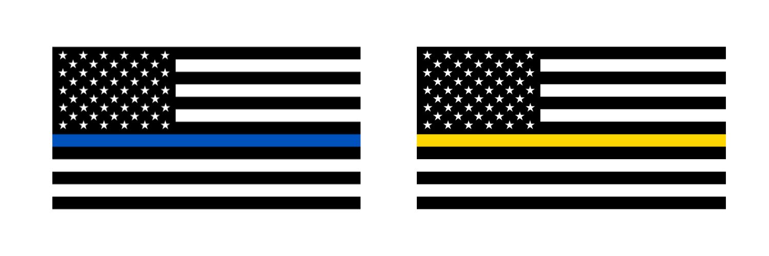
The American flag, a symbol of national unity and historical perseverance, has long served as a canvas for various iterations and adaptations. Among these, the monochromatic flag featuring a single horizontal blue stripe between black and white segments—commonly known as the “Thin Blue Line” flag—stands out as one of the most polarizing and widely recognized brand extensions of the national standard. From a branding and design perspective, this flag serves as a quintessential case study in how visual symbols shift in meaning when stripped of their original color palette and repurposed to communicate specific institutional identities.
The Evolution of Corporate and Institutional Identity
In the realm of brand strategy, colors are not merely aesthetic choices; they are linguistic tools used to evoke emotion, trust, and affiliation. The traditional American flag utilizes red, white, and blue to symbolize valor, purity, and justice. By stripping away the red, the designers of the Thin Blue Line flag fundamentally altered the brand’s messaging.
The Power of Monochromatic Design
The transition to a black-and-white aesthetic is a deliberate design choice that signals austerity, gravity, and seriousness. In branding, black is frequently associated with power, authority, and elegance. When combined with the high-contrast, solitary blue stripe, the design creates a focused visual hierarchy. This is a common tactic in logo design—by reducing the palette, the brand eliminates noise and directs the observer’s eye toward the element of primary importance. In this context, the blue stripe is elevated to the focal point, acting as a visual anchor that signifies the presence of law enforcement within the broader structure of society.
Strategic Symbolism and Affiliation
Corporate identity thrives on the ability to foster a sense of belonging. Organizations that adopt modified versions of the American flag are essentially engaging in a form of visual “co-branding.” By grafting their institutional identity onto the most powerful brand in the country—the flag of the United States—these groups seek to derive legitimacy and patriotic gravity. This strategy is effective because it leverages the existing emotional equity held by the original flag, redirecting those patriotic sentiments toward the specific institution or demographic represented by the secondary design element.
Visual Communication and Cultural Signaling
Brands and symbols do not exist in a vacuum. As they move from their original context into the public square, they become subject to the laws of perception and semiotics. The Thin Blue Line flag, specifically, highlights the risks and rewards of visual identity when applied to social and political discourse.
Contextual Reinterpretation
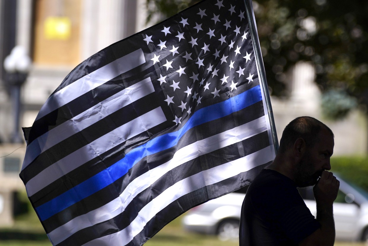
When a logo or symbol is modified, the original meaning is rarely completely erased. Instead, it is layered. For those who view the flag, the meaning is derived from a synthesis of the original American identity and the new, specific inclusion of the blue line. For many, this represents a statement of support for law enforcement, honoring the perceived line that stands between order and chaos. However, in the world of brand perception, an entity does not always control how its design is decoded by the public. When a design choice becomes highly visible, it often undergoes “meaning drift,” where the original intent of the designer is superseded by the collective perception of the consumer base.
Design as a Divisive Tool
From a design strategy standpoint, the effectiveness of a symbol is often measured by its ability to create a clear “in-group” and “out-group” dynamic. The blue stripe serves as a design boundary. By introducing this element, the creators have moved the flag from a broad, inclusive national brand to a specific, exclusionary, or targeted one. This is a common pivot in brand strategy: moving from a “mass-market” appeal to a “niche” appeal. Whether this shift is deemed successful depends on the objective of the branding. If the objective is to solidify a specific identity, the design is highly successful; if the objective is broad, universal appeal, the modification of a national icon inherently complicates the brand’s reach.
The Implications of “Brand Drift” in Public Symbols
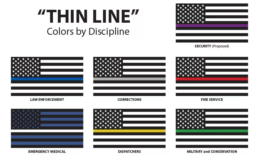
The proliferation of variations on the American flag—ranging from the Thin Blue Line to the Thin Red Line (firefighters) and others—represents a significant trend in the democratization of corporate-style branding. No longer are organizations waiting for national approval to create icons; they are designing their own visual identities by modifying existing cultural heritage assets.
Intellectual Property and Cultural Heritage
While national flags are generally considered public domain and not subject to traditional copyright in the way a private corporation’s logo would be, they remain subject to “soft” regulation through cultural norms. When organizations design symbols that closely mimic official national branding, they invite scrutiny. This mirrors the struggle companies face when they attempt to rebrand: they must balance the need for innovation and novelty with the risk of diluting their core value proposition. When a brand modifies a foundational icon, it risks alienating the portion of its audience that feels the original integrity of the symbol has been compromised.
Managing Brand Equity in the Public Eye
For organizations, the lesson of the black, blue, and white flag is that visual communication is a volatile asset. Once a design is introduced into the public domain, the organization loses control over its meaning. If an institution seeks to align itself with a powerful symbol, it must be prepared for the reality that the symbol’s meaning will be interpreted through the lens of current events, political leanings, and cultural tension. In this case, the design has become a lightning rod. Whether or not it was intended to be political, the act of modification ensured that it would be perceived as such.
Strategic Conclusion: The Responsibility of Visual Identity
The black, blue, and white flag serves as a reminder that every design choice carries a weight that can expand far beyond the intended audience. In the broader landscape of brand strategy and corporate identity, it is a masterclass in the unintended consequences of symbolic modification.
Designers, organizations, and brand strategists must carefully consider the impact of repurposing established symbols. When you alter a high-value asset like a national flag, you are not just changing the aesthetics; you are editing the historical and emotional narrative that the symbol carries. The success of a brand identity, therefore, is not solely determined by the balance of colors or the sharpness of the lines; it is determined by the psychological bridge built between the symbol and the viewer. As this flag continues to be used in various arenas of public life, it remains a permanent fixture in the study of how symbols define, divide, and connect us, proving that in the world of visual branding, the design is only the beginning of the conversation.
aViewFromTheCave is a participant in the Amazon Services LLC Associates Program, an affiliate advertising program designed to provide a means for sites to earn advertising fees by advertising and linking to Amazon.com. Amazon, the Amazon logo, AmazonSupply, and the AmazonSupply logo are trademarks of Amazon.com, Inc. or its affiliates. As an Amazon Associate we earn affiliate commissions from qualifying purchases.