
The bee, as a symbol, transcends its biological reality to become one of the most potent icons in the landscape of global branding. When a company chooses the bee as its visual marker, it is rarely a coincidence or a whimsical choice. It is a calculated decision rooted in deep psychological associations: industry, community, productivity, and essentiality. By examining why brands gravitate toward this winged insect, we uncover the principles of semiotics in design and the strategic power of archetypes in corporate identity.
The Semiotics of Industry and Productivity
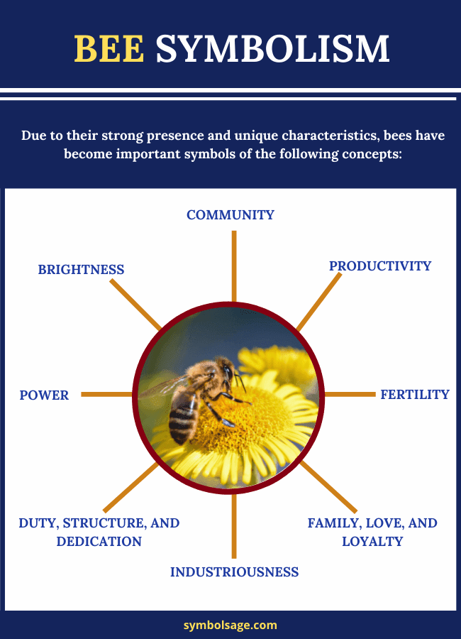
At the core of the bee’s branding power is the universal human association with “busy-ness.” The phrase “busy as a bee” has permeated global culture, translating across linguistic and cultural boundaries. For a brand, incorporating a bee is an immediate shorthand for a company that is active, efficient, and relentlessly productive.

Efficiency as a Core Value
When a software startup or a logistics company adopts a bee as its logo, it is signaling a commitment to operational excellence. In the context of business strategy, the bee represents the optimization of resources. A hive functions with a level of precision that many corporations aspire to replicate; it is a system where individual actions contribute to an exponentially greater whole. By associating with the bee, a brand promises the consumer that their problems will be solved with the same systematic efficiency that a colony employs to gather nectar.
The Myth of Relentless Growth
Beyond mere efficiency, the bee suggests a brand that does not rest. In the competitive landscape of modern business, stagnation is synonymous with failure. A bee-centric logo suggests a dynamic entity—a company that is constantly foraging for new opportunities, innovating, and expanding its reach. This creates a psychological narrative of growth, assuring stakeholders and clients that the business is moving forward and that the collective “hive” is consistently producing value.
Community and the Hive Mind Architecture
Modern branding has shifted from top-down messaging to the creation of brand ecosystems. The bee is the ultimate archetype for the collaborative economy. In an era where “community” is the gold standard for marketing success, the bee serves as a potent symbol of cooperative identity.
Decentralized Power and Collaboration
The hive is a decentralized marvel. No single bee dictates the success of the colony; rather, it is the collective intelligence—the “hive mind”—that governs survival and prosperity. Brands that position themselves as community-centric, such as co-working spaces, open-source software projects, or cooperative business models, leverage the bee to communicate that they are more than just a firm; they are a collective. This creates a sense of belonging for the consumer, suggesting that the brand is an organism that thrives on contribution rather than a monolith that dictates terms.
The Role of the Individual in the Collective
A critical nuance in bee-themed branding is the balance between the individual and the group. A brand that uses a bee image often signals that it values the unique contributions of its users, employees, or customers. Just as every bee plays a specific, essential role in the survival of the colony, a brand adopting this imagery communicates that every customer is a vital stakeholder. This fosters customer loyalty, as users feel like essential components of a larger, meaningful project rather than passive recipients of a product.
Sustainability and Environmental Stewardship
In the contemporary market, “purpose-driven” branding is no longer a luxury; it is a requirement. The bee is perhaps the most recognizable mascot for environmental health and the delicate balance of ecosystems. For companies in the food, retail, or ethical manufacturing sectors, the bee is a badge of honor that signals a commitment to sustainability.
The Symbol of Essentiality
Pollination is the foundation of our agricultural system. By branding with a bee, a company taps into the subconscious understanding that this insect is indispensable to life. When a business uses the bee, they are subtly asserting their own indispensability. They are saying: “Like the bee, we are essential to the healthy functioning of your world.” This is a powerful positioning tool, elevating a brand from a mere commodity to an essential partner in the consumer’s lifestyle.
Ethical Signaling in Consumer Choice
Consumers are increasingly discerning regarding their environmental footprint. A bee logo serves as an immediate visual cue that the brand is aligned with nature. Whether the company is selling honey, sustainable apparel, or eco-friendly cleaning supplies, the bee acts as a shorthand for “earth-friendly.” It mitigates suspicion and builds trust, providing a visual shorthand that the company operates within the boundaries of natural systems rather than in opposition to them. This creates a halo effect around the brand, imbuing it with the virtues of the bee: nurturing, life-sustaining, and inherently good.
The Design Evolution: From Biological Literalism to Minimalist Icons
How a brand portrays the bee matters as much as the decision to use it. As design trends have shifted toward minimalism, the bee has evolved from a detailed, illustrative icon to a geometric, abstract symbol. This evolution tells a story about how brands want to be perceived in the modern digital age.
Geometric Precision and Modernity
Contemporary brands often utilize golden ratios and clean, sharp lines to construct their bee icons. This serves two purposes: it makes the logo scalable for digital interfaces and apps, and it conveys technological sophistication. A geometric bee suggests that the brand is built on sound mathematics, engineering, and structure. It strips away the “fuzzy” nature of the insect and replaces it with the “precision” of a machine, signaling that the company is a high-tech player that understands the complexities of the digital landscape.
Brand Recognition in a Saturated Market
With the abundance of brands competing for attention on mobile screens, icons must be instantly recognizable. The bee is a unique silhouette. Its wings, its antennae, and its striped body provide a high-contrast form that is easily identifiable even at small scales. This makes it an ideal candidate for app icons and social media avatars. A brand that chooses a bee is choosing a symbol that can travel—one that remains legible on a billboard, a business card, or a pixel-dense smartphone interface.
Conclusion: The Strategic Resonance of the Bee
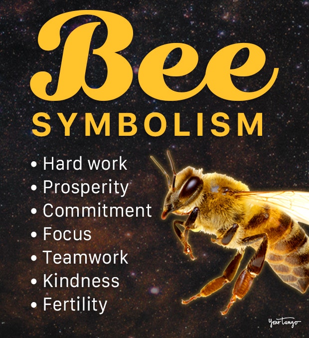
The bee is not merely an image; it is an archetype that bridges the gap between biological instinct and corporate strategy. It speaks to our deep-seated need for order, our desire for community, and our growing anxiety regarding environmental sustainability.
When a brand adopts the bee, it is anchoring its identity to a narrative of success. It is promising that it will work hard, that it will work together, and that it is an essential part of the larger ecosystem. Whether it is a technology platform using the bee to denote speed and connectivity, or a lifestyle brand using it to denote environmental ethics, the bee provides a reliable, powerful, and deeply resonant foundation for brand identity. In the final analysis, the bee means exactly what every successful company needs to mean: that it is focused, it is vital, and it is here to flourish.
aViewFromTheCave is a participant in the Amazon Services LLC Associates Program, an affiliate advertising program designed to provide a means for sites to earn advertising fees by advertising and linking to Amazon.com. Amazon, the Amazon logo, AmazonSupply, and the AmazonSupply logo are trademarks of Amazon.com, Inc. or its affiliates. As an Amazon Associate we earn affiliate commissions from qualifying purchases.