In the vast landscape of global commerce, few symbols possess the instant recognition, profound resonance, and sheer iconic power of the Apple logo. Far more than a mere identifier, the bitten apple is a masterclass in corporate identity, a silent ambassador for one of the world’s most valuable brands, and a deeply embedded cultural artifact. Its simplicity belies a rich tapestry of design evolution, strategic intent, and layered symbolism that has captivated consumers and design enthusiasts alike for decades. Understanding what the Apple logo represents is to delve into the very essence of effective brand strategy, exploring how a single image can embody innovation, aspiration, and a distinct philosophy that transcends product lines and geographical boundaries. This article will dissect the multifaceted meaning of the Apple logo, examining its historical journey, its deliberate symbolism, and its integral role in forging Apple’s unparalleled brand identity and market dominance.
The Evolution of an Icon: A Design Journey
The Apple logo, in its current minimalist form, might seem like an immutable entity, but its history is one of deliberate evolution, reflecting the company’s own transformations and changing strategic focus. From its intricate beginnings to its universally recognized silhouette, each iteration of the logo has contributed to its legendary status, carefully crafted to resonate with its target audience and communicate Apple’s evolving brand narrative.
From Newton to the Bitten Apple: Early Iterations
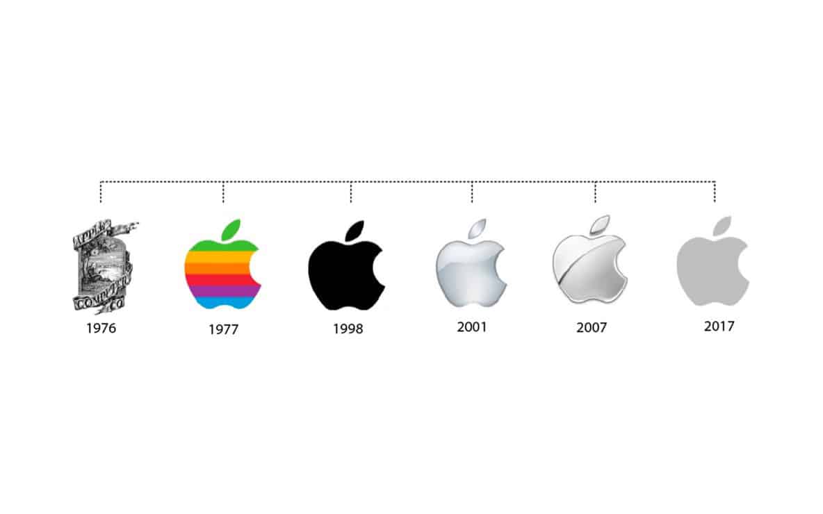
The very first Apple logo, designed in 1976 by Ronald Wayne (Apple’s third co-founder), was a world apart from the sleek symbol we know today. It depicted Isaac Newton sitting under an apple tree, an apple dangling precariously above his head, framed by a banner bearing the company’s name and a quote from Wordsworth. This complex, illustrative design, while poetic, was ill-suited for the emerging age of personal computing. It lacked scalability, memorability, and the modern aesthetic that Steve Jobs envisioned for his burgeoning tech company.
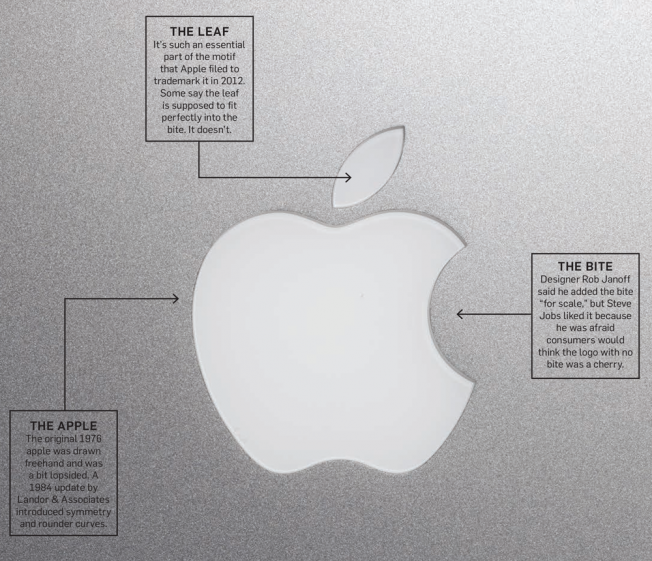
Recognizing the need for a more impactful and versatile emblem, Jobs swiftly commissioned Rob Janoff to create a new logo in 1977. Janoff’s genius lay in his ability to distill the essence of “Apple” into a simple, recognizable graphic. He presented Jobs with a simplified silhouette of an apple, distinctively featuring a bite taken out of its side. This decision was pivotal, transforming a generic fruit shape into a unique, identifiable mark. The bite, often debated for its deeper meaning, served the practical purpose of distinguishing the apple from a cherry and providing a sense of scale. This stripped-down, modern design marked Apple’s true birth in the visual branding world, setting the stage for an iconic journey.
The Rainbow Era: Symbolizing Innovation and Inclusivity
Upon its introduction in 1977, Janoff’s bitten apple wasn’t monochrome; it was adorned with vibrant rainbow stripes. This “rainbow Apple” logo was a bold statement for its time, especially in the typically staid corporate landscape of the 1970s. The rainbow colors were not merely an aesthetic choice; they were imbued with profound brand messaging.
Firstly, the spectrum of colors was an ode to the Apple II, one of the first personal computers capable of displaying color graphics. This subtly highlighted Apple’s technological innovation and differentiation in a market dominated by monochrome displays. Secondly, and perhaps more importantly from a branding perspective, the rainbow colors projected an image of approachability, humanity, and creativity, countering the often intimidating perception of early computers. It symbolized Apple’s philosophy of making technology accessible and user-friendly for everyone, not just engineers or specialists. This period firmly established Apple as a brand synonymous with groundbreaking technology delivered with a human touch, a core tenet of its brand strategy that continues to this day. The rainbow logo fostered a sense of inclusivity and represented a playful yet powerful rebellion against conventional corporate imagery.
The Monochromatic Shift: Modern Simplicity and Premium Appeal
As Apple matured and its product lines expanded, the brand’s identity evolved to reflect a growing emphasis on sophistication, elegance, and premium design. The vibrant rainbow logo, while beloved, began to feel less aligned with the sleek, minimalist aesthetics of products like the iMac G3 and later, the iPod. In 1998, under Steve Jobs’s second tenure, Apple made a decisive shift to a monochromatic version of the bitten apple logo.
This transition was a strategic masterstroke in refining Apple’s corporate identity. The monochromatic logo, often rendered in silver, white, or black, perfectly complemented the clean lines and polished finishes of its new product designs. It signaled a brand that was confident, mature, and focused on timeless elegance rather than fleeting trends. The removal of color simplified the logo even further, increasing its versatility and adaptability across various media and product applications. This modern, minimalist aesthetic elevated Apple from a quirky tech innovator to a global design leader, reinforcing its image as a purveyor of high-end, exquisitely crafted devices. The monochromatic logo became a powerful symbol of premium quality, sophisticated design, and understated luxury, solidifying Apple’s position at the apex of the consumer electronics market.
More Than Just an Apple: Decoding the Symbolism
The Apple logo’s enduring power lies not just in its clean design but in the layers of symbolism it has accumulated and intentionally projected. It is a testament to how an abstract image can evoke complex ideas, cultural narratives, and aspirational qualities, making it a cornerstone of Apple’s powerful brand mythology.
The Bite: A Tale of Knowledge, Temptation, and Imperfection
The most distinctive feature of the Apple logo, the “bite,” has sparked countless theories and interpretations. While Rob Janoff initially included it for practical reasons (to avoid confusion with other fruits), its symbolic implications have proven to be far more profound, resonating with a variety of cultural and historical narratives.
One dominant interpretation connects the bite to the biblical story of Adam and Eve and the “forbidden fruit” from the Tree of Knowledge. In this context, the bite represents the pursuit of knowledge, enlightenment, and challenging the status quo – a perfect metaphor for a company that sought to democratize technology and empower individuals with information. It hints at a willingness to “think different” and disrupt established norms, embodying a spirit of intellectual curiosity and rebellious innovation.
Another perspective links it to the story of Alan Turing, the father of theoretical computer science and artificial intelligence, who famously died from cyanide poisoning after biting into an apple laced with the poison. While Apple has never officially endorsed this connection, the tragic yet brilliant figure of Turing aligns with the company’s ethos of groundbreaking invention and overcoming societal barriers.
Beyond these specific allusions, the bite can also be seen as a symbol of human imperfection or incompleteness. In a world striving for flawless perfection, a slightly imperfect apple suggests a more relatable, human touch – a brand that understands and caters to human needs and desires, rather than presenting an intimidating, unapproachable façade. This subtle imperfection makes the brand more approachable and aspirational, allowing consumers to connect with it on a deeper, more emotional level.
Minimalism and Universality: A Global Language
The current monochromatic Apple logo is the epitome of minimalist design. Stripped of all superfluous detail, its clean lines and simple form make it instantly recognizable across cultures and demographics. This minimalism is a strategic choice, reflecting Apple’s core brand philosophy of simplicity, elegance, and intuitive user experience.
In a cluttered visual world, the logo stands out precisely because of its restraint. It communicates clarity, focus, and an uncluttered aesthetic that is mirrored in Apple’s product designs and software interfaces. This “less is more” approach allows the logo to transcend language barriers and cultural specificities, functioning as a universal symbol. Like a well-designed road sign, it conveys its message effortlessly and without ambiguity. This universality is crucial for a global brand, enabling instant recognition and fostering a consistent brand perception whether in Tokyo, London, or New York. The logo doesn’t need text or complex imagery to explain what it is; its form speaks volumes about the brand’s commitment to clean design and functional beauty.
The “Think Different” Spirit: Creativity and Rebellion
Beyond its immediate visual impact, the Apple logo is inextricably linked to the company’s legendary “Think Different” campaign, launched in 1997. This campaign, featuring historical figures like Albert Einstein, Martin Luther King Jr., and Mahatma Gandhi, positioned Apple not merely as a tech company but as a champion of creativity, rebellion, and challenging the status quo. The logo, though not explicitly shown in all campaign elements, became the silent emblem of this philosophy.
The bitten apple, in this context, embodies the spirit of nonconformity and creative ingenuity. It represents a willingness to approach problems from new angles, to innovate fiercely, and to empower individuals to express their unique ideas. For many, owning an Apple product became a statement of belonging to a community that values design, innovation, and an independent spirit. The logo, therefore, signifies more than just a product; it represents a lifestyle choice, a belief system, and an aspiration to be different, to be creative, and to make an impact. This deep association with the “Think Different” ethos has imbued the logo with a powerful emotional resonance, transforming it into a badge of honor for creative professionals and forward-thinkers worldwide.
The Logo’s Role in Apple’s Brand Strategy
The Apple logo is not merely a decorative element; it is a critical component of Apple’s overarching brand strategy, meticulously integrated into every touchpoint to reinforce brand identity, communicate core values, and cultivate an unparalleled level of brand loyalty. Its strategic deployment has been instrumental in Apple’s journey from a niche computer company to a global cultural phenomenon.
Building Brand Recognition and Recall
One of the primary functions of any successful logo is to establish instant brand recognition and recall. The Apple logo excels at this. Its distinctive shape, unique “bite,” and consistent application across all products, packaging, advertising, and retail spaces have etched it into the global consciousness. Whether partially obscured or seen from a distance, the bitten apple is immediately identifiable as Apple.
This high level of recognition is invaluable for brand equity. It reduces cognitive load for consumers, allowing them to quickly identify Apple products and services amidst a crowded marketplace. It acts as a powerful shortcut, bypassing the need for extensive description and directly accessing the reservoir of positive associations and experiences consumers have with the brand. The consistency in its design and application ensures that every encounter with the logo reinforces the Apple brand, building cumulative recognition that is nearly impossible for competitors to replicate. This ubiquitous presence and instant recognition are not accidental; they are the result of decades of strategic branding efforts, making the logo a master key to brand recall.
Communicating Core Values: Innovation, Simplicity, and User Experience
Beyond recognition, the Apple logo serves as a potent symbol for the company’s core values. Its sleek, minimalist design visually communicates Apple’s unwavering commitment to simplicity and elegance in both hardware and software. The clean lines and uncluttered form reflect a design philosophy that prioritizes intuitive functionality and ease of use, making complex technology accessible.
Furthermore, the logo is inherently linked to Apple’s relentless pursuit of innovation. From the original rainbow logo signifying color computing to the modern monochrome version representing cutting-edge design, the logo has always been associated with pioneering technology and pushing boundaries. It suggests a brand that is always looking forward, consistently delivering groundbreaking products that redefine industries. The bitten apple itself, hinting at knowledge and curiosity, subtly reinforces this innovative spirit. Consequently, seeing the logo triggers associations with premium quality, thoughtful design, and a superior user experience – attributes that Apple has painstakingly built into its brand promise over decades. It functions as a visual shorthand for the entire Apple ethos.
Fostering Brand Loyalty and Community
Perhaps one of the most remarkable achievements of the Apple logo is its ability to foster an unparalleled sense of brand loyalty and community. For many consumers, the logo is not just a mark on a product; it’s a badge of identity, a statement of belonging to a specific tribe. Displaying the Apple logo – whether on a laptop, phone, or t-shirt – often signifies an affinity with the brand’s values and an appreciation for its ecosystem.
This emotional connection is carefully cultivated through Apple’s consistent branding efforts. The logo represents a shared experience, a common language among users who value design, creativity, and seamless technology. It fosters a sense of exclusivity and aspiration, making consumers feel like they are part of something special. This deep psychological bond transforms customers into advocates, willing to defend the brand and eagerly anticipate new product releases. The logo becomes a rallying point, symbolizing a community united by a shared appreciation for Apple’s distinct approach to technology and life. In essence, the Apple logo transcends commercialism to become a cultural symbol that inspires devotion and a strong sense of collective identity among its users.
The Unseen Power: Psychological Impact and Cultural Resonance
The Apple logo’s significance extends far beyond its design and strategic utility. It possesses an unseen power, deeply embedded in the collective psyche, influencing consumer perception, aspirational desires, and maintaining an enduring legacy in the annals of design and marketing. Its cultural resonance is a testament to its profound psychological impact.
Aspirational Appeal: Status and Belonging
For countless individuals, the Apple logo is more than just a brand mark; it’s a symbol of aspiration and status. Owning an Apple product, prominently displaying its iconic logo, often signals a certain lifestyle – one associated with creativity, modernity, success, and discerning taste. This aspirational appeal is a deliberate outcome of Apple’s brand positioning, which emphasizes premium quality, innovative design, and a seamless user experience.
The logo, therefore, becomes a shorthand for these qualities. It suggests that individuals who choose Apple are forward-thinking, value aesthetics, and are willing to invest in superior technology. Furthermore, the ubiquity of Apple products among creative professionals, thought leaders, and influencers reinforces its status as a desirable and culturally significant brand. By proudly displaying the Apple logo, consumers can subtly communicate their alignment with these values, fostering a sense of belonging to a perceived elite or discerning group. This psychological effect transforms the logo into a powerful social signal, influencing consumer choices and solidifying its place as a symbol of contemporary aspiration.
Trust and Reliability: The Seal of Quality
In a technologically complex world, trust and reliability are paramount for consumer confidence. The Apple logo has become an undisputed seal of quality, embodying decades of consistent performance, intuitive design, and robust ecosystem support. When consumers see the bitten apple, they implicitly trust that the product will be well-engineered, user-friendly, and provide a premium experience.
This trust is built upon Apple’s unwavering commitment to product excellence and rigorous quality control. The logo on a device or in an advertisement reassures consumers that they are investing in a product that is not only innovative but also dependable and secure. This association with reliability extends beyond the physical product to Apple’s customer service, software updates, and overall brand promise. In essence, the logo acts as a guarantee, minimizing perceived risk and enhancing consumer confidence. It simplifies the purchasing decision, as the brand’s reputation for quality is intrinsically tied to its iconic symbol, making it a powerful testament to product integrity and a consistent, positive brand experience.
![]()
An Enduring Legacy in Design and Marketing
The Apple logo’s journey from a complex illustration to a minimalist global icon offers invaluable lessons in corporate identity, brand strategy, and the enduring power of effective design. Its legacy extends beyond its commercial success, cementing its place as one of the most influential and recognizable brand marks in history. It stands as a testament to the idea that simplicity, when executed with precision and strategic intent, can create immense value and cultural impact.
For designers, marketers, and business strategists, the Apple logo serves as a case study in how to build a powerful brand mythology around a single symbol. Its evolution demonstrates adaptability without losing core identity, its symbolism showcases the depth that can be embedded in an abstract form, and its strategic deployment highlights how a logo can drive recognition, communicate values, and cultivate fierce loyalty. The Apple logo is not just a mark for a company; it is a benchmark for brand excellence, a cultural touchstone, and an enduring emblem that will continue to shape perceptions and inspire designers for generations to come. Its quiet power will continue to represent innovation, aspiration, and a distinct way of thinking in the global marketplace.
aViewFromTheCave is a participant in the Amazon Services LLC Associates Program, an affiliate advertising program designed to provide a means for sites to earn advertising fees by advertising and linking to Amazon.com. Amazon, the Amazon logo, AmazonSupply, and the AmazonSupply logo are trademarks of Amazon.com, Inc. or its affiliates. As an Amazon Associate we earn affiliate commissions from qualifying purchases.