In the hyper-competitive landscape of modern marketing, color is far more than an aesthetic choice; it is a silent ambassador for a brand’s values, mission, and psychological positioning. When we ask, “What does sage green look like?” we are not merely discussing a hex code or a pigment blend of gray and green. In the context of brand strategy and corporate identity, sage green represents a sophisticated shift toward organic growth, tranquility, and high-level trustworthiness.
As brands move away from the aggressive “tech blues” and “urgent reds” of the last decade, sage green has emerged as a cornerstone of the “New Minimalist” movement. It is a color that breathes, offering a sense of respite in a cluttered digital world. This article explores the strategic application of sage green, its psychological underpinnings, and why it has become the go-to palette for brands looking to establish a sustainable and premium identity.
The Visual DNA and Psychology of Sage Green
To understand what sage green looks like in a professional context, one must first understand its composition. Sage green is a muted, desaturated green with significant gray undertones. It mimics the dried leaves of the sage herb, sitting at the intersection of nature and neutrality. Unlike neon greens which signal energy or dark forest greens which signal traditionalism, sage green occupies a space of “refined growth.”
The Technical Composition: Hex Codes and Varieties
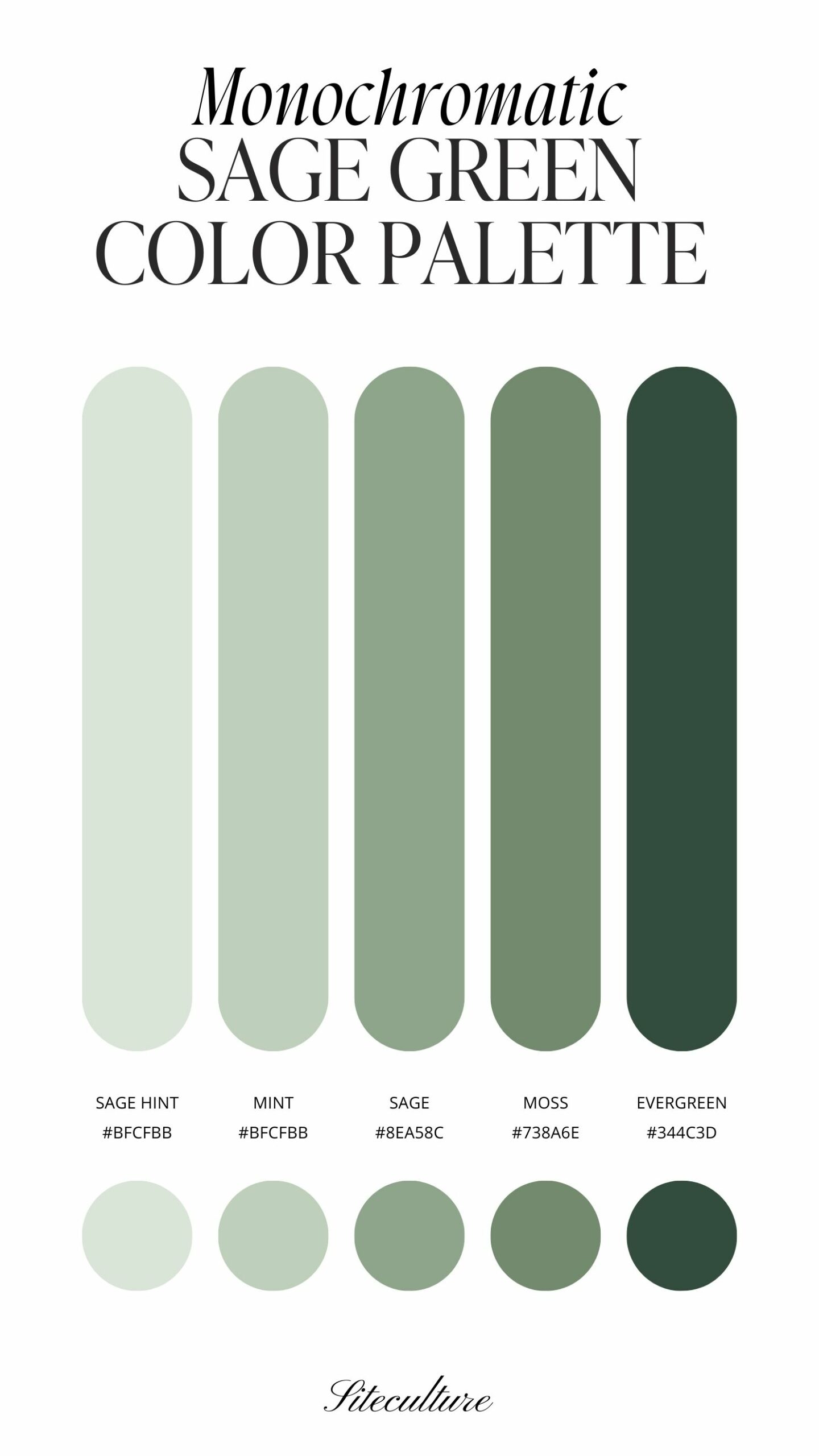
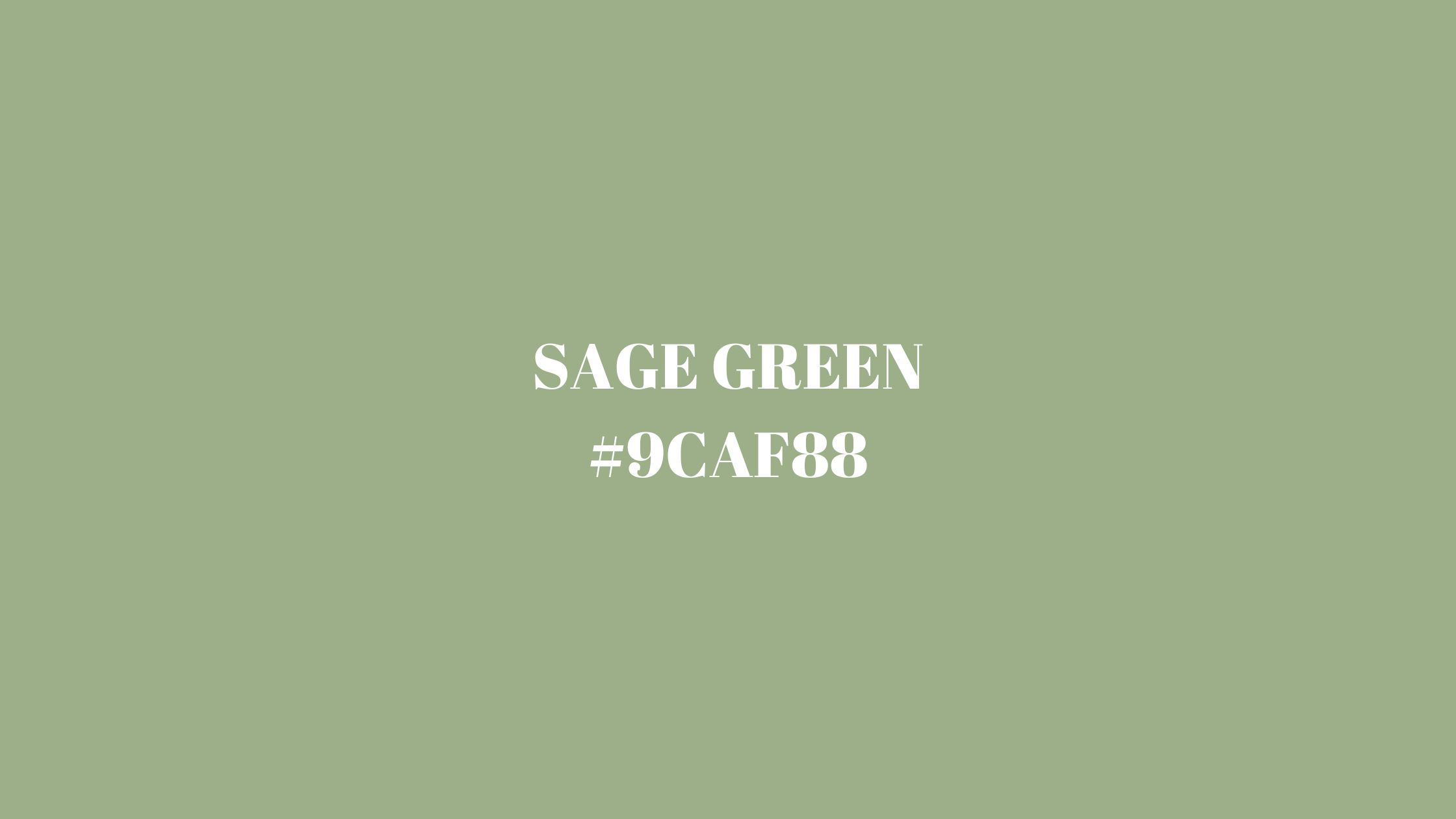
In digital design, sage green isn’t a single point on the spectrum but a family of tones. Common iterations include Hex #B2AC88 (a traditional earthy sage) or #8A9A5B (a slightly more vibrant, mossy sage). For brand designers, the “look” of sage green is defined by its low chroma. Because it is desaturated, it functions almost as a neutral, much like beige or slate gray, but with the added emotional benefit of the green spectrum.
The Psychological Anchor: Wisdom and Wellness
The word “sage” itself denotes wisdom and experience. In brand psychology, using this color signals that a company is an authority—not through force, but through expertise and calm. It evokes feelings of peace, healing, and equilibrium. This makes it an ideal choice for brands in the wellness, skincare, and consultancy sectors where the goal is to lower the consumer’s heart rate and build a foundation of long-term trust.
Sage Green as a Catalyst for Brand Trust and Sustainability
In the current market, “sustainability” is often a primary brand pillar. However, the overconsumption of bright “leaf green” has led to a phenomenon known as “greenwashing fatigue.” Modern consumers are skeptical of overly vibrant greens. Sage green provides a sophisticated alternative that feels more authentic and “of the earth.”
Communicating Eco-Consciousness Without Clichés
What does sage green look like when applied to sustainable packaging? It looks like maturity. When a brand utilizes sage green in its corporate identity, it moves away from the “loud” environmentalism of the 1990s and toward a subtle, integrated lifestyle choice. It suggests that sustainability is not a gimmick but a core, quiet component of the product’s DNA. This subtlety is highly effective for premium brands that want to attract an affluent, environmentally-conscious demographic.
Establishing Emotional Resonance with the Modern Consumer
Post-pandemic consumer behavior has shifted heavily toward “sanctuary branding.” People are looking for products and services that offer a sense of home and safety. Sage green excels here because it is a “biophilic” color—it reminds the brain of the outdoors. By incorporating sage into a brand’s visual identity, marketers can tap into the restorative power of nature, making the brand feel like a safe harbor in a chaotic economy.
Strategic Implementation: Case Studies and Sector Trends
Different industries utilize sage green to achieve specific strategic goals. While it is versatile, its effectiveness depends on how it is paired with typography and secondary colors to tell a specific brand story.
Wellness and Lifestyle: The “Clean” Aesthetic
In the beauty and wellness industry, sage green has become the hallmark of the “Clean Girl” and “Quiet Luxury” aesthetics. Brands like Chobani or various high-end apothecary labels use sage to signify that their ingredients are plant-based and gentle. In this sector, sage green looks like purity. It suggests that the product is free from harsh chemicals and is instead derived from the wisdom of nature.
The Evolution of Tech and Fintech Minimalism
Perhaps most surprisingly, sage green is making inroads into the tech and fintech sectors. Traditionally dominated by “Trust Blue,” new fintech startups are adopting sage green to differentiate themselves as “ethical” or “calm” financial partners. Here, the color seeks to reduce the anxiety often associated with money management. It transforms a cold digital interface into a soft, approachable tool, signaling that the company is there to help the user grow their wealth organically rather than aggressively.
Designing the Palette: Complementary Colors and Brand Architecture
A brand is rarely defined by a single color. The success of sage green depends on the “supporting cast” of colors within the corporate identity.
Earthy Neutrals and “Soft Minimalism”
When paired with cream, taupe, or warm wood tones, sage green creates a “soft minimalist” look. This is highly effective for interior design brands, high-end furniture retailers, and boutique hotels. This combination suggests a lifestyle of leisure and high-quality craftsmanship. It avoids the clinical coldness of pure white and black, opting instead for a “lived-in” luxury.
Bold Contrasts: Copper, Gold, and Charcoal
For brands that want to appear more “corporate” or “authoritative,” sage green is often paired with charcoal gray or metallic accents like brushed copper and champagne gold. This elevates the color from “earthy” to “executive.” A sage green logo embossed in gold on a charcoal business card communicates a brand that is both grounded and immensely successful. It is a favorite combination for sustainable investment firms and high-end real estate agencies.
The Future of Sage Green in Digital and Physical Brand Identities
As we look toward the future of design, the “look” of sage green is evolving alongside technology. With the rise of high-definition OLED screens and sophisticated printing techniques, the nuances of muted tones are easier to replicate than ever before.
Adaptability Across Mediums
One of the strategic strengths of sage green is its legibility. Unlike yellow (which can be hard to see on white backgrounds) or dark navy (which can lose detail), sage green maintains its integrity across both digital UI and physical packaging. It provides enough contrast for accessibility standards while remaining easy on the eyes during long periods of screen time. This makes it an excellent choice for app-based brands that prioritize user experience (UX).

Moving Beyond the Trend
Is sage green a passing fad? While it is currently at the height of its popularity, its roots in nature give it a timeless quality that “Trend Colors of the Year” often lack. In brand strategy, longevity is key. A brand that builds its identity around sage green is making a bet on the enduring human connection to the natural world. As long as consumers value wellness, sustainability, and calm, sage green will remain a powerful tool in the brand strategist’s toolkit.
In conclusion, when we define what sage green looks like, we are defining the visual language of the modern, conscious brand. It is a color of balance—halfway between the gray of the city and the green of the forest. For a brand, it represents a commitment to growth that is thoughtful, an authority that is quiet, and a presence that is perpetually refreshing. Whether you are a startup looking to disrupt a loud market or an established corporation seeking to soften your image, sage green offers a sophisticated path toward a more resonant and trusted brand identity.
aViewFromTheCave is a participant in the Amazon Services LLC Associates Program, an affiliate advertising program designed to provide a means for sites to earn advertising fees by advertising and linking to Amazon.com. Amazon, the Amazon logo, AmazonSupply, and the AmazonSupply logo are trademarks of Amazon.com, Inc. or its affiliates. As an Amazon Associate we earn affiliate commissions from qualifying purchases.