
In the landscape of global commerce, few symbols carry as much legal weight and consumer trust as the “Rx Only” designation. While often viewed simply as a legal requirement, the “Rx Only” label is a cornerstone of brand strategy within the life sciences sector. It serves as a definitive marker of a product’s identity, its safety profile, and its position within the marketplace. For brand managers and corporate strategists, understanding what “Rx Only” means involves more than just reading a label; it requires an analysis of how regulatory compliance intersects with corporate identity, visual design, and market positioning.
The transition from the long-form cautionary statements of the mid-20th century to the streamlined “Rx Only” symbol represents one of the most successful examples of regulatory branding simplification in history. It is a testament to how a brand can communicate complex legal and safety information through a singular, recognizable mark.
The Evolution of a Universal Brand Identifier
The history of the “Rx Only” mark is rooted in the need for clarity in a crowded marketplace. Before the late 1990s, pharmaceutical manufacturers were required to include a lengthy, cumbersome statement on their products: “Caution: Federal law prohibits dispensing without prescription.” From a brand design perspective, this statement was a nightmare, consuming valuable “real estate” on small packaging and diluting the visual impact of the product’s name and corporate logo.
The Food and Drug Administration Modernization Act (FDAMA)
The shift occurred with the passage of the Food and Drug Administration Modernization Act (FDAMA) of 1997. This legislation allowed manufacturers to replace the long-form caution statement with a simple, punchy alternative: “Rx Only.” This change was not merely a linguistic shortcut; it was a strategic shift toward visual efficiency. By standardizing this designation, the FDA provided a tool that allowed brands to maintain a cleaner aesthetic while fulfilling their legal obligations.
Establishing the “Rx” Symbol as an Industry Standard
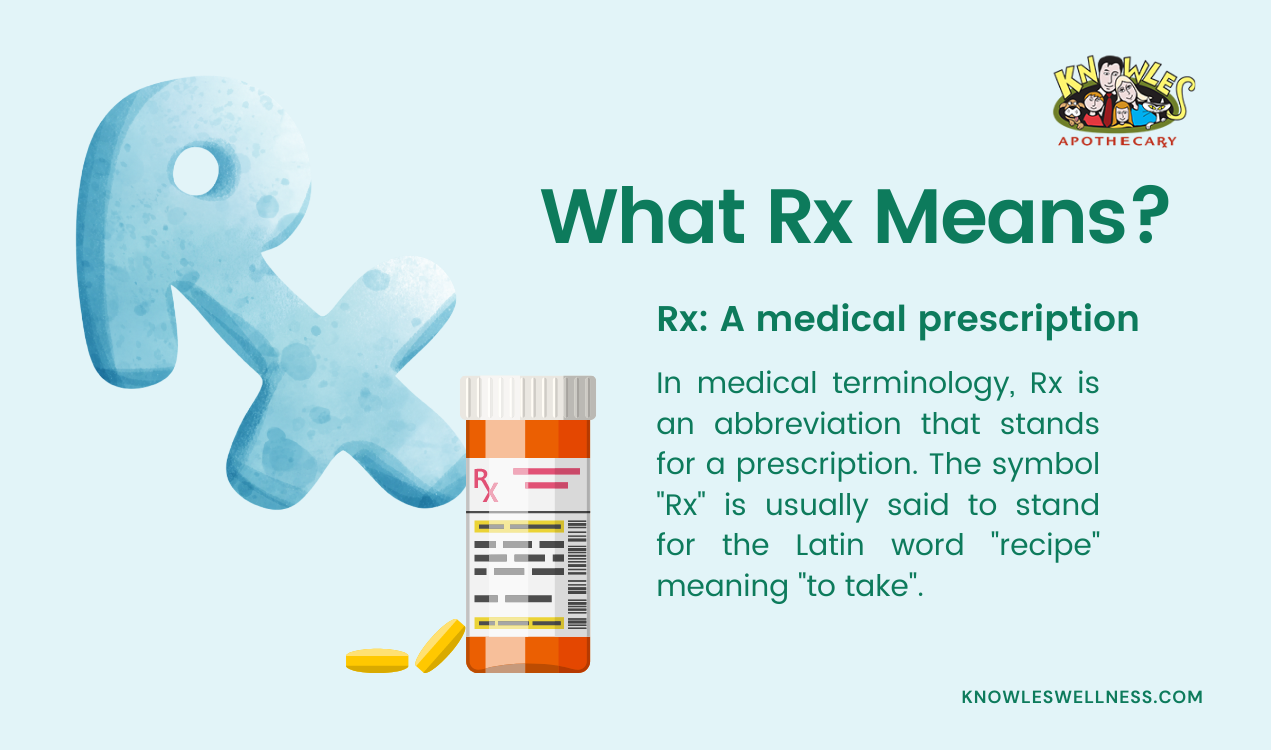
The “Rx” symbol itself has ancient roots, derived from the Latin word recipe, meaning “take.” In a branding context, it has evolved into a global shorthand for professional medical oversight. When a company places the “Rx Only” mark on its product, it is instantly categorized within a specific tier of the market. This tier is defined by high barriers to entry, rigorous scientific validation, and a level of authority that Over-the-Counter (OTC) products do not possess.
Compliance as a Branding Strategy
In highly regulated industries, compliance is often seen as a constraint. However, for leading pharmaceutical brands, “Rx Only” is a badge of authority. It differentiates a product from the sea of supplements and wellness products that do not undergo the same level of clinical scrutiny.
The Psychology of Professional Authority
From a consumer and practitioner perspective, the “Rx Only” designation influences brand perception. It suggests that the product is potent, scientifically backed, and requires the intervention of a healthcare professional. This creates a “halo effect” around the corporate brand, positioning the manufacturer as a serious scientific entity. For companies like Pfizer, Novartis, or Roche, the “Rx Only” designation is an integral part of their corporate identity, reinforcing their status as innovators in the field of human health.
Protecting Brand Equity through Regulation
The “Rx Only” status also serves as a protective barrier for brand equity. Products in this category are shielded from the direct price wars common in the OTC market. Because the brand is tied to a prescription, the relationship between the brand and the consumer is mediated by a physician. This creates a unique brand loyalty—not necessarily driven by emotional marketing, but by clinical efficacy and professional endorsement. Maintaining the “Rx Only” status is a strategic choice to preserve the high-value perception of a product.
The Visual Identity of Restriction: Design Constraints
Designing for a pharmaceutical brand requires a delicate balance between marketing objectives and stringent regulatory requirements. The “Rx Only” mark must be prominent enough to be legible but integrated enough not to distract from the product’s core identity.
Visual Hierarchy and Label Real Estate
In pharmaceutical packaging design, “real estate” is the most precious commodity. Every millimeter of a label is scrutinized. Designers must fit the brand name, generic name, dosage strength, manufacturer logo, and the “Rx Only” statement into a very small space. The “Rx Only” mark acts as a foundational element in this visual hierarchy. It is typically placed near the brand name to ensure that the pharmacist and the patient immediately understand the product’s classification.
Color Theory and Symbol Placement
While the FDA does not mandate a specific color for the “Rx Only” statement, brand managers often use color theory to ensure it stands out. Using high-contrast colors (such as black text on a white background or vice versa) ensures that the designation is unmistakable. The placement of the mark is also a strategic decision. Often, it is aligned with the corporate logo to create a visual link between the company’s reputation and the regulated nature of the product.
The Brand Lifecycle: The Rx-to-OTC Switch
One of the most significant strategic moves a pharmaceutical company can make is the “Rx-to-OTC switch.” This is the process of transitioning a drug from “Rx Only” status to a non-prescription, over-the-counter status. This move represents a massive shift in brand strategy, moving the product from a professional-mediated market to a direct-to-consumer (DTC) retail environment.
Rebranding for the Mass Market
When a product loses its “Rx Only” designation, it loses its “exclusive” professional status but gains access to a much wider audience. The branding must change accordingly. The “Rx Only” mark is removed, and the packaging is redesigned to appeal to consumers browsing a retail aisle. The focus shifts from clinical data and professional authority to consumer benefits, ease of use, and competitive pricing.
Leveraging the “Rx” Heritage
Even after a product makes the switch to OTC, many brands continue to use their “Rx” heritage as a marketing tool. Phrases like “Formerly available only by prescription” or “Original Prescription Strength” are used to carry over the trust and authority associated with the “Rx Only” mark into the retail space. This is a classic brand extension strategy, utilizing the previous regulatory status to build a competitive advantage in a new market segment.
Digital Branding and the “Rx Only” Badge
In the age of digital health and e-pharmacies, the “Rx Only” designation has moved from physical labels to digital interfaces. This transition has introduced new challenges for UX (User Experience) and UI (User Interface) designers working within the healthcare space.
The Role of “Rx Only” in E-Commerce
On digital platforms, the “Rx Only” badge serves as a critical navigation tool. It alerts the user that the product cannot be added to a cart and purchased as easily as a bottle of vitamins. From a UI perspective, the “Rx Only” designation must be presented early in the customer journey to prevent friction and ensure compliance. This is a form of “friction as a feature,” where the brand intentionally uses a regulatory requirement to guide the user through the correct legal channels.
Trust Indicators in Telehealth
The rise of telehealth brands—such as Hims, Ro, and Nurx—has redefined how “Rx Only” products are marketed. These companies have built their entire brand identities around the idea of simplifying the process of obtaining “Rx Only” medications. For these brands, the “Rx Only” label is not a hurdle; it is the core of their value proposition. They use modern, minimalist design to frame the “Rx Only” status as a sign of modern, science-based wellness, rather than an old-fashioned clinical restriction.

Conclusion: The Power of a Regulated Mark
Ultimately, “Rx Only” is far more than a legal disclaimer. It is a symbol that defines the boundary between consumer goods and professional medical intervention. In the world of brand strategy, it represents a unique intersection of law, science, and design.
For the corporation, it is a marker of high-value innovation and clinical authority. For the designer, it is a constant in the visual hierarchy of the product. For the consumer, it is a signal of safety and professional oversight. By understanding the multi-faceted meaning of “Rx Only,” brands can better navigate the complex landscape of the pharmaceutical industry, ensuring that their products are not only compliant but also positioned for maximum authority and trust in a global market.
aViewFromTheCave is a participant in the Amazon Services LLC Associates Program, an affiliate advertising program designed to provide a means for sites to earn advertising fees by advertising and linking to Amazon.com. Amazon, the Amazon logo, AmazonSupply, and the AmazonSupply logo are trademarks of Amazon.com, Inc. or its affiliates. As an Amazon Associate we earn affiliate commissions from qualifying purchases.