
The transition from The Andy Griffith Show to its successor, Mayberry R.F.D., represents one of the most successful examples of brand extension in television history. For the casual viewer, the initials “R.F.D.” might seem like a mere stylistic choice or a cryptic nod to the show’s setting. However, in the context of brand identity and historical marketing, these three letters carry significant weight. Standing for “Rural Free Delivery,” the acronym was a deliberate choice designed to evoke a specific set of values, a sense of community, and a direct connection to a government service that once revolutionized the American landscape. Understanding what R.F.D. stands for is the first step in analyzing how the “Mayberry” brand maintained its dominance in the late 1960s and early 1970s.
The Meaning Behind the Initials: Rural Free Delivery as a Service Brand
At its most literal level, R.F.D. stands for Rural Free Delivery. Before this service was established by the United States Post Office Department in the late 19th century, residents in rural areas had to travel to distant post offices to collect their mail. The introduction of R.F.D. brought the mail directly to the farm gate, effectively bridging the gap between isolated rural outposts and the burgeoning information age of the early 20th century.
The Historical Context of R.F.D.
The implementation of Rural Free Delivery was more than a logistical upgrade; it was a branding triumph for the federal government. It signaled that every citizen, regardless of their proximity to an urban center, was a valued part of the national infrastructure. By the time Mayberry R.F.D. premiered in 1968, the term “R.F.D.” had become synonymous with a specific kind of American life—one that was grounded, decentralized, and intrinsically linked to the soil. For the producers of the show, incorporating this acronym into the title was a strategic move to signal the show’s “down-home” credentials to an audience that was increasingly feeling the pressures of rapid urbanization and social upheaval.
How the Post Office Defined the American Rural Experience
From a brand strategy perspective, the U.S. Post Office’s R.F.D. service created a “touchpoint” for millions of Americans. It transformed the mailbox into a symbol of connectivity. When the “Mayberry” franchise decided to lean into this imagery, they were tapping into a pre-existing brand equity. The letters R.F.D. served as a shorthand for reliability and tradition. In a period where television was moving toward more experimental and often chaotic content, the “R.F.D.” brand promise offered the viewer a return to a predictable, comforting, and service-oriented world.
Brand Extension: From The Andy Griffith Show to Mayberry R.F.D.
When Andy Griffith decided to leave his namesake show at the height of its popularity, the network faced a critical branding crisis. How do you maintain the loyalty of an audience when the central figure of the brand departs? The solution was a masterclass in brand repositioning. By shifting the focus to the town itself and the broader concept of rural life, the creators ensured that the “Mayberry” brand could survive its founder’s exit.
Maintaining Continuity in a Rebranded Universe
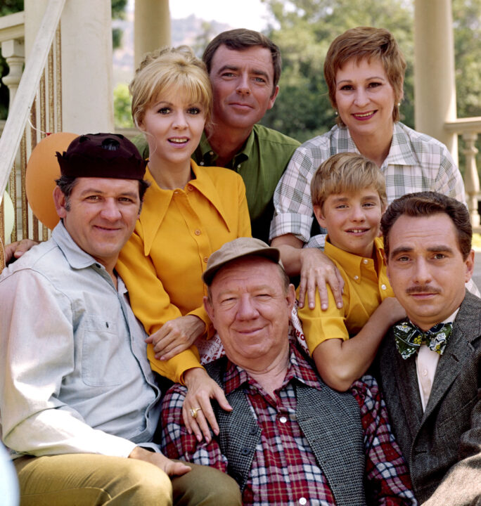
The transition from The Andy Griffith Show to Mayberry R.F.D. involved keeping several key “brand assets.” Characters like Aunt Bee and Goober Pyle remained, providing a visual and emotional bridge for the audience. However, the introduction of Ken Berry as Sam Jones required a new framing device. The title Mayberry R.F.D. acted as that device. It signaled that while the protagonist had changed, the “product experience”—the warmth, the humor, and the rural setting—remained identical. This is a classic example of maintaining brand DNA while updating the packaging to suit a new era.
The Significance of the Title Change
The choice to append “R.F.D.” to the title was a stroke of marketing genius. It differentiated the new series from the old while simultaneously doubling down on the rural identity. In marketing terms, this is known as “sub-branding.” If The Andy Griffith Show was the flagship product, Mayberry R.F.D. was the line extension that specialized in a slightly more modern, yet equally pastoral, niche. It allowed the network to capture the same demographic while signaling that the show was entering a new phase of its lifecycle.
The Rural Archetype: Brand Positioning in Mid-Century Television
The 1960s were a turbulent time for American brands. As the country grappled with civil rights, the Vietnam War, and a widening generation gap, television networks had to decide which “brand of America” they wanted to project. CBS, in particular, leaned heavily into the “rural archetype.” Programs like The Beverly Hillbillies, Green Acres, and Petticoat Junction formed a powerhouse portfolio of rural-themed content.
The “Mayberry” Brand as an Idealized Commodity
Mayberry was never intended to be a realistic depiction of North Carolina life; it was a carefully curated brand environment. It represented an idealized version of the American past—a place where problems were solved within thirty minutes and the social hierarchy was stable and benevolent. By naming the spin-off Mayberry R.F.D., the creators were reinforcing this commodity. They were selling “Rural Free Delivery” of nostalgia. In an era of profound change, the Mayberry brand was a “safe” harbor for advertisers who wanted to associate their products with wholesome, traditional American values.
Nostalgia as a Marketing Tool
Nostalgia is one of the most powerful tools in any brand manager’s arsenal. It bypasses rational critique and speaks directly to the emotional needs of the consumer. Mayberry R.F.D. utilized the R.F.D. acronym to evoke a time when life was simpler. This wasn’t just a television show; it was a lifestyle brand. The show’s aesthetic—the overalls, the front porches, the dirt roads—served as visual cues that reinforced the brand’s position as the antithesis of the “Space Age” or the “Jet Age.” It was the “Slow Age,” and “R.F.D.” was its primary identifier.
The Business of Spin-offs: Lessons in Franchise Management
The success of Mayberry R.F.D. provides valuable insights into how modern franchises manage transitions. In the world of corporate branding, a merger or a change in leadership can often lead to a loss of market share. The “Mayberry” franchise avoided this by focusing on the “environment” as the brand rather than a single individual.
Transitioning the Lead: Brand Loyalty and Audience Retention
In many ways, Sam Jones was a placeholder for Andy Taylor. From a brand management perspective, the character was designed to be low-friction. He was a widower, a father, and a farmer—roles that fit perfectly within the established Mayberry ecosystem. By titling the show Mayberry R.F.D., the network placed the emphasis on the location and the lifestyle (the R.F.D. aspect) rather than the star. This allowed for a smoother transition of audience loyalty. The viewers weren’t just fans of Andy Griffith; they were “brand loyalists” to the town of Mayberry itself.
The Long-Term Equity of the Mayberry Name
The enduring power of the Mayberry brand is evident in how the name is used today. It has become a genericized trademark for any small town that feels stuck in a simpler time. When a brand reaches this level of cultural penetration, its value is immeasurable. The “R.F.D.” suffix played a crucial role in cementing this legacy. It grounded the fictional town in a real-world service, making the “brand world” of Mayberry feel more authentic and reachable. Even though the service of Rural Free Delivery has evolved significantly since the 1960s, the initials remain a potent symbol of the franchise’s commitment to its rural roots.
The “Rural Purge” and the End of an Era
Despite its high ratings, Mayberry R.F.D. was eventually canceled in 1971 as part of what became known as the “Rural Purge.” This was a strategic pivot by CBS to modernize its brand image. The network realized that while rural shows were popular, they weren’t attracting the young, urban, affluent demographic that advertisers were increasingly targeting.
Rebranding a Network Identity
The Rural Purge is a fascinating case study in brand evolution. CBS decided that its “brand portfolio” was too heavily weighted toward the past. To remain competitive, they needed to “refresh” their lineup with shows like All in the Family and The Mary Tyler Moore Show. Mayberry R.F.D. became a casualty of this rebranding. The very thing that made the R.F.D. brand successful—its association with tradition and the rural past—became the reason for its discontinuation. The market had shifted, and the brand identity that once signaled reliability now signaled obsolescence in the eyes of network executives.

The Lasting Impact of Rural Identity on Modern Branding
Today, we see the echoes of the “Mayberry R.F.D.” strategy in modern branding. From “farm-to-table” movements to the “rustic” aesthetic in interior design, the values associated with Rural Free Delivery—authenticity, simplicity, and direct connection—are more valuable than ever. Brands that can successfully tap into the “R.F.D.” spirit of Mayberry continue to find success by offering a sense of community and stability in an increasingly digital and disconnected world. The initials may stand for a defunct postal designation, but the brand strategy behind them remains a masterclass in how to build and maintain a legacy.
aViewFromTheCave is a participant in the Amazon Services LLC Associates Program, an affiliate advertising program designed to provide a means for sites to earn advertising fees by advertising and linking to Amazon.com. Amazon, the Amazon logo, AmazonSupply, and the AmazonSupply logo are trademarks of Amazon.com, Inc. or its affiliates. As an Amazon Associate we earn affiliate commissions from qualifying purchases.