
In the intricate world of brand strategy and corporate identity, colors are far more than mere aesthetic choices; they are a fundamental language, communicating values, evoking emotions, and forging indelible connections with audiences. Among the vast spectrum, the combination of red, white, and blue stands out as exceptionally potent, rich with historical significance, and universally recognizable. Its pervasive presence across national flags, corporate logos, and marketing campaigns is no accident, but a testament to its profound psychological and cultural impact on brand perception. Understanding what these colors represent, both individually and in concert, offers invaluable insights for crafting powerful and resonant brand narratives.

The Universal Language of Color in Brand Strategy
Color psychology is a cornerstone of effective branding, influencing everything from consumer purchasing decisions to perceived brand attributes. Each hue carries inherent meanings and triggers specific emotional responses, which shrewd brand strategists harness to shape public perception. However, the interpretation of colors is not entirely monolithic; it is deeply intertwined with cultural context, historical associations, and industry norms. A color that signifies mourning in one culture might represent celebration in another, making a nuanced approach essential for global branding efforts.
The Psychological Impact of Color
At a basic psychological level, colors elicit predictable responses. Warm colors like red often grab attention and stimulate energy, while cool colors like blue tend to soothe and inspire trust. White, often perceived as neutral, offers a sense of clarity and cleanliness. These primal associations form the bedrock upon which more complex brand identities are built. For brands, selecting the right color palette is akin to choosing the right tone of voice – it defines personality, establishes credibility, and sets expectations.
Cultural Context and Brand Perception
While some psychological responses to color are universal, their symbolic meanings are frequently culturally conditioned. This is particularly true for combinations like red, white, and blue, which have been imbued with specific nationalistic and historical significance in many parts of the world. A brand leveraging these colors must be acutely aware of the existing cultural narratives to ensure their message is received as intended, whether they seek to align with patriotism, evoke a sense of heritage, or project a specific set of values.
Decoding Red: Power, Passion, and Prominence in Branding
Red is perhaps the most attention-grabbing color in the palette, a hue that demands immediate recognition. Its physiological impact—increasing heart rate and stimulating appetite—makes it a powerful tool for brands seeking to evoke urgency, excitement, or strong emotion.
Red in National Branding
Historically and globally, red has been a dominant feature in national flags, signifying courage, sacrifice, revolution, and the lifeblood of a nation. Countries like China, Switzerland, and many across the African continent prominently feature red to project strength, resilience, and a fiery spirit. In this context, red functions as a brand beacon, symbolizing the collective identity forged through shared struggle and vibrant national character. It rallies citizens and communicates national resolve to the international community.
Red in Corporate Branding
For corporate brands, red is leveraged to achieve a similar, though commercial, effect. It’s the color of power brands that want to be seen as dynamic, energetic, and leaders in their field. Think of Coca-Cola, whose iconic red packaging exudes passion and vitality, or Netflix, which uses red to signal excitement and entertainment. Red is often chosen for brands in the food industry (stimulating appetite), entertainment (passion, excitement), and retail (urgency, sales). It’s an aggressive color, perfect for brands that want to stand out from the competition and make a bold statement. The strategic use of red can create a sense of urgency, driving calls to action and fostering a memorable, high-impact brand presence.
Brand Strategy Implications for Red
Brands looking to convey energy, dynamism, courage, or a competitive edge often gravitate towards red. However, its intensity requires careful application to avoid appearing overly aggressive or alarming. Used effectively, red can create a strong emotional connection, communicate a sense of urgency, and establish a brand as a dominant force in its market.
Unpacking White: Purity, Simplicity, and Professionalism in Branding
White occupies a unique space in the color spectrum, often perceived as the absence of color, yet it conveys a powerful set of associations. It represents new beginnings, clarity, and an uncluttered aesthetic.
White in National Branding
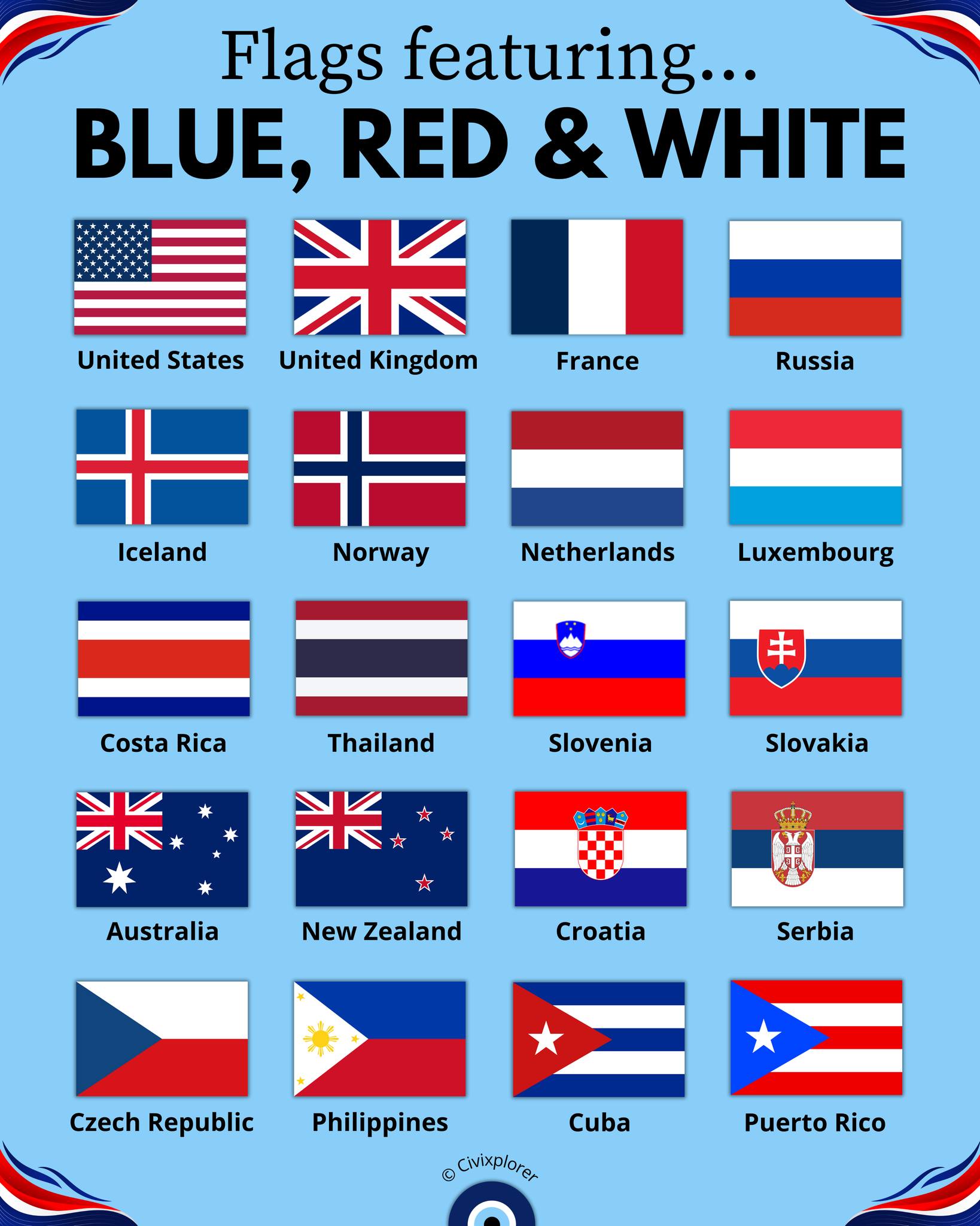
In national branding, white frequently symbolizes peace, honesty, and purity. It can represent a nation’s aspiration for justice or a fresh start. Examples include the white stripe in the French flag (representing the King and, after the revolution, the people’s freedom), or the prominent use of white in flags like Finland and Greece, often evoking snow-covered landscapes or the purity of national ideals. As a national brand element, white provides a canvas, suggesting transparency and an unwavering moral compass.
White in Corporate Branding
In the corporate world, white is a go-to for brands aiming to project minimalism, modernity, and sophistication. Tech giants like Apple lean heavily on white space in their branding to communicate simplicity, elegance, and user-friendliness. Healthcare and pharmaceutical brands often utilize white to signify cleanliness, sterile environments, and trustworthiness. Luxury brands frequently employ white to enhance a sense of exclusivity and premium quality, allowing products to speak for themselves against a crisp, clean backdrop. White’s ability to create a sense of space and breathability makes it ideal for brands seeking to appear approachable, transparent, and refined. It allows other colors to pop and directs focus, making it an invaluable tool for visual hierarchy in brand design.
Brand Strategy Implications for White
Brands that prioritize clarity, honesty, cleanliness, or a high-end, minimalist aesthetic will find white an indispensable component of their brand identity. It serves as an excellent foundational color, allowing other brand elements to shine and preventing visual clutter, thereby enhancing the overall perception of professionalism and quality.
Exploring Blue: Trust, Stability, and Serenity in Branding
Blue is consistently one of the most favored colors across cultures, likely due to its association with the sky and ocean – elements that evoke feelings of vastness, calm, and stability. In branding, blue is a heavyweight, especially when building trust and projecting authority.
Blue in National Branding
Many nations incorporate blue into their flags to symbolize vigilance, justice, truth, and freedom. The blue in the United States flag, for instance, represents vigilance, perseverance, and justice. Similarly, the blue in the United Kingdom’s Union Jack and France’s Tricolour evokes a deep sense of tradition, reliability, and the open sea, reflecting historical ties to maritime power and global influence. As a national brand identifier, blue serves to inspire confidence in governmental institutions and express a nation’s unwavering commitment to its core principles.
Blue in Corporate Branding
Corporate brands frequently choose blue to communicate reliability, professionalism, and trustworthiness. This is why it’s a dominant color in the financial sector (e.g., Chase, Visa), technology (e.g., IBM, Facebook, LinkedIn), and healthcare industries. These sectors thrive on customer confidence, and blue inherently projects stability and security. Brands like Ford use blue to emphasize their heritage and dependability, while Facebook utilizes it to create a sense of calm and community. Blue is perceived as conservative and non-threatening, making it a safe yet powerful choice for brands that want to be seen as established, competent, and ethical. Its calming effect can also be used by brands to imply a relaxed and seamless customer experience.
Brand Strategy Implications for Blue
For brands aiming to build credibility, convey professionalism, or establish a sense of security and trust, blue is an unparalleled strategic choice. Its versatility allows it to be used across diverse industries, always reinforcing positive attributes like competence, loyalty, and calm.
The Synergistic Power of the Tri-Color Combination
While each color—red, white, and blue—carries significant individual weight, their combination unlocks a heightened level of symbolism and brand resonance. This triad is more than the sum of its parts; it creates a distinct and powerful brand identity.
National Identity and Unity
The iconic red, white, and blue color scheme is arguably most prominent in national branding. For countries like the United States, the United Kingdom, and France, these colors are intrinsically linked to their national identity, history, and values. The American flag, for example, combines red (hardiness and valor), white (purity and innocence), and blue (vigilance, perseverance, and justice) to form a powerful visual representation of its national brand. This combination evokes deep-seated patriotism, a shared sense of heritage, and collective aspirations. It acts as an immediate shorthand for national pride, unity, and the enduring ideals upon which these nations were founded. Brands that leverage national symbols often tap into these existing emotional connections.
Corporate Borrowing and Adaptation
Corporations frequently borrow from this potent combination, either directly or by incorporating one or two of the colors while hinting at the third, to align their brand with specific values. A brand might use red and blue with white as a background to subtly suggest patriotism, reliability, or a historical connection. For instance, many sports teams and organizations in countries like the USA adopt this palette to evoke national spirit and loyalty. Airlines often incorporate red, white, and blue into their liveries, not just for aesthetic appeal, but to subtly convey safety (blue), reliability (blue), and national pride (all three). Consumer goods brands might use this combination to suggest a product is “classic,” “trusted,” or “American-made” (or British, or French, etc.), leveraging the existing brand equity of national symbols. The strategy here is to tap into the powerful emotional and historical associations already established by these colors without necessarily being a direct imitation.

Brand Cohesion and Recognition
The tri-color combination creates an exceptionally cohesive and immediately recognizable brand presence. When red, white, and blue are strategically deployed, they work together to form a clear and memorable identity. The vibrancy of red, the clarity of white, and the stability of blue balance each other, creating a dynamic yet harmonious visual. This balance is crucial for effective branding, as it allows a brand to convey multiple facets of its personality simultaneously. The instant recognition factor means that a brand utilizing this palette can quickly communicate its core message and values, fostering a strong connection with its target audience and distinguishing itself in a crowded marketplace. It speaks to a legacy, a certain gravitas, and a universal understanding of strength, purity, and trust.
In conclusion, the colors red, white, and blue are not arbitrary selections but deeply embedded cultural and psychological signifiers. For brand strategists, understanding their individual and combined meanings is paramount. Whether crafting a national identity or building a corporate brand, these colors offer a powerful toolkit for communicating core values, evoking desired emotions, and forging indelible connections with audiences, ultimately shaping perception and driving brand success.
aViewFromTheCave is a participant in the Amazon Services LLC Associates Program, an affiliate advertising program designed to provide a means for sites to earn advertising fees by advertising and linking to Amazon.com. Amazon, the Amazon logo, AmazonSupply, and the AmazonSupply logo are trademarks of Amazon.com, Inc. or its affiliates. As an Amazon Associate we earn affiliate commissions from qualifying purchases.