
The strategic deployment of color is a cornerstone of effective brand identity, influencing perception, emotion, and consumer behavior. Among the myriad hues available, orange holds a distinct and powerful position, embodying a unique spectrum of psychological associations that can be leveraged to forge memorable and impactful brands. Far more than a mere visual element, orange can articulate a brand’s core values, differentiate it from competitors, and resonate deeply with its target audience when understood and applied strategically within corporate identity, marketing, and design.
The Psychology of Orange in Branding
Orange is a secondary color, born from the vibrant combination of red’s energy and yellow’s happiness. This origin grants it a dual nature, allowing it to convey both excitement and warmth. Its psychological impact is profound, making it a favorite for brands seeking to evoke specific emotional responses and associations without resorting to the intense aggression sometimes linked with pure red, or the passive cheerfulness of pure yellow.
Energy and Enthusiasm
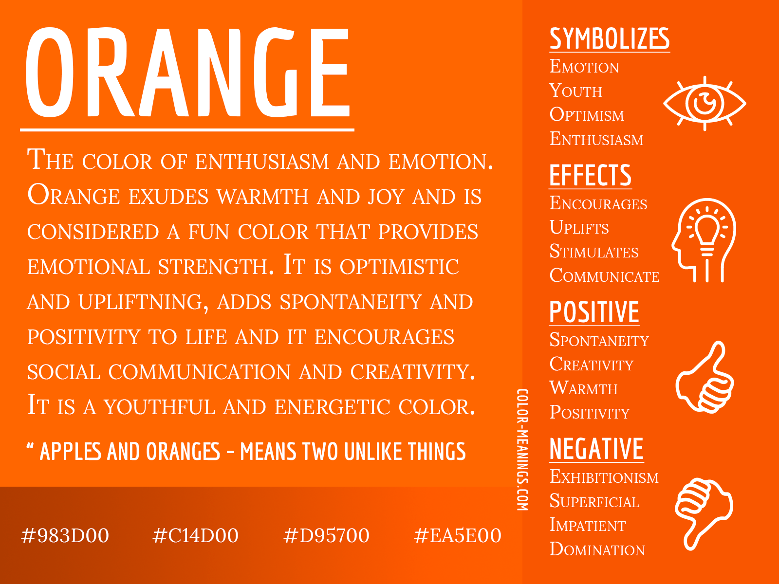
At its core, orange pulsates with an undeniable energy. It’s an invigorating color that stimulates activity, enthusiasm, and a sense of adventure. Brands looking to project dynamism, innovation, or a youthful spirit often gravitate towards orange to signal their vitality and forward-thinking approach. This vibrancy can communicate that a brand is lively, engaging, and not afraid to stand out, making it particularly effective in fast-paced industries or for products designed to energize consumers.
Warmth and Approachability
Beyond its energetic qualities, orange radiates warmth, friendliness, and approachability. Unlike the fiery intensity of red, orange offers a more inviting and less confrontational form of passion. It fosters a sense of comfort and encourages communication, making a brand feel personable and accessible. Companies aiming to build strong community ties, offer exceptional customer service, or simply create a welcoming brand personality often utilize orange to convey this inherent warmth and openness, inviting customers to engage without hesitation.
Creativity and Innovation
Orange is also strongly associated with creativity, imagination, and unconventional thinking. It breaks away from the ordinary, hinting at originality and a willingness to explore new ideas. Brands that position themselves as innovators, problem-solvers, or pioneers in their respective fields often find orange to be an ideal color to express their inventive spirit. This association makes orange particularly compelling for tech startups, design agencies, or educational platforms that prioritize imagination and fresh perspectives.
Affordability and Accessibility
Interestingly, orange can also subtly suggest affordability and value. While not as overtly indicative of “cheap” as some other colors might be, its approachable nature and association with mass-market appeal can imply a brand that offers good quality at reasonable prices. This makes it a strategic choice for retailers, discount stores, or brands that want to be perceived as accessible to a broad demographic, emphasizing practicality and everyday utility without sacrificing a positive brand image.
Strategic Application of Orange in Corporate Identity
Integrating orange into a corporate identity requires careful consideration of the brand’s overarching strategy, target audience, and competitive landscape. It’s not merely about liking the color but understanding its strategic fit within a cohesive visual language.
Target Audience Considerations
The effectiveness of orange varies significantly depending on the demographic. Younger audiences, for instance, often respond positively to orange’s playful and energetic qualities, making it suitable for children’s brands, entertainment companies, or youth-focused tech products. Conversely, certain shades of orange might be perceived differently by older or more conservative demographics, potentially requiring a more muted or sophisticated application. Brands must conduct thorough research to ensure orange resonates appropriately with their intended customers, aligning its inherent psychological traits with their audience’s preferences and cultural contexts.
Industry Relevance
The industry in which a brand operates heavily dictates the appropriateness and interpretation of orange. In the food and beverage sector, for example, orange can stimulate appetite and suggest natural, wholesome ingredients (think oranges themselves, or carrots). In the construction or safety industries, bright orange is universally recognized for visibility and caution. For financial services or luxury brands, however, a dominant orange might be counterproductive, as it could undermine perceptions of stability, sophistication, or exclusivity. Understanding industry norms and consumer expectations is paramount to leveraging orange effectively without sending mixed signals.
Complementary Color Palettes
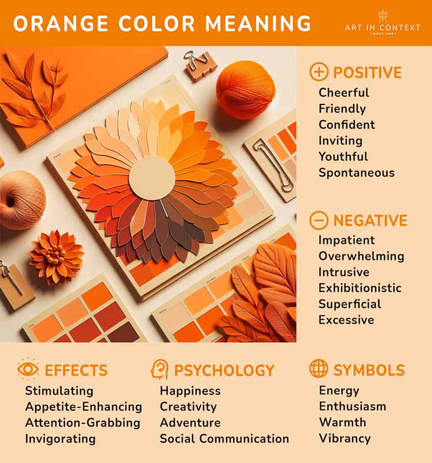
Orange rarely works in isolation. Its impact is amplified or tempered by the colors it is paired with. Combining orange with blues creates a dynamic contrast, highlighting orange’s vibrancy while blue provides a sense of calm and professionalism. Green can reinforce orange’s natural associations, suggesting freshness and growth. Muted grays or creams can lend orange a more sophisticated or understated elegance, preventing it from overwhelming the design. The thoughtful selection of a complementary color palette ensures orange enhances the overall brand message, creating harmony and balance within the corporate identity.
Orange in Marketing and Design
Beyond logos, orange plays a critical role in various marketing materials and design applications, influencing everything from advertising effectiveness to user experience. Its inherent visibility and energetic appeal make it a powerful tool for capturing attention and driving action.
Call-to-Action Impact
Bright, vivid orange is a standout color that draws the eye, making it an excellent choice for calls-to-action (CTAs) in digital marketing and advertising. Buttons that read “Buy Now,” “Sign Up,” or “Discover More” often leverage orange to create urgency and encourage immediate interaction. Its high visibility ensures that critical action points are not missed, enhancing conversion rates across websites, landing pages, and email campaigns. The warmth it emits also makes the action feel more inviting and less aggressive than, say, a stark red.
Packaging and Product Design
In product design and packaging, orange can differentiate an item on a crowded shelf. For food products, it can evoke flavors like citrus, peach, or apricot, suggesting freshness and taste. For consumer electronics, it might signal innovation, ease of use, and a user-friendly interface. Toys and children’s products often use orange to signify playfulness and fun. The tactile and visual experience of orange packaging can create a strong emotional connection with the product, shaping consumer expectations and enhancing perceived value.
Digital Presence and UX
In the digital realm, orange contributes significantly to user experience (UX). It can guide users’ eyes through a webpage, highlight important information, or indicate interactive elements. When used judiciously, orange creates a lively and engaging interface without being distracting. Overuse, however, can lead to visual fatigue. Brands like Mozilla Firefox famously use orange to convey innovation and speed, creating a distinct visual identity in a competitive browser market. Strategic placement of orange in navigation bars, notification icons, or progress indicators can enhance usability and make digital interactions more intuitive and enjoyable.
Case Studies: Brands Embracing Orange
Numerous global brands have successfully harnessed the power of orange to build powerful and enduring identities. Their stories illustrate the diverse applications and strategic advantages of this vibrant color.
Nickelodeon: Playfulness and Youth
Nickelodeon, the iconic children’s television channel, is perhaps one of the most famous proponents of orange. Their signature bright orange slime and logo immediately evoke fun, energy, and unadulterated playfulness. This strategic choice perfectly aligns with their target audience of children and adolescents, signaling a brand that is dynamic, entertaining, and unafraid to be a little messy. The color communicates excitement and creativity, cementing Nickelodeon’s identity as a leader in youth entertainment.
FedEx: Speed and Reliability
While most people associate FedEx primarily with purple, the orange component of their logo is equally critical, particularly in the hidden “arrow” between the “E” and “X.” This subtle yet powerful use of orange conveys speed, precision, and efficiency—key attributes for a logistics and shipping company. The orange element provides a burst of energy against the more stable and authoritative purple, perfectly encapsulating the brand’s promise of swift and dependable delivery.
The Home Depot: Value and Practicality
The Home Depot’s bold orange logo is unmistakable. This specific shade of orange, often referred to as “safety orange,” communicates practicality, hard work, and accessibility. It suggests a brand that is down-to-earth, reliable, and provides the tools and resources for home improvement projects. The color helps position The Home Depot as a trusted partner for DIY enthusiasts and professionals alike, emphasizing value and a no-nonsense approach to getting the job done.
Fanta: Fun and Refreshment
Fanta, the global soft drink brand, uses a vibrant orange to convey refreshment, fruitiness, and an upbeat, playful attitude. The color mirrors the natural hue of oranges, a key flavor in many of their products, while also radiating a youthful and adventurous spirit. Fanta’s orange branding is consistent across its global marketing, creating an easily recognizable and exciting visual identity that encourages enjoyment and thirst for life.

Navigating the Nuances: When to Use (and Avoid) Orange
While orange offers numerous branding advantages, its application requires discernment. Its intense visibility can be a double-edged sword; overuse can lead to visual fatigue or a perception of cheapness if not carefully managed. Brands operating in luxury, finance, or certain professional services might find orange too informal or youthful for their desired image, potentially undermining trust or exclusivity. Conversely, for brands aiming to be seen as innovative, energetic, friendly, or value-driven, orange is an invaluable asset. Understanding the specific connotations of different shades—from a soft peach to a fiery tangerine—and how they align with brand values is crucial. Ultimately, the successful integration of orange hinges on a thorough strategic analysis, ensuring that this dynamic color authentically reflects and amplifies the core essence of the brand.
aViewFromTheCave is a participant in the Amazon Services LLC Associates Program, an affiliate advertising program designed to provide a means for sites to earn advertising fees by advertising and linking to Amazon.com. Amazon, the Amazon logo, AmazonSupply, and the AmazonSupply logo are trademarks of Amazon.com, Inc. or its affiliates. As an Amazon Associate we earn affiliate commissions from qualifying purchases.