
In the landscape of global branding, a name is rarely just a collection of syllables. It is a vessel for history, a psychological anchor, and a strategic asset. When we ask, “What does Kaiser mean?” we are not merely looking for a translation; we are exploring how a term signifying absolute imperial power evolved into one of the most recognized brand identities in the modern corporate world. In the realms of brand strategy and corporate identity, the name “Kaiser” serves as a masterclass in how linguistic heritage can be harnessed to build trust, authority, and market dominance.
The Etymology of Authority: Why Names Matter in Branding
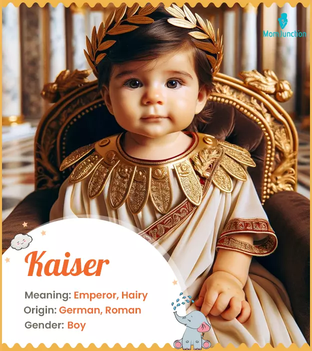
To understand the branding power of “Kaiser,” one must first look at its linguistic DNA. Derived from the Middle High German word for “emperor,” which in turn stems from the Latin “Caesar,” the name carries an inherent weight of leadership, sovereignty, and permanence. In brand strategy, choosing a name with such deep historical roots is a deliberate move to bypass the “newcomer” phase and immediately establish a sense of institutional gravity.
From Ancient Rome to Modern Marketing
The transition of “Caesar” to “Kaiser” represents a lineage of power that has survived millennia. When a brand adopts this name, it taps into a collective subconscious understanding of what an emperor represents: a figure who provides order, protection, and centralized direction. For a corporation, this translates to a brand promise of stability. In an era of “disruptive” startups with whimsical, vowel-heavy names, a brand like Kaiser stands as a monolith of reliability.
The Psychology of Power in Naming
Psychologically, consumers associate phonetically “hard” names containing “K” and “R” sounds with strength and durability. The word “Kaiser” is percussive and authoritative. From a brand identity perspective, this helps in creating a “top-of-mind” awareness. It does not ask for permission; it commands space. This is a critical component of brand positioning—using phonetics and etymology to create a perceived value proposition before the consumer even interacts with the product or service.
Kaiser Permanente: A Case Study in Corporate Identity
When most people today ask what “Kaiser” means, they are likely thinking of Kaiser Permanente. This organization represents perhaps the most successful application of the “Kaiser” name in a commercial context. The brand’s evolution from an industrial health program to a multi-billion dollar healthcare giant is a definitive case study in how corporate identity can be scaled and protected.
Building Trust through Institutional Longevity
The brand’s namesake, Henry J. Kaiser, was an American industrialist who didn’t just build companies; he built infrastructure—Hoover Dam, Liberty ships, and steel mills. The brand “Kaiser” became synonymous with the “can-do” spirit of mid-century American industry. By the time the healthcare arm became a public-facing entity, the “Kaiser” brand already meant “the people who get the big things done.” In brand strategy, this is known as “brand equity transfer”—leveraging the reputation of one sector to legitimize another.
The Transition from Industrial Origins to Healthcare Leader
One of the most difficult feats in branding is moving from “industrial” to “human-centric.” The term “Kaiser,” meaning emperor, could easily have felt cold or detached. However, the brand strategy shifted to emphasize the “Permanente” aspect (taken from a creek near Henry Kaiser’s home) to suggest endurance and a holistic approach. The corporate identity was carefully curated to ensure that while the name sounded powerful, the mission felt accessible. This balance is what allowed the brand to dominate the managed care market for decades.
Brand Strategy and the “Kaiser” Archetype

In the study of brand personalities, we often look to Jungian archetypes to categorize how companies present themselves. The “Kaiser” brand fits squarely into “The Ruler” archetype. This archetype is characterized by a desire for control, a focus on creating order from chaos, and a commitment to providing security for its “subjects” (or, in this case, members and customers).
The Ruler Archetype in Brand Personalities
Brands that adopt the Ruler archetype—like Rolex, Mercedes-Benz, or Kaiser—position themselves as the gold standard in their respective fields. They do not compete on price; they compete on the basis of being the most authoritative choice. For “Kaiser,” this means the brand identity is built around being a “system” rather than just a “service.” It implies a comprehensive, all-encompassing umbrella of care or production that a “lesser” brand could not provide.
Balancing Authority with Empathy
A significant risk for any brand using a name that means “Emperor” is the perception of being authoritarian or uncaring. Modern brand strategy for Kaiser-branded entities involves “softening” the brand through visual identity and messaging. This is why you see Kaiser Permanente, for example, using the tagline “Thrive.” It moves the conversation from the “Emperor” (the entity) to the “Citizen” (the member). This strategic pivot ensures the brand retains its authoritative stature while fostering an emotional connection with its audience.
Global Recognition and the Evolution of the Logo
A brand name is only as strong as the visual identity that supports it. The way “Kaiser” is presented visually has undergone significant refinement to ensure it meets the standards of modern design while respecting its heritage.
Visual Identity: Symbolism and Meaning
The evolution of the Kaiser logo—specifically the shift toward the “people in the sun” motif—is a masterful example of visual brand strategy. The name “Kaiser” provides the foundation of strength, while the logo provides the warmth. The blue color palette often associated with the brand is a strategic choice meant to evoke feelings of professional trust, cleanliness, and calm. In branding, blue is the “corporate” color, perfectly aligned with the authoritative meaning of the name.
Consistency as a Brand Moat
One of the reasons the name “Kaiser” remains so potent is the extreme consistency with which it is applied. Whether in industrial applications or healthcare, the typography is usually bold, sans-serif, and unadorned. This minimalism reflects a brand that is confident in its identity. It doesn’t need “fluff” because the name itself carries enough weight. This consistency acts as a “moat,” making it difficult for competitors to replicate the same sense of established history.
The Future of the Kaiser Brand in a Digital Age
As we move further into a digital-first economy, the meaning of “Kaiser” must continue to evolve. Digital branding requires a different kind of interaction—one that is faster, more agile, and more personalized.
Adapting Heritage to Modern Consumer Expectations
The challenge for a legacy brand with an “imperial” name is to avoid appearing “old” or “clunky” in a world of sleek tech brands. The brand strategy must now focus on “Digital Authority.” This means ensuring that the user experience (UX) of their digital platforms is as robust and reliable as their physical presence. When a user interacts with a Kaiser app, the brand must communicate: “This is the most secure and powerful tool available to you.”

The Endurance of a Name
In conclusion, “Kaiser” means much more than “Emperor.” In the context of brand strategy and corporate identity, it means a legacy of industrial power, a commitment to institutional stability, and a masterclass in archetypal positioning. By understanding the etymological roots and the psychological impact of the name, we can see how a word from the ancient world was successfully transformed into a pillar of modern corporate identity. As branding continues to shift toward emotional intelligence and digital integration, the “Kaiser” identity serves as a reminder that a strong, authoritative foundation is the most valuable asset a brand can possess. The name is not just a label; it is a promise of enduring leadership.
aViewFromTheCave is a participant in the Amazon Services LLC Associates Program, an affiliate advertising program designed to provide a means for sites to earn advertising fees by advertising and linking to Amazon.com. Amazon, the Amazon logo, AmazonSupply, and the AmazonSupply logo are trademarks of Amazon.com, Inc. or its affiliates. As an Amazon Associate we earn affiliate commissions from qualifying purchases.