
In the modern digital landscape, the Google app serves as the primary gateway to the internet for billions of users. Far more than a simple search engine contained within a mobile wrapper, the Google app has evolved into a sophisticated, multi-functional ecosystem. To understand what the Google app looks like today is to understand the cutting edge of mobile user interface (UI) and user experience (UX) design. It represents the pinnacle of Google’s “Material You” design philosophy, prioritizing personalization, accessibility, and fluid interaction.
The visual identity of the Google app is defined by its cleanliness and its ability to surface complex information without overwhelming the user. Whether on Android or iOS, the app maintains a consistent aesthetic characterized by rounded corners, soft shadows, and a vibrant yet professional color palette that shifts according to user preferences.
The Core Interface: Material You and the Home Screen
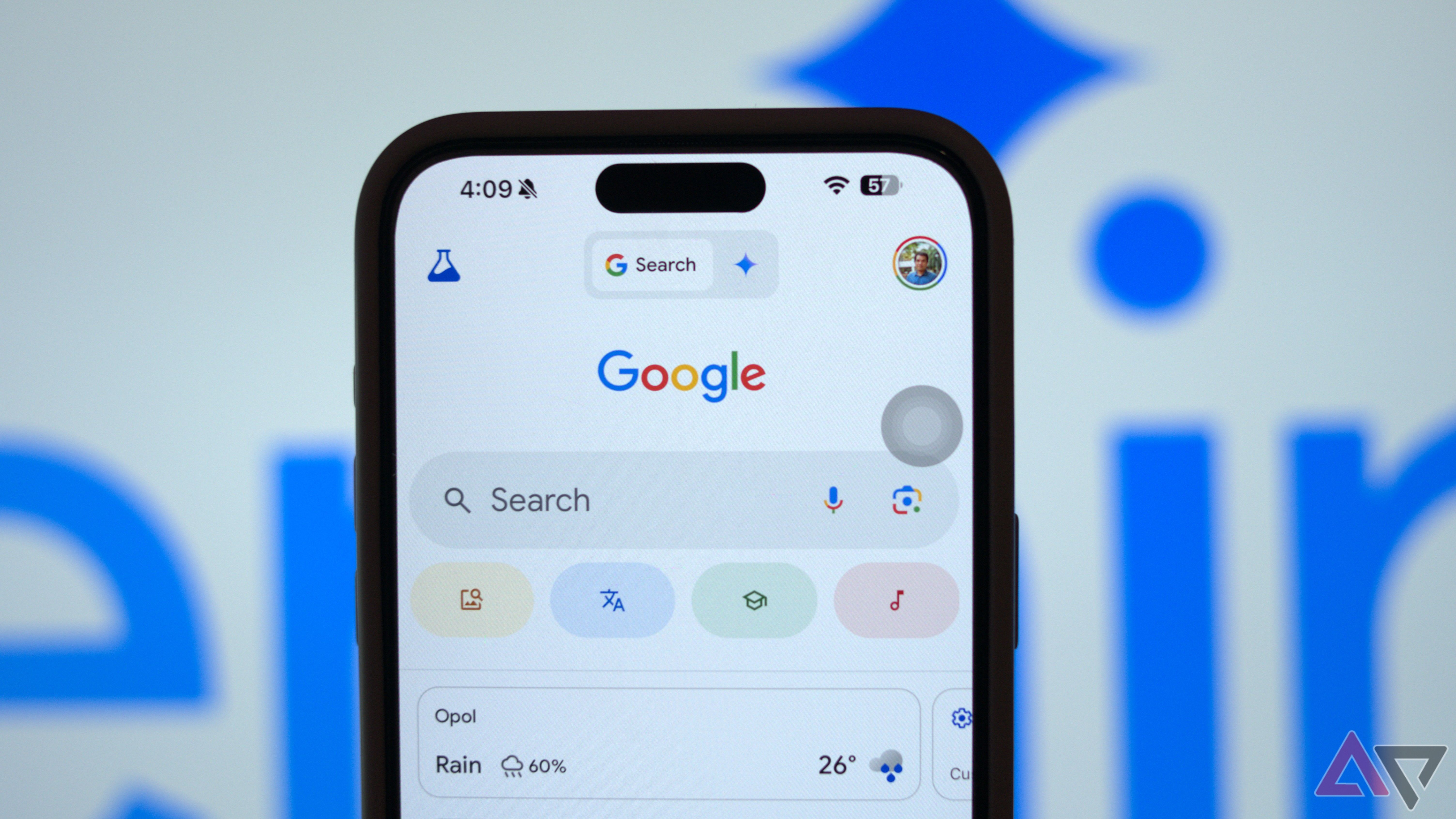
At first glance, the Google app is a testament to minimalism. The centerpiece of the interface is the iconic Google logo—the multi-colored “G”—positioned prominently. Below or around this logo is the “Search Bar,” often referred to as the “Omnibox” in other contexts, which is the heart of the application. In recent updates, this bar has taken on a pill-shaped silhouette, often featuring a subtle shadow to give it depth against the background.
The Search Bar and Input Modalities
The search bar is not just for typing. Visually, it is flanked by two distinct icons that represent the app’s multimodal capabilities. On the right side of the search bar, users find a colorful microphone icon and a Google Lens icon (which resembles a stylized camera). These elements are rendered in Google’s signature four-color scheme—blue, red, yellow, and green—providing a visual pop against the white or dark-themed background. The presence of these icons indicates that the app is no longer just a text-based tool; it is an auditory and visual processing engine.
The Discover Feed: A Visual Newsroom
Scrolling down from the search bar reveals the “Discover” feed. This is perhaps the most visually dynamic part of the app. It consists of a series of “cards” that provide news updates, sports scores, weather forecasts, and personalized content. Each card features a high-resolution hero image, a bold headline in Google’s proprietary “Google Sans” typeface, and a small favicon indicating the source of the information.
The layout uses a significant amount of white space (or “negative space”) to ensure that the content remains readable. The cards themselves have soft, rounded corners, a hallmark of the Material 3 design language. This design choice makes the digital interface feel more organic and less “boxy,” aligning with modern hardware aesthetics like the curved displays of flagship smartphones.
Navigation and the Bottom Bar
At the bottom of the screen, the Google app utilizes a persistent navigation bar. This bar typically includes icons for “Home,” “Search,” and “Saved” (formerly “Collections”). These icons are designed with simplicity in mind—thin lines that fill in when the tab is active. The active tab is often highlighted by a pill-shaped background color, a visual cue that helps users orient themselves within the app’s architecture.
Visual Evolution: From List Views to Dynamic Cards
To understand what the Google app looks like today, one must contrast it with the “Blue Link” era of a decade ago. The modern Google app has largely abandoned the static list of text-based results in favor of a rich, interactive environment. This evolution is driven by the need to provide “zero-click” information—answers that are visible without needing to navigate away from the app.
The Impact of Dark Mode and Dynamic Color
One of the most significant visual shifts in the Google app is the implementation of “Material You.” On Android devices, the app’s theme—including the background tint of the search bar and the accent colors of buttons—can dynamically change based on the user’s wallpaper. This creates a deeply personalized look where the app feels like an integrated part of the operating system rather than a standalone product.

Dark Mode is another critical component. When enabled, the app transforms from a bright white canvas to a deep charcoal or true black background. Google’s design team has carefully adjusted the contrast ratios for text and icons in Dark Mode to ensure that the vibrant colors of the Google logo and Lens icon remain legible and visually striking without causing eye strain.
Rich Snippets and Knowledge Panels
When a user performs a search, the results page is a masterclass in information hierarchy. “Knowledge Panels” often appear at the top, featuring carousels of images, interactive maps, and concise summaries. These elements use a mix of photography, iconography, and structured data to present information. For example, a search for a celebrity will display a circular profile image, a brief biography, and a horizontal scroll of their films or albums. This layout is designed to be highly “scannable,” allowing the user to find the specific detail they need within seconds.
Feature-Specific Layouts: Google Lens and Voice Search
The Google app looks different depending on how you interact with it. It is a shape-shifter that reconfigures its UI to match the user’s intent.
The Google Lens Interface
When a user taps the Lens icon, the standard search interface disappears, replaced by a live camera viewfinder. This “Augmented Reality” (AR) look is minimalist, with a shutter button at the bottom and a series of mode selectors (Translate, Text, Search, Homework, Shopping). As the camera identifies objects in the real world, small glowing dots appear over them—a visual indicator that the AI is “thinking.” Once an object is selected, a drawer slides up from the bottom of the screen, showing visual matches and relevant data. This transition is seamless, utilizing fluid animations that make the app feel responsive and high-tech.
Voice Search and the Google Assistant Look
When voice search is activated, a colorful wave animation appears at the bottom of the screen. This “listening” animation pulses in response to the user’s voice, providing visual feedback that the app is capturing audio. This is a crucial UX element; it turns a technical process into a conversational one. The results of a voice search are often presented with a “Speakable” card, which highlights the most relevant answer in large, easy-to-read text, often accompanied by an audio playback button.
The “Saved” and “Recent” Tabs
The “Saved” tab (formerly Collections) uses a grid-based layout. Here, the app looks more like a personal organizer or a Pinterest board. Saved pages, images, and map locations are stored as rectangular tiles with preview images. This section focuses on visual memory, helping users find things they previously searched for. The “Recent” feature, often accessible via the profile icon or a dedicated tab, shows a chronological stack of previous search “cards,” allowing users to swipe through their search history as if they were flipping through a physical deck.
The Future of the Google App: Generative AI Integration
The most recent visual transformation of the Google app involves the integration of the Search Generative Experience (SGE) and Gemini. This has introduced a new aesthetic layer to the app: the “AI Overview.”
The Look of AI Overviews
When an AI overview is triggered, a shimmering, multi-colored gradient background appears at the top of the search results. This gradient—often blending purples, blues, and pinks—visually distinguishes AI-generated content from traditional search results. The text is presented in a conversational format, often with citations that appear as small, rectangular “chip” icons. This design signals to the user that they are interacting with a different kind of intelligence, one that synthesizes information rather than just retrieving it.
Interactive Elements and Conversational UI
The “Follow-up” button at the bottom of AI results is a relatively new visual element. It is usually a prominent, rounded button that invites the user into a chat-like interface. When tapped, the layout shifts to a messaging-style UI, where the user can ask subsequent questions. This “conversational” look is becoming a core part of the Google app’s identity, moving it away from a static search box and toward a proactive digital assistant.
Cross-Platform Consistency vs. Platform-Specific Design
While the Google app maintains a core identity, it looks slightly different on iOS compared to Android. On iOS, the app often follows Apple’s Human Interface Guidelines, utilizing the standard system fonts and native sharing sheets. On Android, the integration with the system-level “Google Sans” font and the “Material You” color engine is more pronounced. However, the use of the bottom navigation bar and the prominence of the “G” logo remain constant across all platforms, ensuring that the brand identity is never lost.
In summary, the Google app looks like a sophisticated, living document of the internet. It is an interface that prioritizes clarity, speed, and intelligence. Through its use of Material Design 3, dynamic content cards, and AI-driven overlays, the app manages to be both a simple tool for quick queries and a deep, immersive platform for exploration. Its visual language—defined by rounded shapes, vibrant accents, and a focus on scannable information—sets the standard for how we interact with information in the palm of our hands.
aViewFromTheCave is a participant in the Amazon Services LLC Associates Program, an affiliate advertising program designed to provide a means for sites to earn advertising fees by advertising and linking to Amazon.com. Amazon, the Amazon logo, AmazonSupply, and the AmazonSupply logo are trademarks of Amazon.com, Inc. or its affiliates. As an Amazon Associate we earn affiliate commissions from qualifying purchases.