
In the fast-paced world of visual communication, color is the silent ambassador of a brand. While the last decade was dominated by “tech blue” and sterile “millennial pink,” a significant shift is occurring in the corporate landscape. Brands are moving toward authenticity, heritage, and groundedness. This has brought one of the most misunderstood colors in the designer’s toolkit back to the forefront: brown.
When entrepreneurs and brand managers ask, “What does brown go with?” they are rarely asking about fashion or interior design. In a strategic context, they are asking how to utilize this complex, earthy hue to communicate stability, luxury, and sustainability. Brown is a versatile powerhouse that, when paired correctly, can evoke everything from the high-end craftsmanship of a leather goods house to the rugged reliability of a logistics giant.
The Psychology of Brown: Why Brands are Returning to Earth
Before identifying the specific color pairings that make a brand pop, it is essential to understand the psychological weight of brown. In color theory, brown is often associated with the earth, wood, and stone. It is a color of structure, support, and protection. Unlike black, which can feel cold or exclusionary, brown provides a sense of warmth and accessibility.
Reliability and Stability
Brown is the color of the ground beneath our feet. For a brand, this translates to dependability. It suggests a company that is not a “flash in the pan” but rather an institution built on solid foundations. This is why heritage brands and financial institutions looking to project “old money” stability often lean into deep mahogany or walnut tones.
Organic and Sustainable Values
As consumer consciousness shifts toward environmentalism, brown has become the shorthand for “natural.” It represents the soil, unprocessed materials, and raw beauty. Brands in the organic food, skincare, and sustainable fashion sectors use brown to signal that their products are free from synthetic additives and are “of the earth.”
Luxury and Sophistication
In the luxury sector, brown—specifically in shades of espresso, chocolate, and cognac—is synonymous with craftsmanship. It evokes the smell of expensive leather, the richness of dark cocoa, and the patina of aged oak. It is a color that suggests quality that improves with time, contrasting sharply with the “disposable” feel of bright, saturated plastics.
Complementary Palettes: What Colors Work with Brown in Branding?
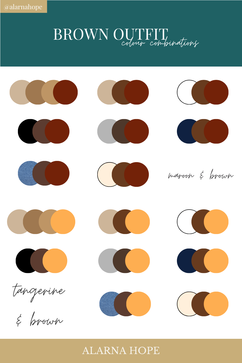
The success of a brown-based brand identity depends entirely on its secondary and tertiary colors. Brown is a neutral, but it is a “warm” neutral, meaning it requires a strategic hand to balance its weight. Here is how leading brand strategists pair brown to create high-impact identities.
Brown and Gold: The Prestige Factor
This is perhaps the most classic pairing in the world of luxury branding. When you pair a deep chocolate brown with a metallic gold or a warm ochre, you immediately elevate the brand’s perceived value. The brown provides a grounded, masculine base, while the gold adds a layer of aspiration and “royalty.”
- Best For: Premium spirits, high-end watches, and boutique hotels.
Brown and Blue: Trust Meets Approachability
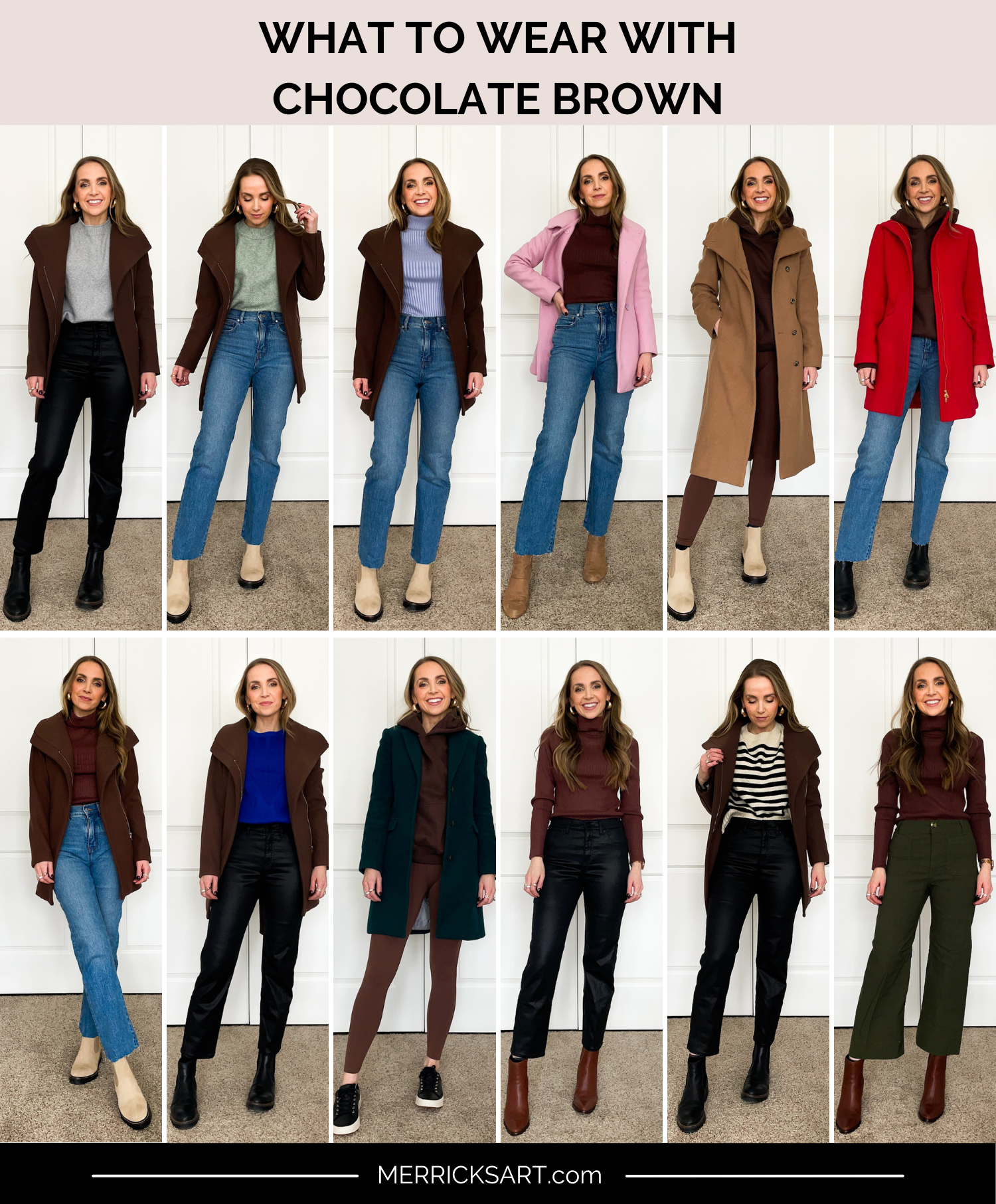
In the world of corporate identity, brown and blue are an underrated power duo. Blue is the world’s most trusted color, representing professionalism and intelligence. When paired with brown, the clinical nature of blue is softened. A navy blue paired with a tan or camel creates a “preppy” and approachable professional aesthetic.
- Best For: Consulting firms, legal practices, and architectural studios.
Brown and Green: The Ultimate Sustainability Combo
This is the “nature” palette. To avoid looking like a 1970s relic, modern brands use forest green or muted sage against a backdrop of raw, sandy browns. This combination communicates growth, health, and ecological responsibility. It is the go-to palette for brands that want to emphasize their “farm-to-table” or “clean-label” credentials.
- Best For: Organic skincare, vegan food brands, and outdoor gear.
Brown and Cream: Minimalist Elegance
For brands that want to channel a “quiet luxury” or Scandinavian aesthetic, the combination of rich espresso and soft cream is unbeatable. This palette is high-contrast but low-stress. It feels clean, spacious, and sophisticated without the harshness of a pure black-and-white scheme.
- Best For: High-end apparel, wellness retreats, and interior design firms.
Case Studies: Iconic Brands That Own Brown
To truly understand what brown goes with, we must look at the market leaders who have successfully claimed a “slice” of the color spectrum that many designers used to avoid.
UPS: Efficiency and “Big Brown”
UPS is perhaps the most famous example of brown in the corporate world. For decades, their slogan was “What can Brown do for you?” In the logistics industry, where speed is often the primary selling point, UPS chose to focus on reliability. Their “Pullman Brown” was originally chosen because it hid dirt on delivery trucks, but it evolved into a symbol of a massive, unstoppable infrastructure. They pair their brown with a bright, energetic yellow-gold, which adds the necessary “velocity” to an otherwise heavy color.
Louis Vuitton: The Heritage of Leather
Louis Vuitton’s visual identity is inextricably linked to brown. Their monogrammed canvas uses a specific combination of dark and light browns that mimics the look of high-quality treated leather. By keeping their palette strictly within the brown family, they communicate a singular focus on craftsmanship and heritage. When they do introduce a second color—such as the bright orange of their shopping bags—it creates a massive visual impact because the “brown” base is so established.
Hershey’s: Comfort and Confectionery
For Hershey’s, brown is literal. It represents the product itself. However, the brand strategy goes deeper. The specific shade of silver-grey used in the “Kisses” branding or the block white lettering on the classic bar creates a sense of nostalgia and Americana. Here, brown goes with “white” to create a high-contrast, legible brand that feels like a staple of the American pantry.
Strategic Implementation: Using Brown Across Digital and Physical Touchpoints
Choosing a color palette is only half the battle. A brand strategist must ensure that brown works across all mediums, from a high-resolution smartphone screen to a recycled cardboard shipping box.
Digital Design and Accessibility
In UI/UX design, brown can be tricky. On screens, dark browns can sometimes appear “muddy” if the saturation isn’t handled correctly. When designing a website for a brown-based brand, it is vital to use high-contrast typography—usually cream or white—to ensure readability. Brown also makes an excellent “dark mode” alternative to pure black, as it feels warmer and more organic for long-term viewing.
Packaging and Materiality
One of the greatest strengths of a brown-focused brand is the ability to use “naked” packaging. Using Kraft paper or corrugated cardboard isn’t just a cost-saving measure; it’s a branding statement. When a brand’s primary color is brown, the packaging material itself becomes part of the identity. This reinforces the “natural” and “honest” associations of the brand.
Photography and Lifestyle Imagery
When brown is the core of a brand, the photography style must follow suit. This means utilizing “warm” lighting, natural textures (wood, linen, stone), and a slight desaturation of bright colors. If a brand uses a rich cognac brown, the lifestyle photography should avoid “cool” fluorescent lighting, which would make the color look sickly. Instead, golden hour light or soft, directional shadows will enhance the richness of the brown.
Future Trends: The New Neutrals in the Digital Age
As we look toward the future of brand strategy, brown is positioned to become the “new black.” In an era of AI-generated perfection and hyper-saturated digital environments, there is a growing consumer craving for the “tactile.” Brown provides a sensory bridge between the digital and the physical.
We are seeing a rise in “terracotta” and “clay” tones in the tech space, as companies try to humanize their interfaces. We are seeing “espresso” replace “obsidian” in luxury automotive branding. The question “What does brown go with?” is no longer a question of aesthetics—it is a question of positioning.
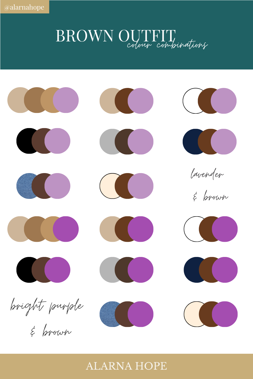
To use brown effectively is to tell the world that your brand is not afraid to be grounded. It tells your audience that you value substance over sparkle, and longevity over trends. Whether paired with the vibrancy of turquoise for a modern twist or the austerity of slate grey for a corporate edge, brown is the anchor that allows a brand to remain steadfast in a volatile market.
In conclusion, brown goes with everything that represents the future of consumer trust: authenticity, sustainability, and enduring quality. By mastering this earth-bound palette, brand strategists can build identities that don’t just stand out for a season but remain relevant for a lifetime.
aViewFromTheCave is a participant in the Amazon Services LLC Associates Program, an affiliate advertising program designed to provide a means for sites to earn advertising fees by advertising and linking to Amazon.com. Amazon, the Amazon logo, AmazonSupply, and the AmazonSupply logo are trademarks of Amazon.com, Inc. or its affiliates. As an Amazon Associate we earn affiliate commissions from qualifying purchases.