
In the competitive landscape of visual identity, the choice of a color palette is rarely a matter of mere aesthetics. It is a strategic calculation rooted in psychology, biology, and cultural history. Among the most potent combinations available to brand strategists is the high-contrast duo of black and yellow. From the industrial grit of heavy machinery to the lightning-fast world of international logistics, this color pairing commands attention unlike any other.
Understanding what black and yellow means in a branding context requires a deep dive into how the human brain processes visual stimuli. It is a combination that signals authority, evokes a sense of urgency, and guarantees visibility in a crowded marketplace. For brands looking to establish a dominant presence, mastering this palette is essential.

The Psychology of Yellow and Black: Why This Duo Dominates Consumer Perception
The relationship between black and yellow is defined by extreme contrast. In the world of color science, yellow is the most visible color in the spectrum to the human eye, while black provides the ultimate “null” backdrop, allowing the vibrancy of the yellow to resonate without distraction.
Visibility and the Evolutionary Pull
Human biology is hardwired to notice black and yellow. In nature, this combination serves as an “aposematic” signal—a warning used by creatures like wasps, bees, and certain amphibians to signal toxicity or danger. Because our ancestors survived by quickly identifying these patterns, the modern human brain is still conditioned to give immediate cognitive priority to black and yellow.
In branding, this translates to unparalleled “stopping power.” When a consumer sees a black and yellow logo, their brain registers it faster than a pastel or a low-contrast combination. This makes it an ideal choice for brands that need to stand out in physical environments, such as retail shelves or busy urban streets.
Emotional Associations: Optimism Meets Authority
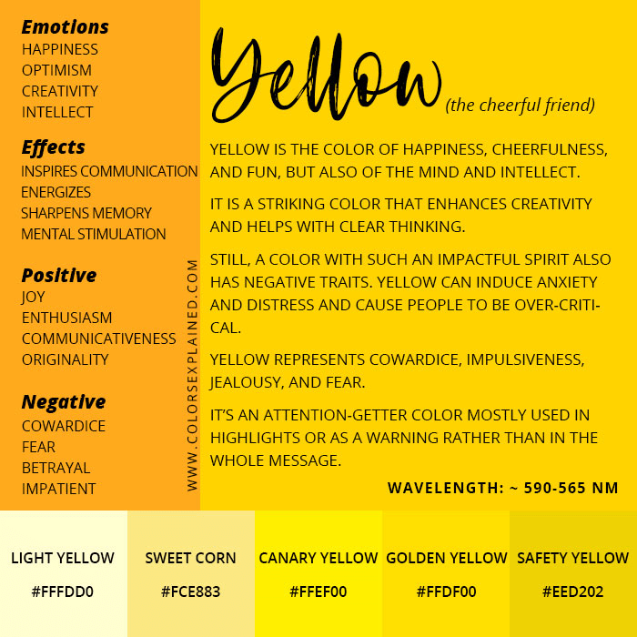
Individually, yellow is associated with sunshine, optimism, energy, and warmth. However, when paired with black, the narrative shifts. Black introduces elements of power, sophistication, and seriousness.
The synergy of these two colors creates a brand persona that is both energetic and disciplined. It suggests a company that is approachable and bright (yellow) but also grounded, professional, and authoritative (black). This balance is why the palette is frequently adopted by service-oriented brands that want to appear both friendly and highly competent.
Industrial Strength and Safety: The Legacy of Functionality
Perhaps the most enduring association of black and yellow is with the industrial sector. For decades, this palette has been the universal language of construction, resilience, and safety.
Construction and Resilience: The Case of Caterpillar and Stanley
When you think of heavy machinery, Caterpillar (CAT) is likely the first brand that comes to mind. Their iconic “Caterpillar Yellow” paired with black accents is not just a stylistic choice; it is a declaration of durability. The color reflects the rugged environments of construction sites where visibility is a safety requirement.
Similarly, Stanley and DeWalt have utilized black and yellow to dominate the power tool industry. In these cases, the color scheme communicates “professional grade.” The yellow suggests the spark of energy and the activity of creation, while the black signifies the heavy-duty nature of the equipment. For these brands, black and yellow mean “built to last.”
Caution and Alert: The Universal Language of Danger
In the realm of corporate identity and public safety, black and yellow are synonymous with caution. From “Caution” tape to hazard signs and traffic barriers, the high-visibility nature of the pairing is used to alert individuals to potential risks.
Strategic branding experts must navigate this association carefully. While it ensures that a brand will be seen, it can also unintentionally trigger a sense of anxiety if not balanced correctly. Modern brands often mitigate this by choosing specific shades of yellow—moving away from “School Bus Yellow” toward more refined, golden, or neon hues—to maintain visibility while distancing themselves from the “hazard” connotation.
Strategic Speed and Efficiency in Logistics
Beyond the industrial sector, black and yellow have become the international shorthand for speed, movement, and efficiency. This is particularly evident in the logistics and transportation industries, where getting from point A to point B quickly is the primary value proposition.

The DHL Example: Reliability at Scale
DHL is one of the most prominent examples of a global brand leveraging this palette. Their bright yellow vehicles with bold red and black accents are recognizable in nearly every country on Earth. In the context of global shipping, yellow represents the “go” signal—the speed and promptness of delivery. The black typography provides the legibility and corporate weight necessary to trust a company with high-value goods.
By using this high-contrast scheme, DHL ensures that its brand assets (trucks, planes, uniforms) act as mobile billboards. The vibrancy of the yellow ensures they are seen from a distance, reinforcing the brand’s presence in the consumer’s daily life.
Urban Mobility: The Iconography of the Taxi
The yellow cab is perhaps the most iconic use of color in urban history. Originally popularized by the Yellow Cab Company in Chicago and later synonymous with New York City, the choice of color was based on a university study suggesting that yellow was the most easily spotted color from a distance.
In the modern gig economy, brands like Yandex or various delivery services continue to utilize black and yellow to signal that they are ready to move. For a service-based brand, this combination means “availability.” It tells the customer that help or service is immediate and easy to find.
Luxury, Prestige, and Niche Positioning
While often associated with utility, black and yellow (and its metallic cousin, gold) also have a significant presence in the luxury and sports sectors. In these niches, the meaning shifts from “caution” to “prestige” and “performance.”
The “Bumblebee” Effect in Sports Branding
In professional sports, teams like Borussia Dortmund (BVB) or the Pittsburgh Steelers have turned black and yellow into a symbol of tribal identity and competitive aggression. In this context, the colors represent energy and dominance. The “Yellow Wall” at a Dortmund match is a psychological tool meant to overwhelm the opposition with a sheer mass of vibrant color, anchored by the intimidation of black.
Premium Contrast: Sophistication Through Minimalism
High-end automotive brands and watchmakers often use yellow as an accent color against a dominant black background to signify “sport” or “performance.” A black luxury watch with yellow stitching or a black supercar with yellow brake calipers uses the color to highlight specific engineering features.
In this application, yellow acts as a spotlight. It doesn’t scream for attention across a whole field; instead, it directs the eye to the most important details, suggesting precision and high-performance technology. This is a common tactic in branding for software or “fintech” startups that want to appear cutting-edge and fast-paced.
Implementation: How to Use Black and Yellow in Your Brand Strategy
Adopting a black and yellow palette requires a nuanced approach to design. Because the combination is so visually loud, it can easily become overwhelming if the proportions are not carefully managed.
Defining the Balance
A successful brand strategy involving these colors usually follows the 60-30-10 rule of design, or a variation of it. Using black as a primary or secondary color helps ground the identity, while yellow is often best used as an “action” color—the color of buttons, links, or key brand messages.
- Dominant Black: Creates a sense of mystery, luxury, and high-end technology. The yellow then acts as a vibrant spark of innovation.
- Dominant Yellow: Creates a sense of high energy, accessibility, and mass-market appeal. The black is then used for typography to ensure maximum readability.
Accessibility and Readability Standards
One of the greatest functional benefits of black and yellow is its compliance with accessibility standards. For digital branding, the contrast ratio between black text and a yellow background (or vice versa) is among the highest possible, often exceeding WCAG (Web Content Accessibility Guidelines) requirements. This makes it an excellent choice for brands that prioritize inclusivity and want their content to be readable by those with visual impairments.
The Shift to Digital
In the digital space, “yellow” can be a difficult color to render consistently across different screens. Brand managers must be meticulous in selecting HEX and RGB values that do not appear “muddy” or “greenish” on low-quality displays. Pairing a vibrant, digital-first yellow with a deep, “rich black” (a black that includes hints of other colors to appear deeper on screen) can create a premium feel that transcends the industrial roots of the palette.
Conclusion: The Enduring Impact of the Palette
What does black and yellow mean for a brand? It means being impossible to ignore. It means claiming a space of authority, whether that is on a construction site, in a logistics hub, or on a mobile app interface. It is a color combination of extremes: the brightest light meets the deepest dark.
For brands that value speed, safety, energy, and clarity, there is no more effective visual shorthand. By tapping into evolutionary psychology and industrial history, a black and yellow brand strategy communicates a message of readiness and power before a single word of copy is ever read. It is the ultimate palette for the bold.
aViewFromTheCave is a participant in the Amazon Services LLC Associates Program, an affiliate advertising program designed to provide a means for sites to earn advertising fees by advertising and linking to Amazon.com. Amazon, the Amazon logo, AmazonSupply, and the AmazonSupply logo are trademarks of Amazon.com, Inc. or its affiliates. As an Amazon Associate we earn affiliate commissions from qualifying purchases.